This early baroque typographic gem is crafted with passion to variable font.
Designing font family systems has become a fashion ever since the beginning of digital typography.
Tested by centuries of reading.
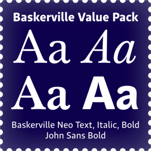
The standard of the classics, considered by many to be the most trusted typeface in the world.
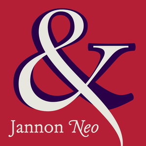
Baskerville's perfect companion.
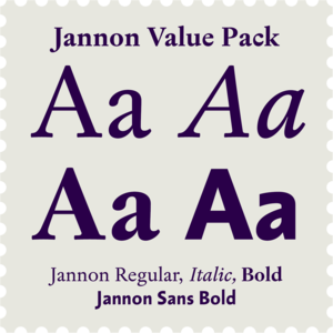
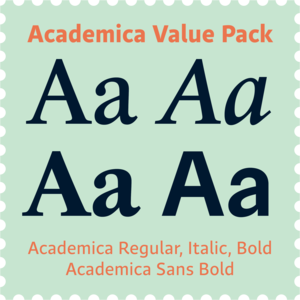
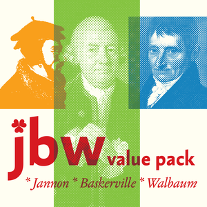
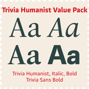
A smart selection of four fonts considered by many to be the most trusted typefaces in the world, at a great price.
Ready for action and striking messages! While working on this font in Winter/Spring 2024, I came across a news that scared the hell out of me.
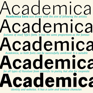
A universal typeface for books, magazines and newspapers is economizing, quiet, strong in drawing, but original and peaceful at the same time.
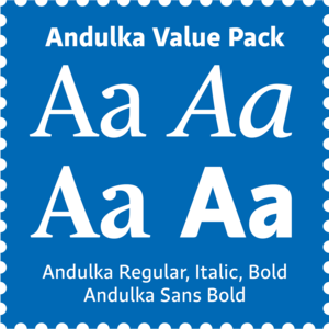
Andulka was drawn in 2004 for the purposes of publication and visual identity.
A universal typeface for books, magazines and newspapers.
Realiable scientific text workhorse.
Reliable scientific sans-serif.
Small selection for big jobs from serious volumes to fancy invitations, music and poetry.
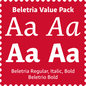
The goal of Beletria is to be a contemporary looking book typeface for fast reading (frankly, I was already bored of using of good old Baskerville for the volumes I illustrated recently).
Beletrio was made as companion to Beletria, it has many shapes in common.
Contemporary legible font kit.
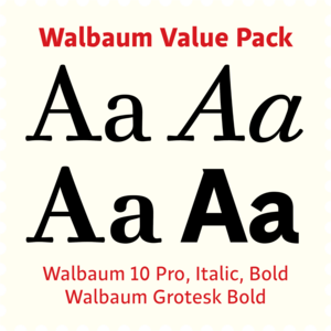
Jannon, Baskerville, Walbaum and their sans-serif companions.
Modern humanist book typeface.
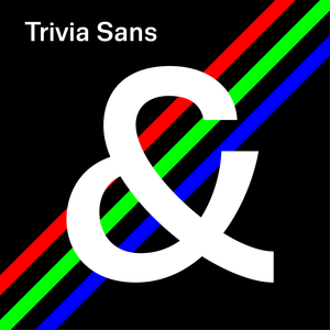
Dynamic humanist sans-serif.
Dynamic contemporary Roman & Sans at a great price.
There is a moment in everyone’s life when they start wearing glasses and I am no exception.
Originally designed for a fading vision, but soon it became a favourite font for many publishers.
A friendly font for large scientific volumes, but also poetry and small periodicals.
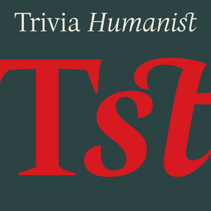
I decided to draw the Regular style of Trivia Humanist not too light and the Bold not too dark.
Cold, perfect and strict organizer.
Contrasting contemporary text & headline combination for decent corporate representation.
Upon numerous demands of highly esteemed users of our fonts I decided to supplement the Walbaum type family by display and poster cuts.
From what we can tell, Justus Erich Walbaum probably never intended to create a sans-serif typeface.
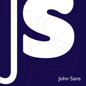
Essential solid sans-serif with many customizable characters for individual style and branding.