Reliable scientific text workhorse.
Small selection for big jobs from serious volumes to fancy invitations, music and poetry.
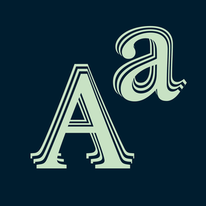
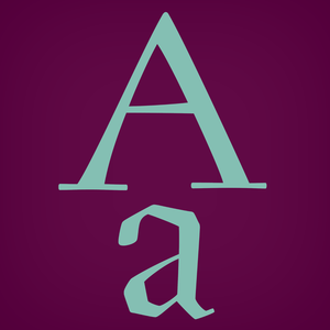
Monumental inscriptional majuscule originally carved in stone, sometimes called "Roman Capital", is a craddle of upper-case part of latin alphabet.
A universal typeface for books, magazines and newspapers is economizing, quiet, strong in drawing, but original and peaceful at the same time.
Modern humanist book typeface.
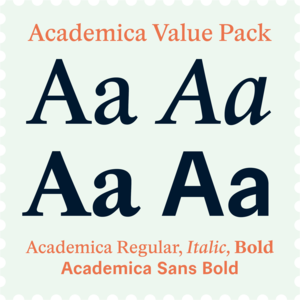
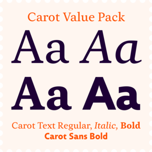
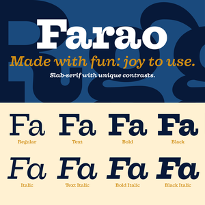
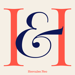
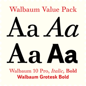
Dynamic contemporary Roman & Sans at a great price.
The concept of the Baroque Roman type face is something which is remote from us.
My professor's masterpiece.
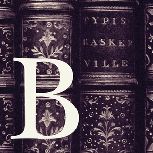
The standard of the classics, considered by many to be the most trusted typeface in the world.
A faithful revival with a touch of letterpress, revised in summer 2025.
The most trusted typeface in the world for best price.
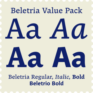
Beletria is a modern book font family for fast reading.
Contemporary legible font kit for easy reading.
The twenty-fifth anniversary of the release of this font is a reason for a thorough improvement, both technically and aesthetically.
Versatile typeface inspired by bohemian culture.
There is a moment in everyone’s life when they start wearing glasses and I am no exception.
A friendly font for large scientific volumes, but also poetry and small periodicals.
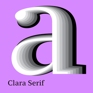
Clara system is a superfamily of related sans and serif fonts, ideal for magazine, identity and corporate design use.
Comenia was developed as typographic system for use on all levels of schools and universities.
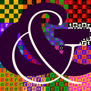
Deriving the letterforms from a car’s bodywork required a certain dose of madness — the same kind needed to drive and maintain that curious vehicle.
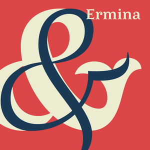
In the realm of decorative typefaces, only a few are usable for longer texts, but Ermina’s swallow-tail serifs disappear in small sizes and her open drawing is perfectly legible.
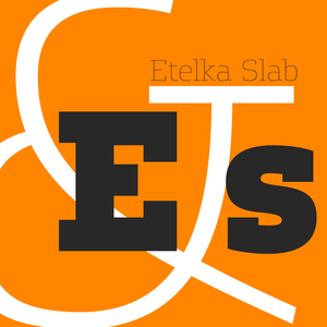
You can use Etelka Slab wherever you wanted to use Etelka, but the serifs add a much sharper and louder expression.
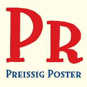
Originally designed in 1998 as 3-font family, updated in 2016 by new italics, SmallCaps and many OpenType functions, resulting in a set of highly visible poster typefaces.
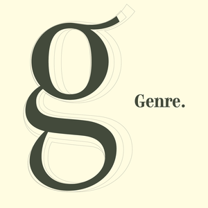
Genre is inspired by 19th century architecture, with serifs formed like façade ledges.
The iconic 19th century modern book superfonts.
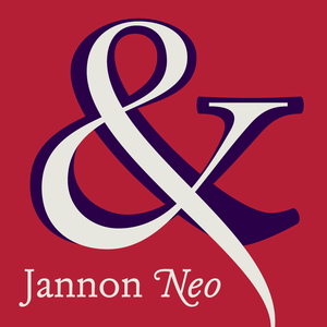
A faithful revival of an early Baroque typographic gem.
This early baroque typographic gem is crafted with passion to variable font.
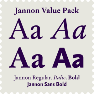
Jannon Serif and Sans Bold is both versatile and affordable package.
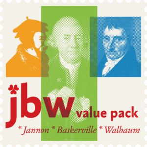
Jannon, Baskerville, Walbaum and their sans-serif companions.
Designs of characters that are almost forty years old can be already restored like a historical alphabet – by transferring them exactly into the computer with all their details.
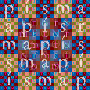
Storm Type Foundry proudly presents the UI fonts for Kingdom Come Deliverance II.
Fancy variation on newspaper, dictionary and magazine type face.
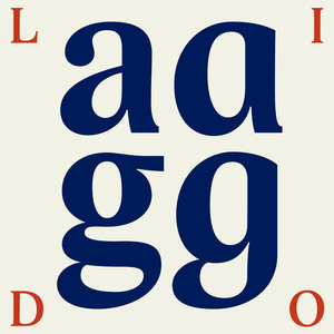
Lido was created before the year 2000, in the conditions of developing digital typography.
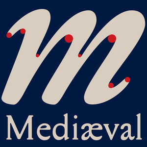
The same font used in the architecture and in the book? That's Mediaeval.
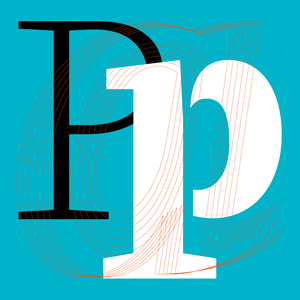
Roman capitals narrowed.
The five-pointed star gave vertical proportions to this typeface.
The world was full of dull grotesques.
Czech Modernist Masterpiece.
A monument of Czech patriotic typography.
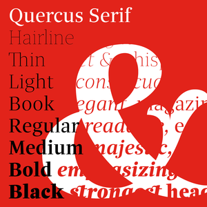
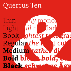
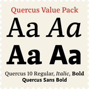
Quercus is characterised by open, yet a little bit condensed drawing with sufficient spacing so that the neighbouring letters never touch.
The Quercus family of fonts was inspired by classicistic types with vertical shadows.
This modernized rustic Baroque Roman face paraphrases freely its model from the first half of the 18th century.
Baroque design, music and architecture, historical books, catalogues, posters and social media.
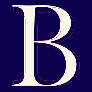
A confession of love for baroque typography.
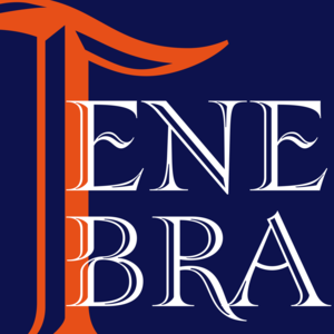
Tenebra is an example of a combination of the Baroque inscriptional majuscule with decorative calligraphic elements and alchemistic symbols.
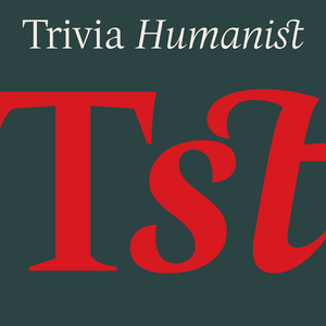
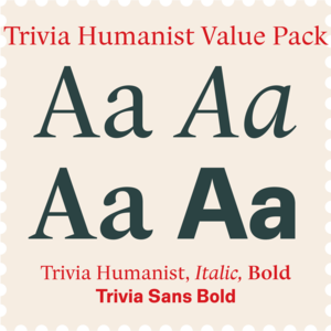
I decided to draw the Regular style of Trivia Humanist not too light and the Bold not too dark.
Contrasting text & headline for great corporate design.
Essential high-contrast headliner.
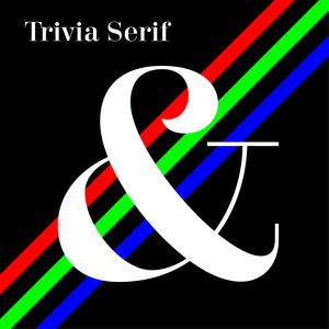
Trivia Serif 10 is an addition to the Trivia type system consisting of forty styles.
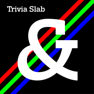
Trivia Slab is a part of our Trivia superfamily system.
Slavoboj Tusar was the brother of Czech prime minister during the First republic period.
This Antikva and Italic are well-known perhaps to all Czech graphic artists and typographers ever since their release.
For romantic literature at dawn of the industrial revolution.
From what we can tell, Justus Erich Walbaum probably never intended to create a sans-serif typeface.