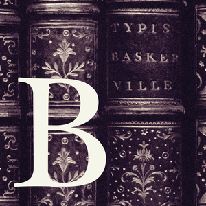
The standard of the classics, considered by many to be the most trusted typeface in the world.
This early baroque typographic gem is crafted with passion to variable font.
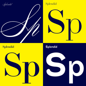
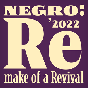
A faithful revival with a touch of letterpress, revised in summer 2025.
Reliable scientific text workhorse.
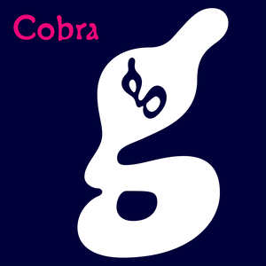
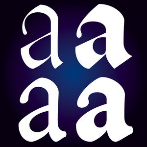
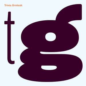
A cross between a Roman type face and a slug, a type face with blurred letters, inspired by a tropical snake remotely contained in the letter "g".
A faithful revival of an early Baroque typographic gem.
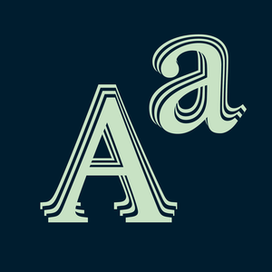
The iconic 19th century modern book superfonts.
Czech Modernist Masterpiece.
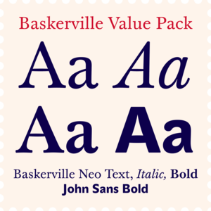
The most trusted typeface in the world for best price.
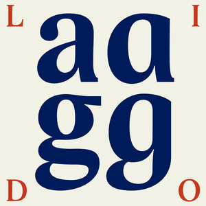
Lido was created before the year 2000, in the conditions of developing digital typography.
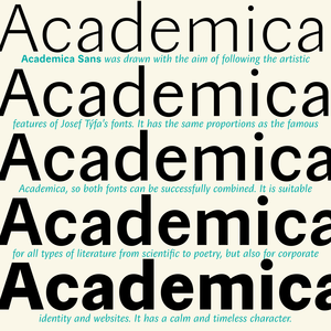
A universal typeface for books, magazines and newspapers is economizing, quiet, strong in drawing, but original and peaceful at the same time.
Designing font family systems has become a fashion ever since the beginning of digital typography.
Metron is so far the most ambitious typeface made to order in the Czech Republic.
Essential high-contrast headliner.
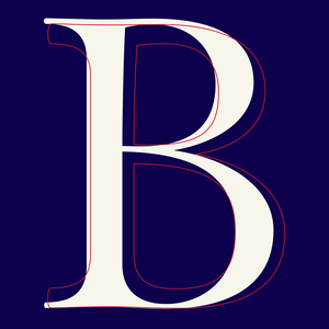
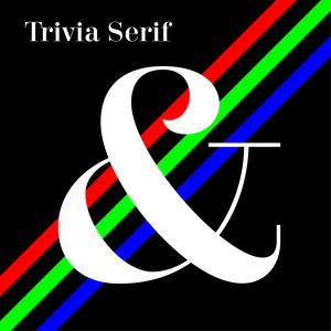
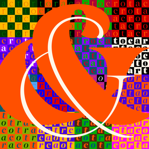
Baroque design, music and architecture, historical books, catalogues, posters and social media.
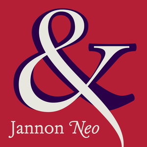
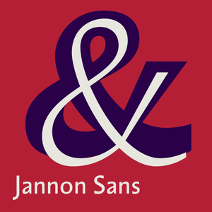
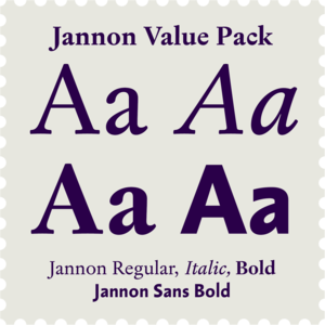
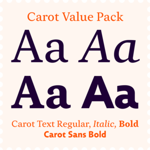
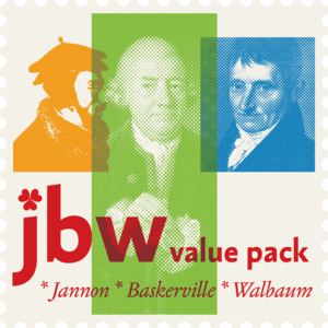
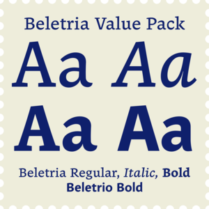
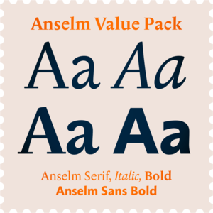
Jannon Serif and Sans Bold is both versatile and affordable package.
It can be assumed that when the designer is having fun, the viewer will also have fun.
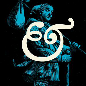
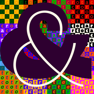
A confession of love for baroque typography.
If we are looking for something neutral, without artistic emotions and without historical reminiscences, here we have it.
Matrix dot printer font with rounded edges, can be used in extremely small sizes as well as large on posters.
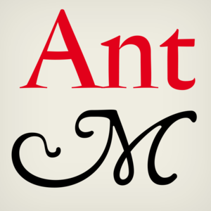
This Antikva and Italic are well-known perhaps to all Czech graphic artists and typographers ever since their release.
Sharp expression and rigor for a distinctive identity.
A friendly font for large scientific volumes, but also poetry and small periodicals.
There is a moment in everyone’s life when they start wearing glasses and I am no exception.
For romantic literature at dawn of the industrial revolution.
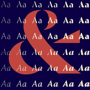
Jannon, Baskerville, Walbaum and their sans-serif companions.
Fonts for fragrances and wine blended with the best typographic ingredients and - love.
Designed in 1999 for an inscription on Santini's architecture.
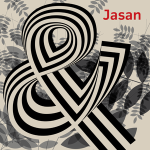
Jasan is the Czech expression for ash tree (Fraxinus Excelsior) which provides great wood for tools and furniture.
Our eye is able to join missing parts of worn letters back into undisturbed shapes.
Andulka was drawn in 2004 for the purposes of publication and visual identity.
Czech National Bank official font.
Dark, spicy & distinctive display typefaces from the nineteenth century I had in mind when creating this font family.
Contemporary legible font kit for easy reading.
Originally designed for a fading vision, but soon it became a favourite font for many publishers.
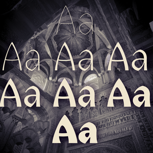
The land of beauteous angels, Andalucia, connects different cultures with a curved arch.
The concept of the Baroque Roman type face is something which is remote from us.
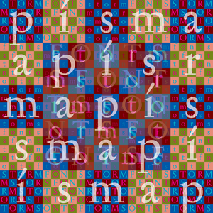
Storm Type Foundry proudly presents the UI fonts for Kingdom Come Deliverance II.
Dynamic contemporary Roman & Sans at a great price.
Reliable scientific sans-serif.
Magazine headlines & poster superfamily.