Cookies help us deliver our services. By using our services, you agree to our use of cookies.Got it
  • ☾☼
  • 🛒 (0) 0,00 CZK
  • Change currency
    • CZK
    • EUR
    • USD
  • Currency
    • CZK
    • EUR
    • USD
  • Login
  • Licensing
  • Font Packages
  • Custom Fonts
  • Printed Materials
  • Bestsellers
  • Cyrillic
  • Greek
  • Contact Us
  • Facebook
  • Instagram
  • About Us
  • People
  • Help
  • Rules and Conditions
  • Privacy Policy
  • GDPR
❓ Storm Type Foundry
  • Sans-serif 
    • Academica Sans
    • Amor Sans
    • Amphibia
    • Andulka Sans
    • Anselm Sans
    • Bahnhof
    • Beletrio
    • Carot Mono
    • Carot Sans
    • Clara Sans
    • DynaGrotesk
    • Etelka Pro
    • Header
    • Hercules Sans
    • Inicia
    • Jannon Sans
    • Jasan
    • John Sans
    • Josef Sans
    • Melange
    • Metron
    • Populus
    • Quercus C
    • Quercus Sans
    • Quercus Whiteline
    • Sebastian
    • Shompen
    • Solpera
    • Splendid Sans
    • St Croce Pro
    • Superscience
    • Teuton
    • Trivia Gothic
    • Trivia Grotesk
    • Trivia Sans
    • Vida
    • Walbaum Grotesk
    • Zeppelin Grotesk
  • Serif 
    • Academica
    • Alebrijes
    • Amor Serif
    • Andulka
    • Anselm Serif
    • Antique
    • Areplos
    • Baskerville Neo
    • Baskerville Original
    • Beletria
    • Biblon Pro
    • Carot Display
    • Carot Slab
    • Carot Text
    • Clara Serif
    • Comenia Serif Pro
    • Defender
    • Ermina
    • Etelka Slab
    • Farao
    • Genre
    • Hercules Neo
    • Jannon Antiqua
    • Jannon Neo
    • Juvenis
    • Kingdom
    • Lexon
    • Lido STF
    • Mediaeval
    • Mramor
    • Pentagraf
    • Pepone
    • Preissig Antikva
    • Preissig Poster
    • Quercus Serif
    • Quercus Ten
    • Regent
    • Regula
    • Serapion
    • Tenebra
    • Trivia Humanist
    • Trivia Serif
    • Trivia Serif 10
    • Trivia Slab
    • Tusar
    • Tyfa Antikva
    • Walbaum 2010 Pro
  • Blackletter 
    • Coroner
    • Dracula
    • Dream Within A Dream
    • Friedhof
    • Hexenrunen
    • Julinka
    • Monarchia
    • Moyenage
    • Moyenage Sans
    • Plagwitz
    • Spiritist
    • Wittingau
  • Decorative 
    • Abalda
    • Aichel
    • Alcoholica
    • Andaluz
    • Bhang
    • Brauer
    • Briefmarken
    • Clichee
    • Cobra
    • Compur
    • Enamelplate
    • Excelsor Script
    • Fenix
    • Gallus Konzept
    • Hammertone
    • Ideal Gothic
    • Libcziowes
    • Lokal Script
    • Modell
    • Mortal
    • Negro
    • Patzcuaro
    • Pivo
    • Politic
    • Rondka
    • Rooftiles
    • Splendid Quartett
    • Stencilul
    • Technomat
    • Traktoretka
  • Font Packages 
    • Baskerville Sans & Serif
    • Carot Complete
    • Hercules Sans & Serif
    • Jannon Sans & Serif
    • Storm Type Library 7
    • Trivia Complete
    • Walbaum Sans & Serif
    •  
    • Academica Value Pack
    • Andulka Value Pack
    • Anselm Value Pack
    • Baskerville Value Pack
    • Beletria Value Pack
    • Carot Value Pack
    • Clara Value Pack
    • Hercules Value Pack
    • Jannon Value Pack
    • JBW Value Pack
    • Quercus Value Pack
    • Trivia Grotesk Value Pack
    • Trivia Humanist Value Pack
    • Walbaum Value Pack
37 fonts :
10558,93 CZK
(285,38 CZK per font)
🛒 add to cart

Vida
Buying options: Storm Type Library 7: 244522,53 CZK

  • Typefaces
  • Gallery


  • Full vida a3 2014 specimen 1
    Full vida a3 2014 specimen 2
    Full vida a3 2014 specimen 3
    Full vida a3 2014 specimen 5
    Full vida a3 2014 specimen 10
    Full vida a3 2014 specimen 6
    Full vida a3 2014 specimen 8
    Full vida a3 2014 specimen 9
    Full vida a3 2014 specimen 7
    PreviousNext

    Vida

    by František Štorm

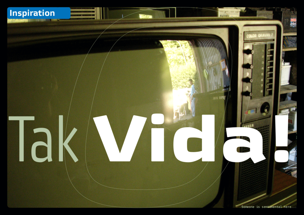
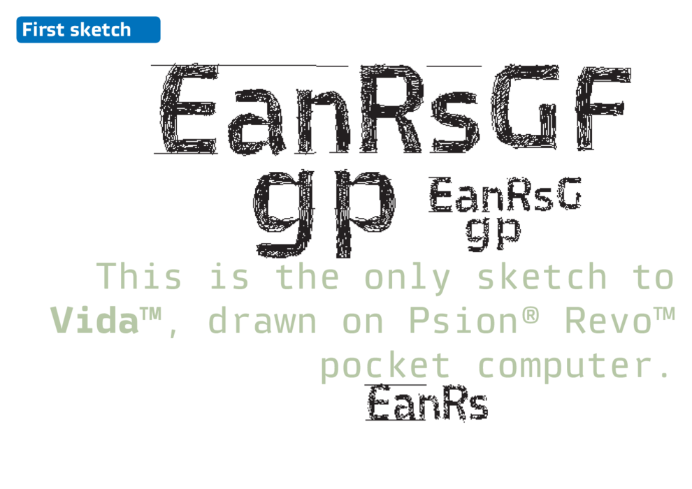
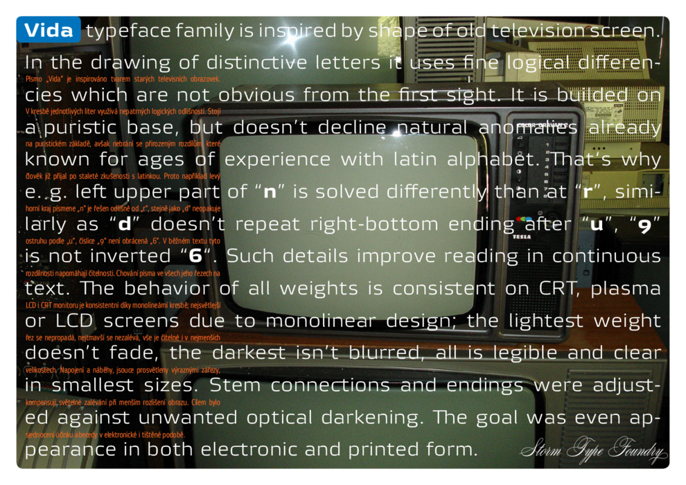
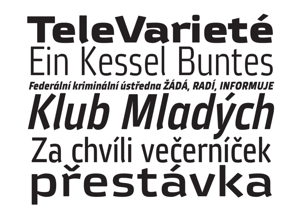
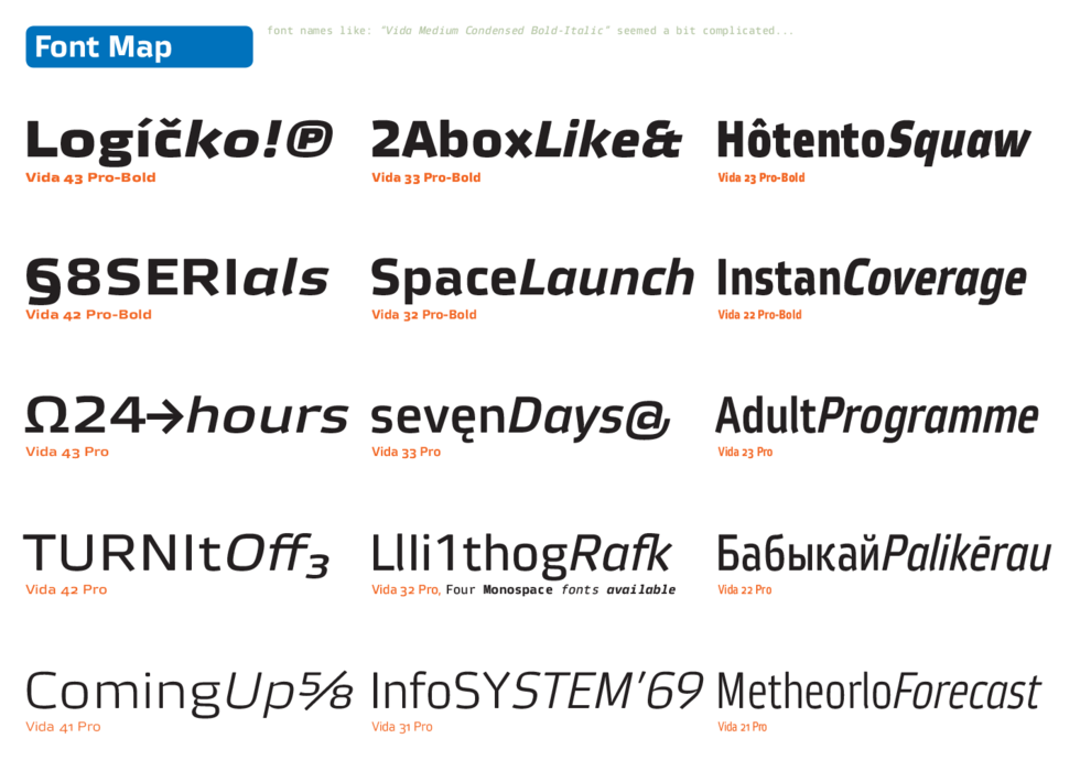
    New typeface family Vida has been designed in summer 2006. The drawing of each letter form differs finely in its logic, which is a feature invisible at first. It is constructed on a puristic base, but it doesn‘t reject the natural anomalies already known from ages of experience with latin alphabet. That‘s why the upper left section of “n” is constructed differently from that of „r, similarly as “d” doesn’t repeat right-bottom ending after “u”, “9” is not inverted “6“. Such details improve reading in continuous text. The behavior is consistent on all output devices due to monolinear design; the lightest weight doesn’t fade, the darkest isn’t blurred, all is legible and clear in smallest sizes. Stem connections and endings were adjusted to avoid undesirable optical darkening. The goal we desired was to achieve balance appearance in both electronic and printed form.

    Písmo „Vida“ bylo vytvořeno v létě 2006. V kresbě jednotlivých liter využívá nepatrných logických odlišností. Stojí na puristickém základě, avšak nebrání se přirozeným rozdílům, které člověk již přijal po staleté zkušenosti s latinkou. Proto například levý horní kraj písmene „n“ je řešen odlišně od „r“, stejně jako „d“ neopakuje ostruhu podle „u“, číslice „9“ není obrácená „6“. V běžném textu tyto rozdílnosti napomáhají čitelnosti. Chování písma na všech výstupních zařízeních je konsistentní díky monolineární kresbě; nejsvětlejší řez se nepropadá, nejtmavší se nezalévá, vše je čitelné i v nejmenších velikostech. Napojení a náběhy, jsouce prosvětleny výraznými zářezy, kompensují světelné zalévání při menším rozlišení obrazu. Cílem bylo sjednocení účinku abecedy v elektronické i tištěné podobě.

    Tags
    cyrillic  legible  headline  corporate  information system  advertising  thin  cyrillics  heavy  ultra  narrow  rounded  geometric  expanded  industrial 
    ©2025 Storm Type Foundry
  • made by Gravastar s.r.o.