Cookies help us deliver our services. By using our services, you agree to our use of cookies.Got it
  • ☾☼
  • 🛒 (0) 0,00 EUR
  • Change currency
    • CZK
    • EUR
    • USD
  • Login
  • Licensing
  • Font Packages
  • Custom Fonts
  • Free Trial Fonts
  • Printed Materials
  • Bestsellers
  • Cyrillic
  • Greek
  • Contact Us
  • Facebook
  • Instagram
  • About Us
  • People
  • Help
  • Rules and Conditions
  • Privacy Policy
  • GDPR
❓ Storm Type Foundry
  • Sans-serif 
    • Academica Sans
    • Amor Sans
    • Amphibia
    • Andulka Sans
    • Anselm Sans
    • Bahnhof
    • Beletrio
    • Carot Mono
    • Carot Sans
    • Clara Sans
    • DynaGrotesk
    • Etelka Pro
    • Header
    • Hercules Sans
    • Inicia
    • Jannon Sans
    • Jasan
    • John Sans
    • Josef Sans
    • Melange
    • Metron
    • Populus
    • Quercus C
    • Quercus Sans
    • Quercus Whiteline
    • Sebastian
    • Sedlec Sans
    • Shompen
    • Solpera
    • Splendid Sans
    • St Croce Pro
    • Superscience
    • Teuton
    • Trivia Gothic
    • Trivia Grotesk
    • Trivia Sans
    • Vida
    • Walbaum Grotesk
    • Zeppelin Grotesk
  • Serif 
    • Academica
    • Alebrijes
    • Amor Serif
    • Andulka
    • Anselm Serif
    • Antique
    • Areplos
    • Baskerville Neo
    • Baskerville Original
    • Beletria
    • Biblon Pro
    • Carot Display
    • Carot Slab
    • Carot Text
    • Clara Serif
    • Comenia Serif Pro
    • Defender
    • Ermina
    • Etelka Slab
    • Farao
    • Genre
    • Hercules Neo
    • Jannon Antiqua
    • Jannon Neo
    • Juvenis
    • Kingdom
    • Lexon
    • Lido STF
    • Mediaeval
    • Mramor
    • Pentagraf
    • Pepone
    • Preissig Antikva
    • Preissig Poster
    • Quercus Serif
    • Quercus Ten
    • Regent
    • Regula
    • Serapion
    • Tenebra
    • Trivia Humanist
    • Trivia Serif
    • Trivia Serif 10
    • Trivia Slab
    • Tusar
    • Tyfa Antikva
    • Walbaum 2010 Pro
  • Blackletter 
    • Coroner
    • Dracula
    • Dream Within A Dream
    • Friedhof
    • Hexenrunen
    • Julinka
    • Monarchia
    • Moyenage
    • Moyenage Sans
    • Plagwitz
    • Spiritist
    • Wittingau
  • Decorative 
    • Abalda
    • Aichel
    • Alcoholica
    • Andaluz
    • Bhang
    • Briefmarken
    • Clichee
    • Cobra
    • Compur
    • Enamelplate
    • Excelsor Script
    • Fenix
    • Gallus Konzept
    • Hammertone
    • Ideal Gothic
    • Libcziowes
    • Lokal Script
    • Modell
    • Mortal
    • Negro
    • Patzcuaro
    • Pivo
    • Politic
    • Rondka
    • Rooftiles
    • Splendid Quartett
    • Stencilul
    • Technomat
    • Traktoretka
  • Font Packages 
    • Baskerville Sans & Serif
    • Carot Complete
    • Hercules Sans & Serif
    • Jannon Sans & Serif
    • Storm Type Library 7
    • Trivia Complete
    • Walbaum Sans & Serif
    •  
    • Academica Value Pack
    • Andulka Value Pack
    • Anselm Value Pack
    • Baskerville Value Pack
    • Beletria Value Pack
    • Carot Value Pack
    • Clara Value Pack
    • Hercules Value Pack
    • Jannon Value Pack
    • JBW Value Pack
    • Quercus Value Pack
    • Trivia Grotesk Value Pack
    • Trivia Humanist VP
    • Walbaum Value Pack
10 fonts :
95,84 EUR
(9,58 EUR per font)
🛒 add to cart

Ideal Gothic
Buying options: Storm Type Library 7: 9497,50 EUR

  • Typefaces
  • Gallery


  • Full idealgothic2014 2
    Full idealgothic2014 3
    Full idealgothic2014 6
    Full idealgothic2014 4
    Full idealgothic2014 5
    Full idealgothic2014 1
    PreviousNext

    Ideal Gothic

    by František Štorm

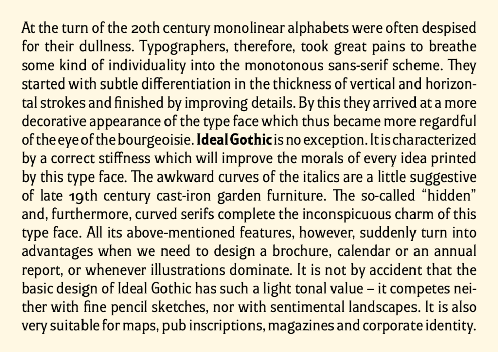
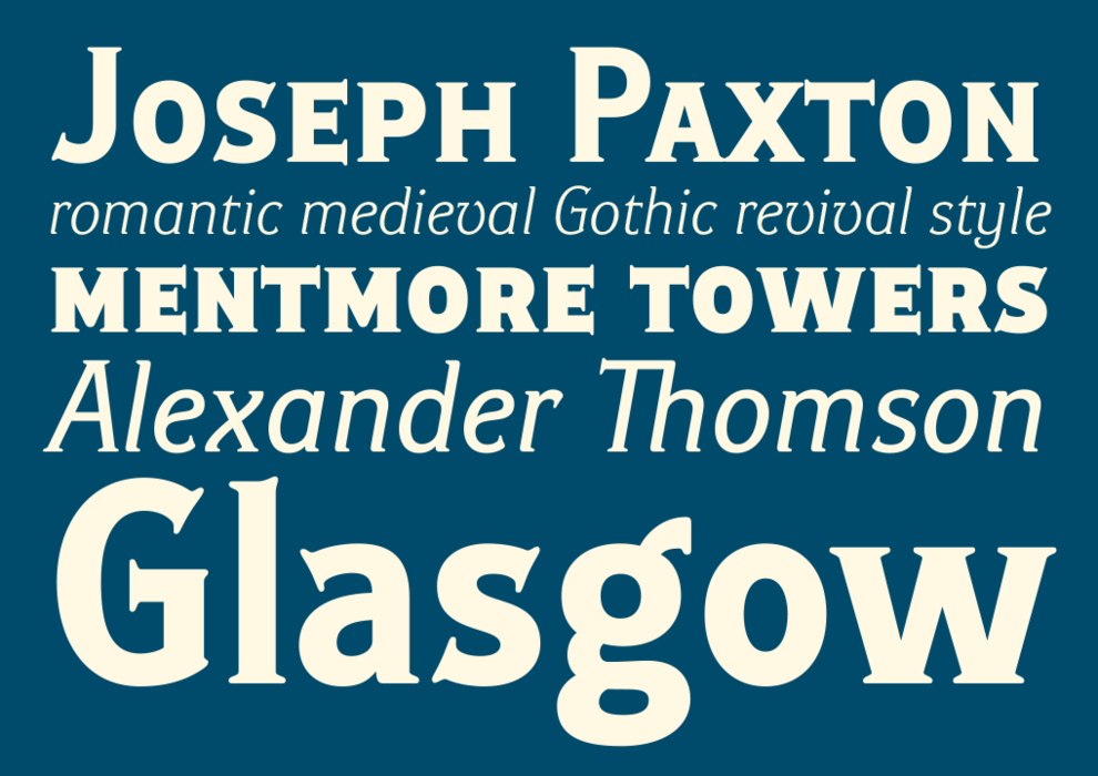
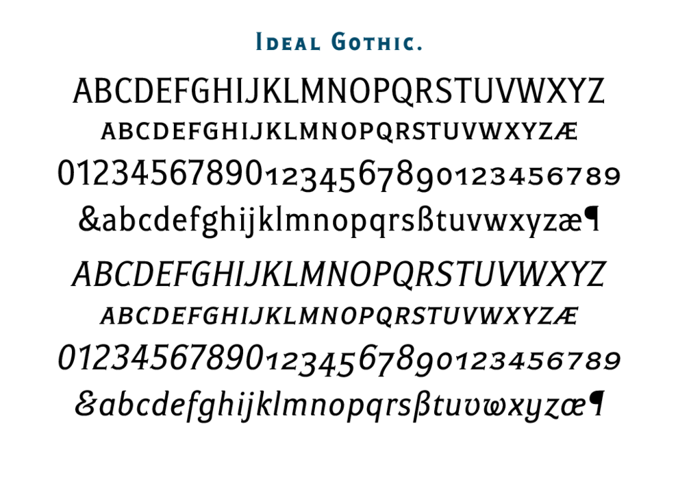
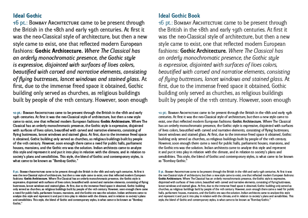
    At the turn of the 20th century monolinear alphabets were often despised for their dullness. Typographers, therefore, took great pains to breathe some kind of individuality into the monotonous sans-serif scheme. They started with subtle differentiation in the thickness of vertical and horizontal strokes and finished by improving details. By this they arrived at a more decorative appearance of the type face which thus became more regardful of the eye of the bourgeoisie. Ideal Gothic is no exception. It is characterized by a correct stiffness which will improve the morals of every idea printed by this type face. The awkward curves of the italics are a little suggestive of late 19th century cast-iron garden furniture. The so-called “hidden” and, furthermore, curved serifs complete the inconspicuous charm of this type face. All its above-mentioned features, however, suddenly turn into advantages when we need to design a brochure, calendar or an annual report, or whenever illustrations dominate. It is not by accident that the basic design of Ideal Gothic has such a light tonal value – it competes neither with fine pencil sketches, nor with sentimental landscapes. It is also very suitable for maps, pub inscriptions, magazines and corporate identity.

    Monolineární abecedy byly na přelomu 19. a 20. století často opovrhovány pro svou tupost. Typografové se proto všemožně snažili vdechnout fádnímu bezpatkovému schématu jakousi osobitost. Začali jemným odlišením síly svislých a vodorovných tahů a skončili vylepšováním detailů. Tím dosáhli dekorativnějšího vzhledu písma, které tak bylo ohleduplnější k oku měšťáka. Ideal Gothic není výjimkou. Vyznačuje se korektní toporností, která umravní každou myšlenku jím vytištěnou. Nemotorné křivky kursivy trochu připomínají litinový zahradní nábytek z konce 19. století. Tak zvané skryté, a navíc ještě zaoblené patky dotvářejí nenápadný „šarm“ tohoto písma. Všechny jeho výše jmenované vlastnosti se však rázem promění ve výhody, když potřebujeme upravit časopis, brožuru či výroční zprávu, zkrátka vždy, když dominuje obrazový materiál. Ne náhodou má základní řez písma „Ideal Gothic“ tak světlý valér – nekonkuruje totiž ani jemným tužkokresbám, ani cituplným krajinkám. Velmi vhodné mapy, hospody, časopisy a firemní representaci.

    〗 Download PDF
    Tags
    magazine  text  retro  nostalgia  restaurant  gothic  art-nouveau  steampunk  industrial architecture  pub  spur serif  tiny serif 
    ©2025 Storm Type Foundry
  • made by Gravastar s.r.o.