Amor Sans Neo
- Typefaces
- Gallery


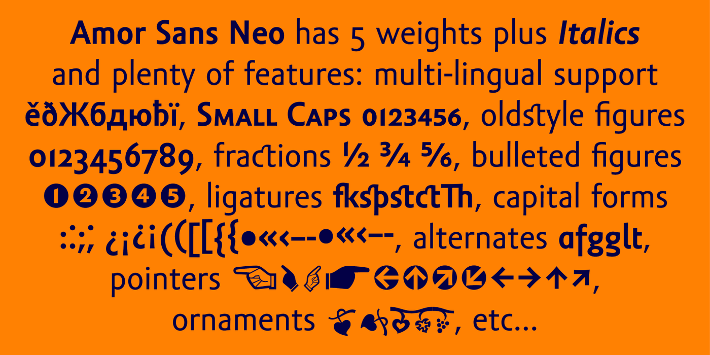


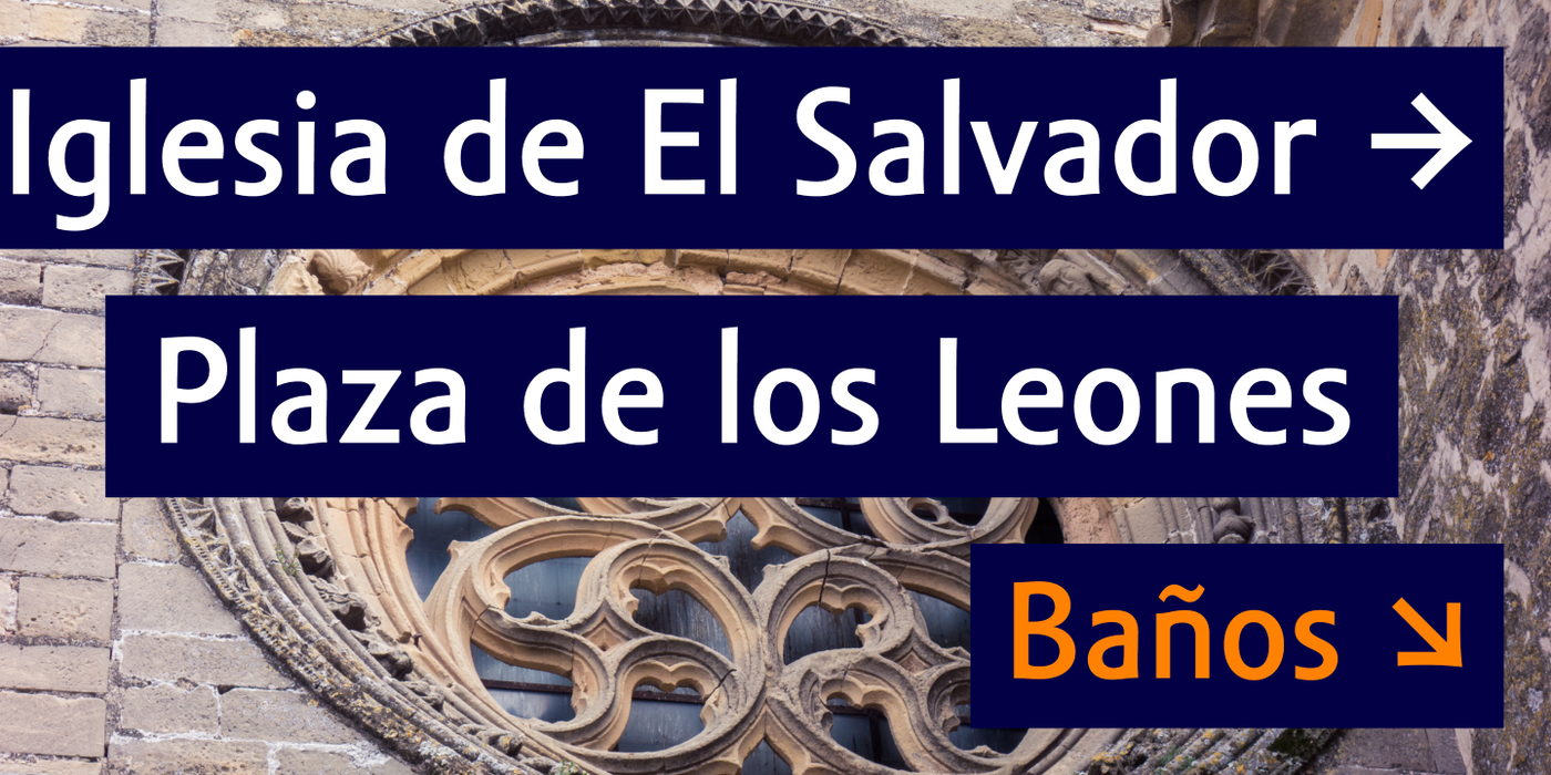


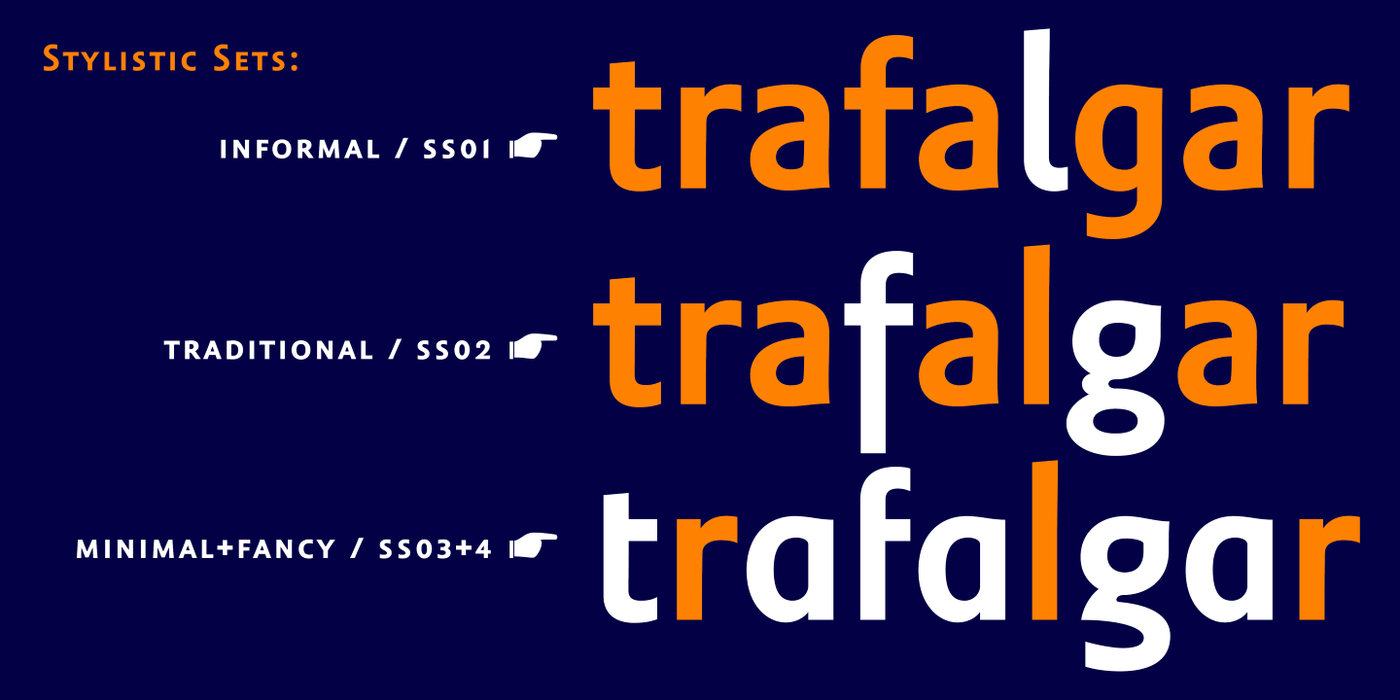

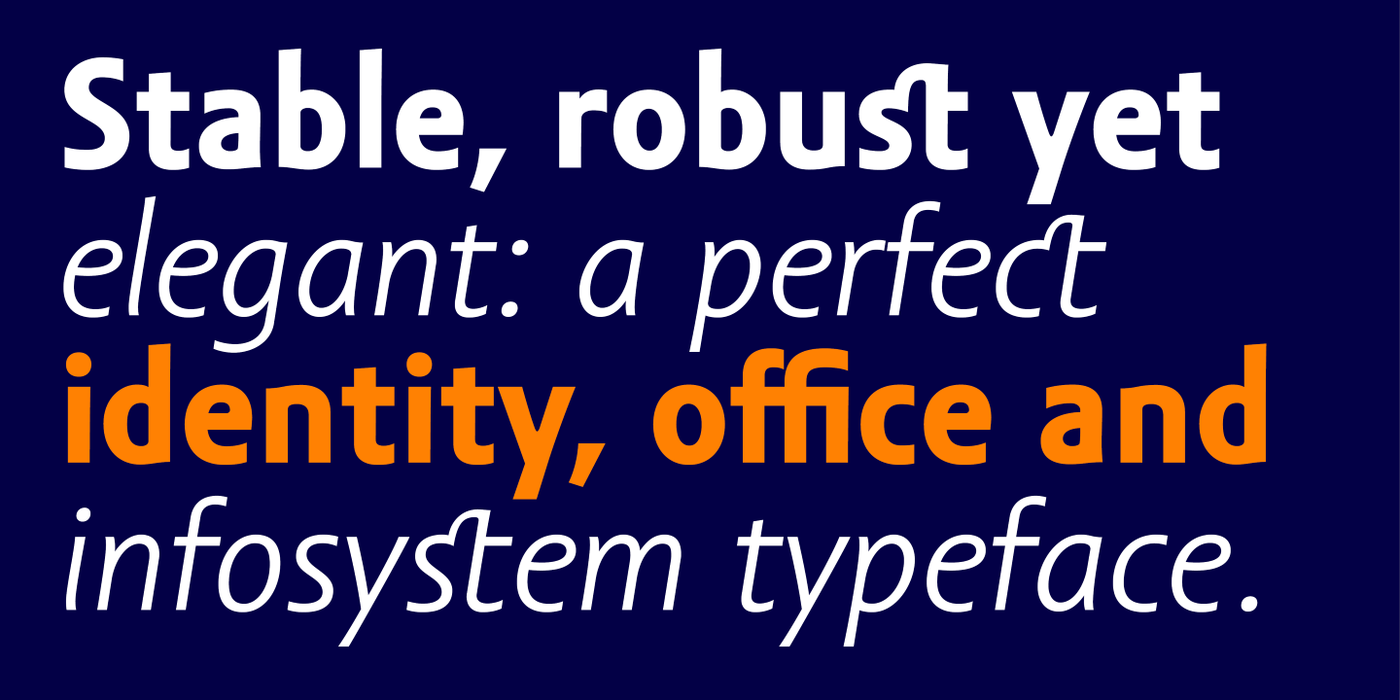


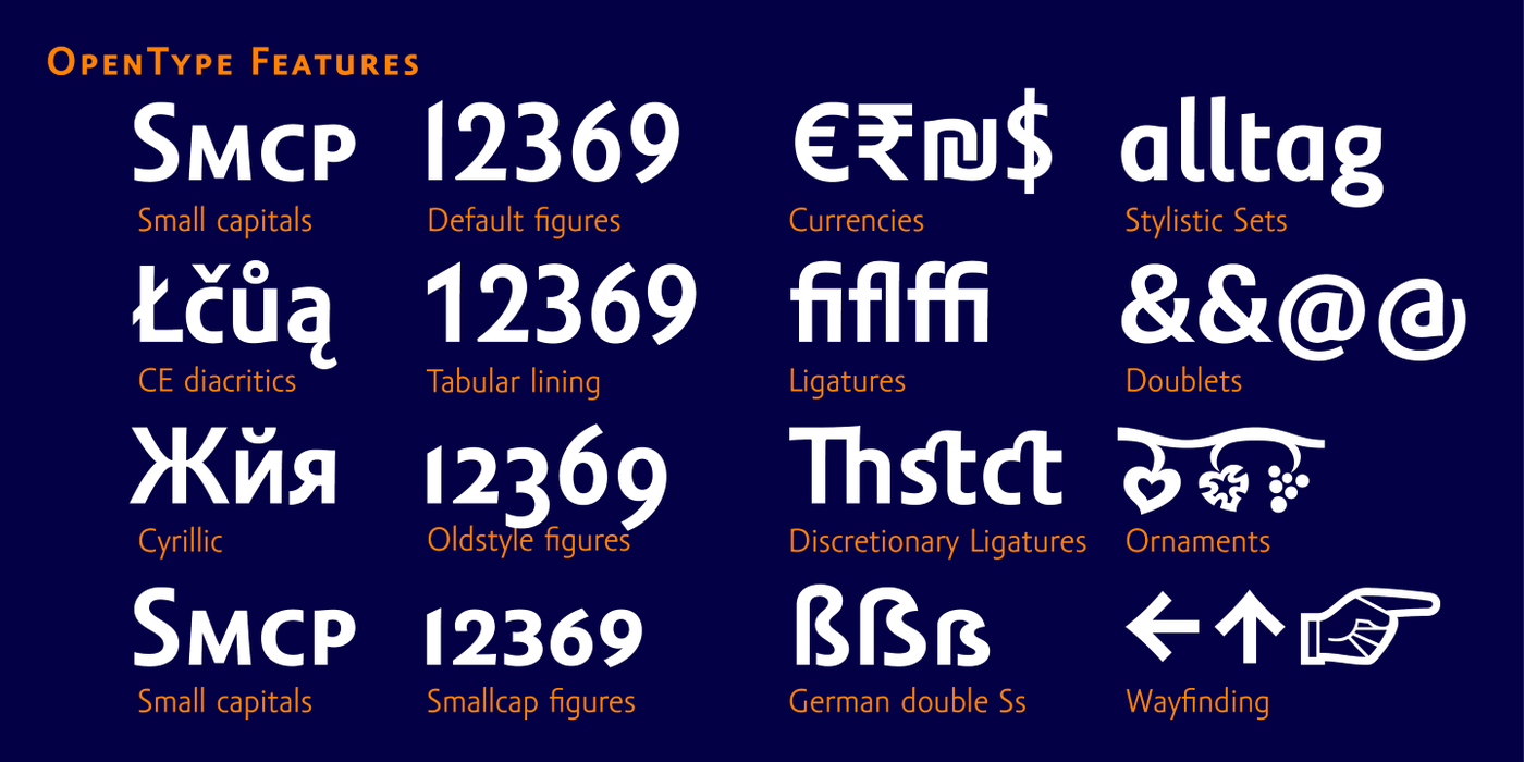

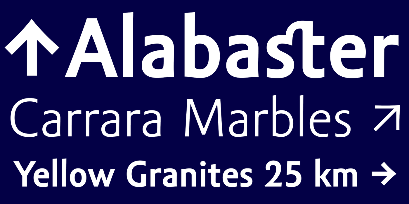

Great for office, poetry, signage, branding etc... The peculiarity of this alphabet is already its origin: the basic drawing was created by narrowing Roman capitals with corresponding lowercase letters. The goal was to create a monumental font for architecture and book covers. Surprisingly, however, Amor Sans has found its way into corporate identity, offices, magazines and packaging design. Its slightly narrowed, economical design predestines it for quick reading of shorter texts, which is why it is also excellent for theater posters and programs. Its moderate width proportions and rich selection of arrows and pointers are excellently used in public spaces. Amor Sans has a neutral expression that works harmoniously in any architectural style. It will serve as an orientation system in a medieval monastery as well as in a modern building, while remaining distinctive even in the dark. The family consists of ten cuts with many functions, such as small capitals, Cyrillic, several types of numerals, a number of ligatures and stylistic alternatives.
Zvláštností této abecedy je už její původ: základní kresba vznikla zúžením římské kapitály s odpovídajícími malými písmeny. Cílem bylo vytvořit monumentální písmo do architektury a na obálky knih. Překvapivě si však Amor Sans našel cestu do oblasti firemní identity, kanceláří, časopisů a obalového designu. Jeho mírně zúžená, úsporná kresba jej předurčuje pro rychlé čtení kratších textů, proto se výborně hodí i na divadelní plakáty a programy. Ve veřejném prostoru se skvěle uplatňují jeho uměřené šířkové proporce a bohatý výběr šipek a ukazovátek. Amor Sans má neutrální výraz, který působí harmonicky v každém architektonickém slohu. Poslouží orientačnímu systému ve středověkém klášteře i v moderní budově, a přitom zůstává výrazný i za šera. Rodinu tvoří deset řezů s mnoha funkcemi, jako jsou malé kapitálky, kyrilice, několik druhů číslic, množství ligatur a stylistických alternativ.