Biblon Neo
- Typefaces
- Gallery
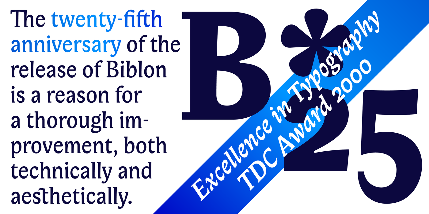
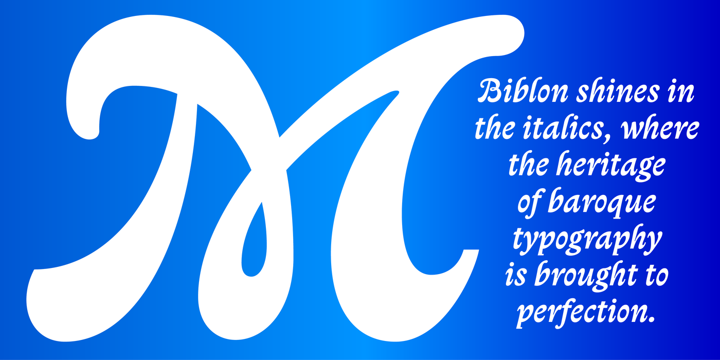
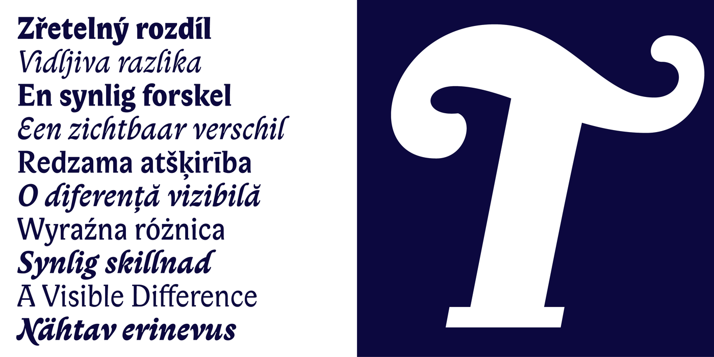
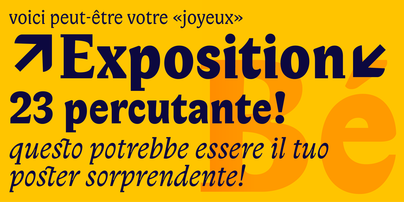
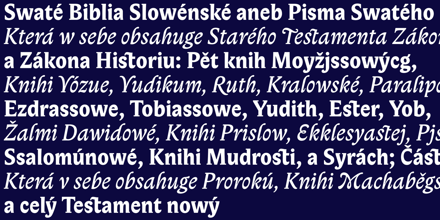
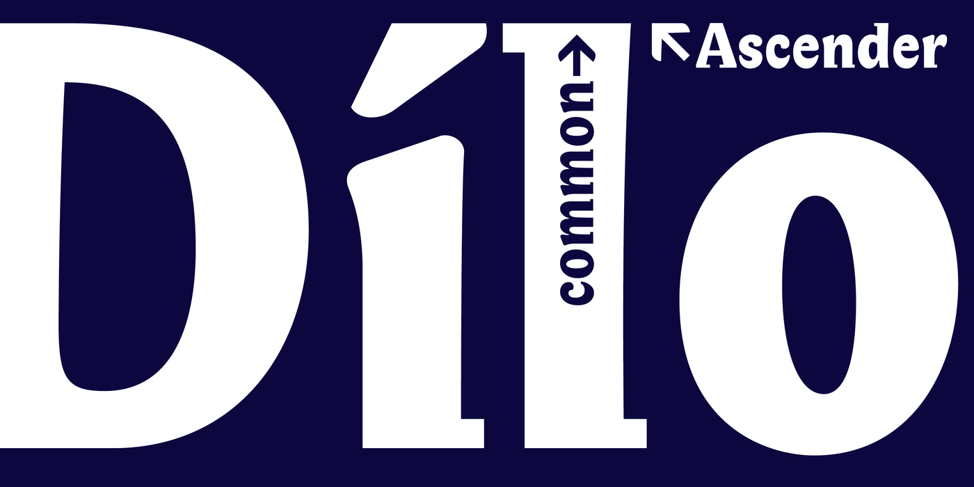
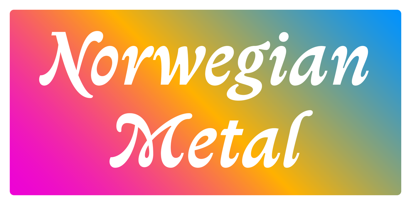
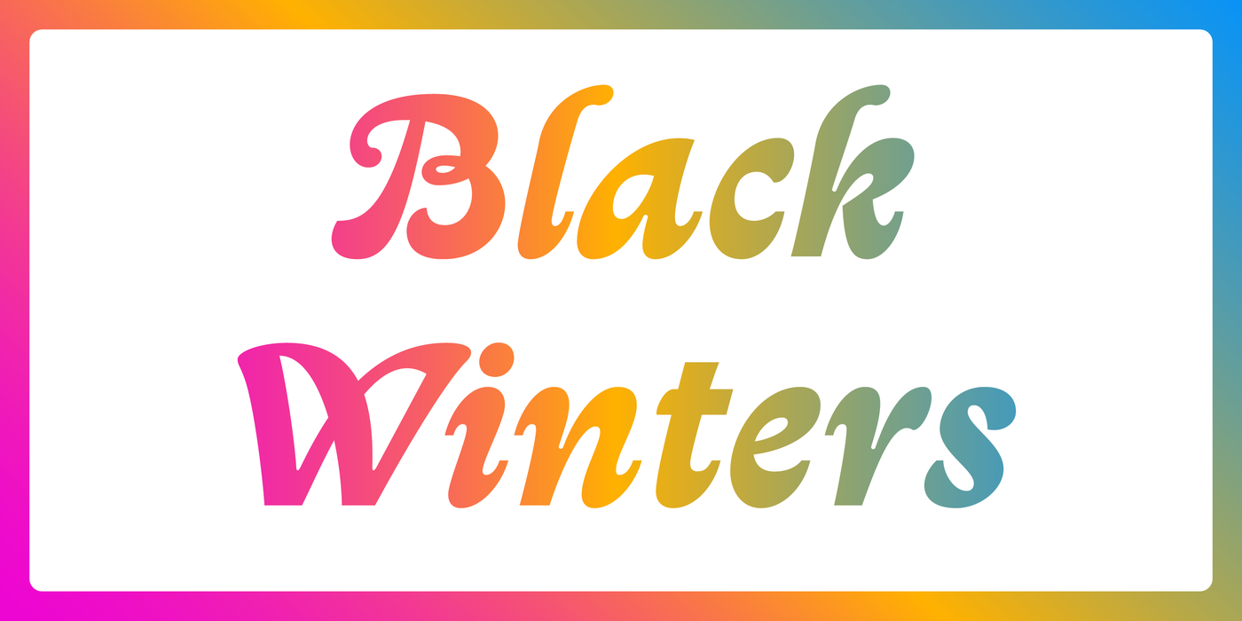
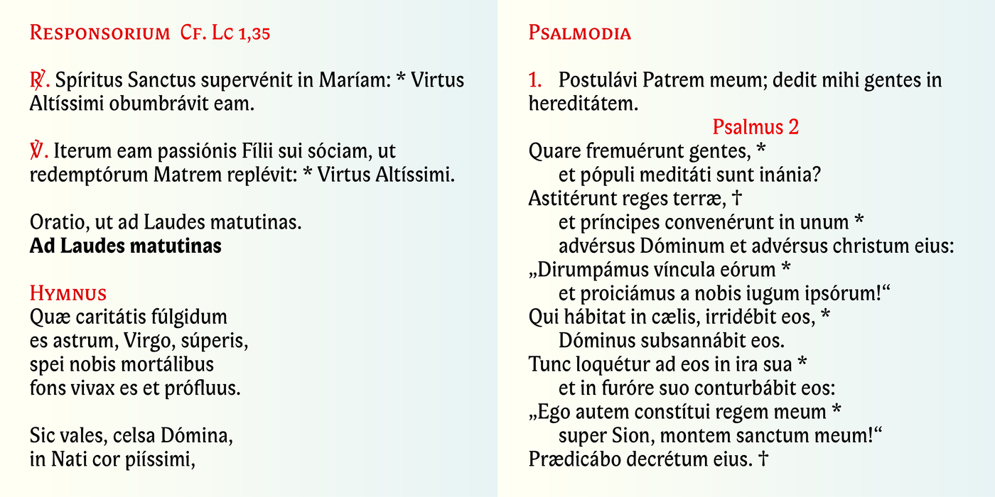
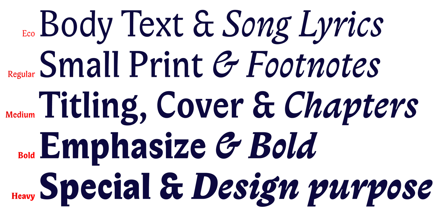
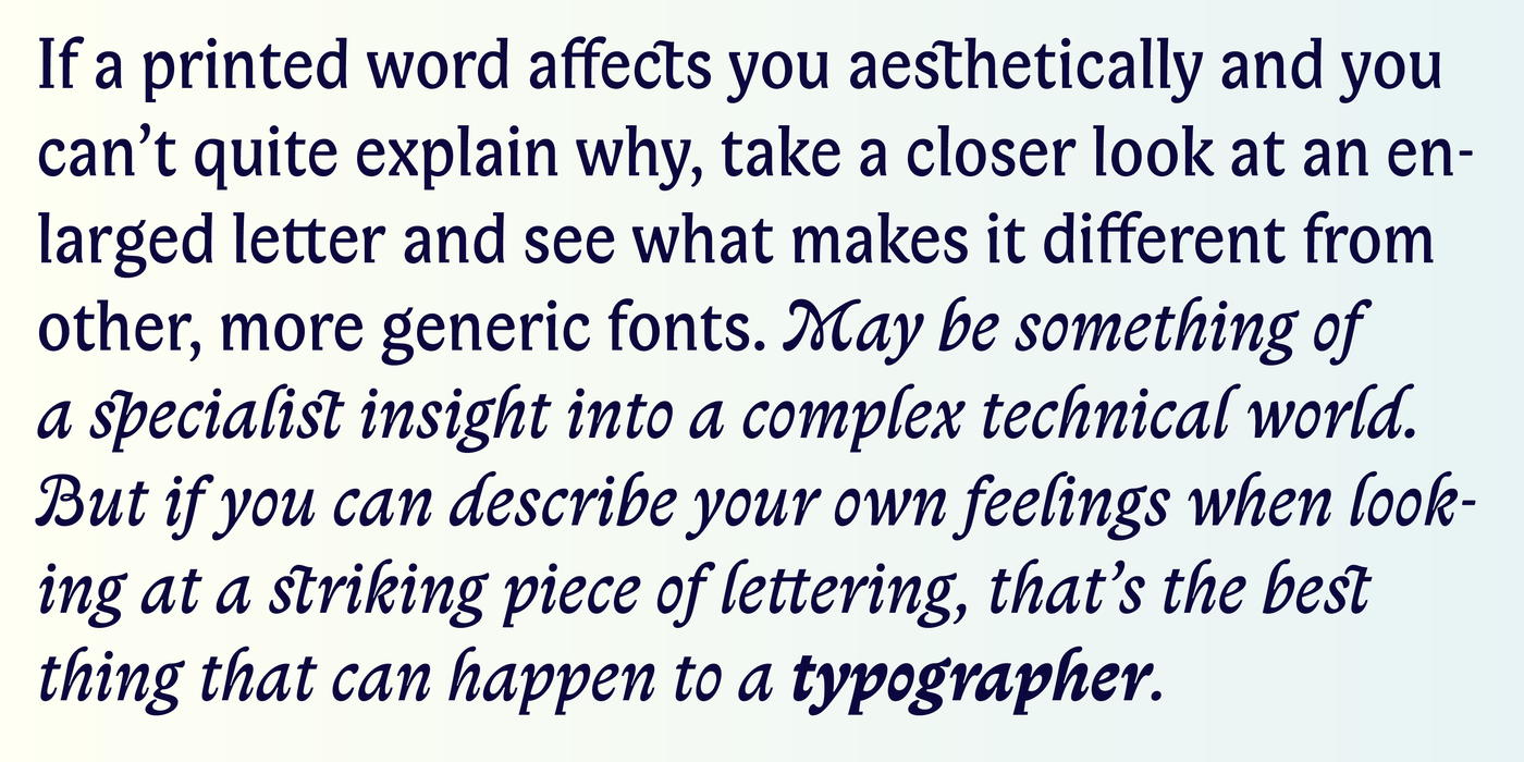
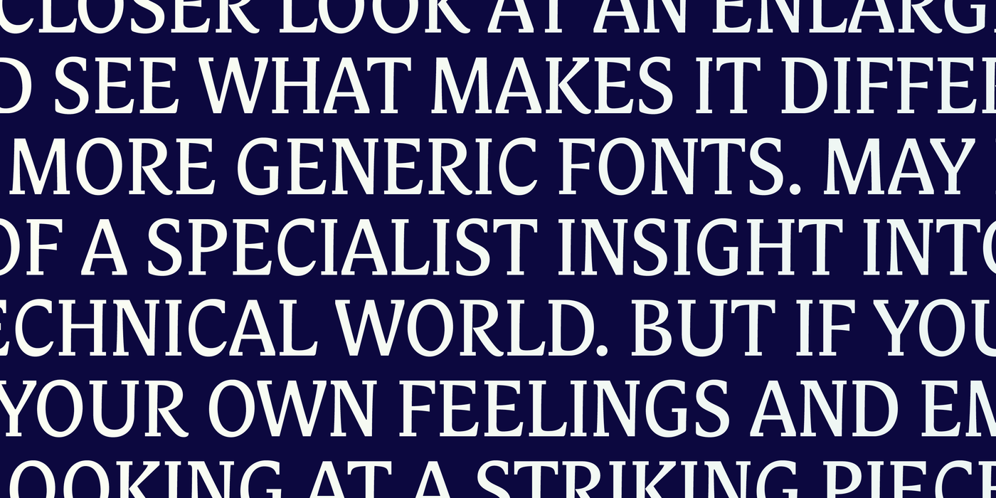
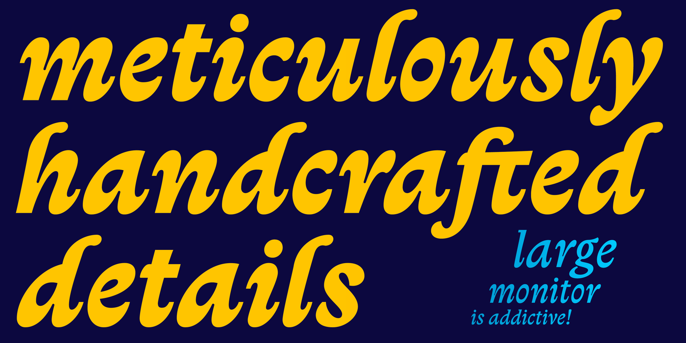
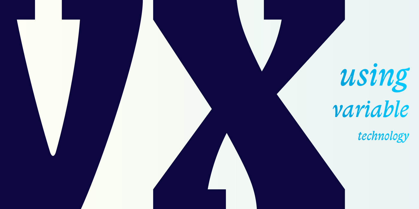
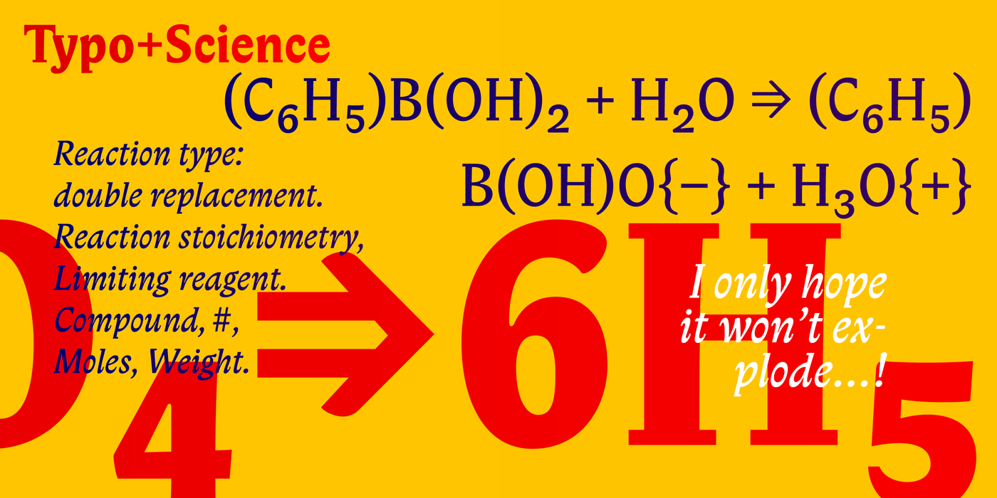
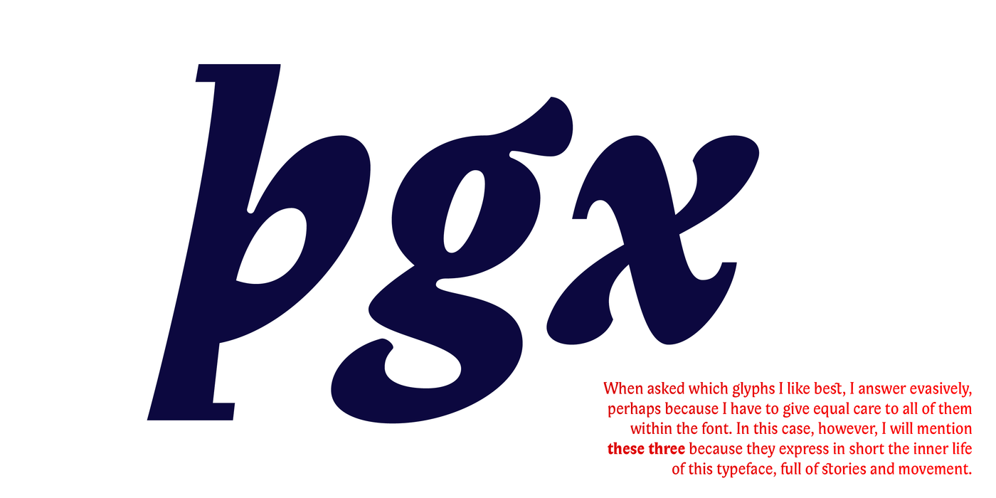
The twenty-fifth anniversary of the release of this font is a reason for a thorough improvement, both technically and aesthetically. If a printed word affects you aesthetically and you can’t quite explain why, take a closer look at an enlarged letter and see what makes it different from other, more generic fonts. May be something of a specialist insight into a complex technical world. But if you can describe your own feelings and emotions when looking at a striking piece of lettering, that’s the best thing that can happen to a typographer. Typographers have been compensating letterforms for small sizes since the very beginnings of printing. Many words on a small surface, thick volumes like the Bible. A typeface that remains legible and striking even at small sizes can save tonnes of paper. In a sense, variable technology began 500 years ago. Biblon has reduced outer serifs so that neighbouring letters don’t touch, which brightens the line of text. Its dynamic character, however, stands out even at maximum enlargement, confidently commanding the space of a poster, book cover, invitation, or website. It is an ideal building block for a visual identity.
Mnoho slov na malé ploše, tlusté svazky jako Bible. Písmo, které zůstává čitelné a razantní i v malé velikosti umí ušetřit tuny papíru. Kompenzací písmen pro malé velikosti se typografové zabývají už od počátků knihtisku. Variable technologie vlastně začala před 500 lety. Biblon má redukované vnější serify aby se nedotýkaly sousedních liter a tím prosvětlují řádek. Dynamický charakter však vynikne i v maximálním zvětšení, takže suverénně ovládne plochu plakátu, knižní obálky, pozvánky či webové stránky. Je ideálním stavebním kamenem pro vizuální identitu.