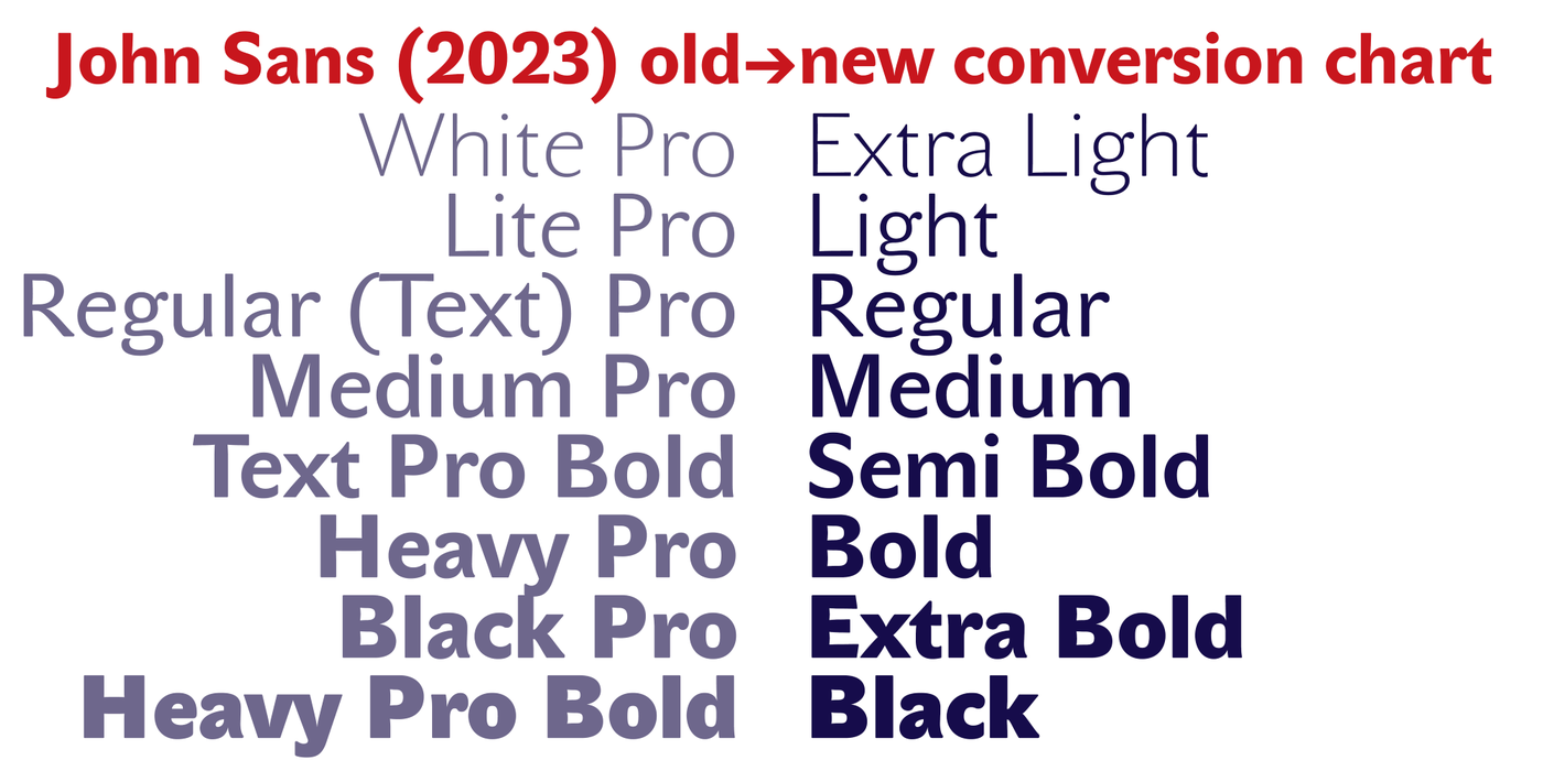
John Sans
- Typefaces
- Gallery

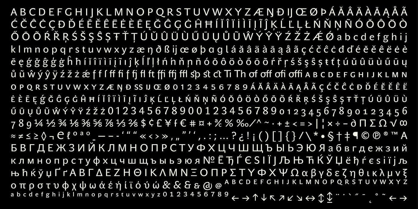
Baskerville's faithful companion. Drawn in 2001 and since then continuously maintained in the highest technical quality. Suitable for books, magazines, newspapers, posters and also for visual identity solutions.
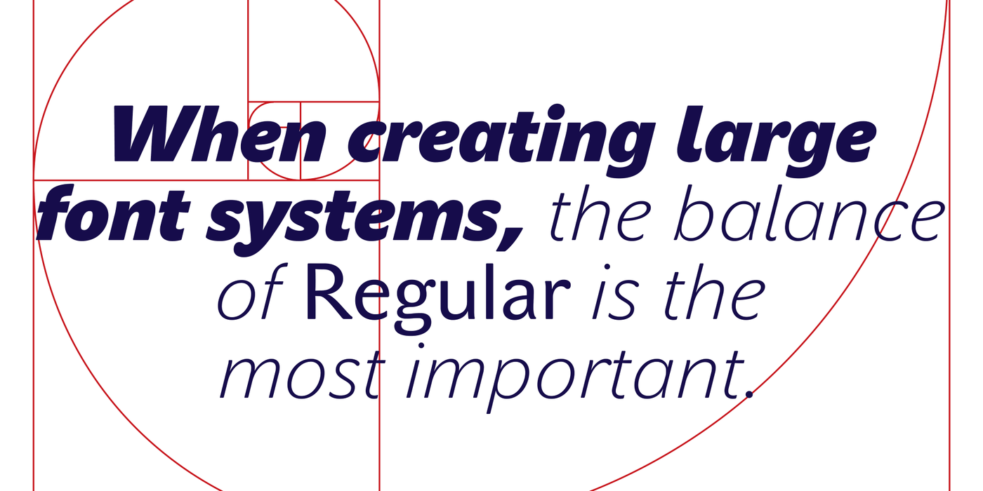
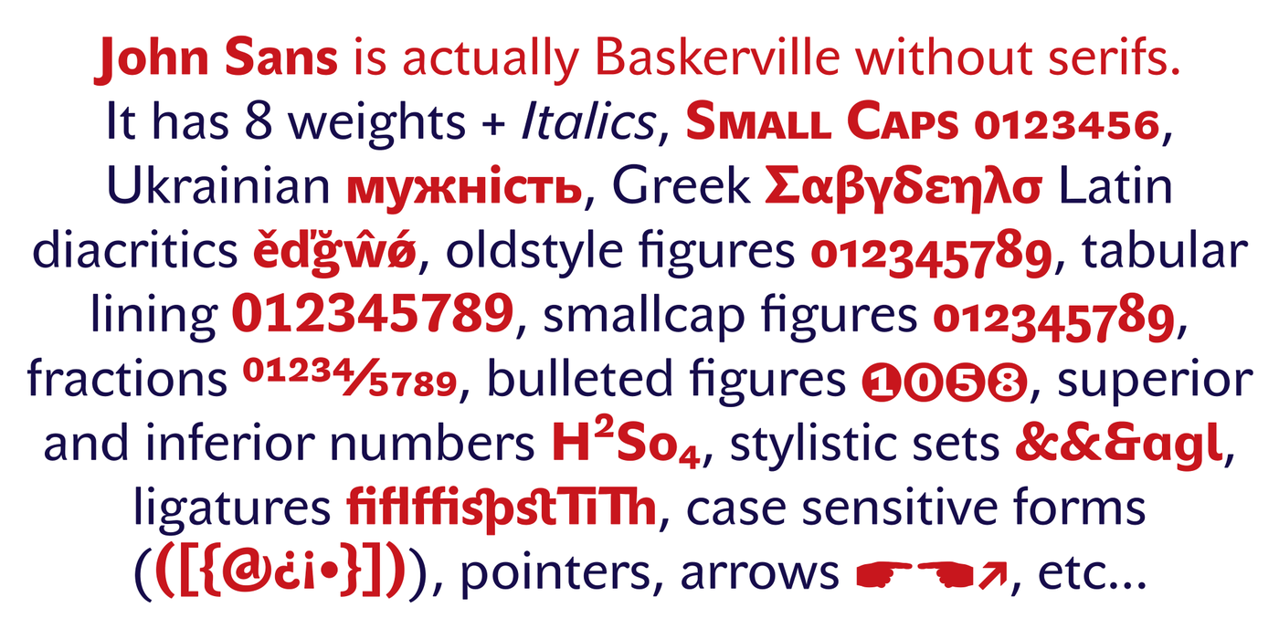
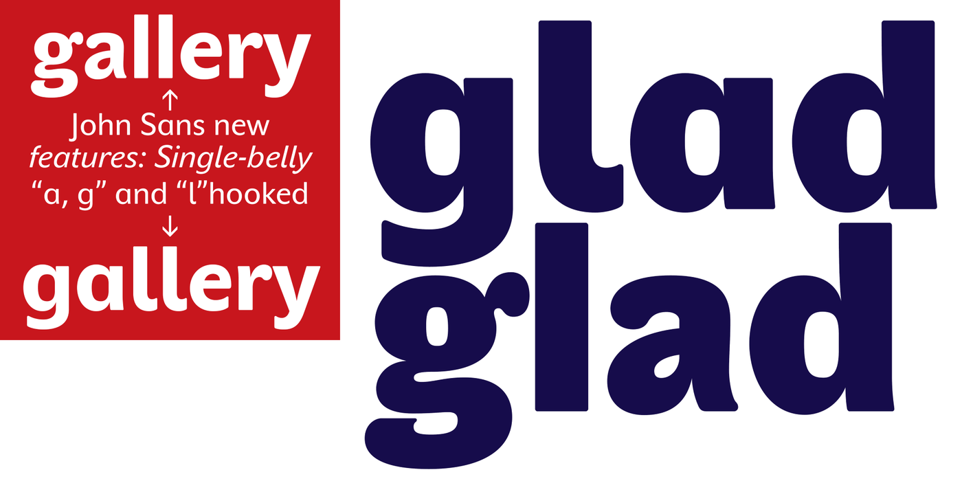
Baskerville cleverly incorporated certain constructional elements in the design of the individual letters of his typeface. These elements include above all the alternation of soft and sharp stroke endings. The frequency of these endings in the text and their rhythm produce a balanced impression. The anchoring of the letters on the surface varies and they do not look monotonous when they are read. We attempted to use these tricks also in the creation of a sans-serif typeface. Except that, if we wished to create a genuine “Baroque grotesk”, all the decorativeness of the original would have to be repeated, which would result in a parody. On the contrary, to achieve a mere contrast with the soft Baskerville it is sufficient to choose any other hard grotesk and not to take a great deal of time over designing a new one. Between these two extremes, we chose a path starting with the construction of an almost monolinear skeleton, to which the elements of Baskerville were carefully attached. After many tests of the text, however, some of the flourishes had to be removed again. Anything that is superfluous or ornamental is against the substance of a grotesk typeface. The monolinear character can be impinged upon in those places where any consistency would become a burden. The fine shading and softening is for the benefit of both legibility and aesthetics. The more marked incisions of all crotches are a characteristic feature of this typeface, especially in the bold designs. The colour of the Text, Medium and Bold designs is commensurate with their serif counterparts. The White and Black designs already exceed the framework of book graphics and are suitable for use in advertisements and magazines.
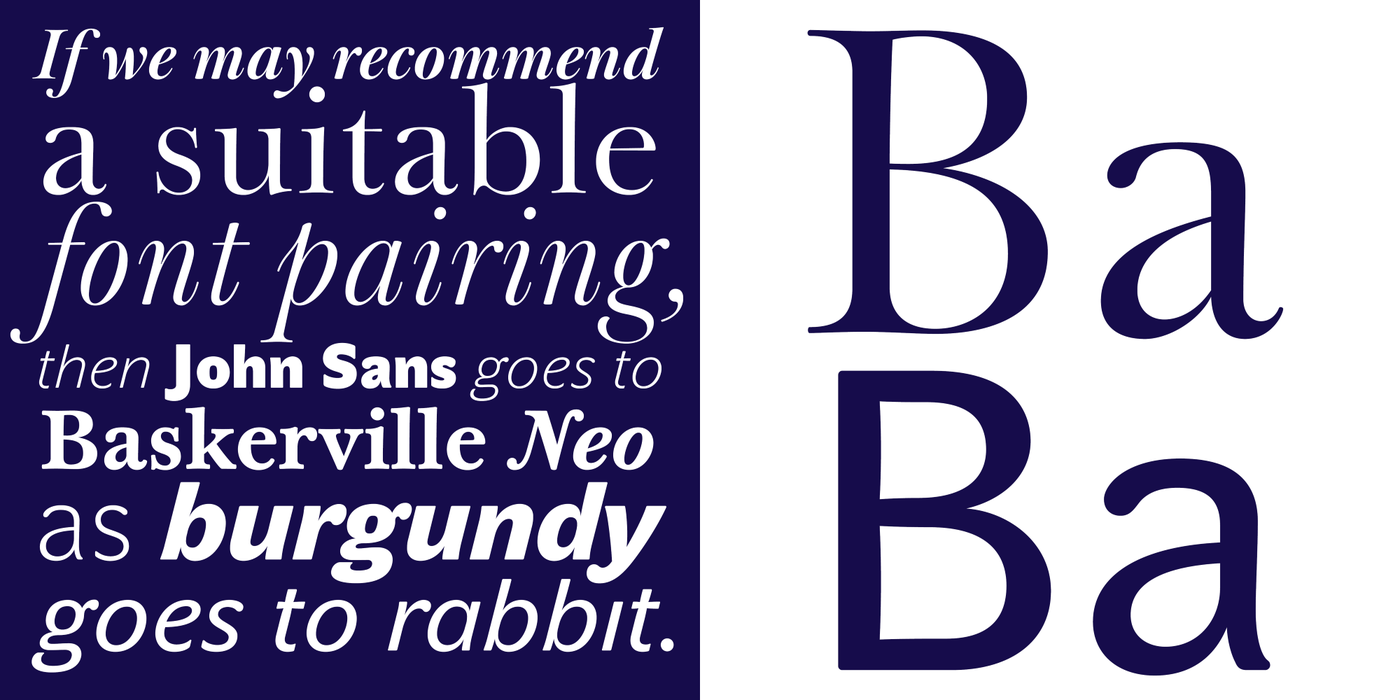
The original concept of the italics copying faithfully Baskerville’s morphology turned out to be a blind alley. This design would restrict the independent use of the grotesk typeface. We, therefore, began to model the new italics only after the completion of the upright designs. The features which these new italics and Baskerville have in common are the angle of the slope and the softened sloped strokes of the lower case letters. There are also certain reminiscences in the details (K, k). More complicated are the signs & and @, in the case of which regard is paid to distinguishing, in the design, the upright, sloped @ small caps forms.
Baskervillův věrný souputník. Nakreslen v roce 2001 a od té doby je průběžně technicky udržován v nejvyšší kvalitě. Hodí se na knihy, časopisy, noviny, plakáty a také na řešení vizuální identity.
Baskerville chytře začlenil určité stavebné prvky do kresby jednotlivých písmen. Především je to střídání měkkých zakončení tahů s ostrými, jejichž četnost a rytmus v textu působí vyváženě. Ukotvení liter v ploše je různé a dojem při čtení není pak jednotvárný. Tyto triky jsme se snažili použít i při tvorbě bezpatkového písma. Jenomže pokud bychom chtěli věrně sledovat „barokní grotesk“, musela by se opakovat veškerá zdobnost originálu, což by vedlo k parodii. Naopak, pro pouhý kontrast s měkkým Baskervillem stačí vybrat jakýkoli cizí tvrdý grotesk a nezdržovat se návrhem nového. Mezi oběma krajnostmi jsme zvolili cestu začínající stavbou téměř monolineární kostry, na niž jsme opatrně umisťovali baskervillovské prvky. Po mnohých textových zkouškách jsme však museli některé kudrlinky zase odstranit. Vše přebytečné a zdobné odporuje podstatě grotesku. Monolinearitu je možné porušit tam, kde by každá důslednost byla na obtíž. Jemné odstiňování a změkčování je ku prospěchu čitelnosti i estetice. Zvýrazněné zářezy všech úžlabí tvoří ve velkých stupních charakteristický rys tohoto písma, zejména v tučných řezech. Přesnou interpolací jsme docílili souměřitelné tmavosti řezů Text, Medium a Bold s jejich patkovými protějšky. Řezy White a Black přesahují již rámec knižní úpravy a hodí se do reklamy i časopisu.
Původní koncept kursivy věrně kopírující Baskervillovo tvarosloví zůstal slepou uličkou. Tento řez by omezoval samostatné použití grotesku. S modelací nové kursivy jsme proto začali až po dopracování stojatých řezů. S Baskervillem má společný úhel naklonění, některé ozvuky detailů (K, k ), a změkčené šikmé tahy minusek. Složitější jsou znaky & a @, u nichž je brán zřetel na kresebné odlišení stojaté, nakloněné a kapitálkové formy.