Serapion
- Typefaces
- Gallery
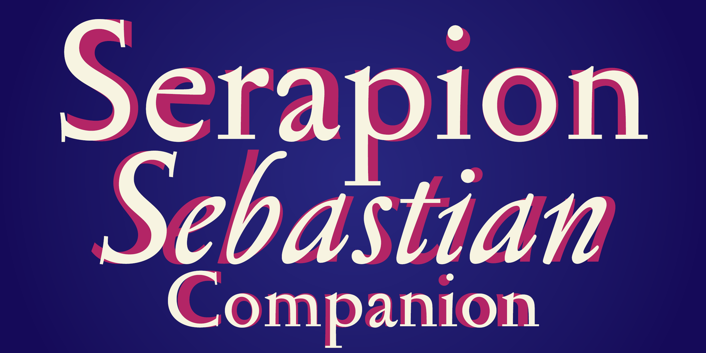
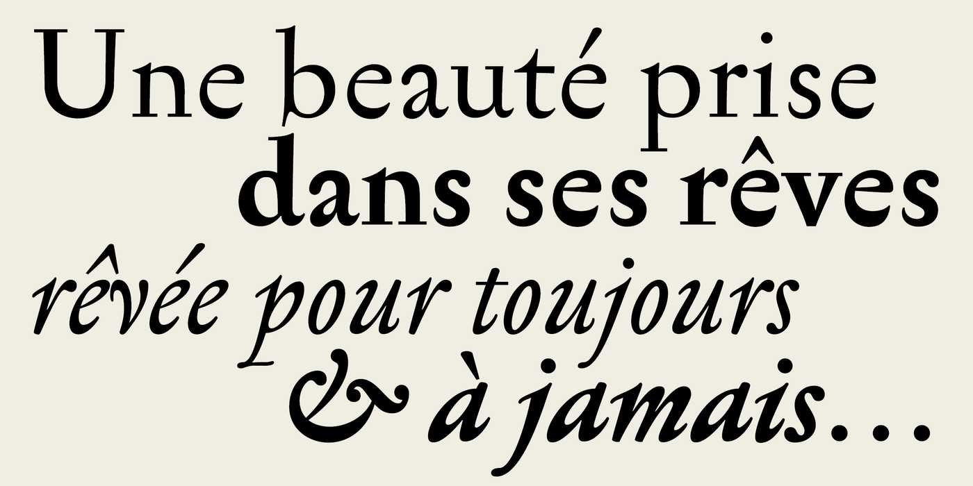
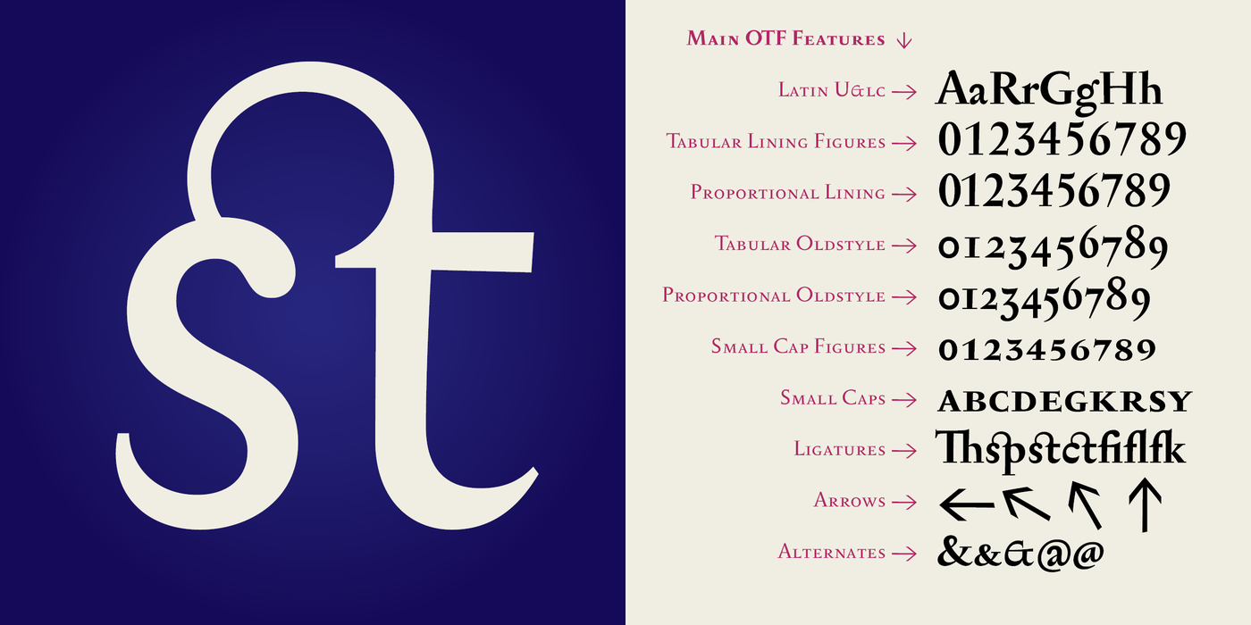
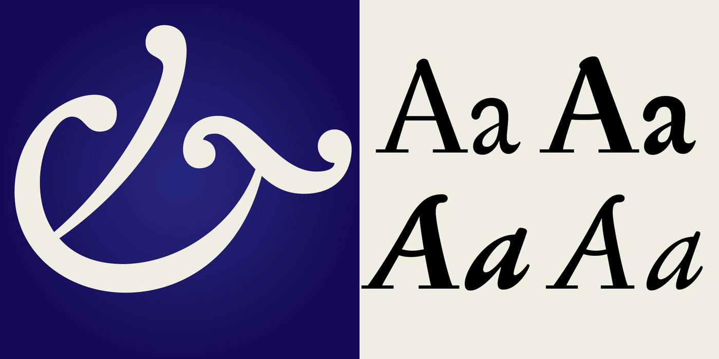
A confession of love for baroque typography. Upon completion of the transcription of Jean Jannon’s type face in 1996 we focused on the proportions and morphology of early Baroque type faces. The constructional principle of Serapion Pro is, of course, still Renaissance, but its expression and details are drawn from the typography of the 17th and 18th centuries. The modern conception of the design of the letters comes to the fore in the use of the principle taken from the lower-case “c”: one ending of its curve is rounded, the other sharp. This element, which looks as if it were inspired by the Chinese brush, is then repeated in all lower-case letters with rounded strokes. In the italics, there is, in addition, the heritage of humanistic calligraphy. In the larger sizes, Serapion Pro produces the impression of a kind of thorny elegance with an unmistakable face; in the smaller sizes, however, the type face begins to behave inconspicuously, as a text one, and the reader perceives its spicy character as if unawares. Five years have already elapsed from the publishing of the first version. In the meantime the demands put on the quality of type faces have increased, which made it necessary to revise and enrich this popular type face family. We started by cleaning some of the characters from certain superfluous decorative ballast, in order that the decorative features, left more or less in italics only, might stand out the more. These decorative features were in particular: the bent horizontal in the upper-case letters “A” and “H”, the loop in “W” and the exaggerated lower serif in the lower-case “b”. A fairly invisible change is the equalizing of the x-height in the letters “b”, “d”, “p”, “q”, which was previously smaller than in other letters – this, at that time, was in the interests of expressiveness, yet it rendered wider use of the type face impossible. The missing ligatures, but above all the genuine small capitals with the corresponding figures, mathematical and other non-alphabetical signs were added. The newly arising OpenType family of four designs thus meets all demands for shorter fiction, poetry and ceremonial prints.
Serapion II Po dokončení transkripce písma Jeana Jannona v roce 1996 jsme navázali na proporce a tvarosloví raně barokních písem. Stavebný princip Serapionu je jistě ještě renesanční, ale výraz a detaily čerpá z typografie 17. i 18. století. Moderní pojetí kresby liter se připomíná použitím principu z minusky c: na jednom konci křivky máme oblé zakončení, na protějším ostré. Tento jakoby čínským štětcem inspirovaný prvek se potom opakuje u všech minusek s oblými tahy. V italikách k tomu přistupuje i odkaz humanistické kaligrafie. Ve větších velikostech Serapion budí dojem jakési trnité elegance s nezaměnitelnou tváří, avšak v malých stupních se písmo začíná chovat nenápadně textově a jeho kořeněný charakter vnímá čtenář jaksi mimoděk. Od vydání první verze uplynulo již pět let. Mezitím se zvýšily nároky na kvalitu písem, takže bylo třeba zrevidovat a obohatit tuto oblíbenou rodinu. Začali jsme vyčištěním některých znaků od nadbytečného dekorativního balastu, aby ozdobné prvky, ponechané víceméně jen v kursivách, o to více vynikly. Byly to zejména: prohnutá horizontála versálek A s H, smyčka u W a přehnaný spodní serif minusky b. Poměrně neviditelnou změnou je vyrovnání střední výšky munisek b, d, p, q, která byla dříve menší než u ostatních liter – tehdy to bylo v zájmu expresivnosti, ale znemožňovalo to širší použití písma. Byly doplněny chybějící ligatury, ale především pravé malé kapitálky s odpovídajícími číslicemi, matematickými a jinými nealfabetickými znaky. Nově vzniklá čtyřřezová rodina tak pokrývá všechny nároky na kratší belletrii, poesii a slavnostní tisky.