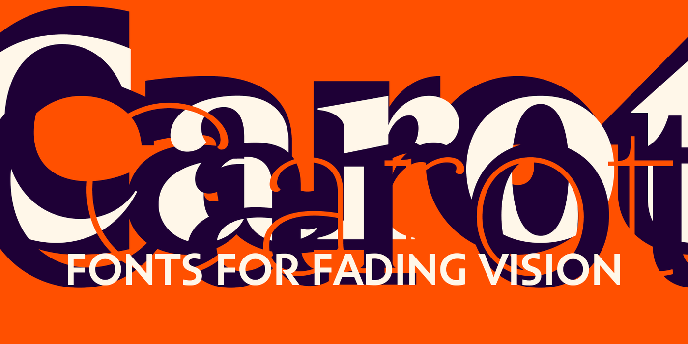
Carot Complete
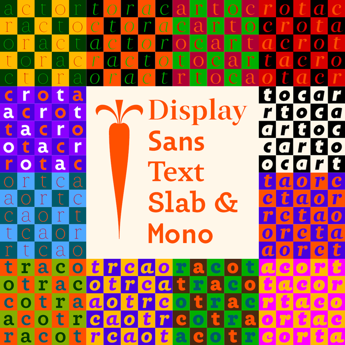

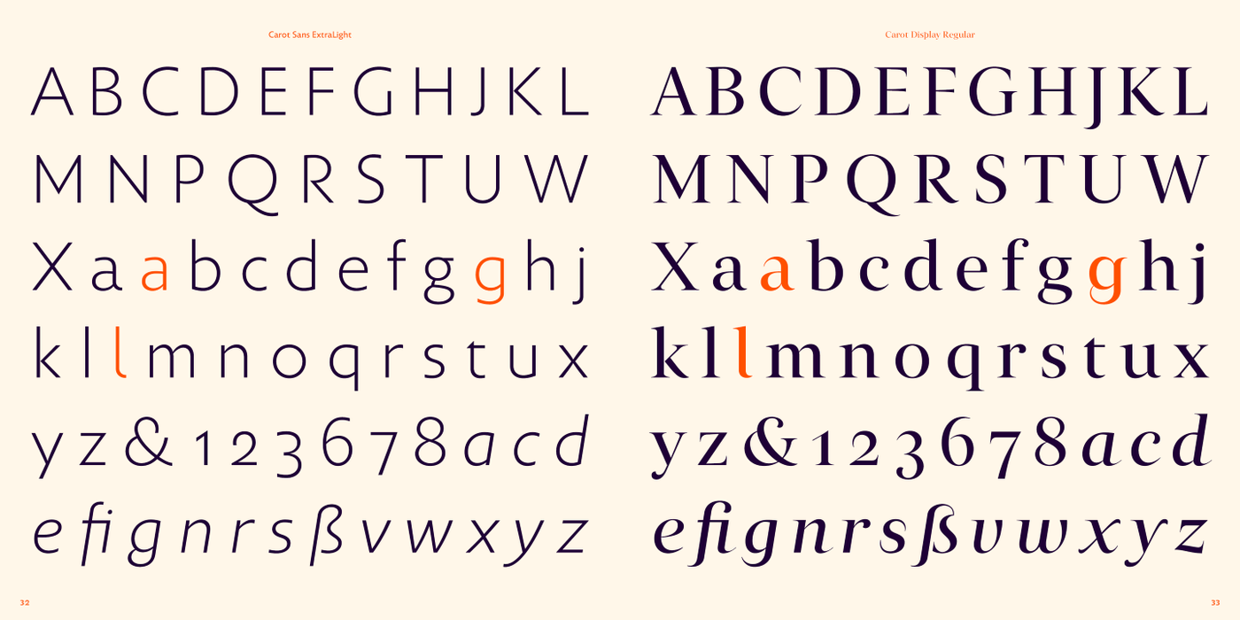
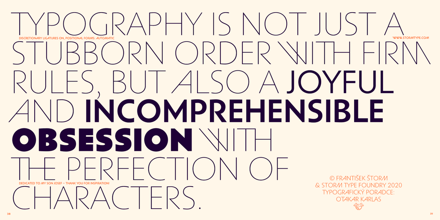

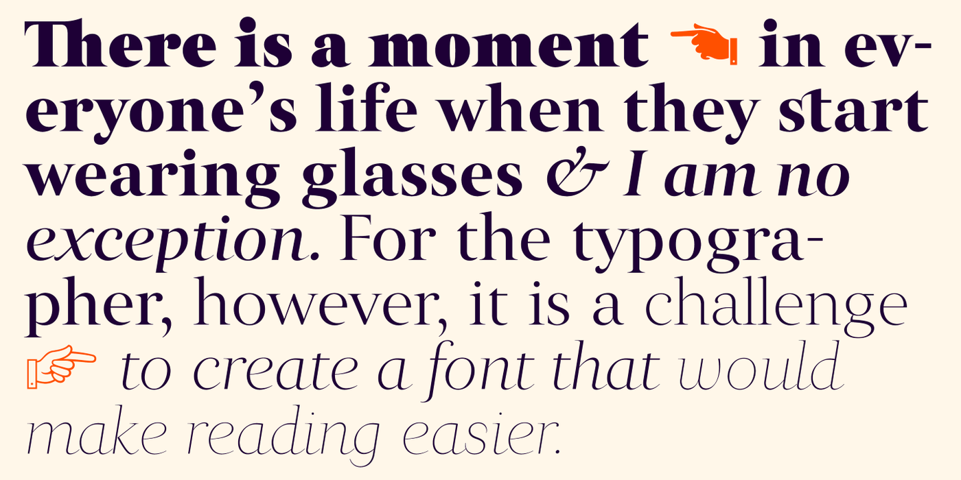

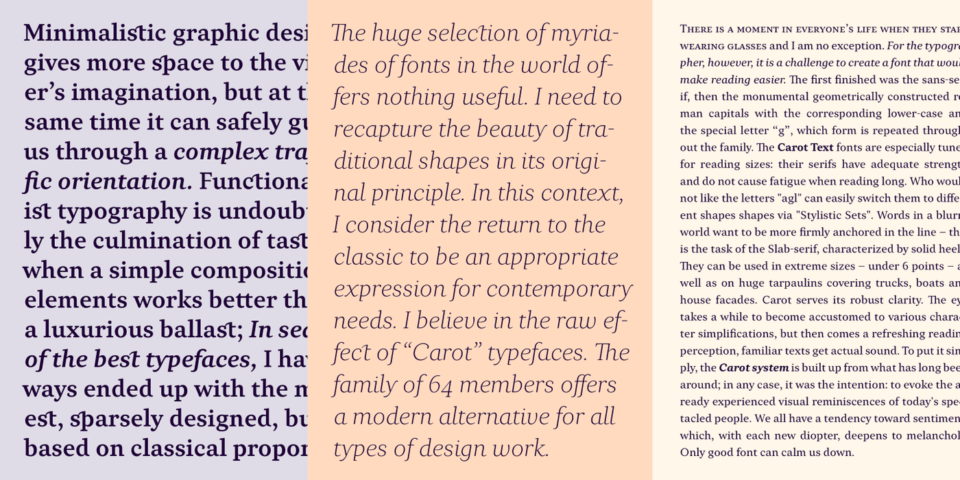
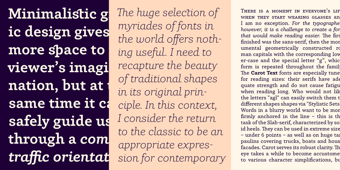
The first flowers of the typographic spring 2020 are here. A font package based on the latest knowledge of the author's diminishing vision. There is a moment in everyone’s life when they start wearing glasses and I am no exception. For the typographer, however, it is a challenge to create a font that would make reading easier. The first finished was the sans-serif, then the monumental geometrically constructed roman capitals with the corresponding lower-case and the special letter “g”, which form is repeated throughout the family.
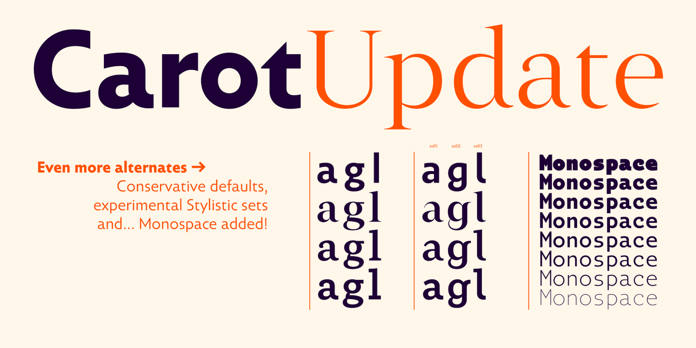
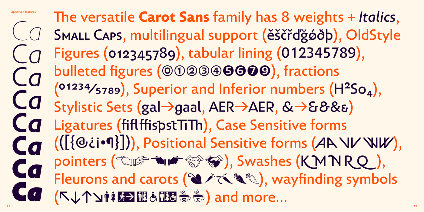
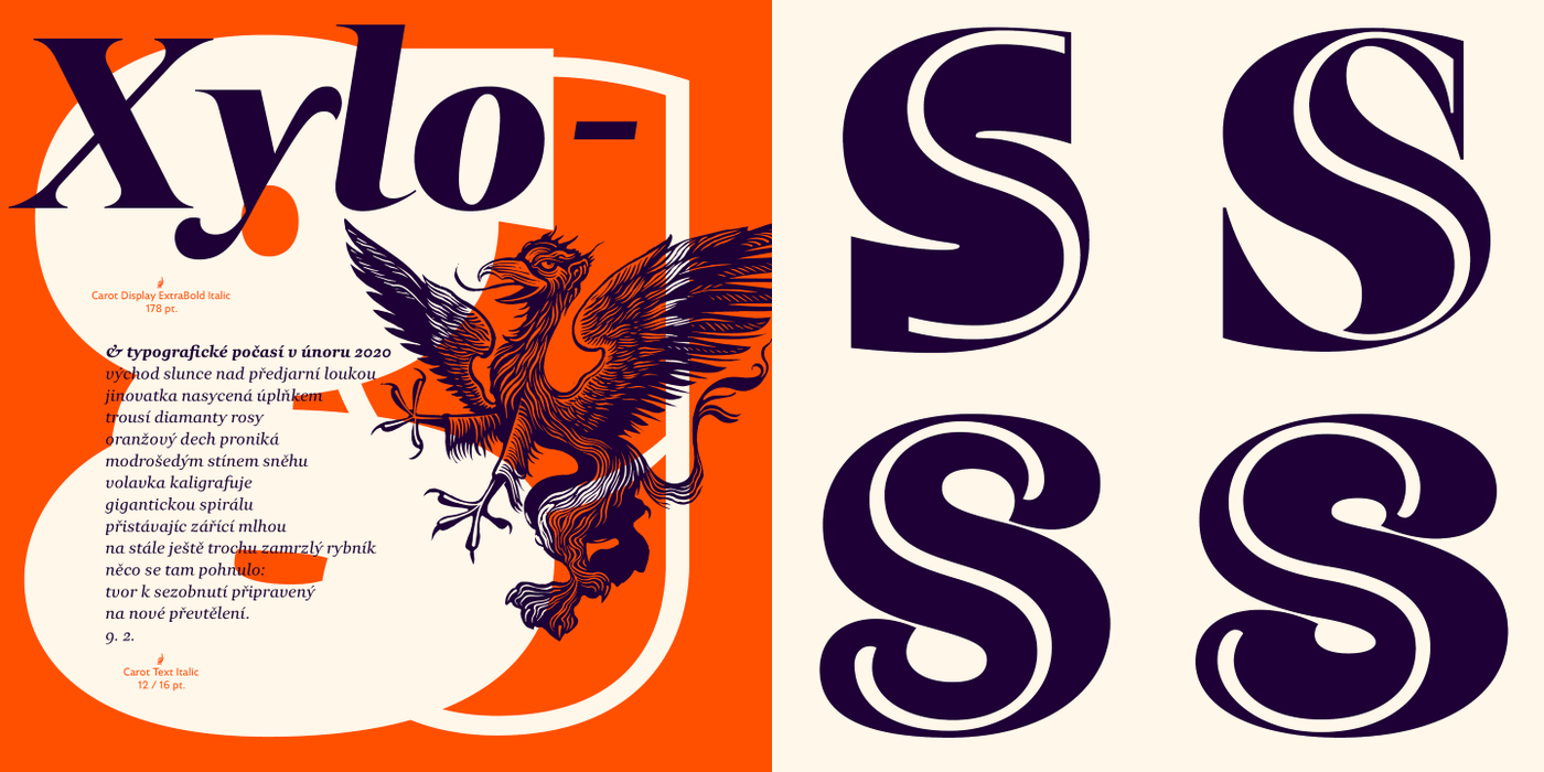
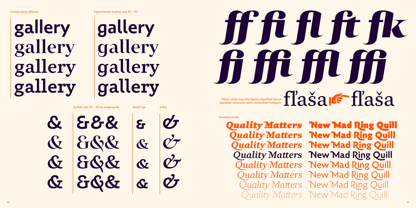
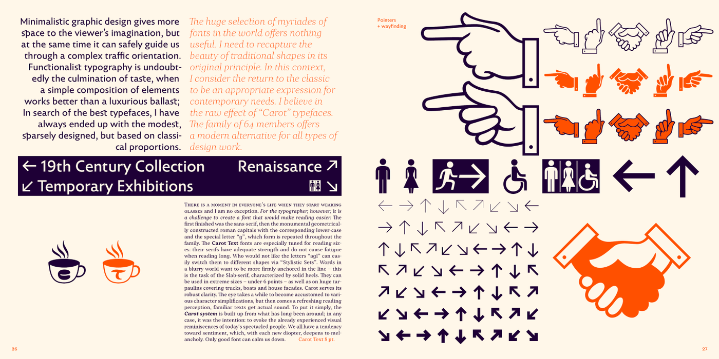
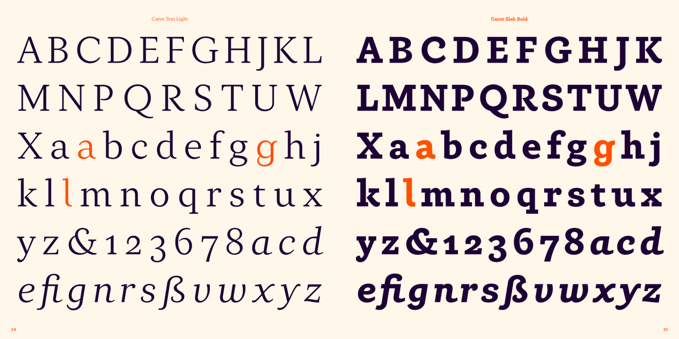
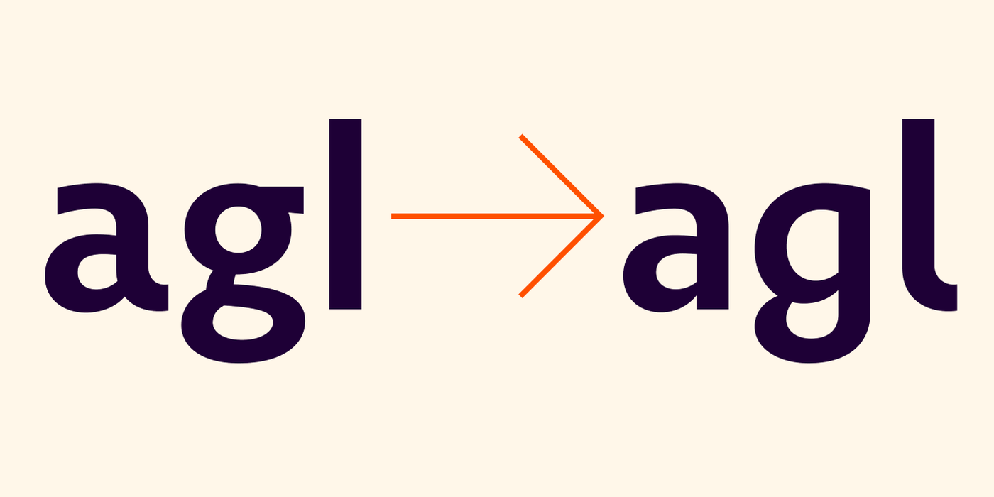
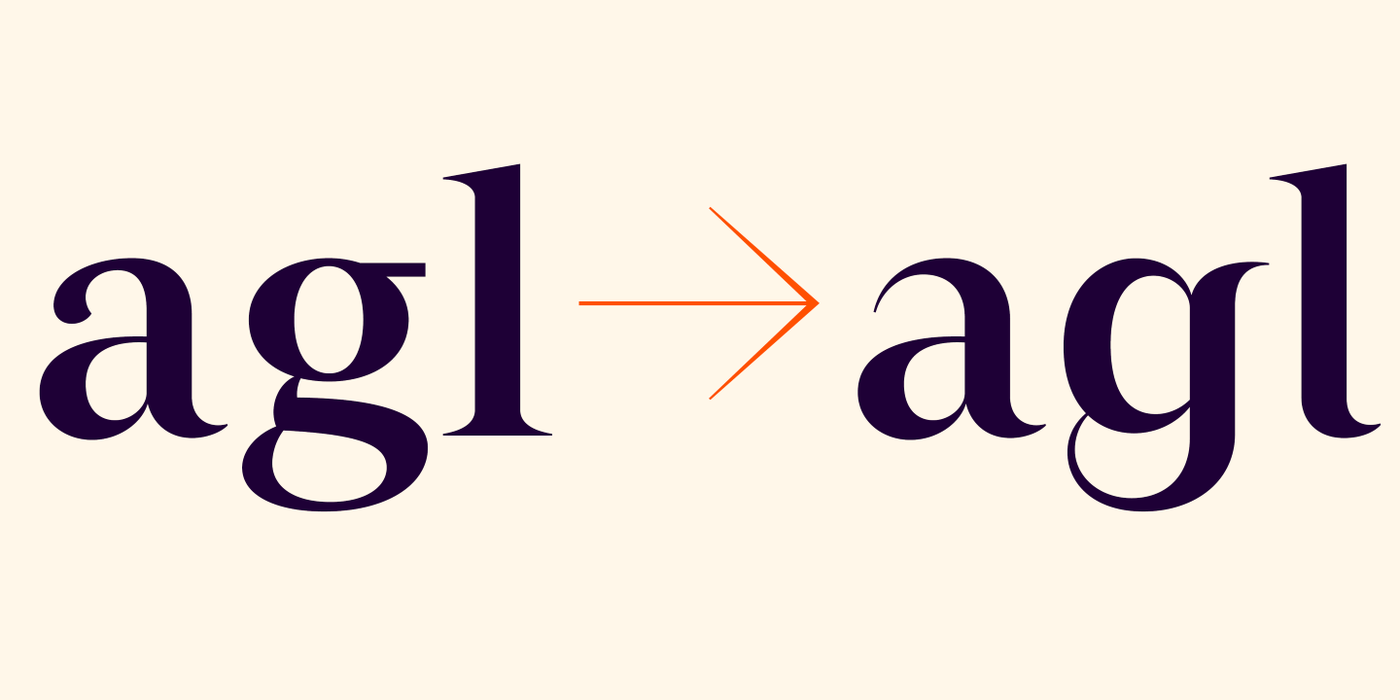
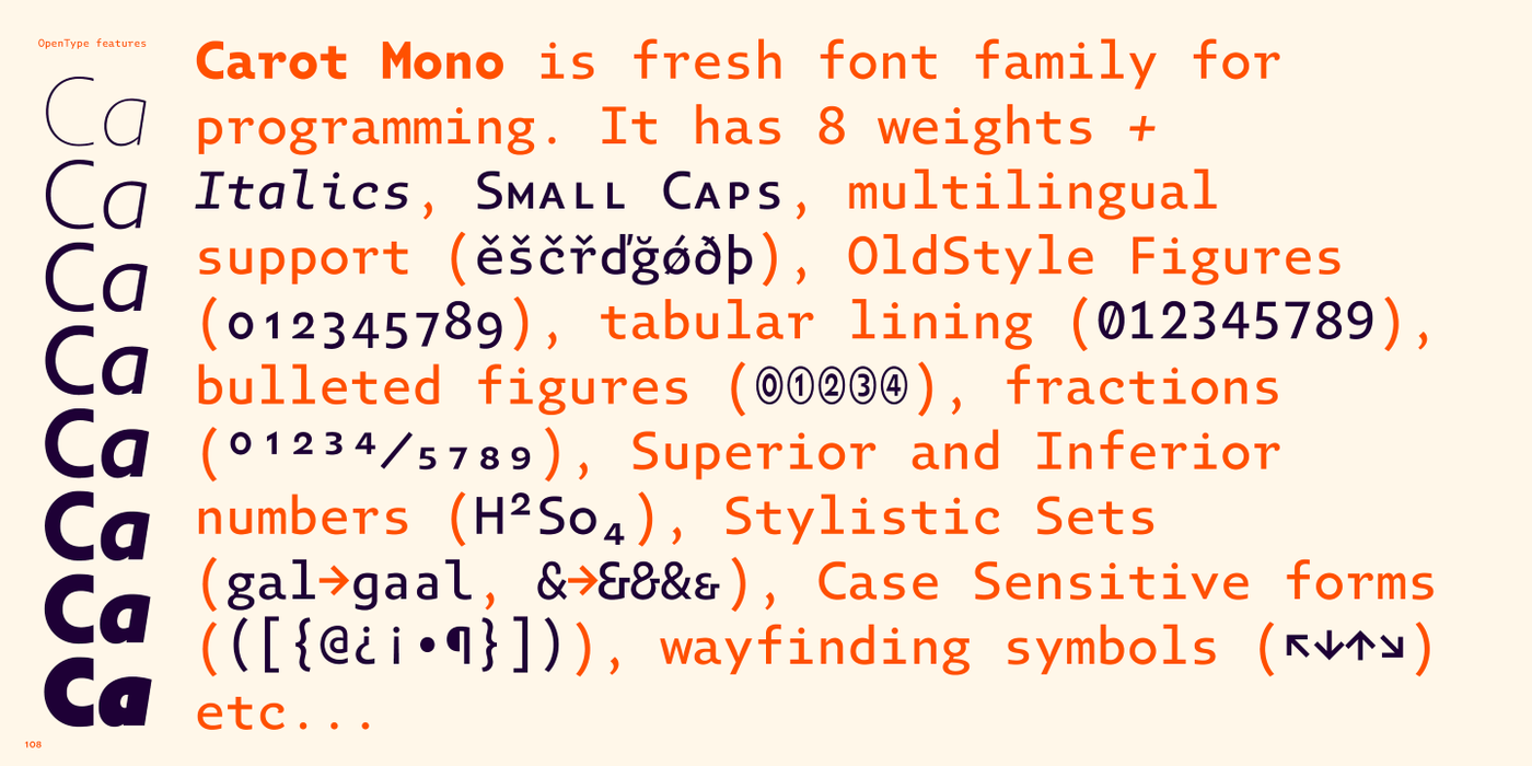
The Carot Text fonts are especially tuned for reading sizes: their serifs have adequate strength and do not cause fatigue when reading long. Who would not like the letters "agl" can easily switch them to different shapes via "Stylistic Sets".
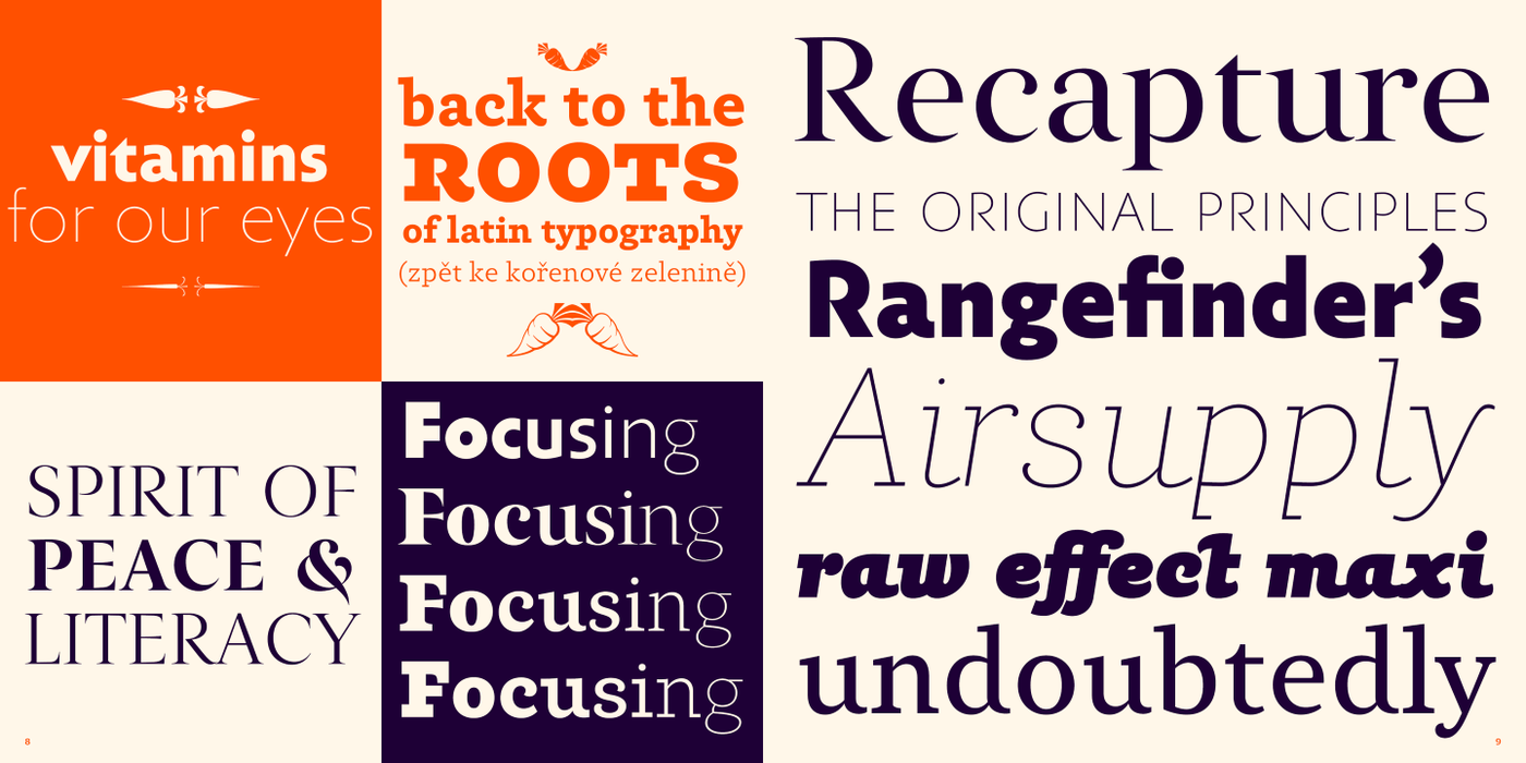
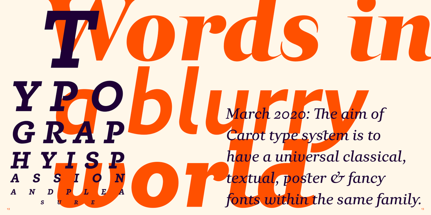
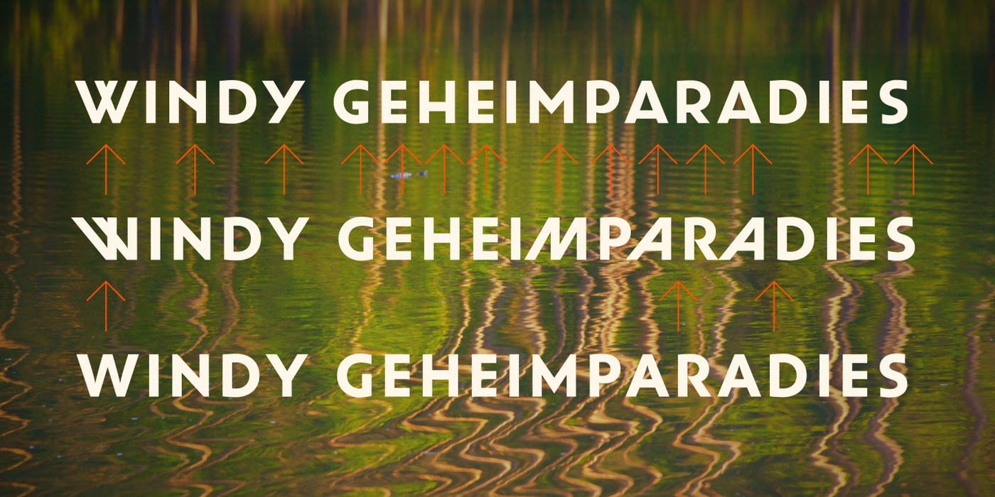
Words in a blurry world want to be more firmly anchored in the line - this is the task of the Slab-serif, characterized by solid heels. They can be used in extreme sizes – under 6 points – as well as on huge tarpaulins covering trucks, boats and house facades. Carot serves its robust clarity. The eye takes a while to become accustomed to various character simplifications, but then comes a refreshing reading perception, familiar texts get actual sound.
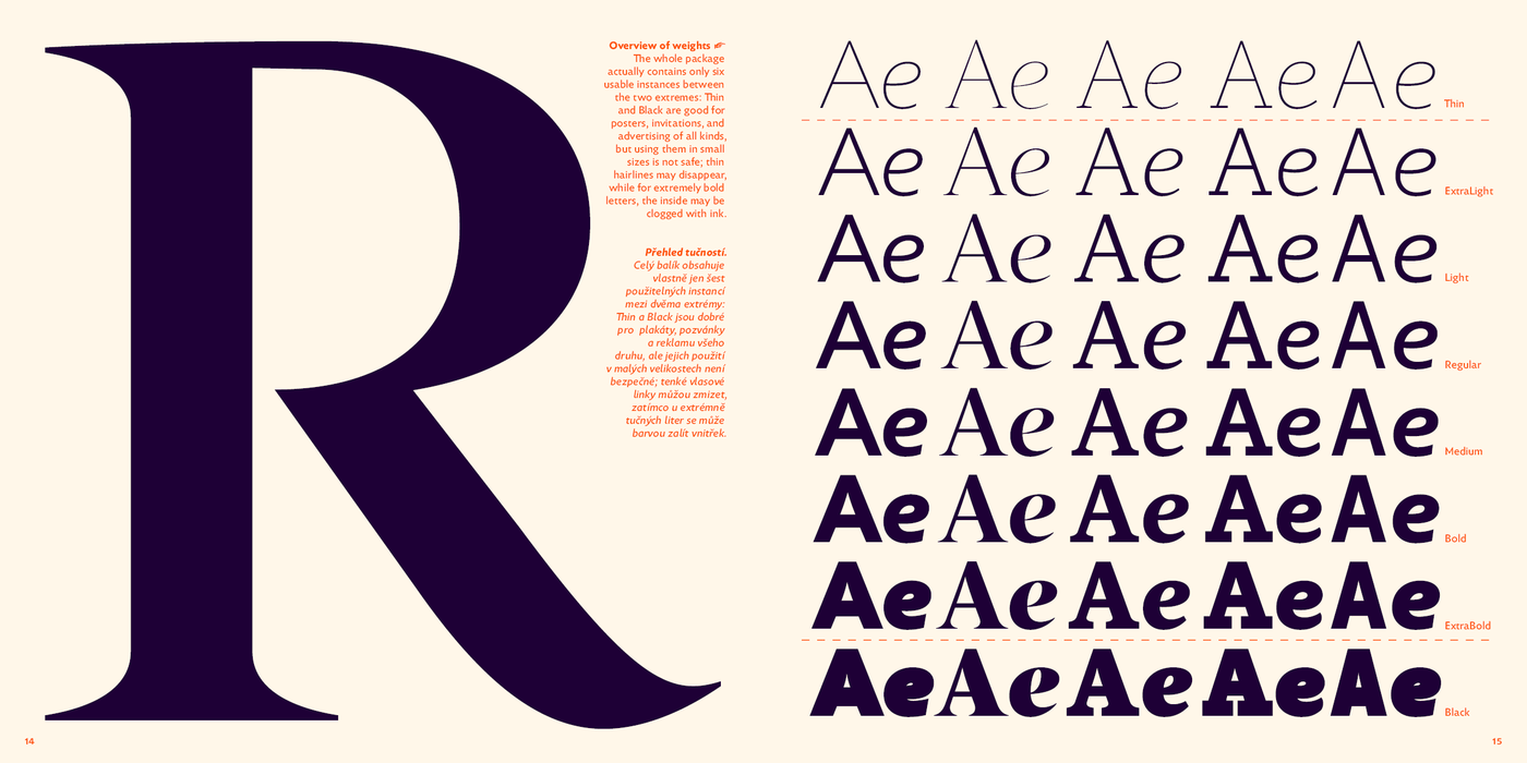
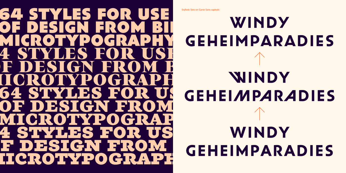
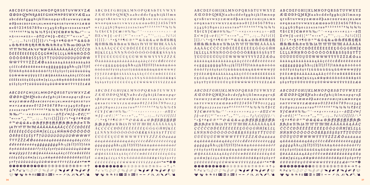
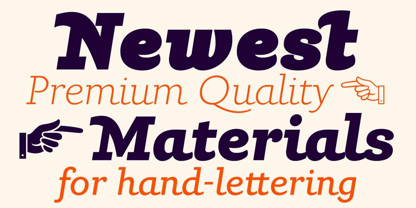
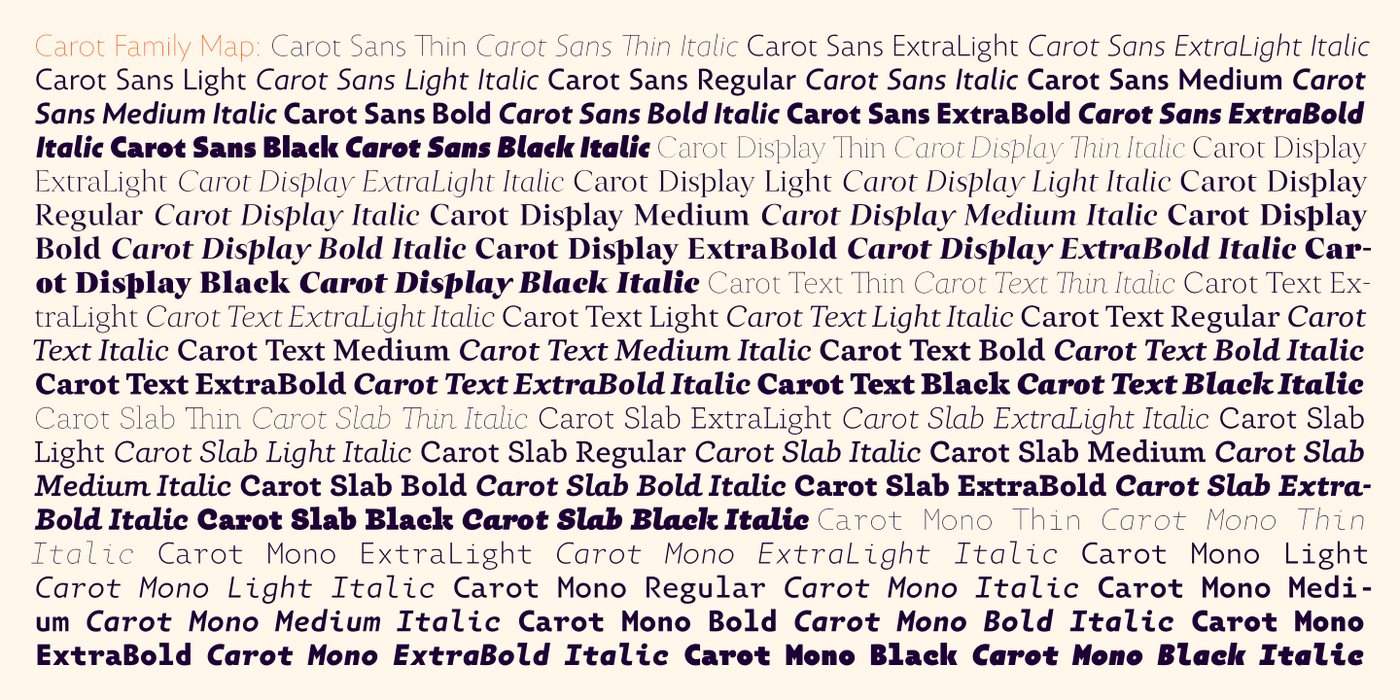
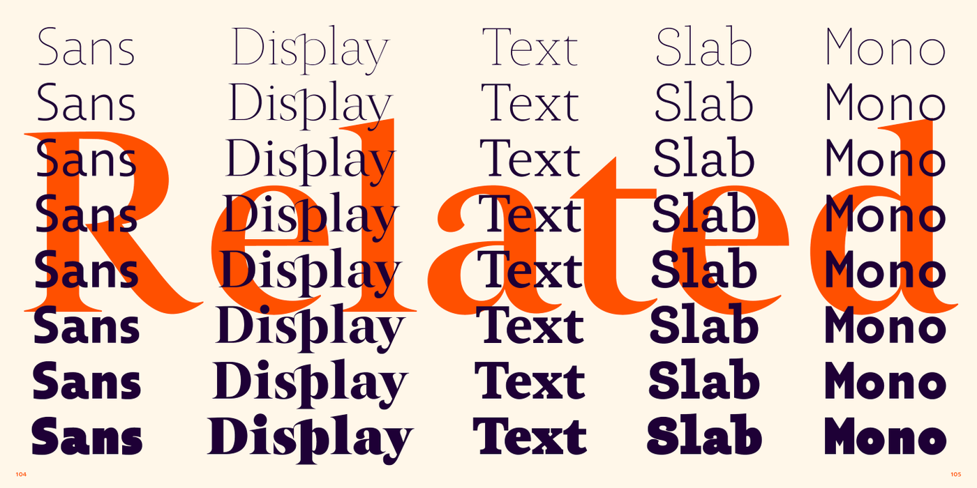
To put it simply, the Carot system is built up from what has long been around; in any case, it was the intention: to evoke the already experienced visual reminiscences of today's spectacled people. We all have a tendency toward sentiment, which, with each new diopter, deepens to melancholy. Only good font can calm us down. I believe in the raw effect of “Carot” typefaces. The family of 64 members offers a modern alternative for all types of design work.