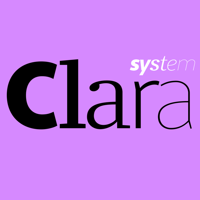
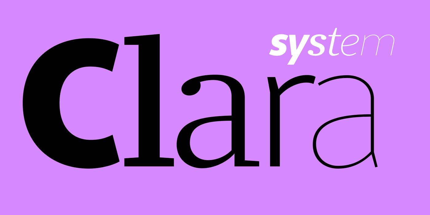
Clara Sans & Serif
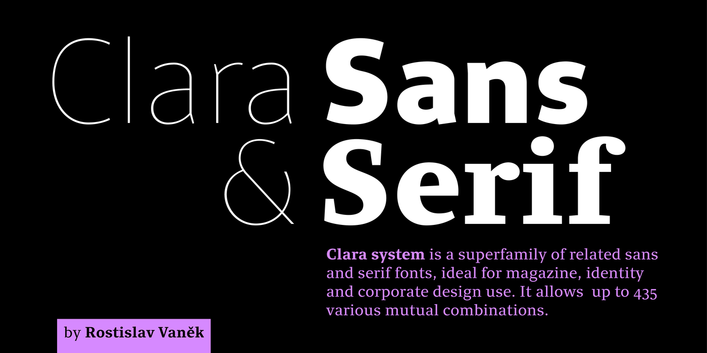
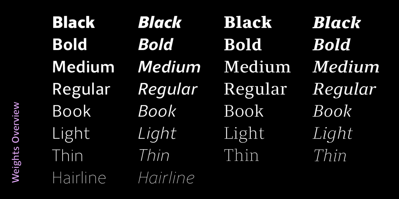
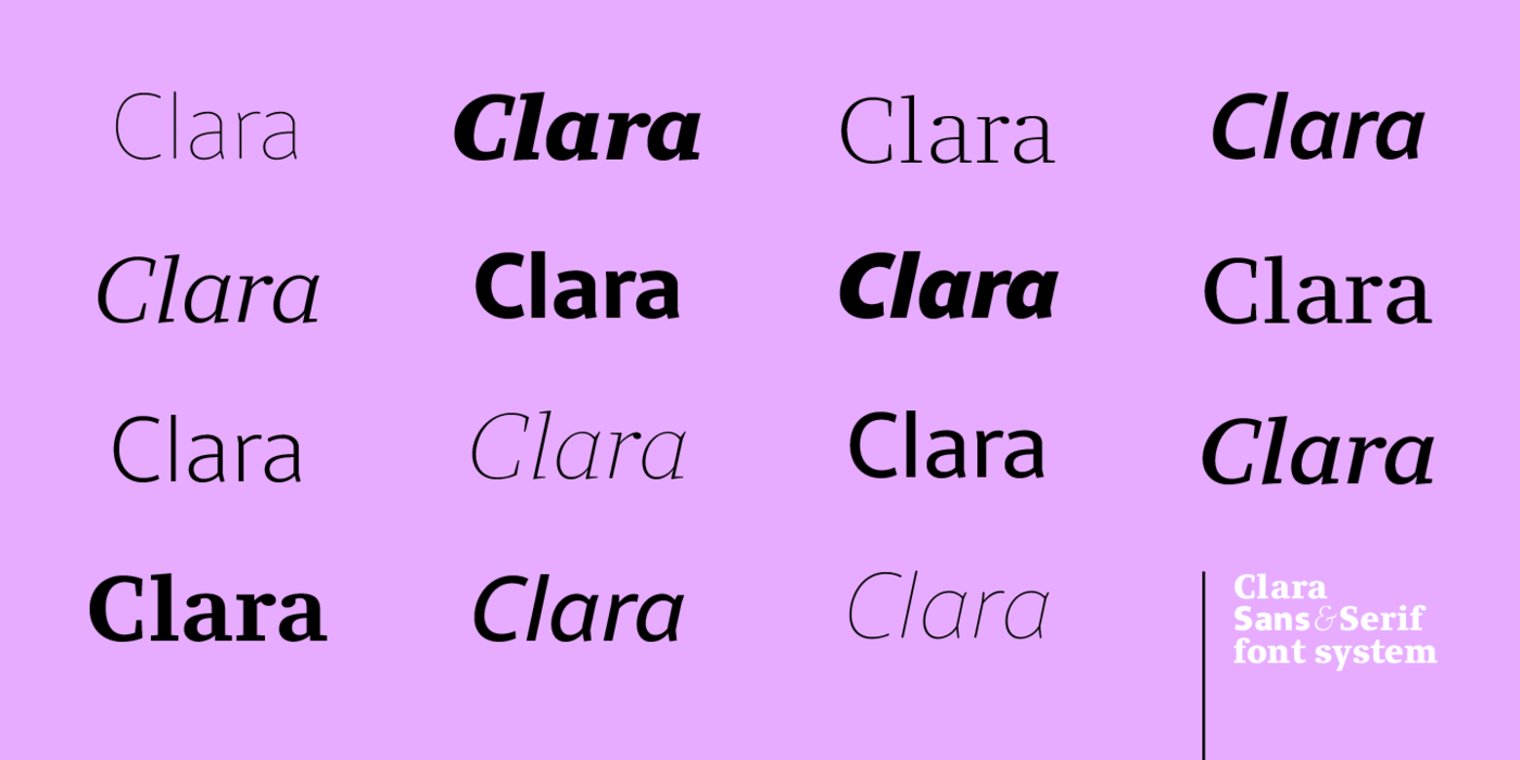
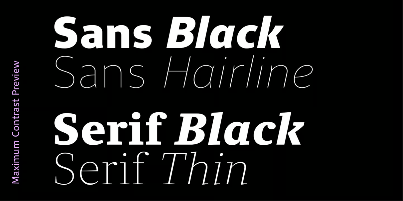
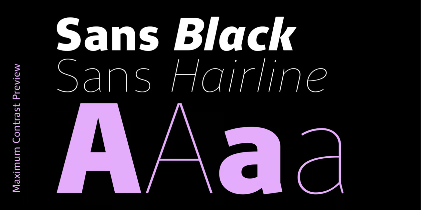
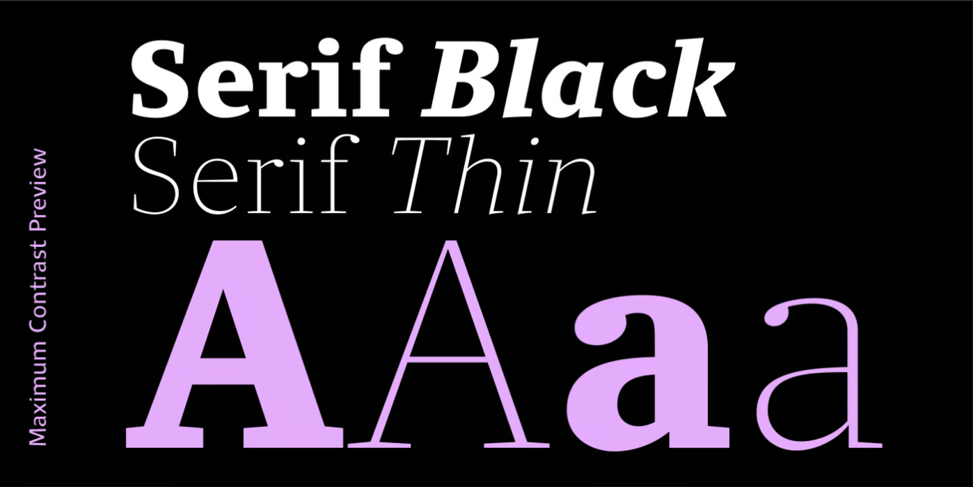
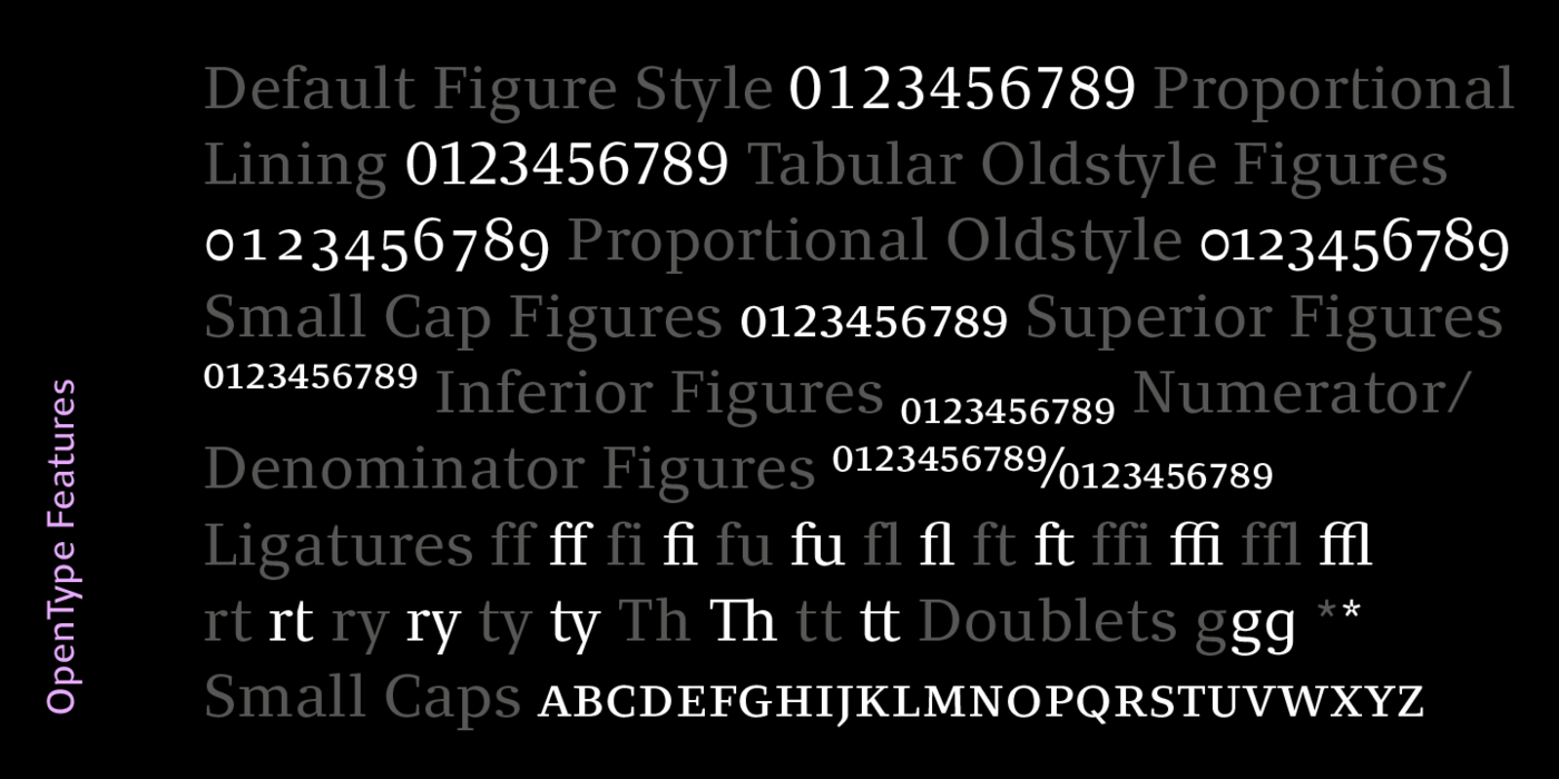
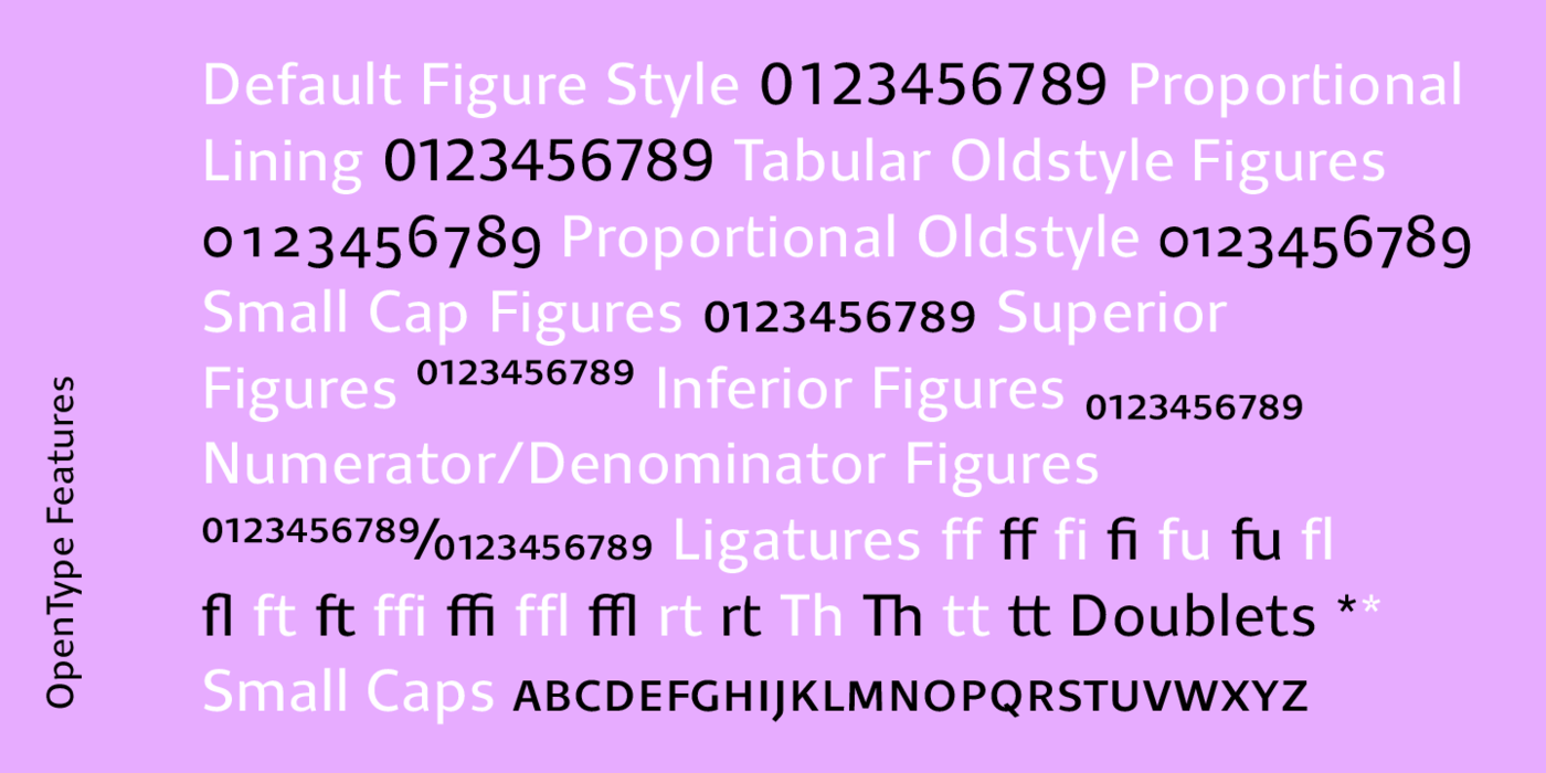
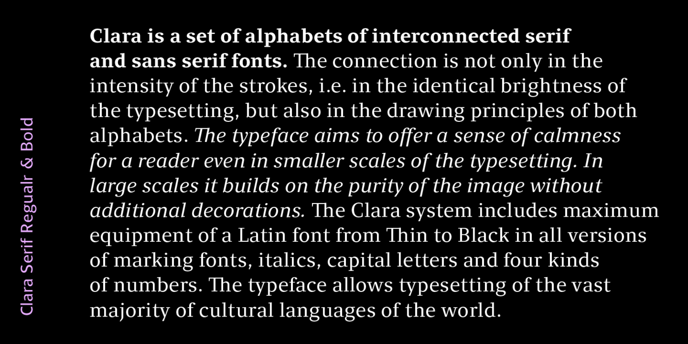
Versatile identity with charm. The superfamily flagship of Rostislav Vaněk proudly digitized by František Štorm, clean, clever and rational collection, great fonts for large volumes of text, magazines and advertising. When working on a school project in 2009, I asked myself the following question: Is it possible for a typeface to express some sort of national character? Is there really anything such as Czech tradition? Can a typeface with such characteristics be drawn? Where to start, when considering how few typefaces came to life in our country in the past 100 years, and only handful of these were ever implemented? Still, I found some inspiration: Preissig's Antikva, Menhart’s Figural, Fairfield by Czech typographer Rudolf Růžička working in the USA, and Týfa's Antikva. Do these typefaces have anything in common? All of them were drawn with utmost care as letters for book setting. All of them feature solid, well-drawn serifs, which lend them the air of sturdy confidence. They do not succumb to fleeting trends of fashion and they cannot be easily put side by side with their counterparts from the USA and Europe. All of them were designed in an era when implementation of type was still extremely demanding; thus, the authors did not even consider that their typefaces could be implemented for large sizes in great families with numerous weights and styles. Originally, I drew the typeface as the core element of the visual identity of the Charles University in Prague. The character set was to include a number of glyphs and acronyms from arts and sciences, Greek alphabet and cyrillics. The character set was conceived as extremely useful and exceptional in its broad scope. The typeface has a number of serif and sans serif styles, including italics. It has full set of small caps, large number of numerals and numerous extra glyphs.
The model for digitalisation was drawn on tracing paper. Its transparency did not matter as much as its surface, ideal for drawing with the Rotring pen and suitable for correcting with the OLFA scratching knife. From the beginning, I tried to draw the letters as small as possible, so that the similarities in shapes of letters would stand out. Where necessary, I corrected the letters in larger sizes. The outlines were always filled in to better see the colour of each of the characters. Elements such as the exact thickness of cuts was left to digitalisation. For me, the most important element was the style of the typeface in book sizes, rather than extravagant shapes apparent in larger sizes. When drawing a typeface, endless possibilities come to mind. I tried to avoid them, even when paying for it with strict, austere character of the letter. I hope the reader will forgive me my choice.
In summer 2011, I asked František Štorm, the most relevant expert of all, to take on the task of digitalising my drawings. I was shy when asking for this – František has hundreds of alphabets in his records, and he digitalises the works of true masters – Preissig, Týfa, Rathouský, Solpera. He was kind enough to accept my request.
Rostislav Vaněk, April 2012