Quercus System
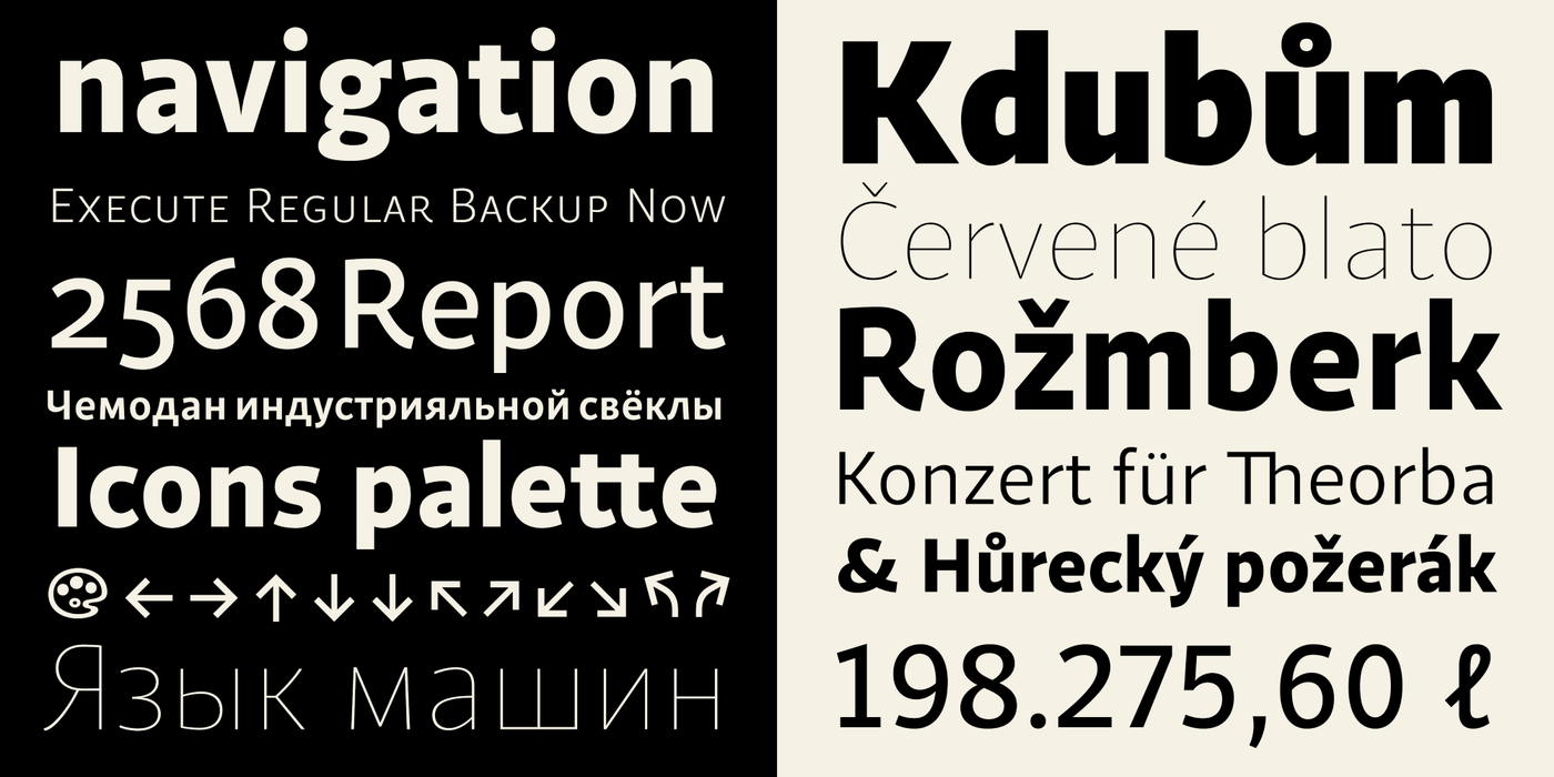
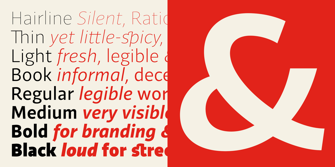

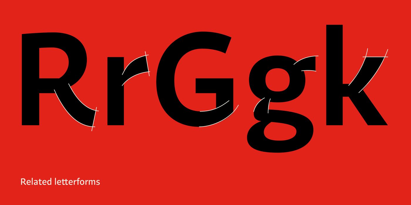

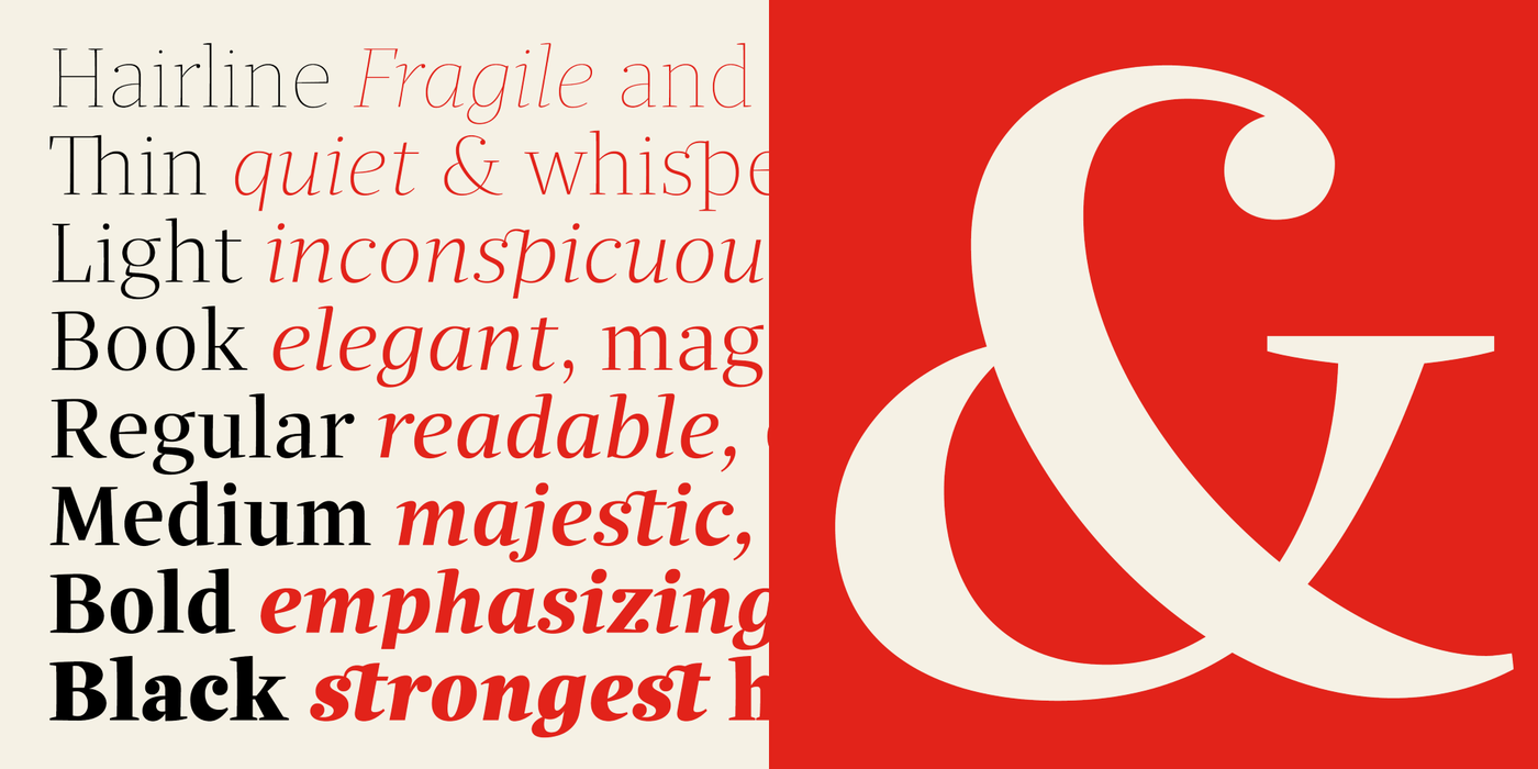
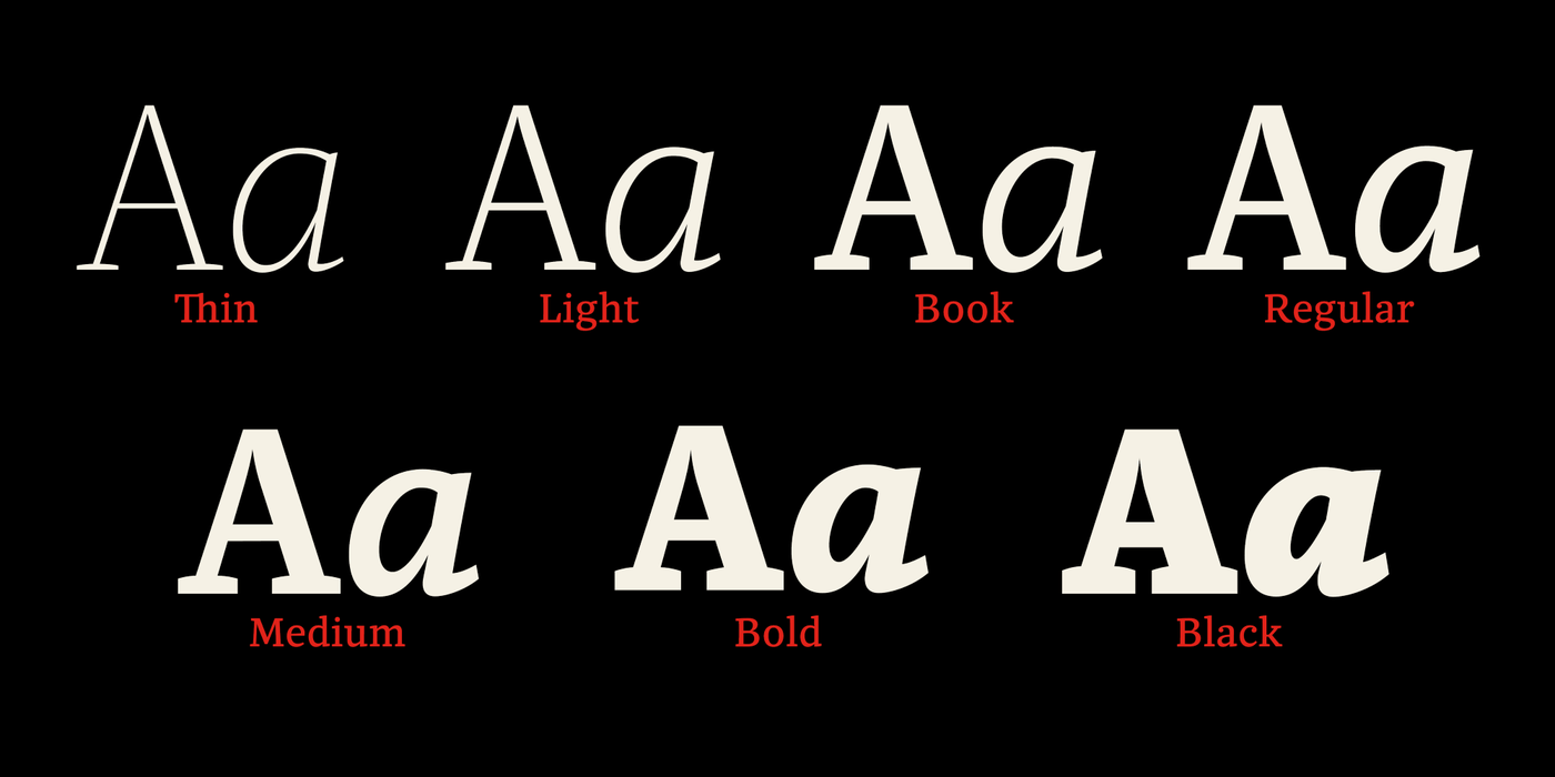
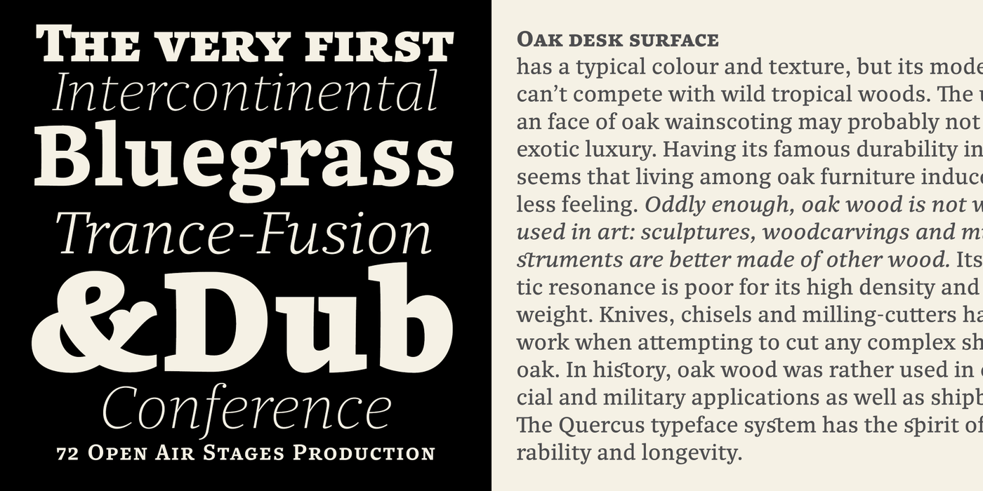

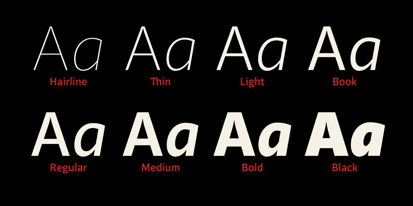
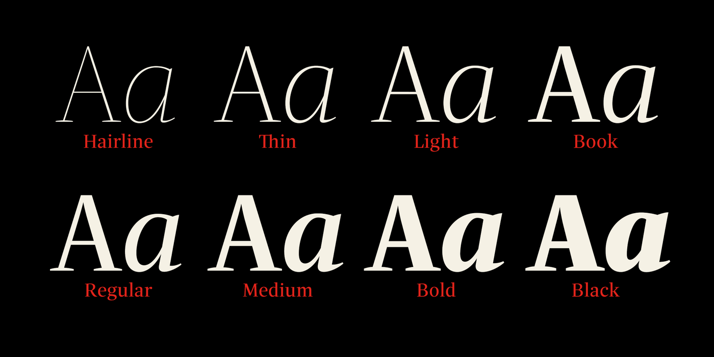
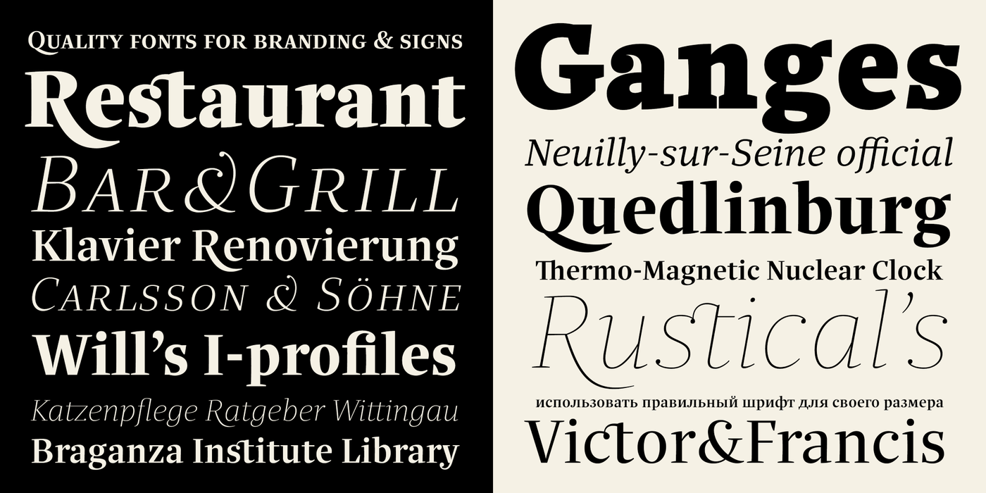
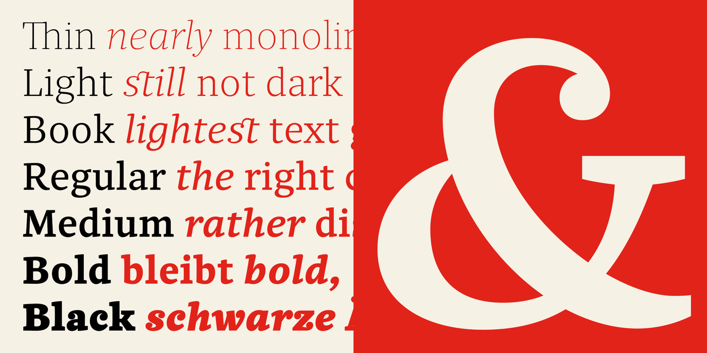
Quercus is characterised by open, yet a little bit condensed drawing with sufficient spacing. It has eight weights with respective italics. Their fine gradation allows to find an exact valeur for any kind of design, especially on the web. Quercus serif styles took inspiration from classicistic typefaces with vertical shadows, ball terminals and thin serifs. The italics have the same width proportion as upright styles. This “modern” attitude is applied to both families and calls for use on the same page, e g in dictionaries and cultural programmes. Serif styles marked by “10” are dedicated to textual point sizes and long reading.
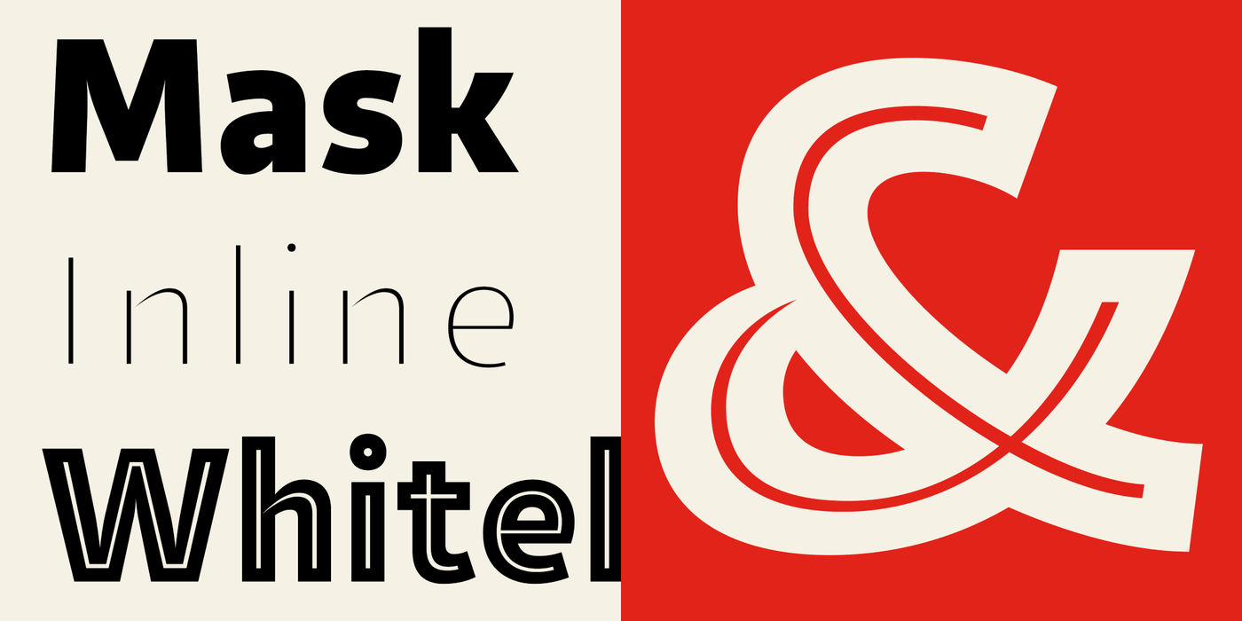
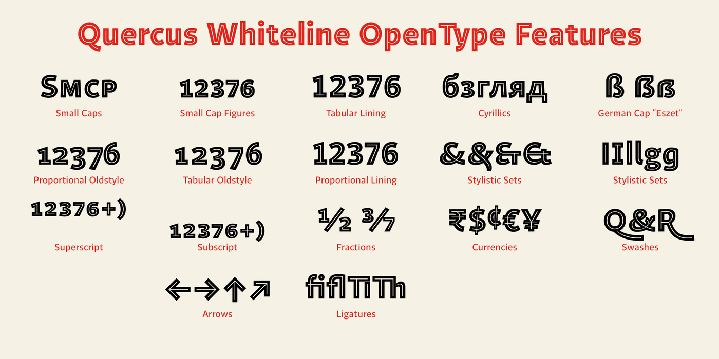
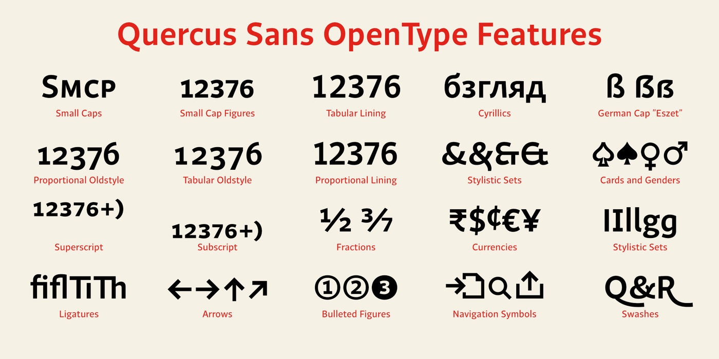
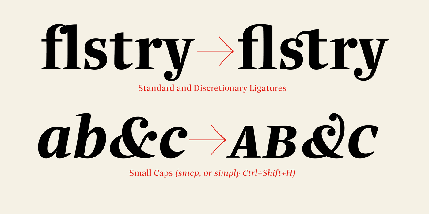
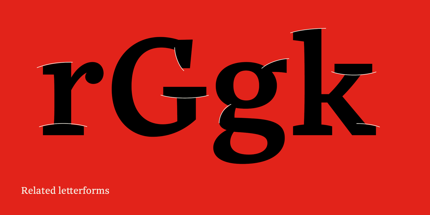
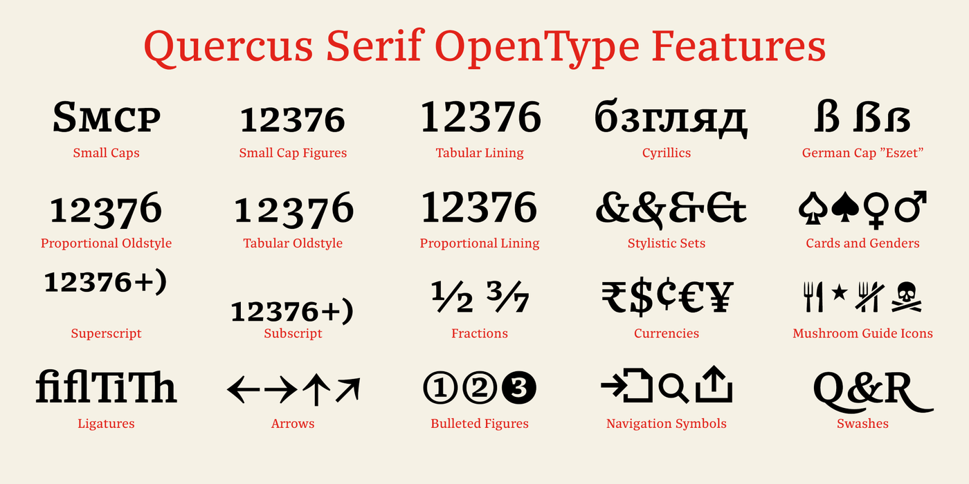
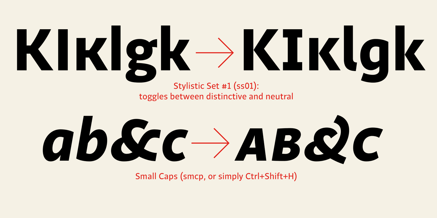
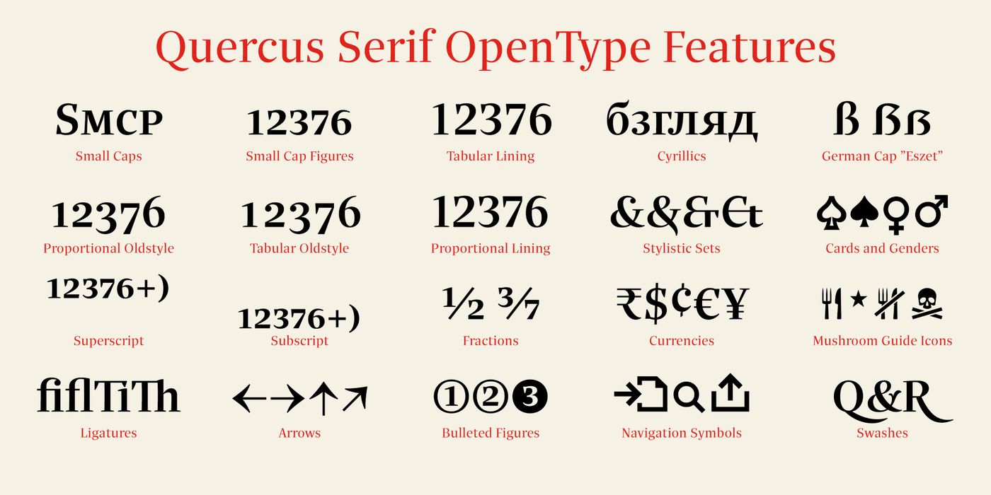
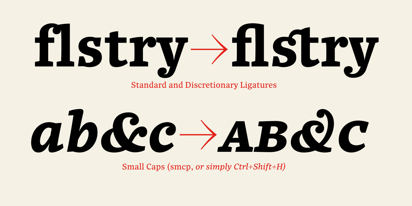
The sans-serif principle is rather minimalistic, with subtle shadows and thinned joints between curved shapes and stems. Quercus family comprises of the usual functionality such as Small Caps, Cyrillics, diacritics, ligatures, scientific and aesthetic variants, swashes, and other bells & whistles. It excels in informational and magazine design, corporate identity and branding, but it’s very well suited for book covers, catalogues and posters as well. When selecting a name for this typeface I’ve been staring out from my studio window, thinking helplessly without any idea in sight. Suddenly I realised that all I can see is a spectacular alley of oaks (Quercus in Latin) surrounding my house. These oaks were planted by the builders of local ponds under the leadership of Jakub Krčín in the fifteenth century.
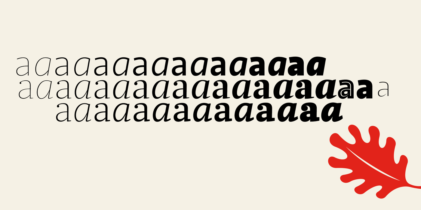
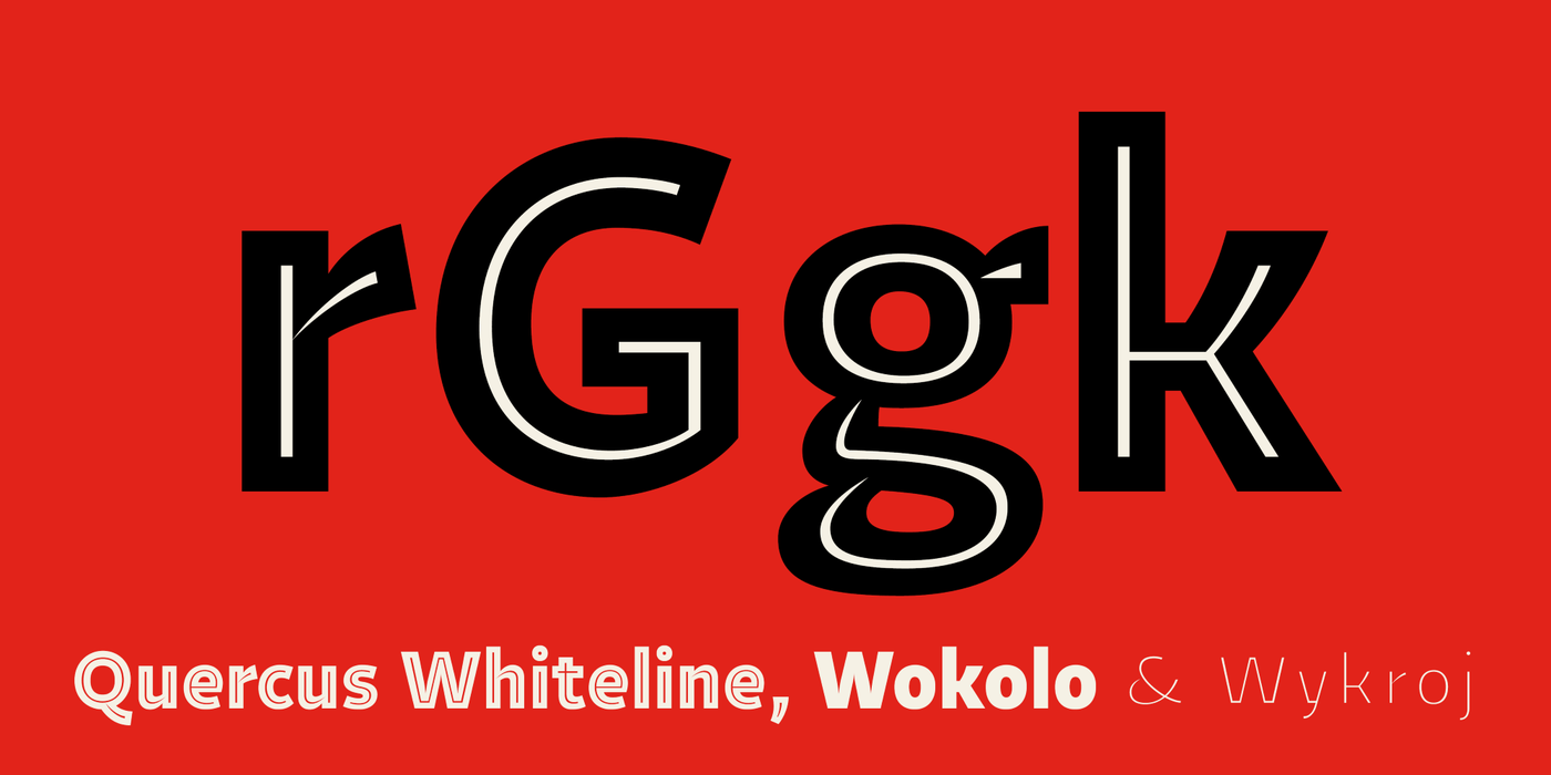
Oaks are not only a park-like decoration of local landscape, their roots have an important function – strengthening the dikes of ponds. Its wood is used for building water-gates and pipes below water level as it is very resistant to putrefaction and fungal attack because of its high tannin content. Daily walks through my beloved oak alleys deliver the peace and order for typographic thinking. Beauty and majestic strength is what I had in mind when finishing the present family. Barrels for beer, wine and whisky are made of oak. I have oak door and furniture parts. The desk in my studio where I’m sitting now is made from solid oak, and the parquet-floor too, not to mention self-made rear bumpers on my old car. Oak has a remarkable trace in our everyday life. Oak desk surface has a typical colour and texture, but its modest beauty can’t compete with wild tropical woods. The utilitarian face of oak wainscoting may probably not evoke any exotic luxury. Having its famous durability in mind, it seems that living among oak furniture induces a timeless feeling. Oddly enough, oak wood is not widely used in art: woodcarvings, musical instruments and sculptures are better made of other wood. Its acoustic resonance is poor for its high density and heavy weight. Knives, chisels and milling-cutters have hard work when attempting to cut any complex shape in oak. In history, oak wood was rather used in commercial and military applications as well as shipbuilding. The Quercus typeface system has the spirit of trade, durability and longevity. About interpolated styles. Quercus comes in fine gradation with slight emphasis on the light side. In today’s magazine design there is a considerable need for large thin fonts, whereas the heavy extremes of textual styles, close to slab-serif, can be used for all sizes. Italics with balls. When drawing Italics, it is necessary to pay attention to languages rich with diagonals (e g Czech). The way we shape diagonals in typography may significantly contribute to readability or compulsiveness of the whole typeface family. Every dynamic design element can enliven our visual experience, but only when it’s adequately tamed. I hesitated for a while with this drawing of “x” and “z” having a fear that such unusual shapes may excessively drag attention and a reader will stumble on it like a pedestrian on refuted cobble. Luckily, the ending balls sufficiently absorb its wild skewness. I’m glad that I at the same time managed to avoid the obligatory rococo-style horizontal curves in “z”.