Baskerville Neo Std
- Typefaces
- Gallery
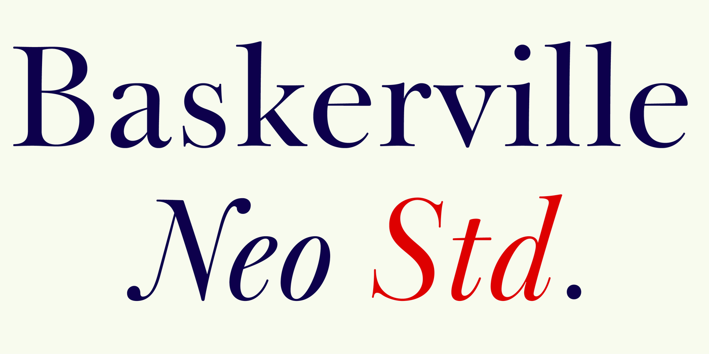
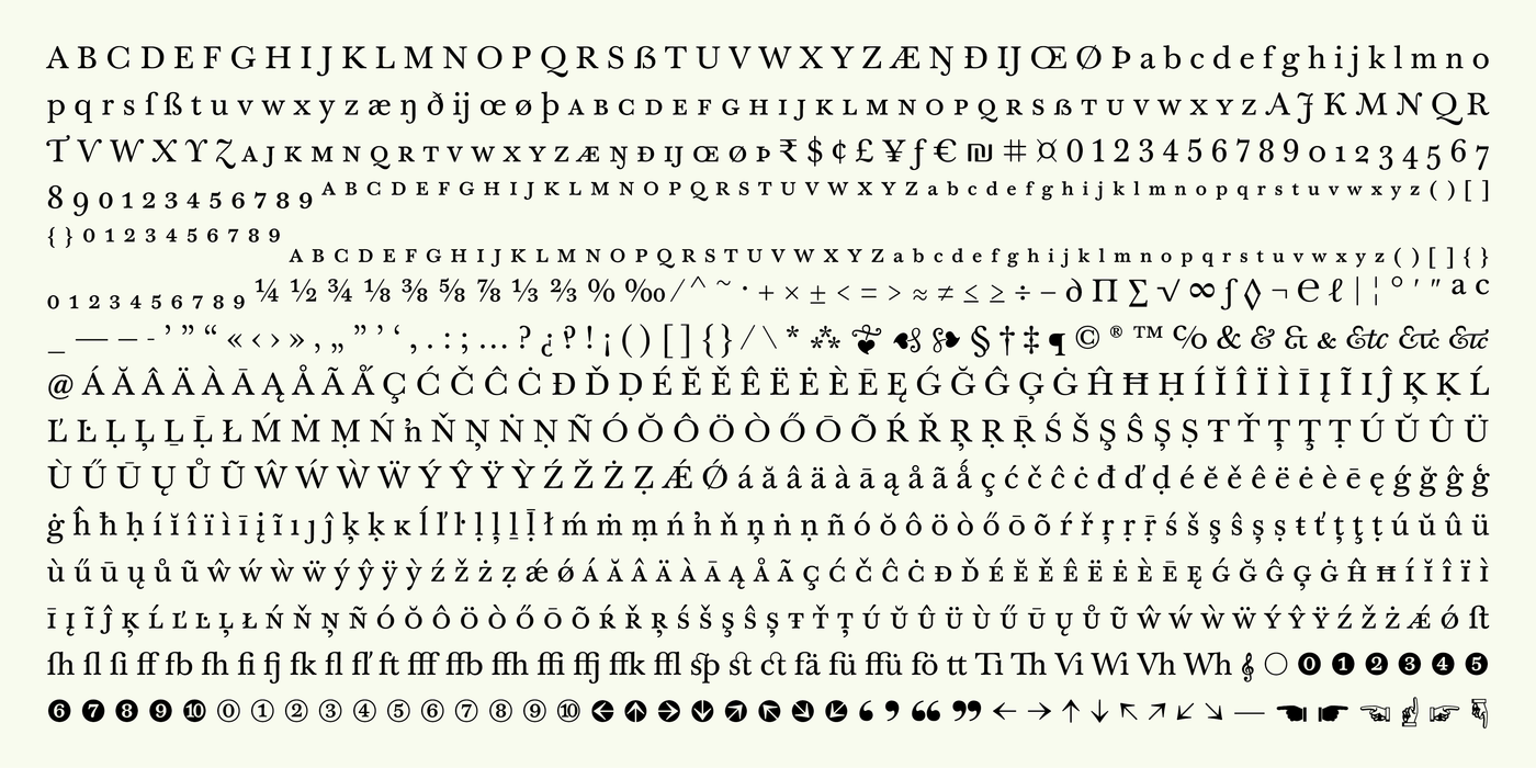
Baskerville Neo is a contemporary digital interpretation of the classic Baskerville serif typeface, developed by the Czech type designer František Štorm and his Storm Type Foundry. Its purpose is to preserve the elegance and readability of 18th-century Baskerville while adapting the design to modern printing, digital publishing and professional typography.
The important distinction for an average user is that Baskerville Neo is not simply an old-fashioned font or a direct copy of an antique typeface. It is a carefully developed font family with different weights, italics and optical sizes, designed to work across a wide range of applications.
1. Historical development: from John Baskerville to Baskerville Neo
John Baskerville (1707–1775), an English printer, businessman and type designer, developed a distinctive transitional serif style. His work featured refined letterforms, strong contrast between thick and thin strokes, carefully controlled spacing and an emphasis on clear, elegant pages. His printing methods and smoother paper helped showcase the delicate details of his type.
Historical foundation:
Storm Type Foundry began researching Baskerville's original printed work in 1999, examining rare books dating from around 1760. Rather than copying every historical detail, Štorm used the originals as a basis for an analytical reinterpretation, completing missing characters and refining the design for contemporary typography.
Source: Storm Type Foundry's account of John Baskerville.
Baskerville Neo was introduced as a substantially expanded successor to the foundry's Baskerville Original family. The new family brought together five weights, four optical-size categories, italics and a separate ornaments style, with extensive language support and advanced digital typography features.
The overall development can be understood as a progression from historical inspiration → analytical redesign → a modern, flexible type system.
2. What makes Baskerville Neo different? Baskerville Neo belongs to the transitional serif category. This means it sits stylistically between older, calligraphic book typefaces and the more sharply contrasted serif designs associated with Bodoni and Didot.
Its main characteristics are: Elegant contrast: thick main strokes combined with fine hairlines give the letters refinement without making the design excessively decorative. Classical proportions: the letterforms convey tradition, seriousness and literary sophistication. Controlled rhythm: spacing and letter shapes are designed to form a harmonious, readable texture across paragraphs. Modern technical refinement: the digital family includes extensive character sets, ligatures, small capitals and other OpenType features.
A broad range of applications: the family is designed for both long reading and more expressive display typography.
The result is a typeface that can look traditional without necessarily feeling old-fashioned. It works particularly well when you want a document to feel thoughtful, established or editorial rather than purely corporate or technological.
3. Understanding the Neo optical sizes. One of the most useful developments in Baskerville Neo is its division into four optical-size categories. These are not simply four different font sizes: each category is designed for a different scale of use.
Small - Intended for small text, where fine details can otherwise disappear. Useful for footnotes, captions, compact printed material and small labels.
Text - The most practical choice for everyday reading. Use it for essays, reports, letters, articles and longer documents. This is the version I would recommend first to an ordinary user. Subhead - Intended for intermediate sizes, such as section headings, introductions, pull quotes and prominent short passages.
Display - Optimized for large typography, such as titles, book covers, posters, invitations and branding. It is the natural choice when the individual letterforms need to make a stronger visual impression.
These four categories are documented in the official family specification. Each also has five weights and corresponding italics.
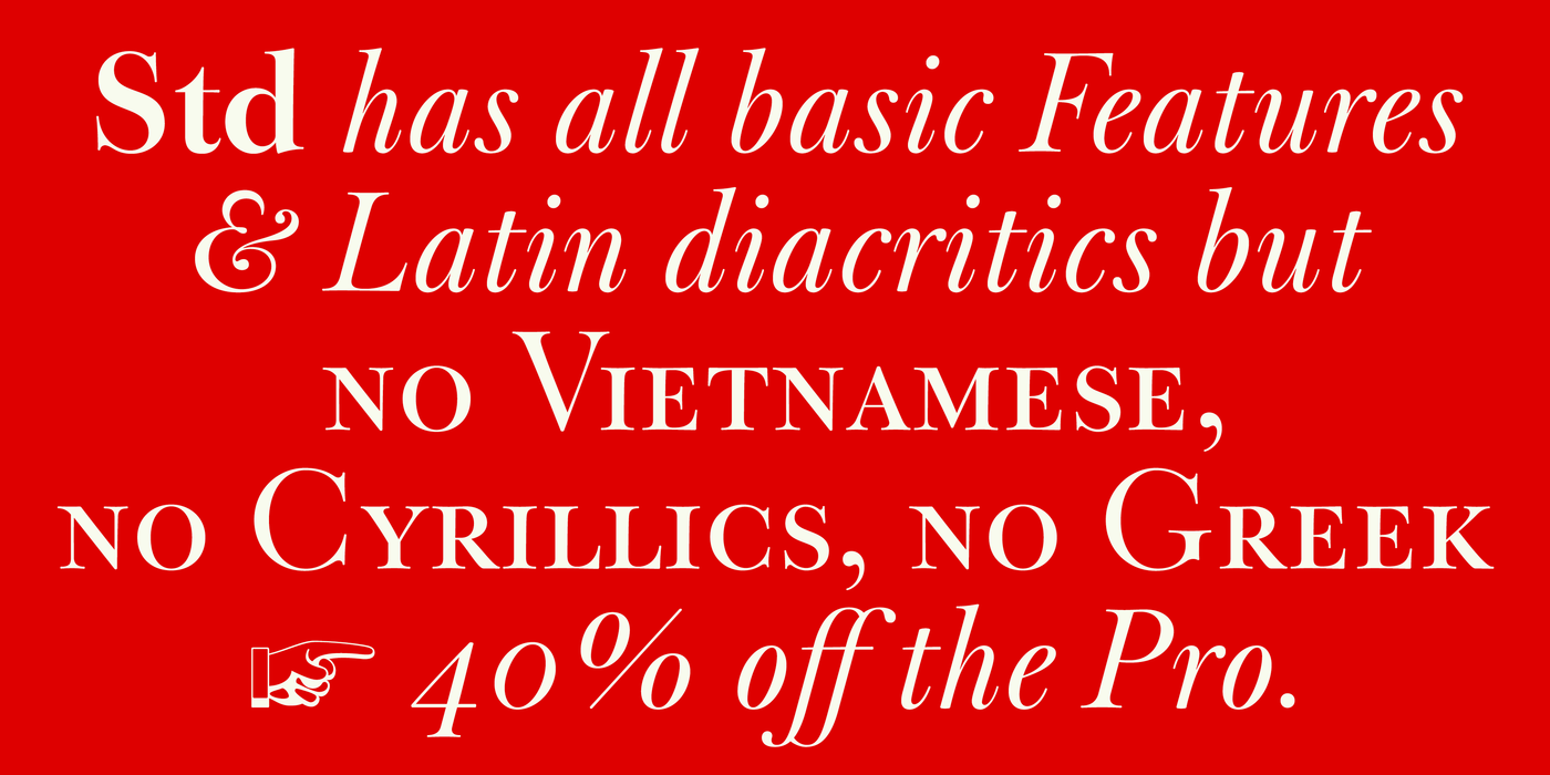
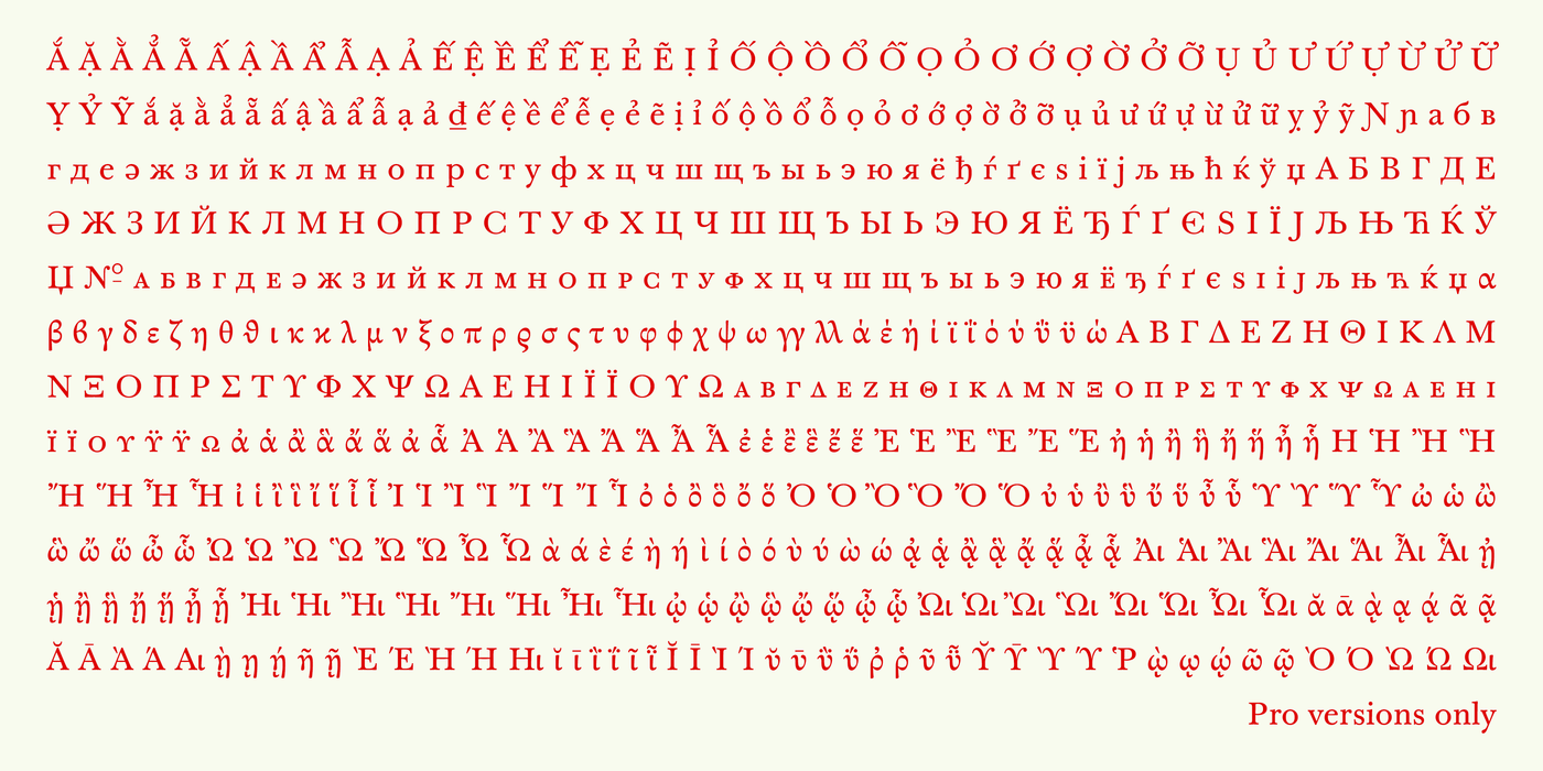
What does “Std.” mean, and should an average user choose it? Std stands for Standard and refers to a particular font edition or character set. It does not automatically mean that the font is a simpler drawing, a lighter weight or an inferior version.