BeletrioBuying options: Beletria Value Pack: 2200,70 CZK
- Typefaces
- Gallery
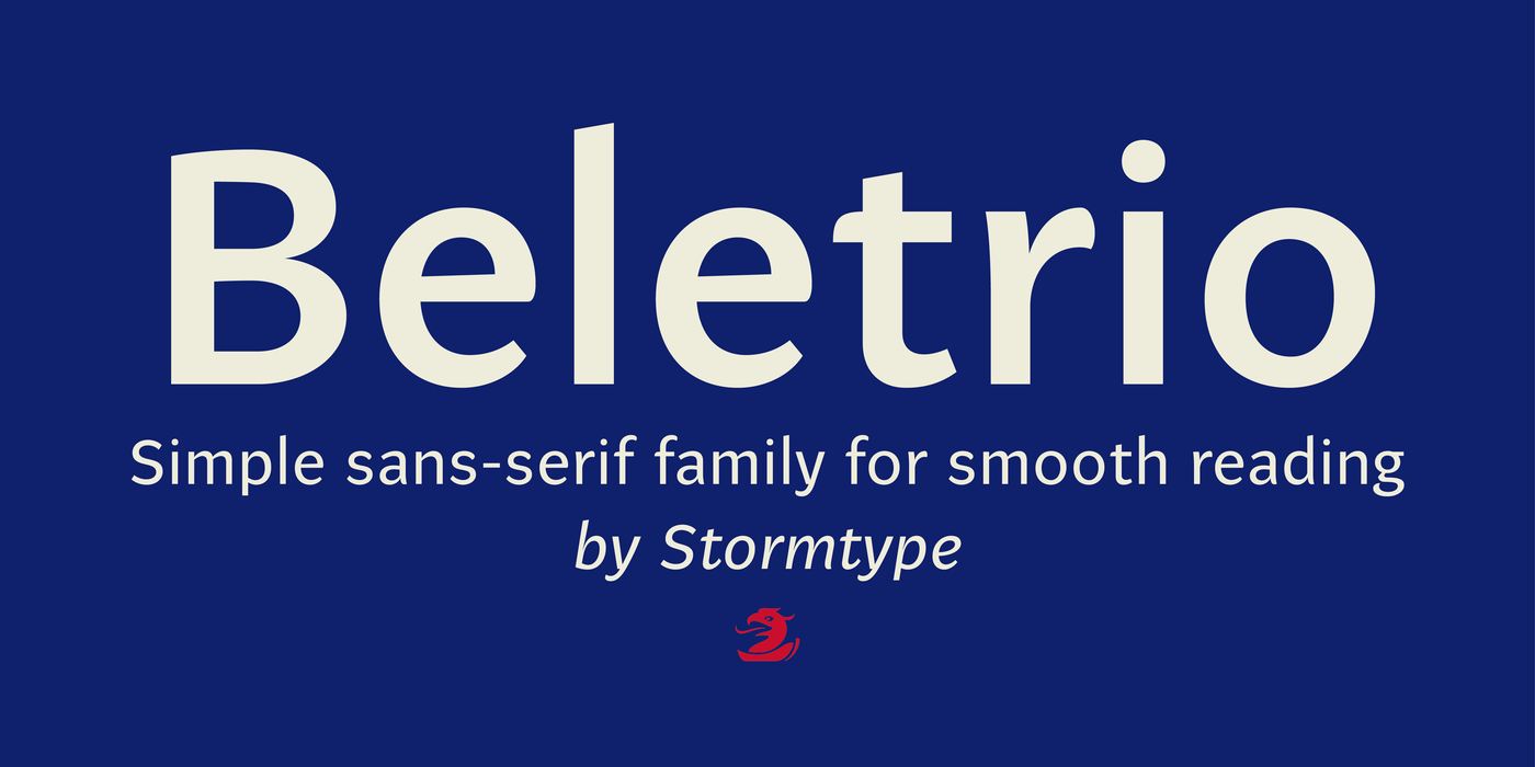
Beletrio was made as companion to Beletria, it has many shapes in common. We already have plenty of sans-serif fonts with classical proportions in the Stormtype library, such as John Sans, Sebastian or Andulka, but Beletrio is certainly the most peaceful of the bunch – it shares not only the feel of its serif originator, but its soft curves provide lovely visual caress as well. The smooth endings are not visible at first, they are balanced for easy reading as they solve some critical relations such as "rv, ry, rt", but in larger sizes you'll fully enjoy the picturesque details. It handles the smallest point sizes as well as large billboards, fashion magazines and philosophic tractates.
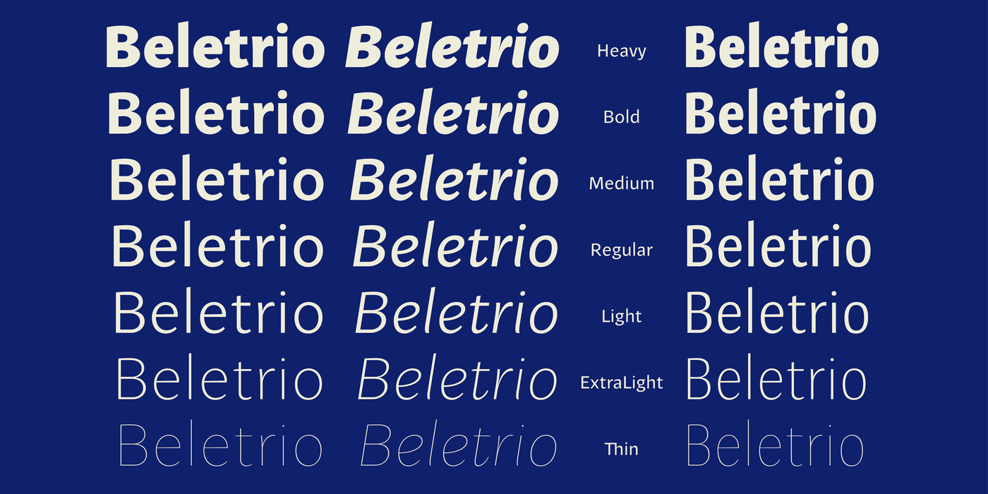
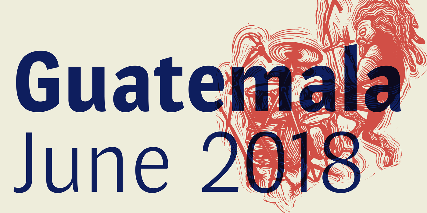
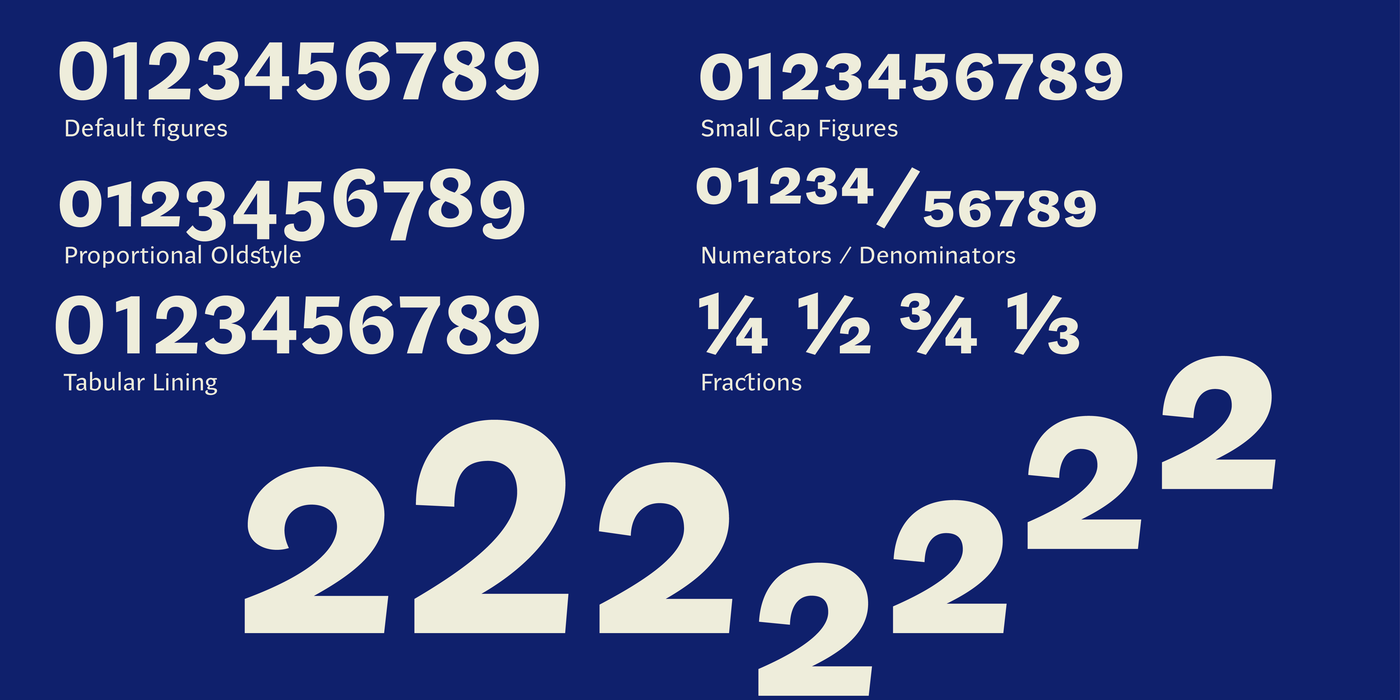
The goal of Beletria is to be a contemporary looking book typeface for fast reading (frankly, I was already bored of using of good old Baskerville for the volumes I illustrated recently). I needed an inconspicuous typographic element to combine with my pictures. The development of Beletria family took most of 2018 and resulted in 26 styles and 2 optical sizes. It has a large x-height and lively italics. Naturally the usual array of OpenType features is present. Beletria is perfect for electronic publication as well. The sans-serif counterpart is called Beletrio, it has the same features as the entire family, plus condensed styles.
Účelem Beletrie je současně vypadající knižní písmo pro rychlé čtení (upřímně, už mě nudilo používat starý dobrý Baskerville pro svazky které jsem ilustroval). Potřeboval jsem nenápadný typografický prvek ke kombinaci s mými obrázky. Vývoj písma Beletria zabral většinu roku 2018 a vyústil v rodinu o 26 řezech a 2 optických šířkách. Má velkou střední výšku minusek a živé kursivy. Obvyklá sestava OpenType funkcí je samozřejmě přítomna. Beletria je také výborná pro elektronické publikování. Bezserifový protějšek se nazývá Beletrio, má stejné funkce jako celá rodina a navíc i zúžené řezy.