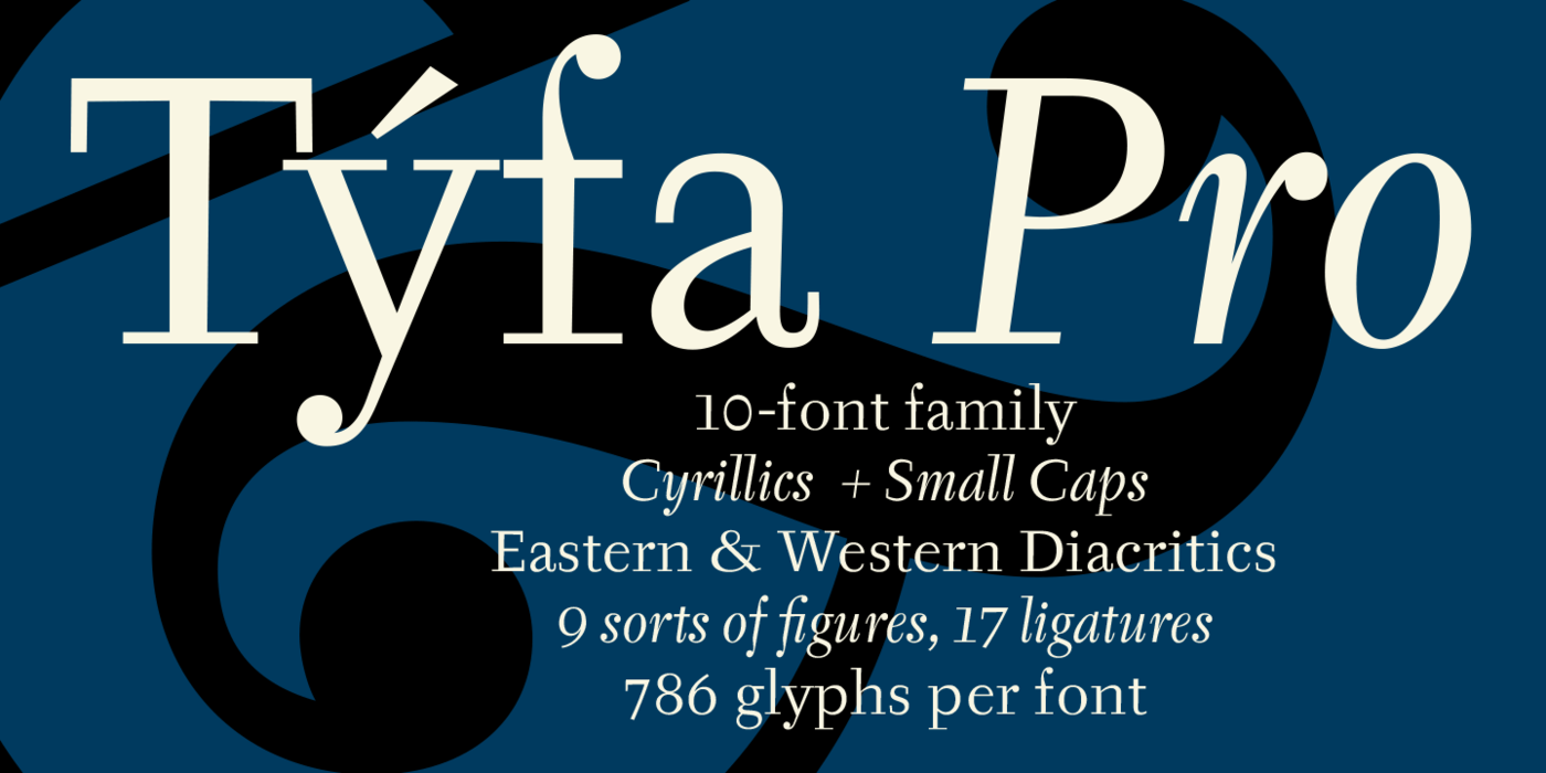
Týfa Antikva
- Typefaces
- Gallery
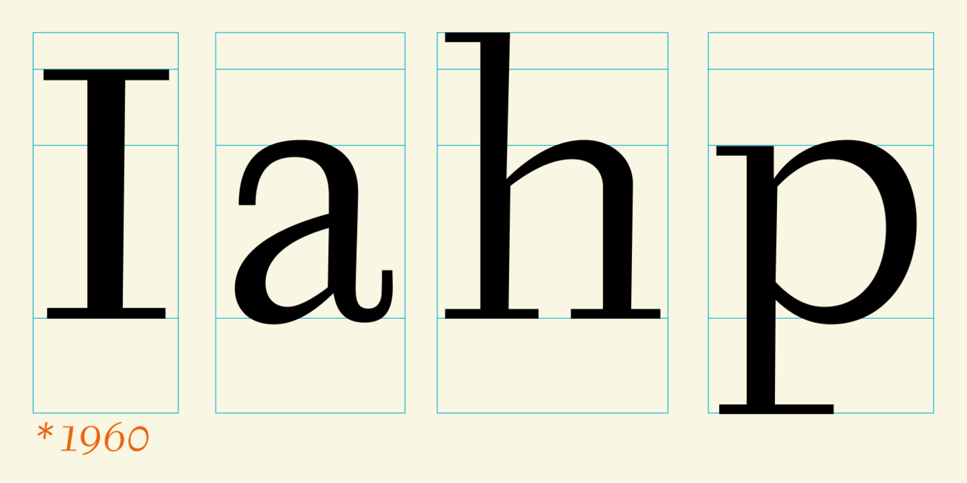
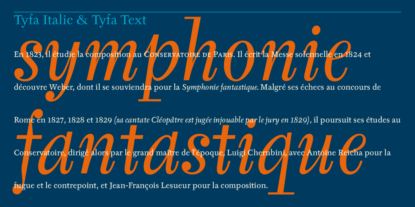
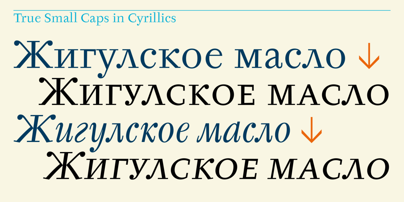
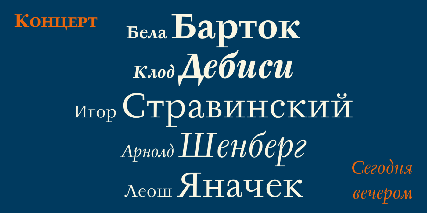
This Antikva and Italic are well-known perhaps to all Czech graphic artists and typographers ever since their release. Although this type face in some details is under the sway of the period of its rise, its importance is timeless, in contradistinction to other famous types dating from the turn of the sixties which were found, after some time, to be trite. The italics live their own life, only their upper-case letters have the same expression as the basic design. Thin and fragile, they work excellently, emphasizing certain parts in the text by their perfect contrast of expression. When seen from a distance they are a little bit darker than the Roman face. Tyfa Roman was released in 1960 by Grafotechna in Prague for hot setting. Later on, Berthold produced letter matrices for Staromat devices, used for manual photosetting of display alphabets. In the eighties it was available on dry transfers of Transotype and today it is offered also by ITC.
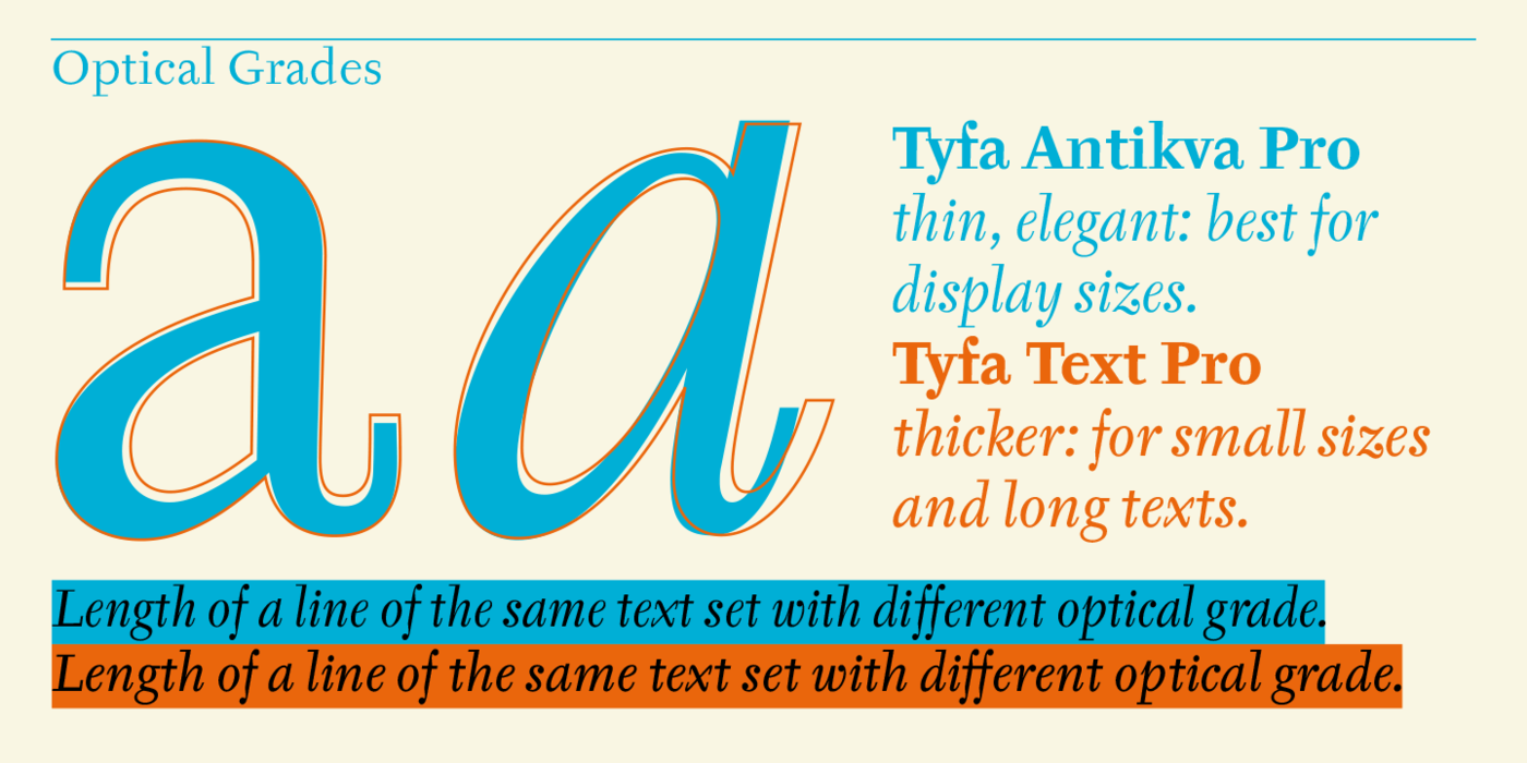
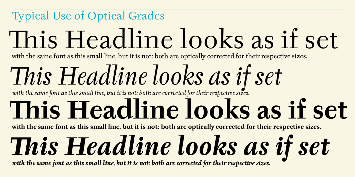
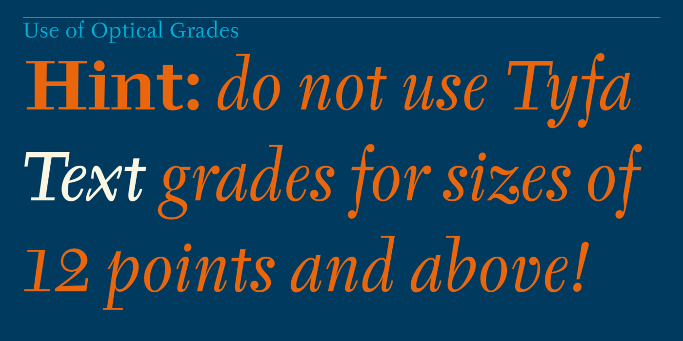
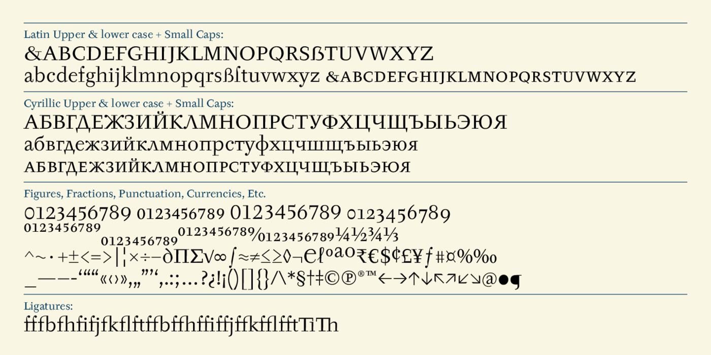
The meticulously executed original designs dating from late 50s are arranged into a set of signs on a cardboard of about B2 in size. The yellowed paper reveals retouches by white paint on the ink. Blue lines mark the baseline, the capital line, the ascender and descender lines and the central verticals of the letters. With regard to the format of the flat scanner, the designs had to be reduced, with the use of a camera, to the format A4, i.e. to the upper-case letter height of about 30 mm. These were then scanned and read as a bitmap template to the FontStudio program. The newly created bold weights derive from Tyfa's only drawings of the bold letters "a", "n", "p", the darkness of which was increased further, to enhance their emphasizing function. We have used electronic interpolation to produce the medium weights. Josef Tyfa himself recommends to choose a somewhat darker design than the basic one for printing of books. The text designs have hairstrokes thickened by one third; the contrast between thin and thick strokes has been modified, in order to improve legibility, in sizes under 12 points.
Týfovu antikvu & kursivu znají snad všichni čeští grafici a typografové. Nemá smysl ji zařazovat do kontextu původní české písmařské tvorby, když se sama řadí do kontextu evropského i světového. Přestože je některými detaily formálně poplatná době svého vzniku, jedná se o písmo nadčasového významu, na rozdíl od jiných slavných písem z přelomu 50. a 60. let, která se po čase okoukala. Kursiva žije svým životem, se základním řezem má společný výraz jen ve versálkách. Štíhlá a křehká, znamenitě funguje – vyznačuje v textu svým dokonalým výrazovým kontrastem. Zdálky je nepatrně tmavší než antikva. Týfova antikva byla v roce 1960 vydána Grafotechnou pro horkou sazbu, později Berthold vyrábí písmové matrice – „pravítka“pro ruční titulkové fotosázecí přístroje. V osmdesátých letech se dala sehnat na suchých obtiscích Transotype, dnes je i v nabídce ITC.
Přepečlivé, pedantsky provedené kresby jednotlivých liter o výšce kuželky 24 cicer jsou seskupeny ve znakovou sadu na karton formátu cca B2. Pokročilé žloutnutí papíru odhaluje retuše bělobou. Modré linky vyznačují účaří a střední vertikálu liter. Vzhledem k formátu plochého scanneru musely být kresby kamerou zmenšeny do formátu A4, tedy do výšky versálek cca 30 mm. Ty pak byly nascannovány v rozlišení 600 dpi a načteny jako bitmapová předloha do programu FontStudio.
Nově vytvořené tučné řezy vycházejí z Týfových kreseb liter a, n, p, jejichž tmavost byla zvětšena ještě asi o 3 %, kvůli lepší vyznačovací funkci. Textové řezy mají vlasové tahy zesíleny asi o třetinu, zmírněn je kontrast slabých a silných tahů pro zlepšení čitelnosti ve velikostech pod 12 typografických bodů. Při výrobě půltučných řezů jsme si opět pomohli elektronickou interpolací. Josef Týfa sám doporučuje knížky tisknout poněkud tmavším řezem, než je základní.