Cookies help us deliver our services. By using our services, you agree to our use of cookies.Got it
  • ☾☼
  • 🛒 (0) 0,00 EUR
  • Change currency
    • CZK
    • EUR
    • USD
  • Login
  • Licensing
  • Font Packages
  • Custom Fonts
  • Free Trial Fonts
  • Printed Materials
  • Bestsellers
  • Cyrillic
  • Greek
  • Contact Us
  • Facebook
  • Instagram
  • About Us
  • People
  • Help
  • Rules and Conditions
  • Privacy Policy
  • GDPR
❓ Storm Type Foundry
  • Sans-serif 
    • Academica Sans
    • Amor Sans
    • Amphibia
    • Andulka Sans
    • Anselm Sans
    • Bahnhof
    • Beletrio
    • Carot Mono
    • Carot Sans
    • Clara Sans
    • DynaGrotesk
    • Etelka Pro
    • Header
    • Hercules Sans
    • Inicia
    • Jannon Sans
    • Jasan
    • John Sans
    • Josef Sans
    • Melange
    • Metron
    • Populus
    • Quercus C
    • Quercus Sans
    • Quercus Whiteline
    • Sebastian
    • Sedlec Sans
    • Shompen
    • Solpera
    • Splendid Sans
    • St Croce Pro
    • Superscience
    • Teuton
    • Trivia Gothic
    • Trivia Grotesk
    • Trivia Sans
    • Vida
    • Walbaum Grotesk
    • Zeppelin Grotesk
  • Serif 
    • Academica
    • Alebrijes
    • Amor Serif
    • Andulka
    • Anselm Serif
    • Antique
    • Areplos
    • Baskerville Neo
    • Baskerville Original
    • Beletria
    • Biblon Pro
    • Carot Display
    • Carot Slab
    • Carot Text
    • Clara Serif
    • Comenia Serif Pro
    • Defender
    • Ermina
    • Etelka Slab
    • Farao
    • Genre
    • Hercules Neo
    • Jannon Antiqua
    • Jannon Neo
    • Juvenis
    • Kingdom
    • Lexon
    • Lido STF
    • Mediaeval
    • Mramor
    • Pentagraf
    • Pepone
    • Preissig Antikva
    • Preissig Poster
    • Quercus Serif
    • Quercus Ten
    • Regent
    • Regula
    • Serapion
    • Tenebra
    • Trivia Humanist
    • Trivia Serif
    • Trivia Serif 10
    • Trivia Slab
    • Tusar
    • Tyfa Antikva
    • Walbaum 2010 Pro
  • Blackletter 
    • Coroner
    • Dracula
    • Dream Within A Dream
    • Friedhof
    • Hexenrunen
    • Julinka
    • Monarchia
    • Moyenage
    • Moyenage Sans
    • Plagwitz
    • Spiritist
    • Wittingau
  • Decorative 
    • Abalda
    • Aichel
    • Alcoholica
    • Andaluz
    • Bhang
    • Briefmarken
    • Clichee
    • Cobra
    • Compur
    • Enamelplate
    • Excelsor Script
    • Fenix
    • Gallus Konzept
    • Hammertone
    • Ideal Gothic
    • Libcziowes
    • Lokal Script
    • Modell
    • Mortal
    • Negro
    • Patzcuaro
    • Pivo
    • Politic
    • Rondka
    • Rooftiles
    • Splendid Quartett
    • Stencilul
    • Technomat
    • Traktoretka
  • Font Packages 
    • Baskerville Sans & Serif
    • Carot Complete
    • Hercules Sans & Serif
    • Jannon Sans & Serif
    • Storm Type Library 7
    • Trivia Complete
    • Walbaum Sans & Serif
    •  
    • Academica Value Pack
    • Andulka Value Pack
    • Anselm Value Pack
    • Baskerville Value Pack
    • Beletria Value Pack
    • Carot Value Pack
    • Clara Value Pack
    • Hercules Value Pack
    • Jannon Value Pack
    • JBW Value Pack
    • Quercus Value Pack
    • Trivia Grotesk Value Pack
    • Trivia Humanist VP
    • Walbaum Value Pack
50 fonts :
Special Offer:
241,75 EUR
328,10 EUR
(4,84 EUR per font)
🛒 add to cart

Hercules Neo
Buying options: Storm Type Library 7: 9497,50 EUR,    Hercules Sans & Serif: 379,90 EUR,    Hercules Value Pack: 96,70 EUR

  • Typefaces
  • Gallery


  • Full herculesneoposter2
    Full herculesneoposter3
    Full herculesneoposter4
    Full herculesneoposter5
    Full herculesneoposter6
    Full herculesneoposter7
    Full herculesneoposter8
    Full herculesneoposter9
    Full herculesneoposter10
    Full herculesneoposter11
    Full herculesneoposter12
    Full herculesneoposter13
    Full herculesneoposter14
    Full herculesneoposter15
    Full herculesneoposter17
    Full herculesneoposter 17
    Full herculesneoposter19
    Full herculesneoposter20
    Full herculesneoposter21
    Full herculesneoposter22
    Full herculesneoposter23
    Full herculesneoposter24
    Full herculesneoposter25
    PreviousNext

    Hercules Neo

    by František Štorm

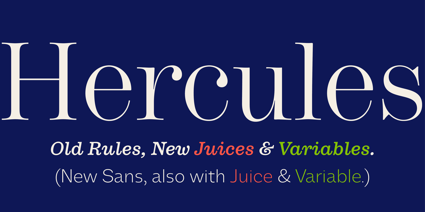
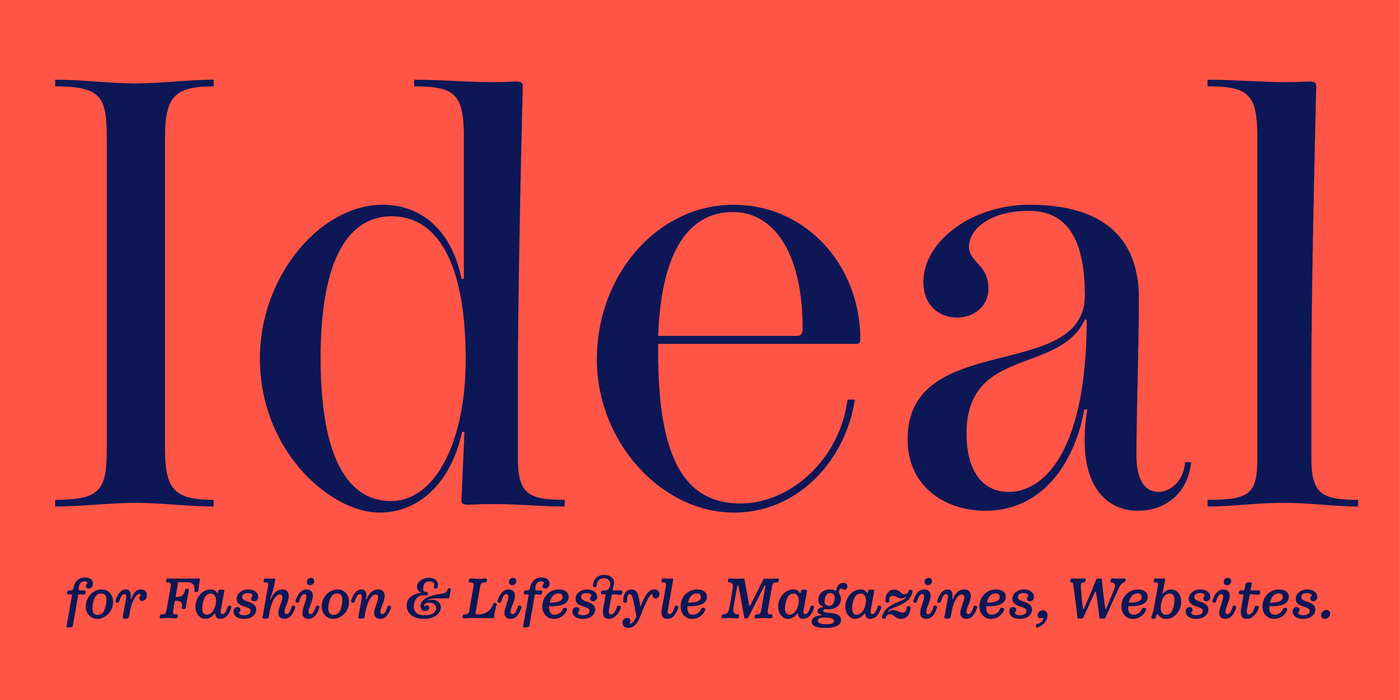
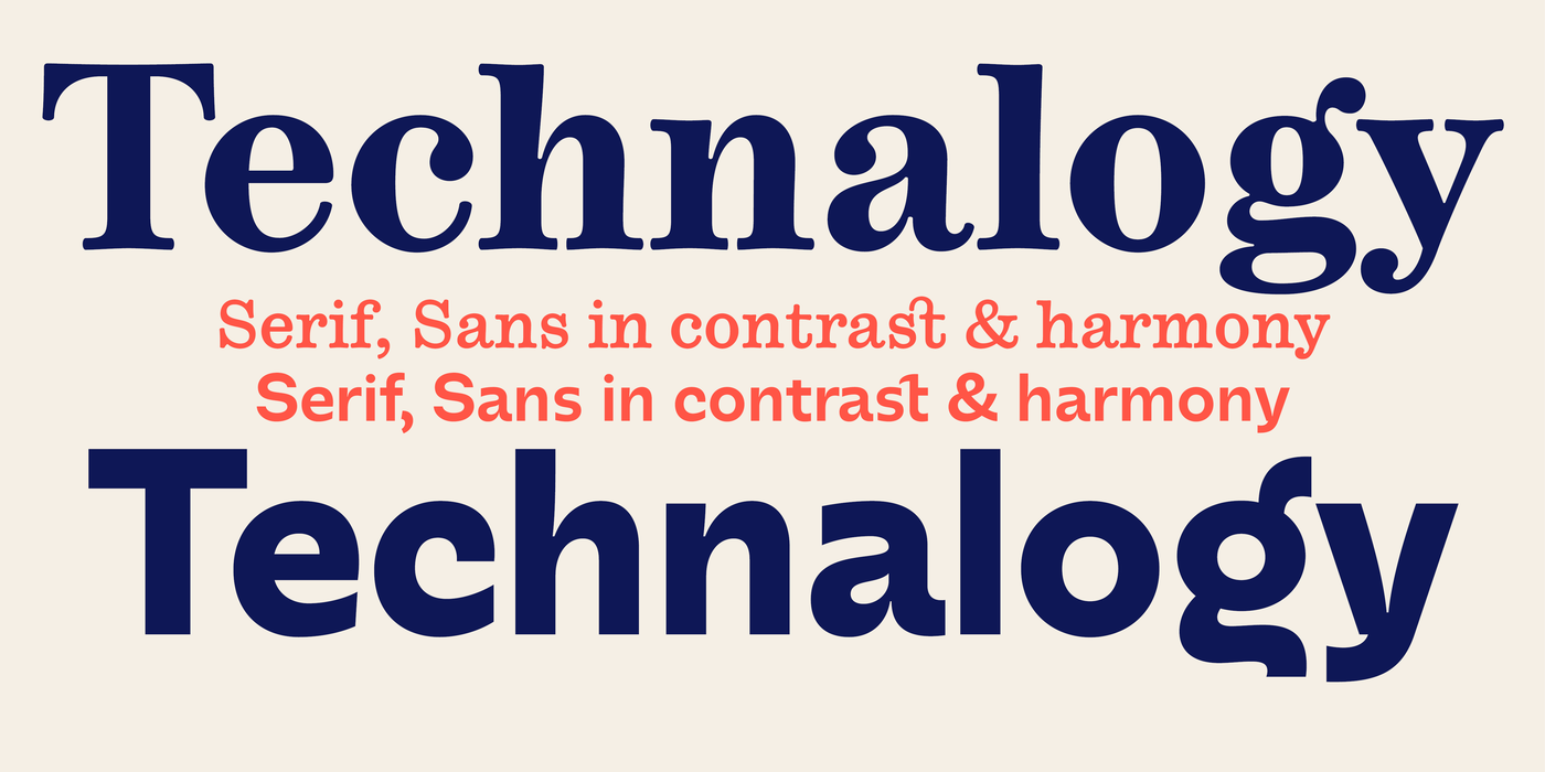
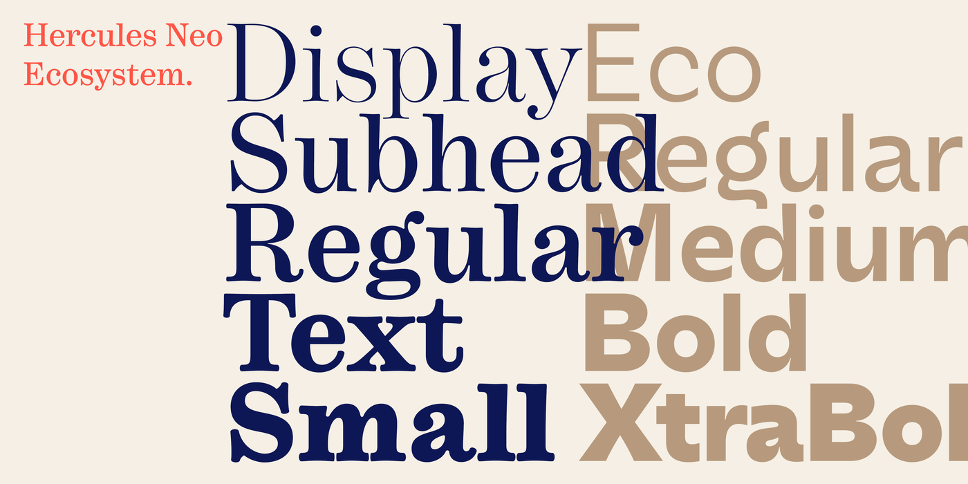
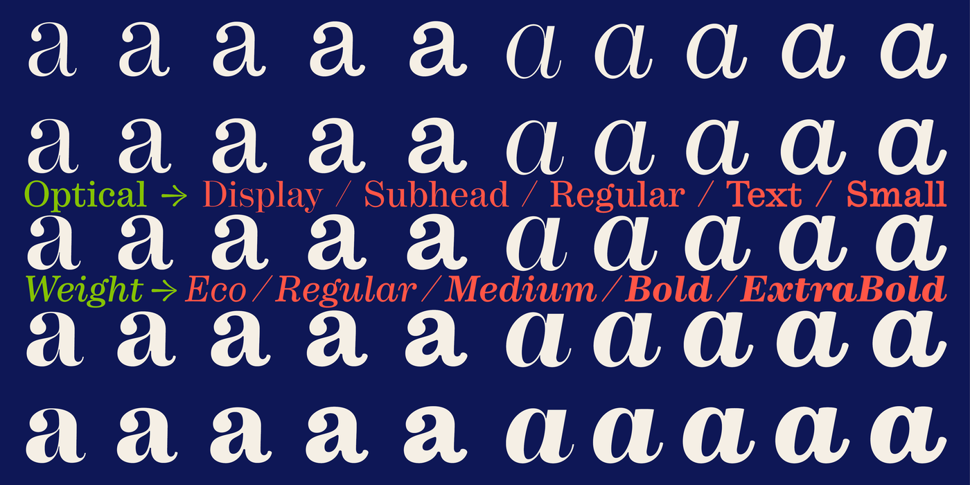
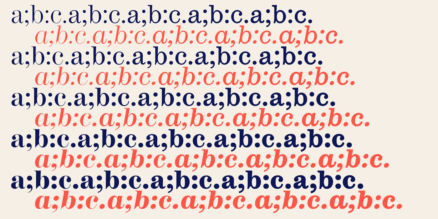
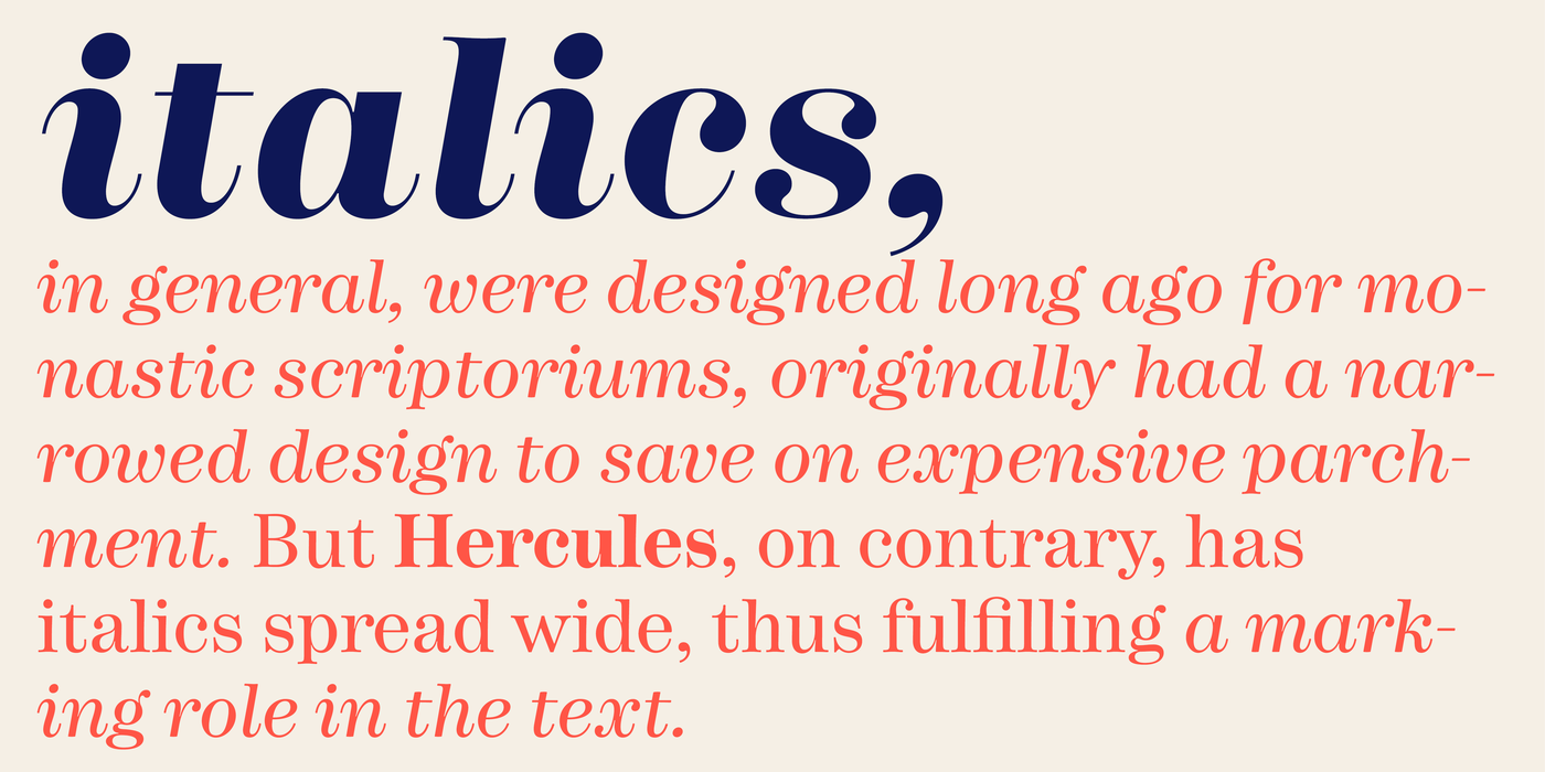
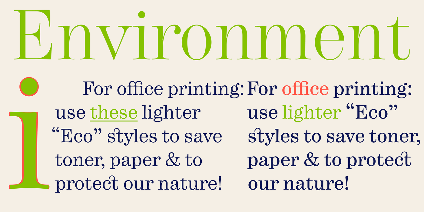
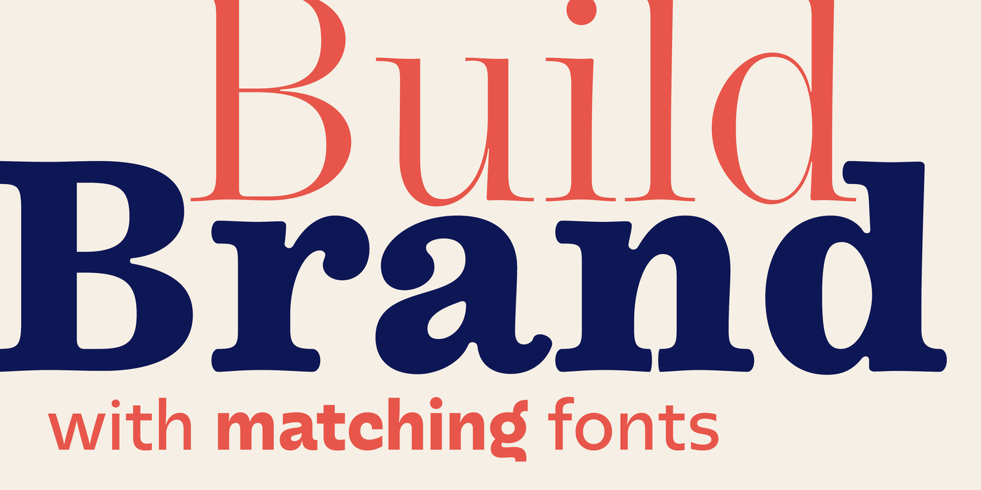
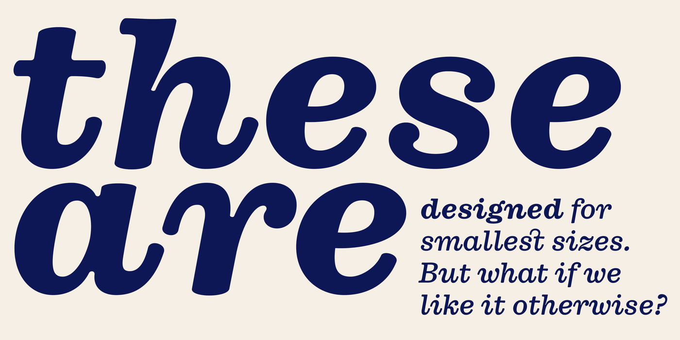
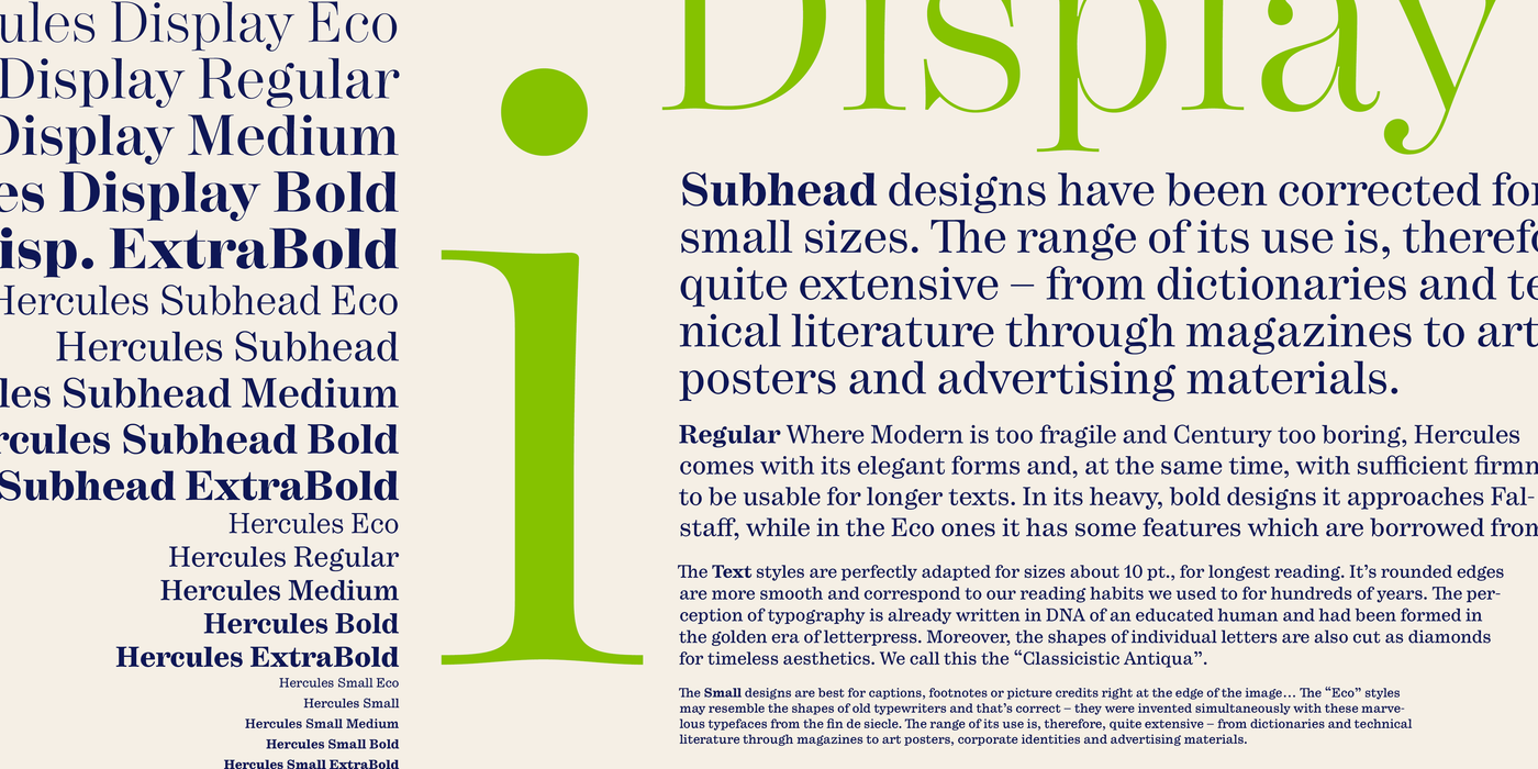
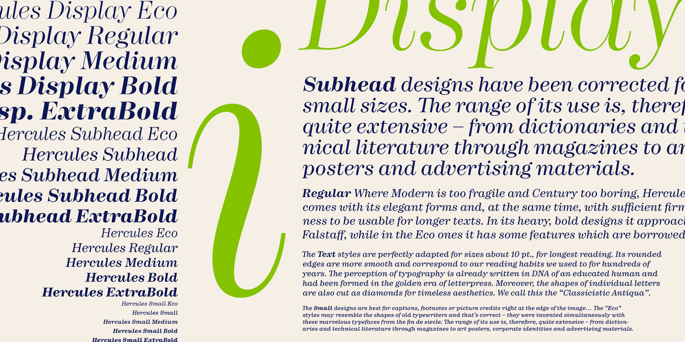
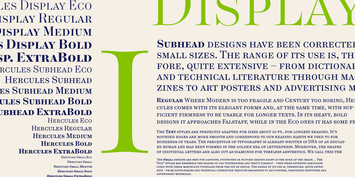
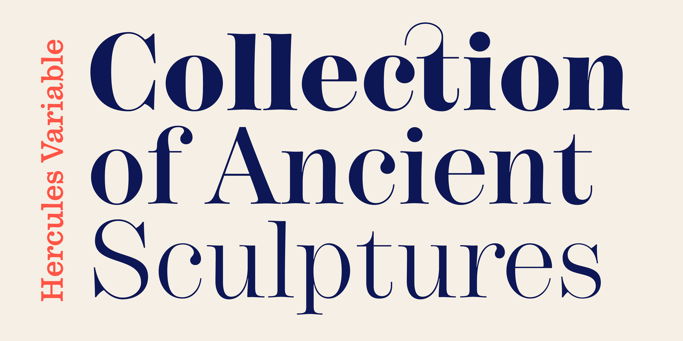
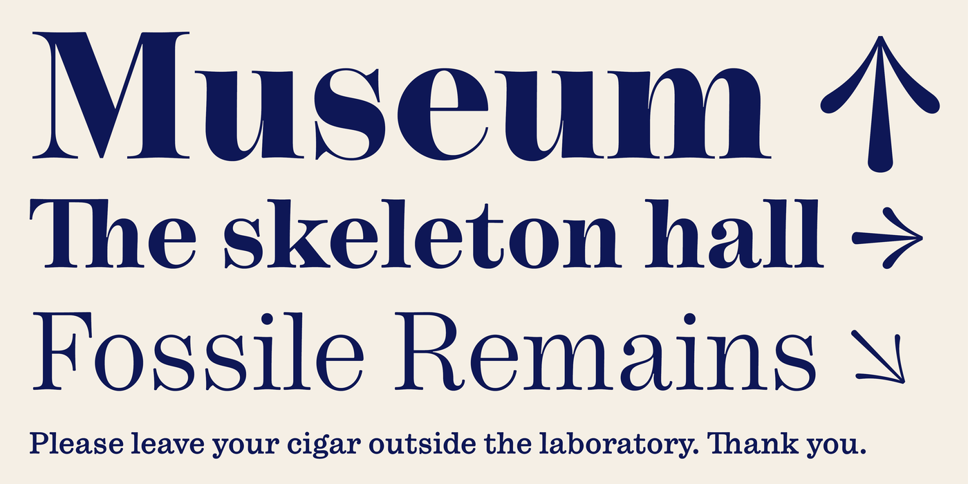
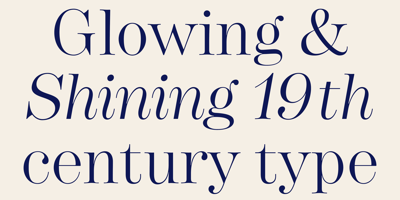
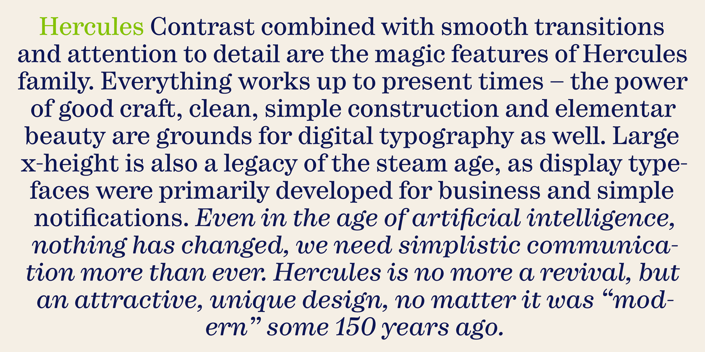
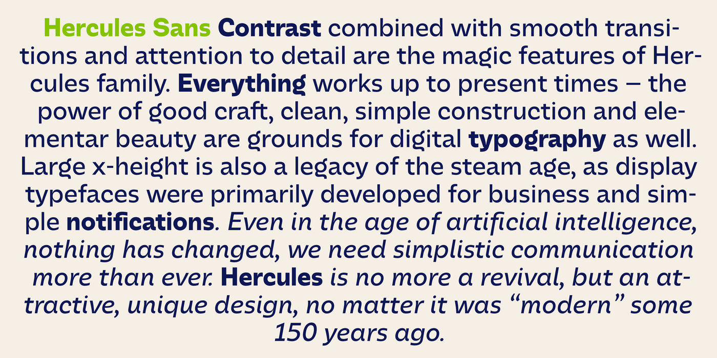
    The iconic 19th century modern book superfonts. Contrast combined with smooth transitions and attention to detail are the magic features of Hercules family, coming from the letterpress era. Everything works up to present times – the power of good craft, clean, simple construction and elementar beauty are grounds for digital typography as well. Large x-height is also a legacy of the steam age, as display typefaces were primarily developed for the industrial revolution. Even in the age of artificial intelligence, nothing has changed, we need simple and easy communication more than ever. Hercules is no more a revival, but an attractive, unique design, no matter it was “modern” some 150 years ago. Subhead designs have been corrected for small sizes. Regular: where Modern is too fragile and Century too boring, Hercules comes with its elegant forms and, at the same time, with sufficient firmness to be usable for longer texts. In its heavy, bold designs it approaches Falstaff, while in the Eco ones it has some features which are borrowed from Didot. The Text styles are perfectly adapted for sizes of about 10 pt., for longest reading. Its rounded edges are more smooth and correspond to our reading habits we used to for hundreds of years. The perception of typography is already written in DNA of an educated human and had been formed in the golden era of letterpress. Moreover, the shapes of individual letters are also cut as diamonds for timeless aesthetics. We call this the “Classicistic Antiqua”. The Small designs are best for captions, footnotes or picture credits right at the edge of the image. The “Small Eco” styles may resemble the shapes of old typewriters and that’s correct – they were invented simultaneously with these marvelous typefaces. The range of its use is, therefore, quite extensive – from dictionaries and technical literature through lifestyle magazines to art posters, corporate identities and advertising materials.
    Kontrast v kombinaci s hladkými přechody a smyslem pro detail, to jsou kouzelné rysy rodiny Hercules, čerpající z éry knihtisku. Vše funguje jako dřív – síla dobrého řemesla, čistá, jednoduchá konstrukce a elementární krása jsou základem i pro digitální typografii. Velká výška minusek je ovšem dědictvím věku páry, protože titulková písma byla primárně vyvinuta pro průmyslovou revoluci. Ani v době umělé inteligence se nic nezměnilo, snadnou a plynulou komunikaci potřebujeme více než kdy jindy. Hercules je i dnes atraktivním, jedinečným fontem, bez ohledu na to, že byl „moderní“ někdy před 150 lety. Velikost závisí na optických vlastnostech písma pro pohodlné čtení a je důležitá pro prevenci únavy očí. Ve svých tučných, odvážných řezech se blíží Falstaffu, zatímco v těch, pojmenovaných Eco, má vlastnosti podobné Didotu. Textové řezy jsou dokonale přizpůsobeny pro velikosti kolem 10 bodů, pro nejdelší čtení. Jeho zaoblené okraje jsou hladší a odpovídají našim čtenářským návykům, na které jsme byli zvyklí po stovky let. Vnímání typografie je již zapsáno v DNA vzdělaného člověka a dozrálo ve zlaté éře kovové sazby. Tvary jednotlivých písmen jsou navíc vybroušeny jako diamanty pro nadčasovou estetiku. Říkáme tomu „klasicistní antikva“. Řezy Small jsou nejlepší pro popisky, poznámky pod čarou nebo kredity přímo v okraji obrázku. Styly „Small Eco“ mohou připomínat tvary starých psacích strojů a je to tak – byly vynalezeny současně s těmito úžasnými stroji. Rozsah jeho využití je tedy poměrně široký – od slovníků a technické literatury přes módní časopisy až po umělecké plakáty, corporate identity a reklamní materiály.

    〗 Download PDF
    Tags
    poster  book  modern  revival  titling  klasické  serif  classicistic  economizing  classical  eco  empire 
    ©2025 Storm Type Foundry
  • made by Gravastar s.r.o.