Cookies help us deliver our services. By using our services, you agree to our use of cookies.Got it
  • ☾☼
  • 🛒 (0) 0,00 USD
  • Change currency
    • CZK
    • EUR
    • USD
  • Currency
    • CZK
    • EUR
    • USD
  • Login
  • Licensing
  • Font Packages
  • Custom Fonts
  • Printed Materials
  • Bestsellers
  • Cyrillic
  • Greek
  • Contact Us
  • Facebook
  • Instagram
  • About Us
  • People
  • Help
  • Rules and Conditions
  • Privacy Policy
  • GDPR
❓ Storm Type Foundry
  • Sans-serif 
    • Academica Sans
    • Amor Sans
    • Amphibia
    • Andulka Sans
    • Anselm Sans
    • Bahnhof
    • Beletrio
    • Carot Mono
    • Carot Sans
    • Clara Sans
    • DynaGrotesk
    • Etelka Pro
    • Header
    • Hercules Sans
    • Inicia
    • Jannon Sans
    • Jasan
    • John Sans
    • Josef Sans
    • Melange
    • Metron
    • Populus
    • Quercus C
    • Quercus Sans
    • Quercus Whiteline
    • Sebastian
    • Shompen
    • Solpera
    • Splendid Sans
    • St Croce Pro
    • Superscience
    • Teuton
    • Trivia Gothic
    • Trivia Grotesk
    • Trivia Sans
    • Vida
    • Walbaum Grotesk
    • Zeppelin Grotesk
  • Serif 
    • Academica
    • Alebrijes
    • Amor Serif
    • Andulka
    • Anselm Serif
    • Antique
    • Areplos
    • Baskerville Neo
    • Baskerville Original
    • Beletria
    • Biblon Pro
    • Carot Display
    • Carot Slab
    • Carot Text
    • Clara Serif
    • Comenia Serif Pro
    • Defender
    • Ermina
    • Etelka Slab
    • Farao
    • Genre
    • Hercules Neo
    • Jannon Antiqua
    • Jannon Neo
    • Juvenis
    • Kingdom
    • Lexon
    • Lido STF
    • Mediaeval
    • Mramor
    • Pentagraf
    • Pepone
    • Preissig Antikva
    • Preissig Poster
    • Quercus Serif
    • Quercus Ten
    • Regent
    • Regula
    • Serapion
    • Tenebra
    • Trivia Humanist
    • Trivia Serif
    • Trivia Serif 10
    • Trivia Slab
    • Tusar
    • Tyfa Antikva
    • Walbaum 2010 Pro
  • Blackletter 
    • Coroner
    • Dracula
    • Dream Within A Dream
    • Friedhof
    • Hexenrunen
    • Julinka
    • Monarchia
    • Moyenage
    • Moyenage Sans
    • Plagwitz
    • Spiritist
    • Wittingau
  • Decorative 
    • Abalda
    • Aichel
    • Alcoholica
    • Andaluz
    • Bhang
    • Brauer
    • Briefmarken
    • Clichee
    • Cobra
    • Compur
    • Enamelplate
    • Excelsor Script
    • Fenix
    • Gallus Konzept
    • Hammertone
    • Ideal Gothic
    • Libcziowes
    • Lokal Script
    • Modell
    • Mortal
    • Negro
    • Patzcuaro
    • Pivo
    • Politic
    • Rondka
    • Rooftiles
    • Splendid Quartett
    • Stencilul
    • Technomat
    • Traktoretka
  • Font Packages 
    • Baskerville Sans & Serif
    • Carot Complete
    • Hercules Sans & Serif
    • Jannon Sans & Serif
    • Storm Type Library 7
    • Trivia Complete
    • Walbaum Sans & Serif
    •  
    • Academica Value Pack
    • Andulka Value Pack
    • Anselm Value Pack
    • Baskerville Value Pack
    • Beletria Value Pack
    • Carot Value Pack
    • Clara Value Pack
    • Hercules Value Pack
    • Jannon Value Pack
    • JBW Value Pack
    • Quercus Value Pack
    • Trivia Grotesk Value Pack
    • Trivia Humanist Value Pack
    • Walbaum Value Pack
8 fonts :
190,00 USD
(23,75 USD per font)
🛒 add to cart

Amor Serif
Buying options: Storm Type Library 7: 11000,00 USD

  • Typefaces
  • Gallery


  • Full amor serif 2x1 2
    Full amor serif 2x1 3
    Full amor serif 2x1 4
    Full amor serif 2x1 5
    Full amor serif 2x1 6
    Full amor serif 2x1 7
    Full amor serif 2x1 1
    PreviousNext

    Amor Serif

    by František Štorm

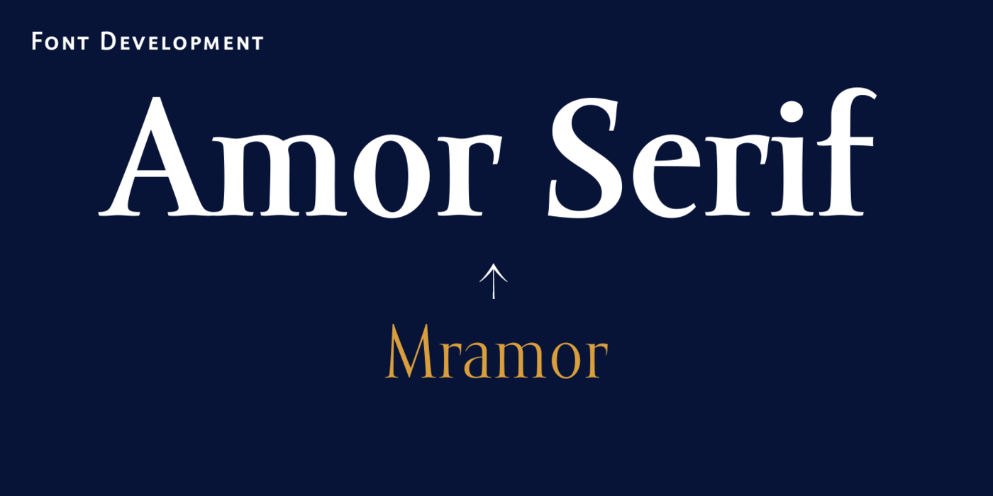
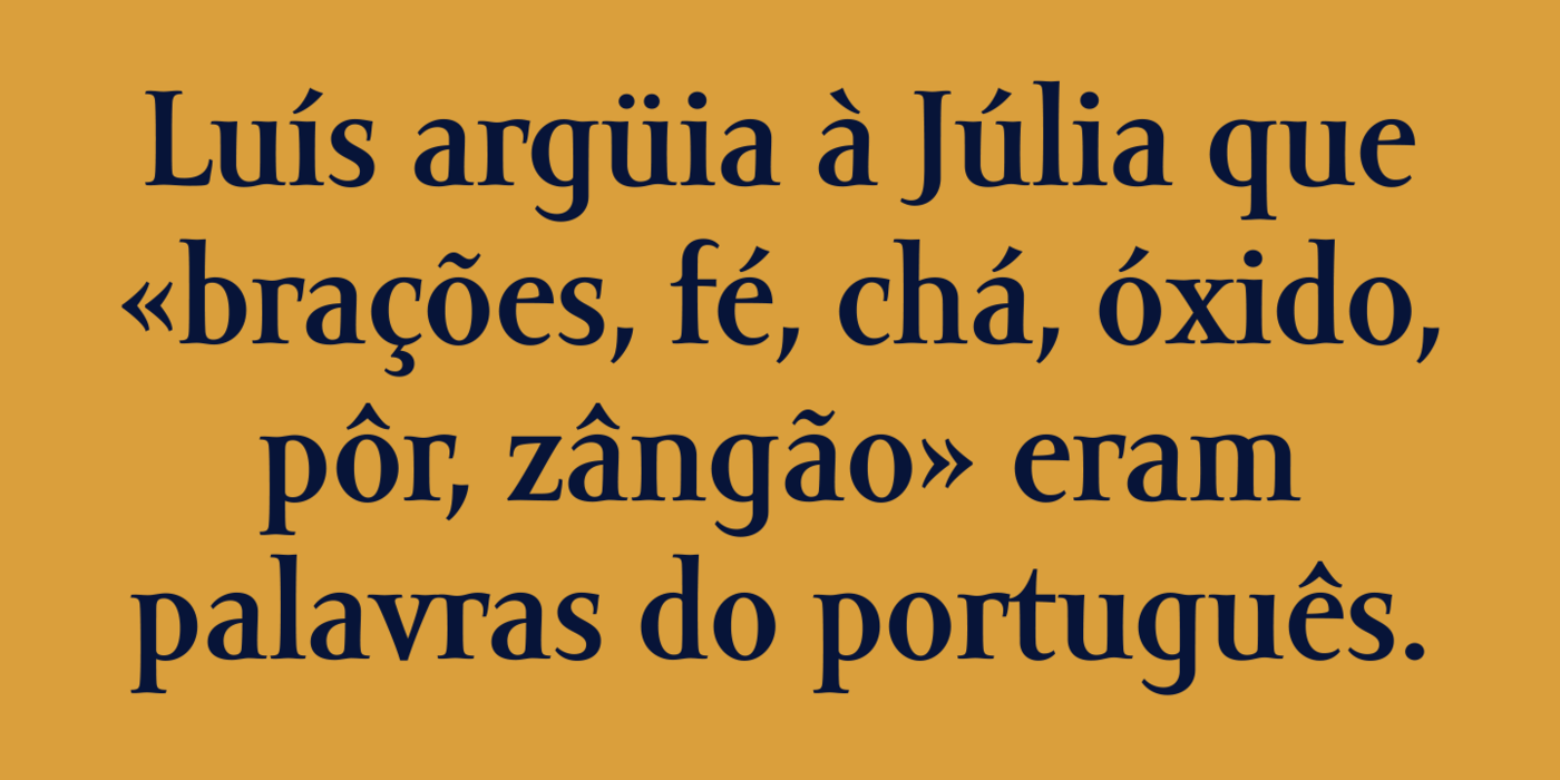
    Monumental inscriptional majuscule originally carved in stone, sometimes called "Roman Capital", is a craddle of upper-case part of latin alphabet. Its narrowed form, derived from handwritten original used between first to third century A. C., served as inspiration to typeface Mramor, which I have drawn with ink on paper in 1988 under Jan Solpera's leadership. After composing negative letters on a strip of film there was possible to use Mramor through first phototypesetting devices. In 1994 with the help of Macintosh IIvi I have made also lower-case letters and bolds, and issued this typeface as 14-font family. After some years of using Mramor for various purposes, I realized a need of modernization and humanizing its very fragile appearance, as well as removing of numerous decorative useless parts. Besides that, type design made a huge technical progress in past few years, so I was able to finish the remaining cca 9600 glyphs contained in the present font system names Amor Sans & Serif Pro.
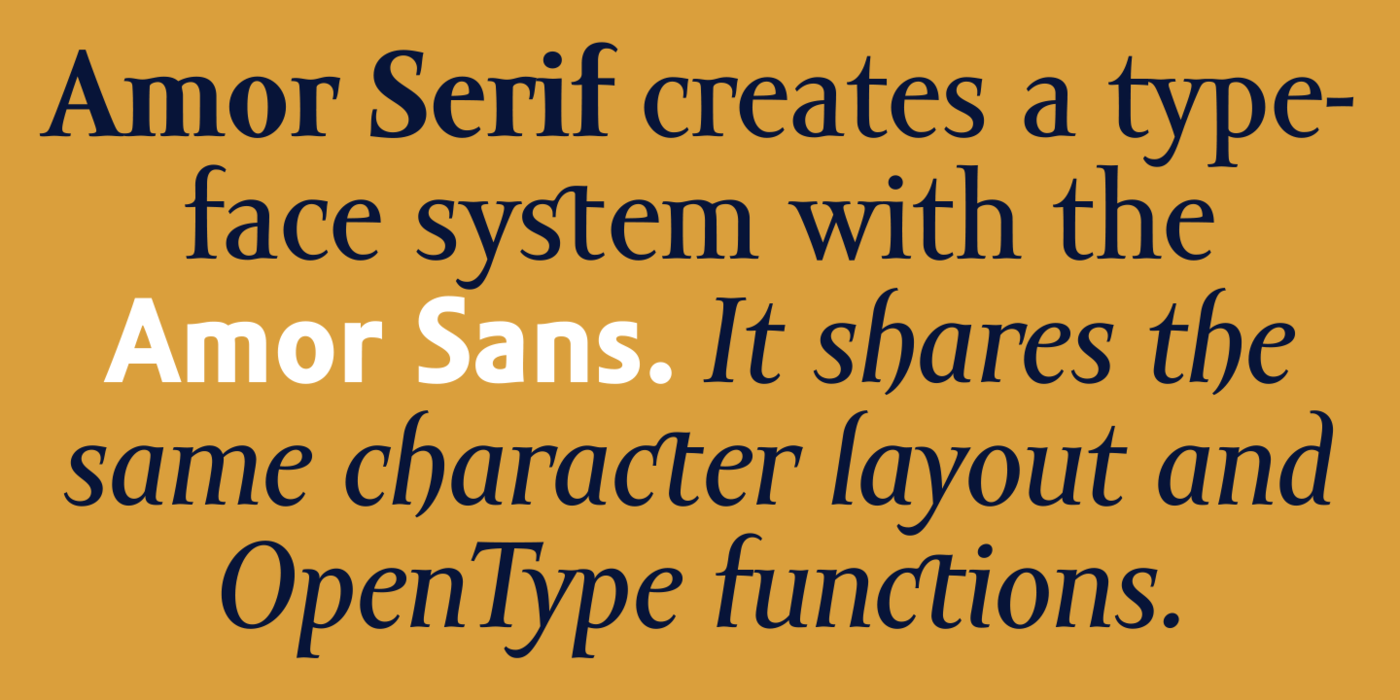
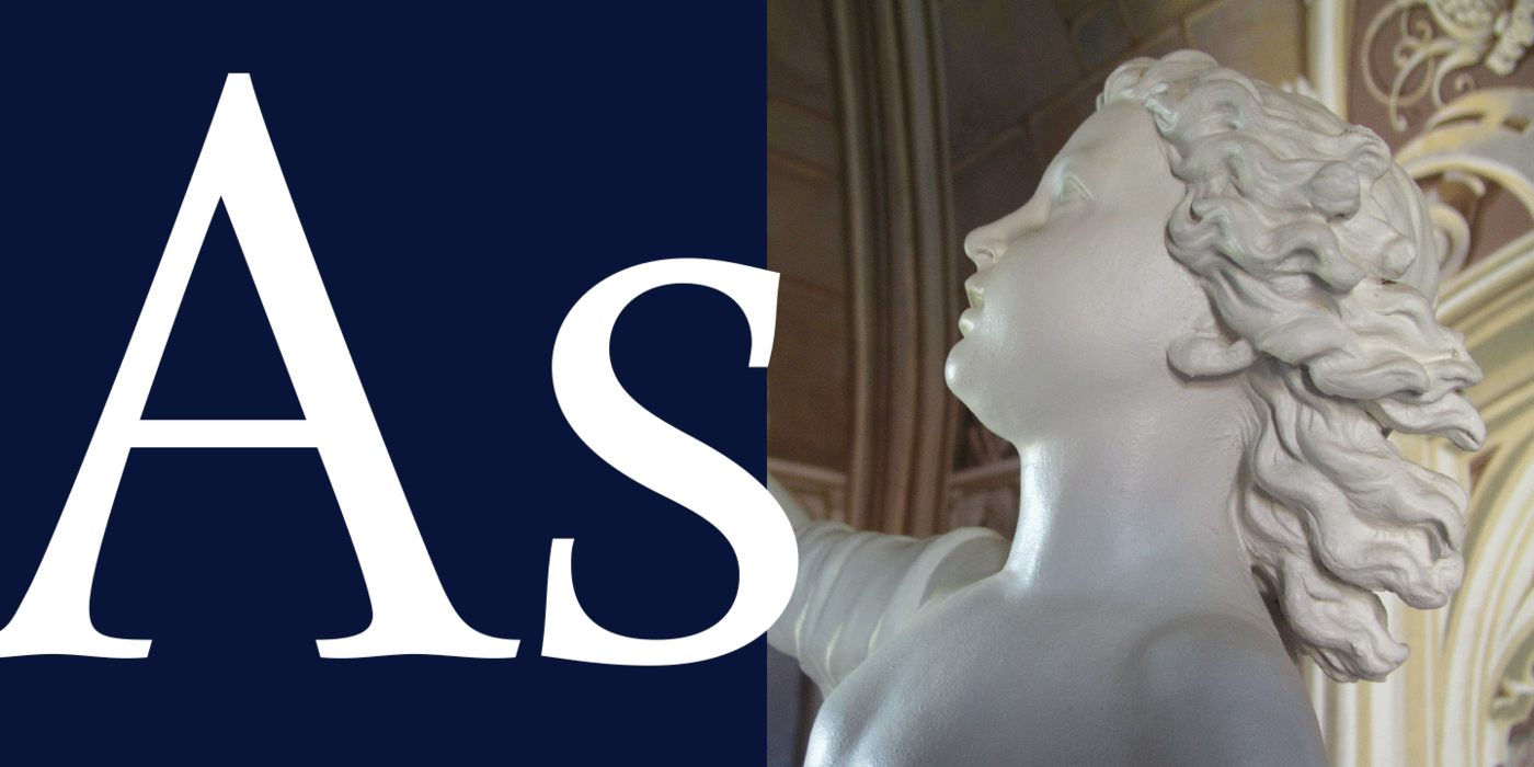
    It is already usual to combine sans- and serif fonts within one family, in order to distinguish historical part from contemporary, a plain chapter from a special one, or, in quotations, to divide speaking persons. Sans-serif typeface don't arise by simple removing serifs, it has to be drawn completely separeately, when ocassionally many declined forms may be made, considered to the serifed original. Neverteless, both parts of this type system appear consistent as for proportional, aesthetic and emotional atmosphere. Usage of type is often closely linked to its original inspiration, in this particular case with architecture and figurative sculpture. An inner "order" was also text setting in smaller sizes. A smooth scale of weights enriches the possibilities in designing of magazines, brochures, exposition catalogues and corporate indentity. Economizing, but opened shape of characters is well legible and antique hint comes into play after longer reading.

    Antická monumentální nápisová majuskula původně tesaná do kamene, někdy také nazývaná „římská kapitála“, je kolébkou versálkové části latinkové abecedy. Její zúžená forma, odvozená od ručně psané varianty z prvního až třetího století našeho letopočtu, posloužila jako inspirace k písmu Mramor, které jsem ručně nakreslil tuší na papír v roce 1988 pod vedením Jana Solpery. Po namontování negativních liter na pás filmu šlo dokonce Mramor používat v prvních titulkových fotosázecích zařízeních. V roce 1994 jsem s pomocí Macintoshe IIvi nakreslil minusky a tučné řezy, a písmo vydal ve čtrnácti řezech. Po letech používání k různým účelům se ukázala nutnost aktualisace a zlidštění příliš křehkého obrazu liter, stejně jako odstranění četných dekorativních zbytečností. Pronikavý technologický pokrok mě začátkem roku 2005 donutil k dopracování zbývajících zhruba 9600 znaků, ze kterých se skládá přítomný písmový systém jménem Amor Sans & Serif Pro.
    Dnes je již obvyklé kombinovat patkové a bezpatkové řezy v rámci jedné rodiny, kde je třeba odlišit (například v knize) část historickou a současnou, kapitolu obecnou od speciální, či v přímé řeči jednotlivé hovořící osoby. Bezserifové písmo ovšem nevzniká pouhým odstraněním serifů, musí se kreslit úplně jinak, přičemž mimoděk vzniká řada odlišností od patkového základu. Přesto se podařilo tento písmový systém udržet ve stejné proporční, kresebné i výtvarně-emotivní atmosféře. Použití písma je obvykle úzce spjato s jeho původní inspirací, v tomto případě s architekturou a figurální plastikou. Vnitřní „objednávkou“ byla textová sazba v malých velikostech. Jemné odstupňování jednotlivých tučností rozšiřuje možnosti v úpravě časopisů, brožur, výstavních katalogů i firemních tiskovin. Úsporná, leč otevřená kresba je dobře čitelná a klasický nádech se uplatňuje až po delším čtení.

    〗 Download PDF
    Tags
    magazine  headlines  cyrillic  invitation  exhibition  signage  catalogue  contemporary  advertising  monumental  peaceful  inscriptional  Roman Capital  Antic  stone  majuscule  carved 
    ©2025 Storm Type Foundry
  • made by Gravastar s.r.o.