Cookies help us deliver our services. By using our services, you agree to our use of cookies.Got it
  • 〖 (0) 0,00 USD
  • Login
❓ Storm Type Foundry
  • Sans-serif 
    • Abalda
    • Amor Sans
    • Amphibia
    • Andulka Sans
    • Anselm Sans
    • Bahnhof
    • Beletrio
    • Carot Mono
    • Carot Sans
    • Clara Sans
    • DynaGrotesk '95
    • DynaGrotesk Pro
    • Etelka
    • Etelka Sans
    • Header
    • Inicia
    • Jannon Sans
    • Jasan
    • John Sans
    • Josef Sans
    • Metron
    • Quercus C
    • Quercus Whiteline
    • Sebastian
    • Solpera
    • Splendid Sans
    • Teuton
    • Trivia Gothic
    • Trivia Grotesk
    • Trivia Sans
    • Vida
    • Walbaum Grotesk
    • Zeppelin
  • Serif 
    • Academica
    • Alebrijes
    • Amor Serif
    • Andulka
    • Anselm Serif
    • Antique
    • Areplos
    • Baskerville Original
    • Beletria
    • Biblon Pro
    • Carot Display
    • Carot Slab
    • Carot Text
    • Clara Serif
    • Comenia Serif Pro
    • Defender
    • Ermina
    • Etelka Slab
    • Farao II
    • Genre
    • Hercules
    • Jannon
    • Lexon
    • Lido STF
    • Mediaeval
    • Mramor
    • Pentagraf
    • Pepone
    • Preissig Antikva
    • Preissig Poster
    • Quercus Serif
    • Quercus Ten
    • Regent
    • Regula
    • Serapion
    • Tenebra
    • Trivia Humanist
    • Trivia Serif
    • Trivia Serif 10
    • Trivia Slab
    • Tusar
    • Tyfa Antikva
    • Walbaum 2010 Pro
  • Blackletter 
    • Coroner
    • Dracula
    • Dream Within A Dream
    • Friedhof
    • Hexenrunen
    • Monarchia
    • Moyenage
    • Moyenage Sans
    • Plagwitz
    • Spiritist
    • Wittingau
  • Other 
    • Aichel
    • Alcoholica
    • Bhang
    • Briefmarken
    • Clichee
    • Cobra
    • Compur
    • Enamelplate
    • Excelsor Script
    • Fenix
    • Gallus Konzept
    • Hammertone
    • Ideal Gothic
    • Juvenis
    • Libcziowes
    • Lokal Script
    • Modell
    • Mortal
    • Negro
    • Patzcuaro
    • Pivo
    • Politic
    • Rondka
    • Rooftiles
    • Splendid Quartett
    • St Croce
    • Stencilul
    • Technomat
    • Traktoretka
  • Packages 
    • All Sans
    • Alpha 1 Single License
    • Andulka Sans & Serif
    • Anselm Sans & Serif
    • Baskerville Sans & Serif
    • Beletria + Beletrio
    • Carot Complete
    • Essential SL
    • Etelka Sans & Slab
    • Jannon Sans & Serif
    • Josef Sans & Serif
    • Quercus System
    • SOL 3.0
    • Storm Type Library 5
    • Trivia Pro
    • Walbaum Sans & Serif
  • ✤
8 fonts :
149,00 USD
(18,63 USD per font)
✦ add to cart

Farao II
in: Storm Type Library 5, Essential SL, Alpha 1 Single License

  • Typefaces
  • Gallery


  • Cascade farao ii 2
    Cascade farao ii posters4
    Cascade farao ii posters5
    Cascade farao ii3 png
    Cascade farao ii posters6
    Cascade farao ii posters12
    Cascade farao ii posters11
    Cascade farao ii posters7
    Cascade farao ii posters8
    Cascade farao ii posters10
    Cascade farao ii posters

    Farao II

    by František Štorm

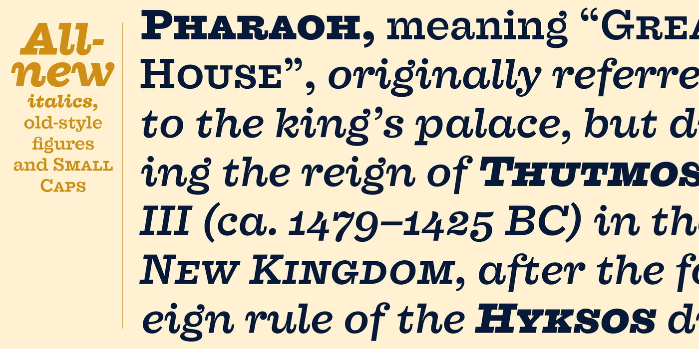
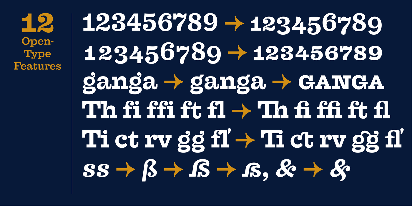
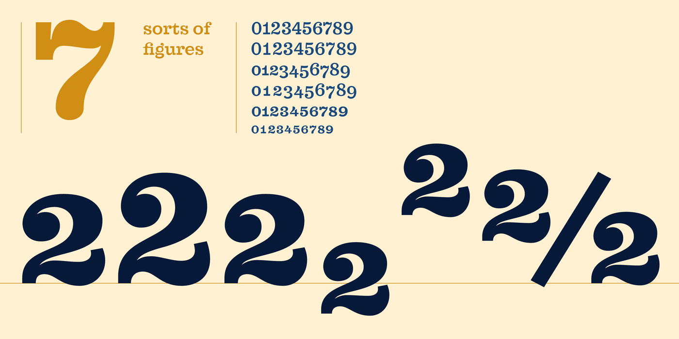
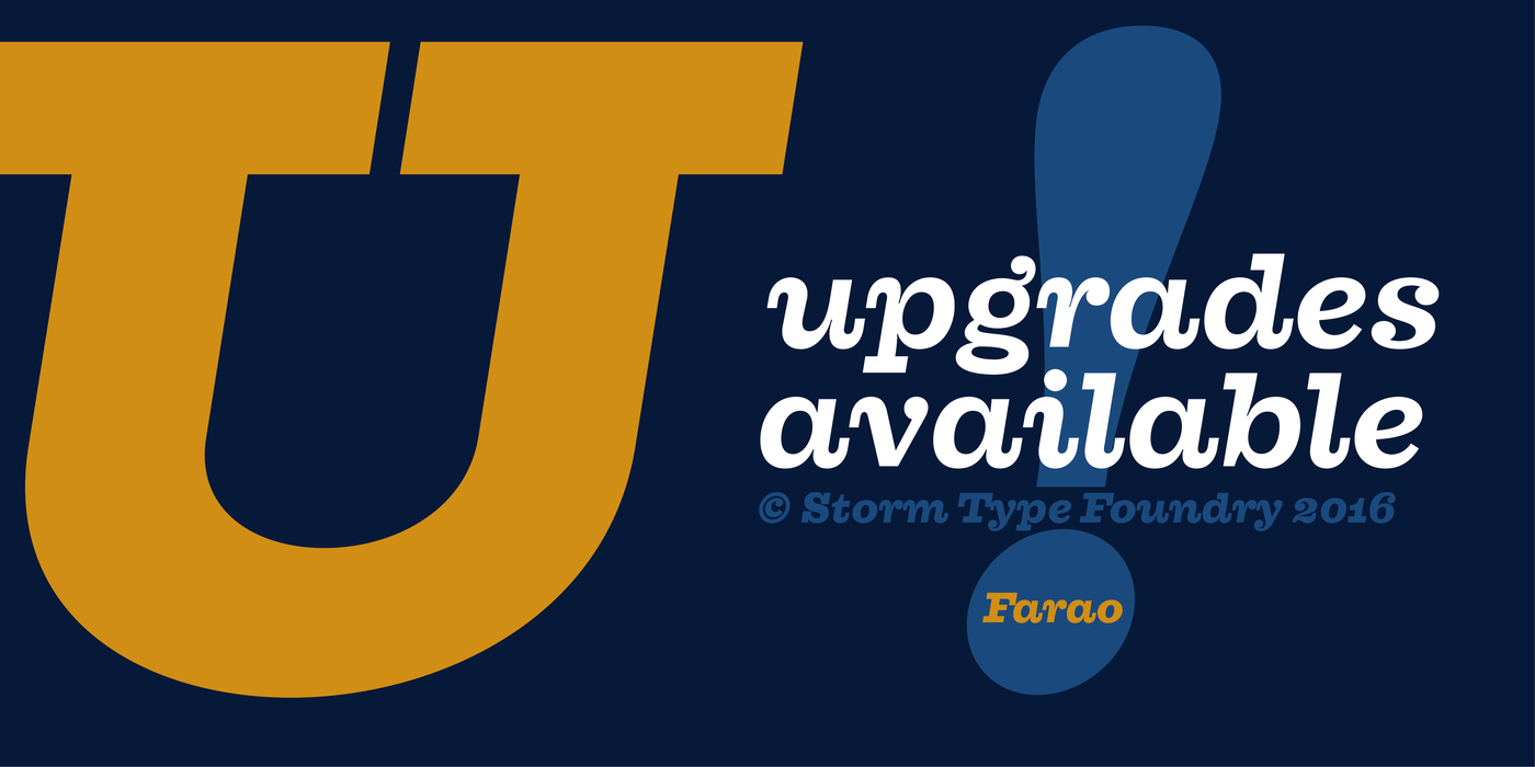
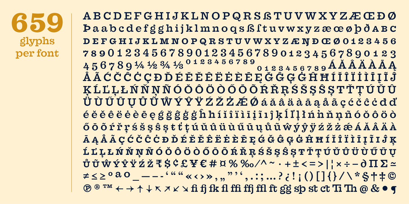
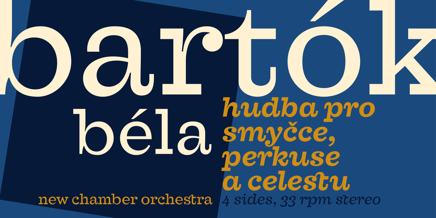
    Originally designed in 1998 as 3-font family, updated in 2016 by new italics, SmallCaps and many OpenType functions, resulting in a set of highly visible poster typefaces.
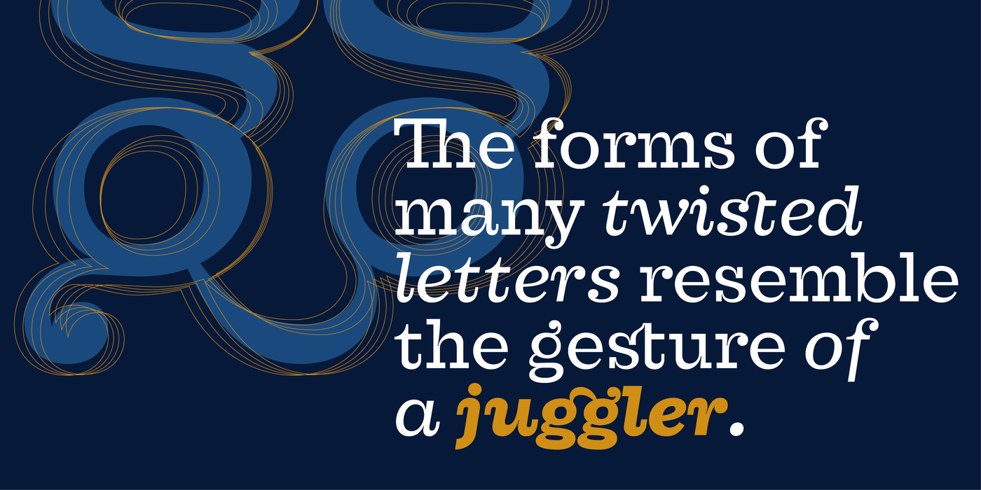
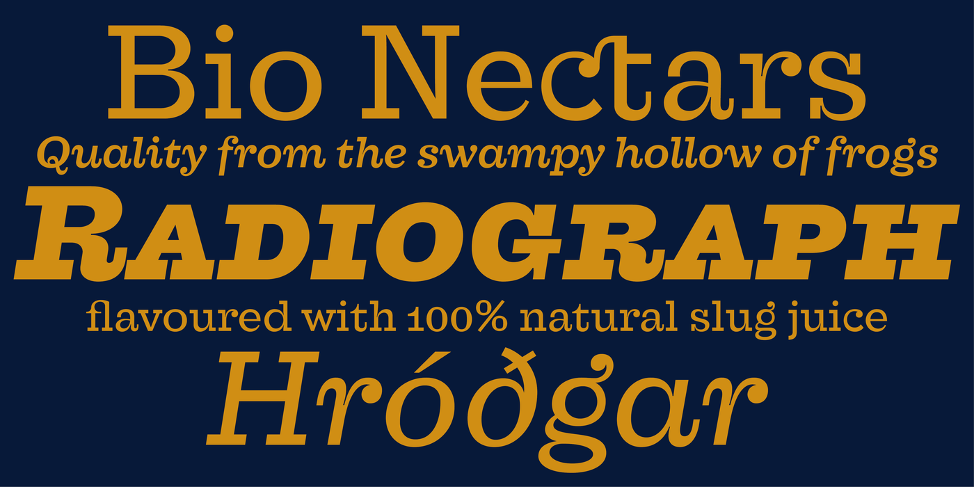
    If a text is set in a good Egyptienne, we can observe a kind of sparkle in the lines. Slab-serifs are cheerful type faces, possibly due to the fact that they developed simultaneously with Grotesque typefaces. The design principle originating from the first half of the 19th century does not have such firm and long-established roots as for example, the Venetian Roman typefaces, hence it’s much more prone to a “decline”. We know of Egyptiennes with uneven colour, with letters falling backwards (this often happens in the case of “S”), and especially with slightly bizarre modelling of details. In the course of time, however, it was realized that such things could be quite pleasant and tempting. After a century and a half we find that such Egyptiennes could refresh the uniform computer typography. The forms of many twisted letters resemble the gesture of a juggler: others, rectangularly static ones, the profile of a rail or a steel girder – things which, in their time, were new and were observed by the first creators of Egyptiennes. These type faces are ideal for circus posters and programs for theatre performances, just as for printing on cement sacks.
    The bequest of the “declined” typography is the following: Let us not be like a machine, let us not be afraid of doing things in a slapdash way! Farao is consistently imperfect, in which it differs from the “cold” current slab-serif fonts.

    〗 Download PDF
    Tags
    poster headlines fancy black slab egyptienne egyptienka 
©2021 Storm Type Foundry
  • About Us
  • Contact Us
  • People
  •  
  •  
  • made by Gravastar s.r.o.
Connect

Facebook
E-Shop
  • Rules and Conditions
  • Licensing
  • Privacy Policy
  • GDPR
  • Help
Quick Links
  • Bestsellers
  • Packages
  • Custom Fonts
  • Cyrillic
  • Greek
  • Free Trial Fonts