Hercules Sans
- Typefaces
- Gallery
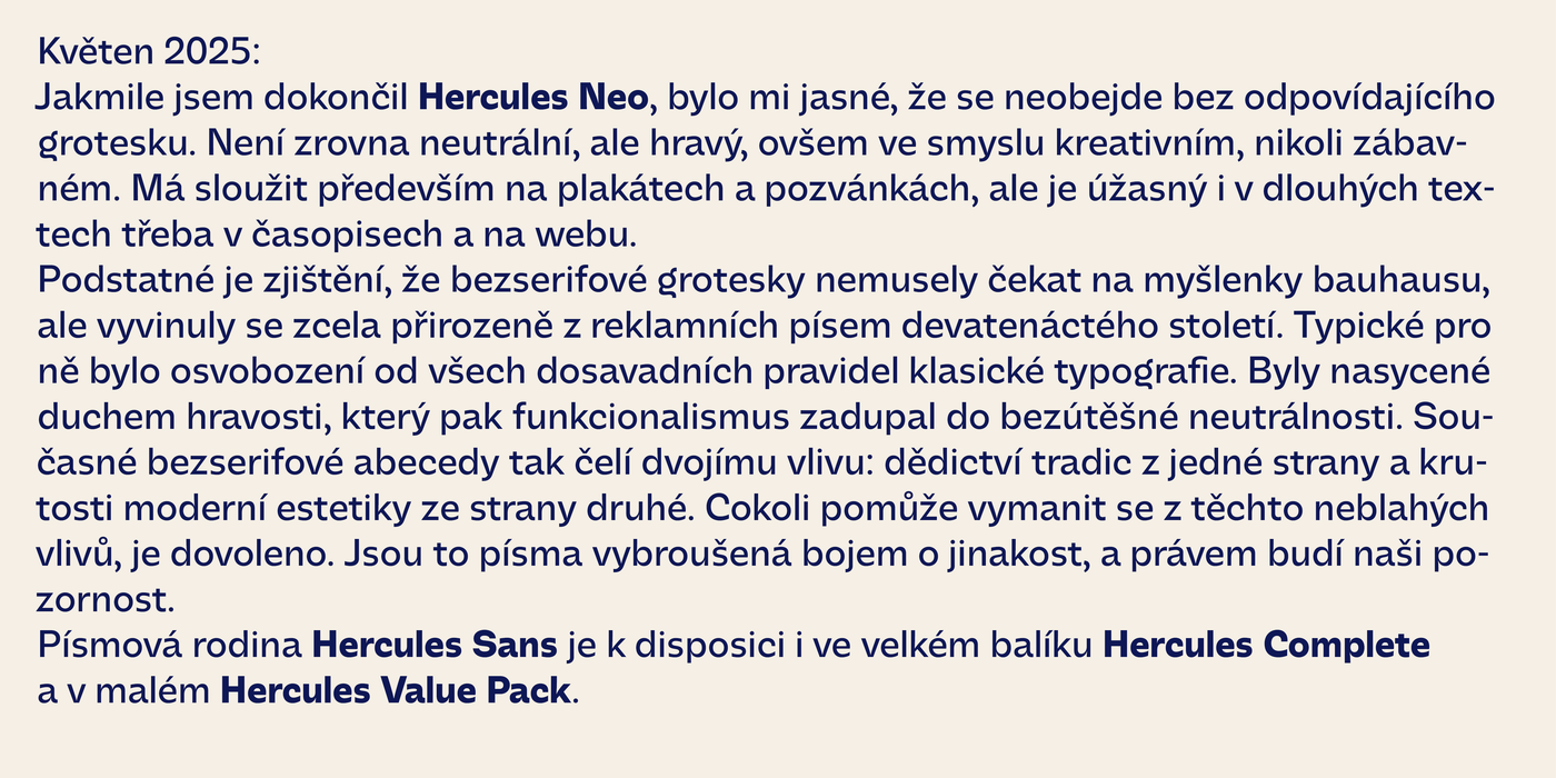
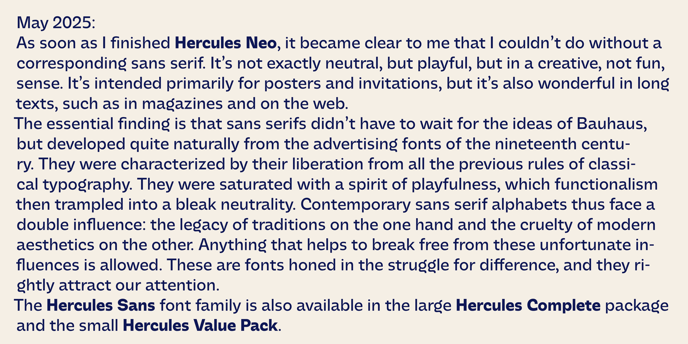
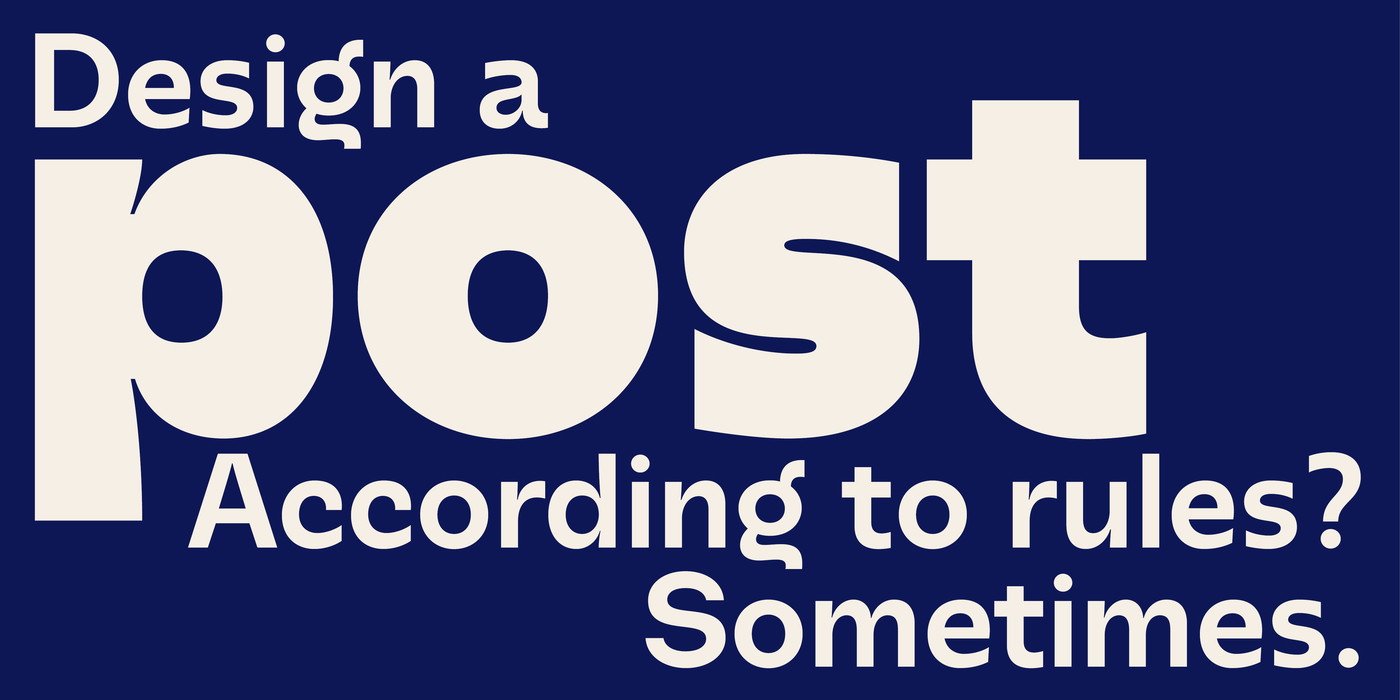
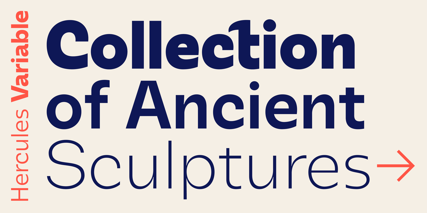
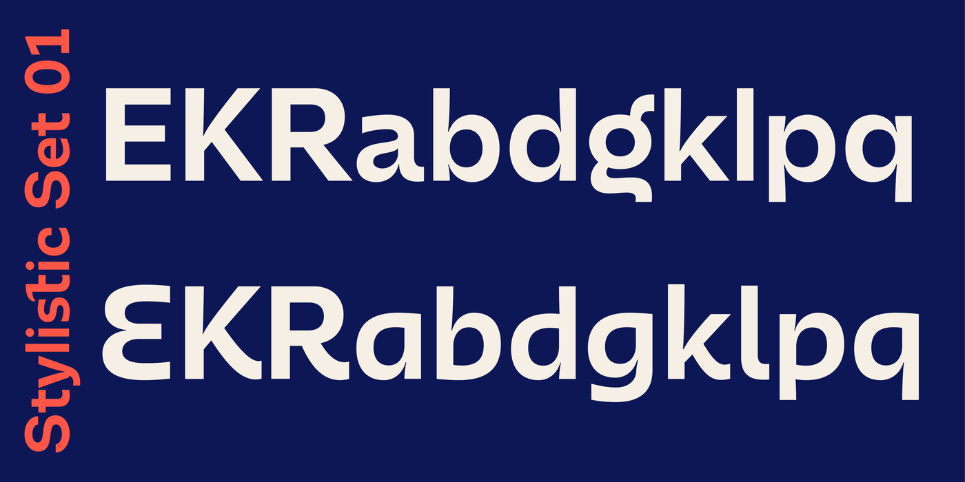
As soon as I finished Hercules Neo, it became clear to me that I couldn’t do without a corresponding sans serif. It’s not exactly neutral, but playful, but in a creative, not fun, sense. It’s intended primarily for posters and invitations, but it’s also wonderful in long texts, such as in magazines and on the web.
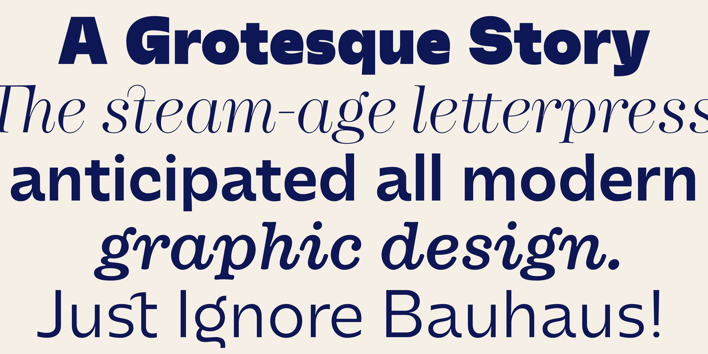
The essential finding is that sans serifs didn’t have to wait for the ideas of Bauhaus, but developed quite naturally from the advertising fonts of the nineteenth century. They were characterized by their liberation from all the previous rules of classical typography. They were saturated with a spirit of playfulness, which functionalism then trampled into a bleak neutrality. Contemporary sans serif alphabets thus face a double influence: the legacy of traditions on the one hand and the cruelty of modern aesthetics on the other. Anything that helps to break free from these unfortunate influences is allowed. These are fonts honed in the struggle for difference, and they rightly attract our attention.
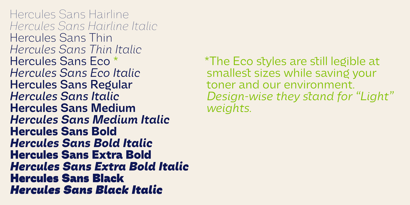
The Hercules Sans font family is also available in the large Hercules Complete package and the small Hercules Value Pack.