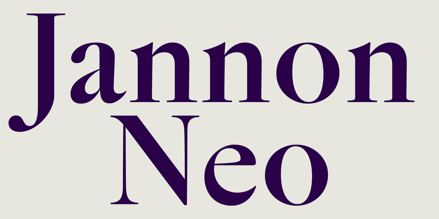
Jannon Neo
- Typefaces
- Gallery
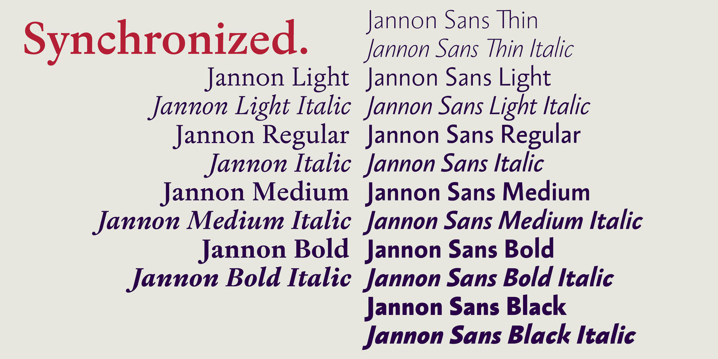
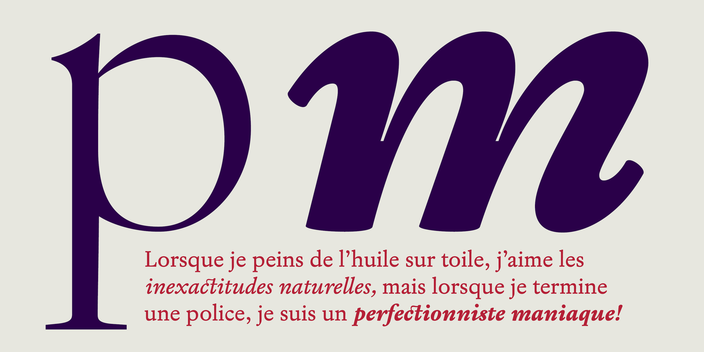
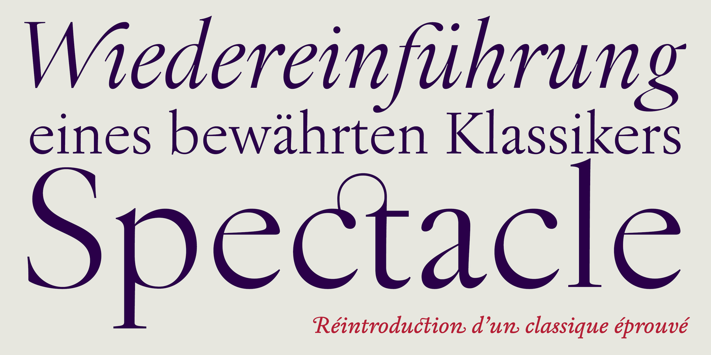
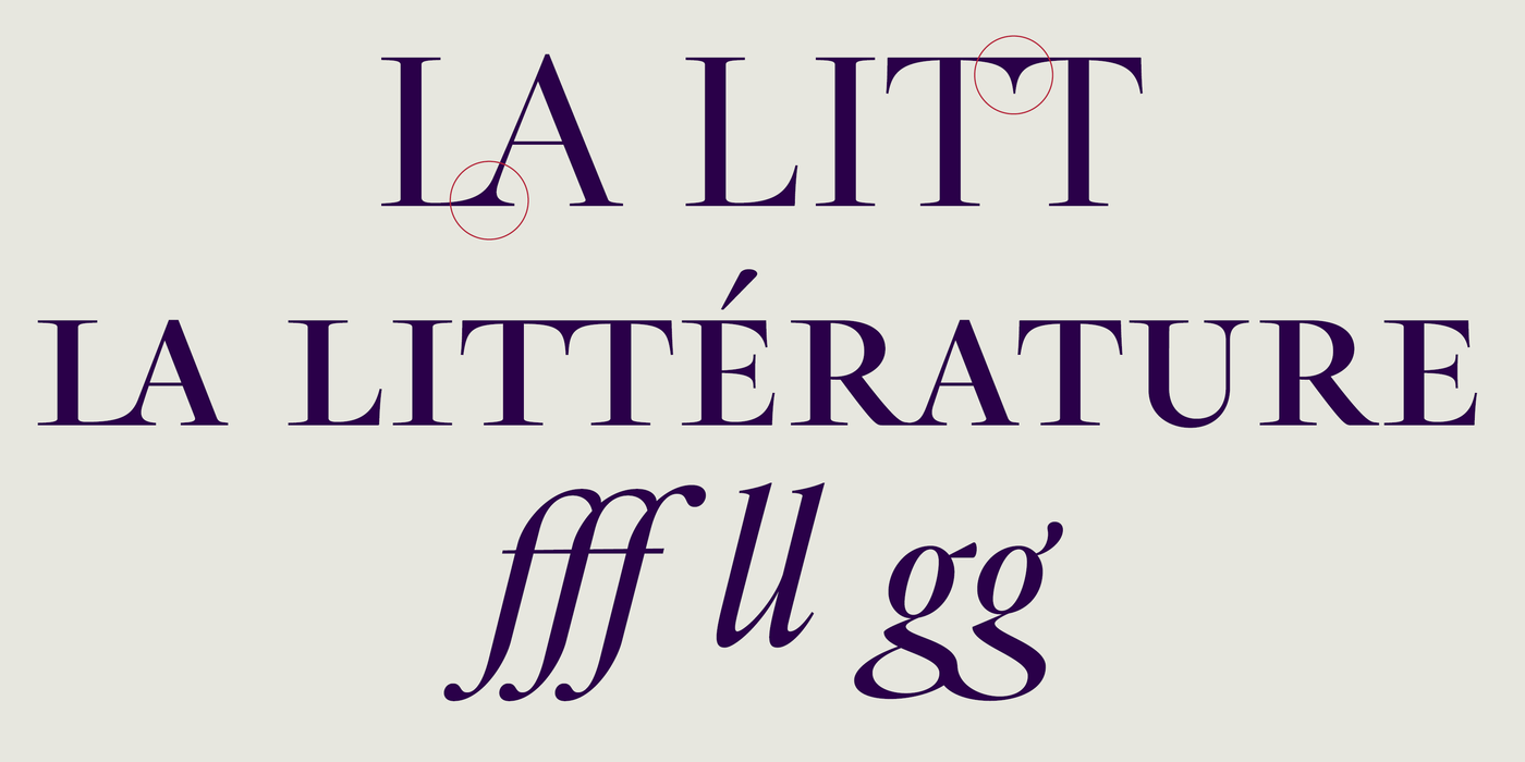
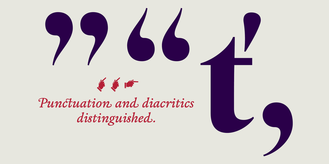
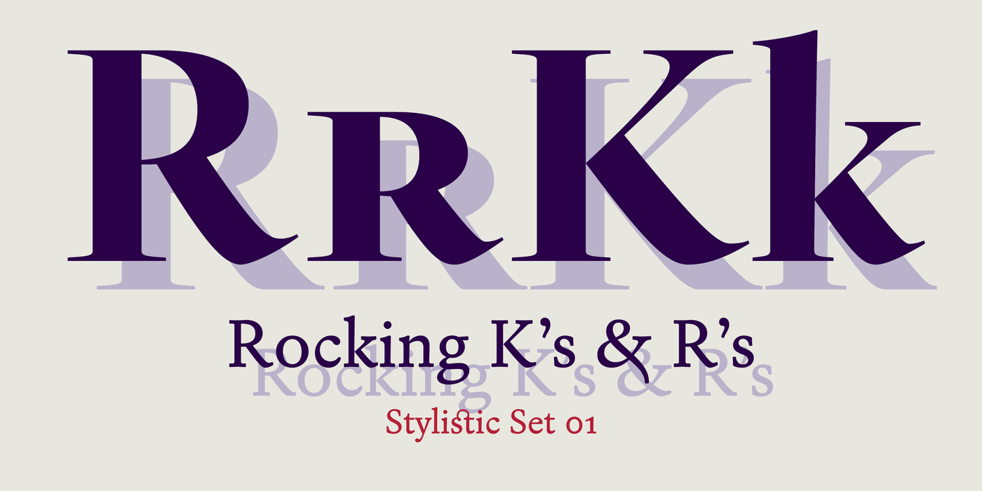
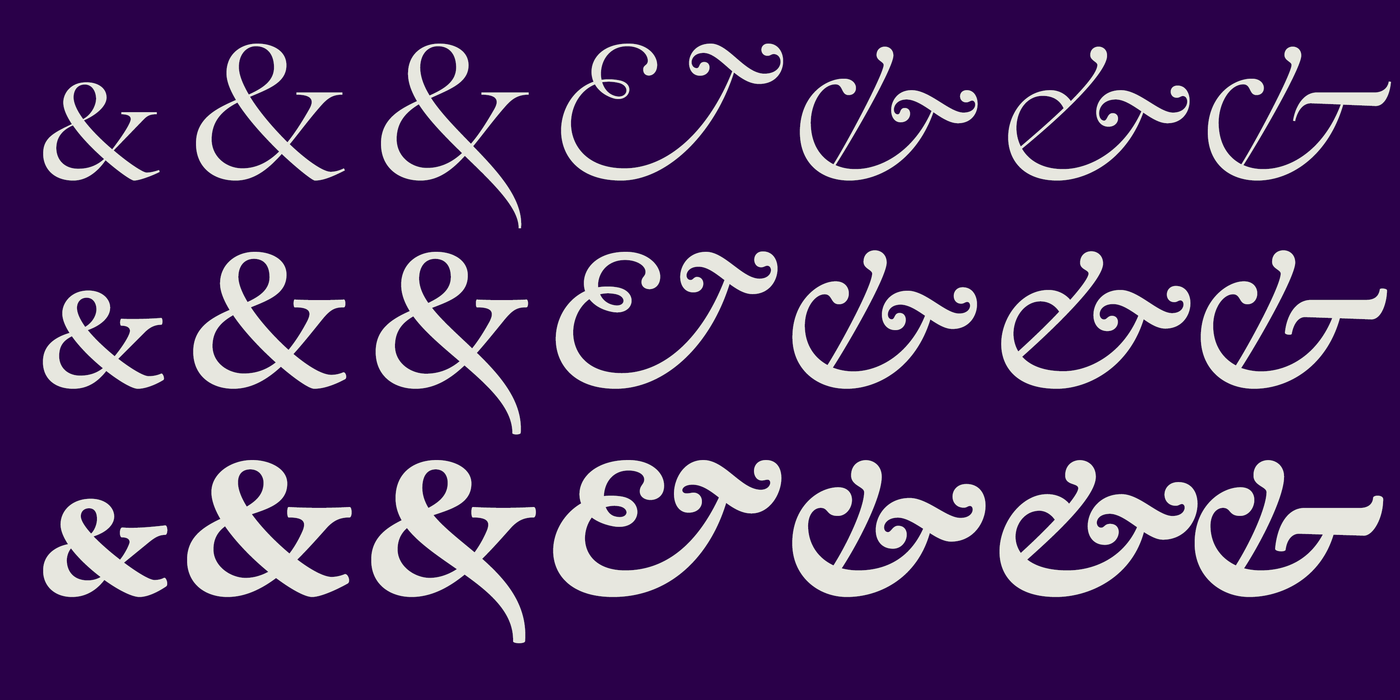
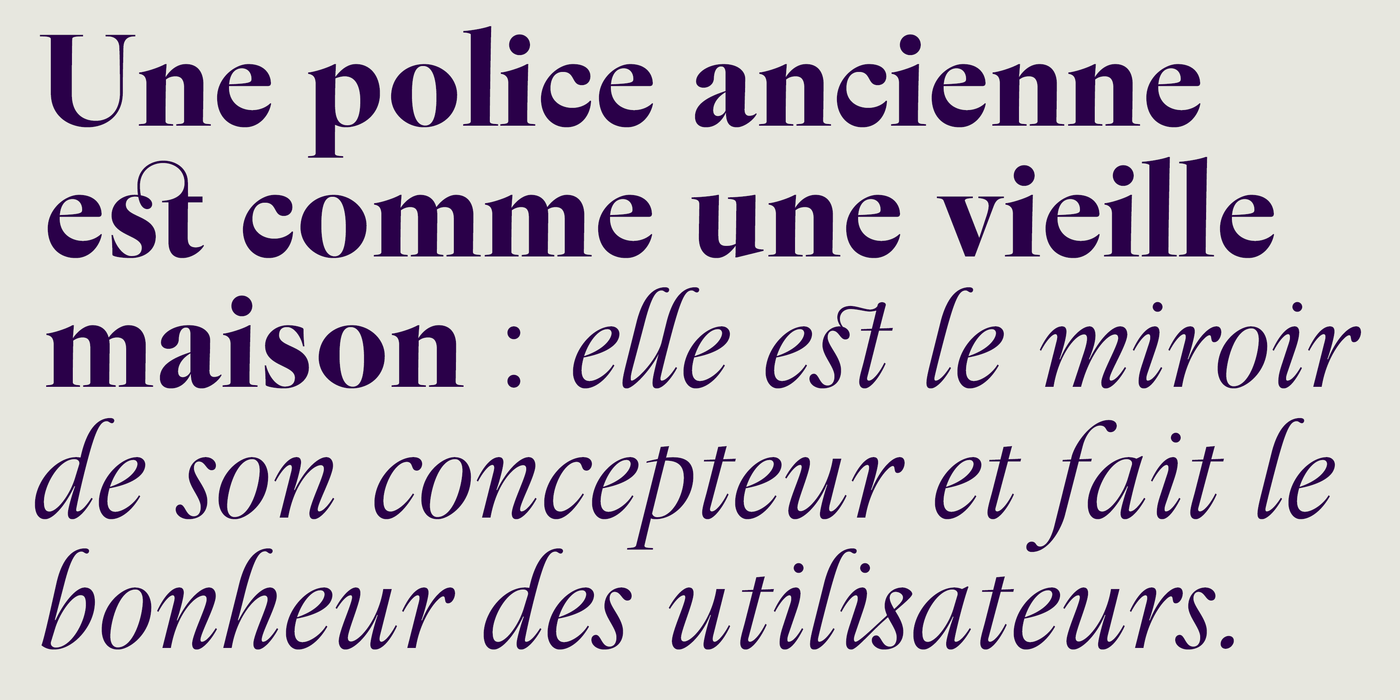
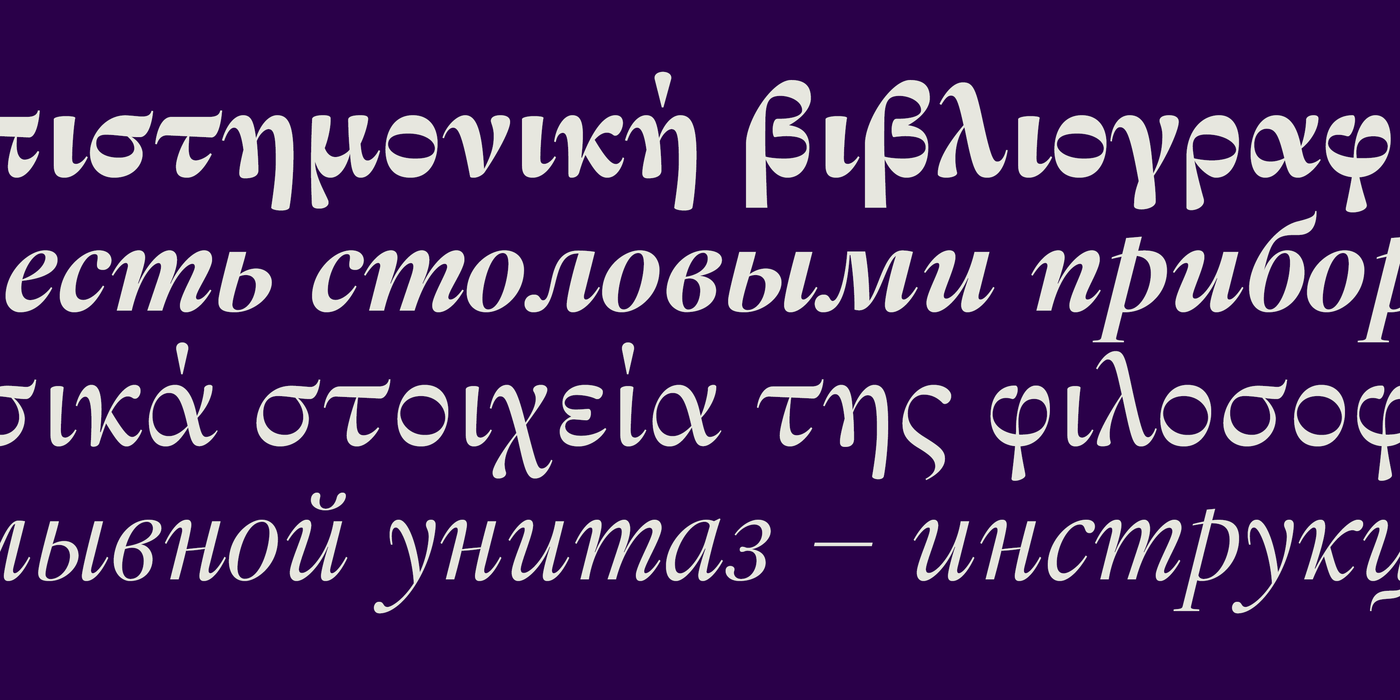
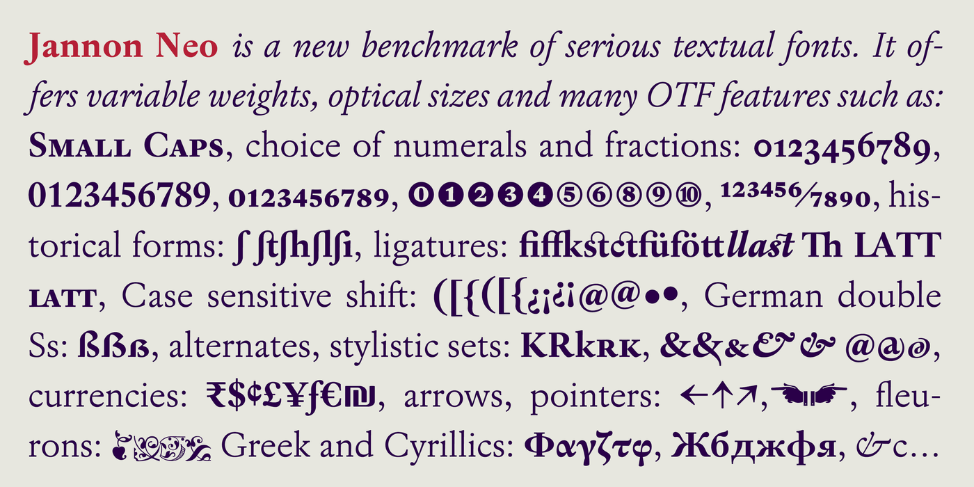
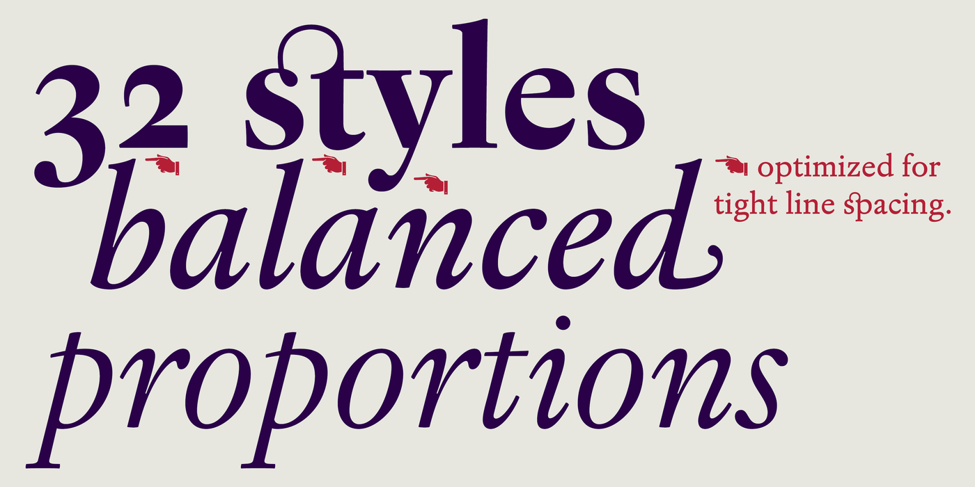
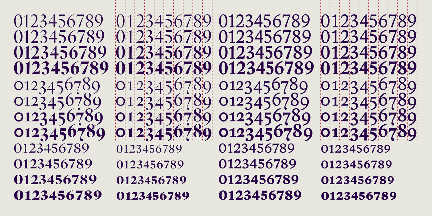
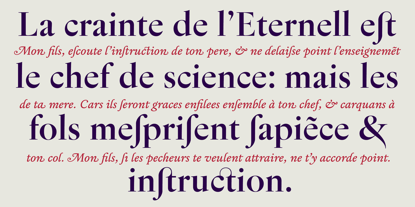
This early baroque typographic gem is crafted with passion to variable font. In the 1990s, when I didn’t enjoy the advent of computers, I wanted to reverently preserve inaccuracies, try to imitate the best of hand typesetting and letterpress. The fashion and dullness of the first imported fonts put me in the opposite position: searching for the poetics and unique spirit of the typeface and its creator, as opposed to the anonymous digital fonts of big companies. With the development of requirements for contemporary design, I got tired of those inaccuracies, and a maniacal perfectionism gradually set in, probably stimulated by Variable technology, when I can have small and large matrices in one file. I realized at high magnification how risky is to display picturesque inaccuracies at an inappropriate scale. In the days when one did not work with large font families, it was more like amateur archeology. With Jannon Neo, I am finally correcting the mistakes of the original version, both technical and drawing: the different tilting of the italics was somewhat wild, irregularities in the shaping of numbers and punctuation, the absence of important modern signs... There’s a surprising amount that can and even needs to be improved to make the font stand up in today’s world, but it’s worth it. In the wide family of cuts, Jannon Neo gained a new contrast that was not in the antique design, but in the basic cuts I kept the original spirit. It is the nature of any good work to outlive its creator. The engraver, letterfounder and printer Jean Jannon is no exception. At the beginning of the 17th century, he “designed fonts” in the early Baroque style. We’ve seen a number of reincarnations of it in the digital world, but the current one is something special: it looks forward, without any nostalgia or sentiment. It does a good job at any size while still looking surprisingly modern.
V devadesátých letech, kdy mě nebavil nástup počítačů, jsem chtěl pietně zachovávat nepřesnosti, snažil se napodobit to nejkrásnější z ruční sazby a knihtisku. Módnost a otupělost prvních importovaných fontů mě dostala na opačnou posici: hledání poetiky a vlastního ducha písma a jeho tvůrce, v protikladu k anonymním digitálním fontům velkých firem. S vývojem požadavků na současný design se mi ty nepřesnosti a nedokonalosti omrzely a nastoupil maniakální perfekcionismus, asi podnícený technologií Variable, kdy v jednom souboru můžu mít malé i velké matrice Ve velkém zvětšení jsem si uvědomil, jak riskantní je malebné nepřesnosti vystavovat v nevhodném měřítku. V dobách, kdy se nepracovalo s velkými písmovými rodinami, to spíš připomínalo amatérskou archeologii. U Jannonu Neo napravuji chyby původní verze a to jak technické, tak kresebné: různé naklonění kursiv bylo přece jen divoké, chyby v tvarování číslic a interpunkcí, absence důležitých znaků současnosti. Je toho překvapivě mnoho, co se dá a dokonce musí vylepšit, aby písmo obstálo v dnešním světě, ale stojí to za to. Jannon v široké rodině řezů získal nový kontrast, který v původní předloze nebyl, ale v základních řezech si zachoval původního ducha. Přirozeností každého dobrého díla je přežít svého tvůrce. Jean Jannon není žádnou výjimkou. Na počátku sedmnáctého století „navrhoval fonty“ ve stylu raného baroka. Viděli jsme množství jeho reinkarnací v digitálním světě, ale ta současná je něčím zvláštní: hledí kupředu, bez nostalgie, bez sentimentu. Odvádí dobrou práci v jakékoli velikosti a přitom vypadá překvapivě moderně.
Dans les années 1990, alors que je n'appréciais pas l'avènement des ordinateurs, je voulais préserver avec respect les inexactitudes, essayer d'imiter le meilleur de la composition manuelle et de la typographie. La mode et la monotonie des premières polices importées m'ont mis dans une position inverse : rechercher la poétique et l'esprit unique de la police et de son créateur, par opposition aux polices numériques anonymes des grandes entreprises. Avec le développement des exigences du design contemporain, j'en ai eu assez de ces inexactitudes, et un perfectionnisme maniaque s'est progressivement installé, probablement stimulé par la technologie Variable, lorsque je peut avoir des petites et grandes matrices dans un seul fichier. J'ai réalisé à fort grossissement combien il était risqué d'afficher des inexactitudes pittoresques à une échelle inappropriée. À l’époque où l’on ne travaillait pas avec de grandes familles de fontes, c’était plutôt de l’archéologie amateur. Avec Jannon Neo, je corrige enfin les erreurs de la version originale, tant techniques que graphiques : l'inclinaison différente de l'italique était un peu sauvage, les irrégularités dans la forme des chiffres et de la ponctuation, l'absence de signes modernes importants... Il y un une quantité surprenante qui peut et même doit être améliorée pour que la police résiste dans le monde d'aujourd'hui, mais cela en vaut la peine. Dans la vaste famille de coupes, Jannon Neo a gagné un nouveau contraste qui n'était pas dans le design antique, mais dans les coupes de base j'ai gardé l'esprit original. C'est la nature de toute bonne œuvre de survivre à son créateur. Jean Jannon ne fait pas exception. Au début du XVIIe siècle, il « conçoit des fonts baptismaux » dans le style baroque primitif. Nous en avons vu plusieurs réincarnations dans le monde numérique, mais celle actuelle a quelque chose de spécial : elle regarde vers l’avenir, sans aucune nostalgie ni sentiment. Il fait du bon travail quelle que soit la taille tout en restant étonnamment moderne.