Pepone
- Typefaces
- Gallery
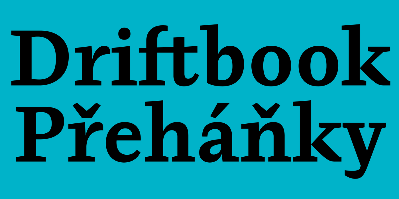
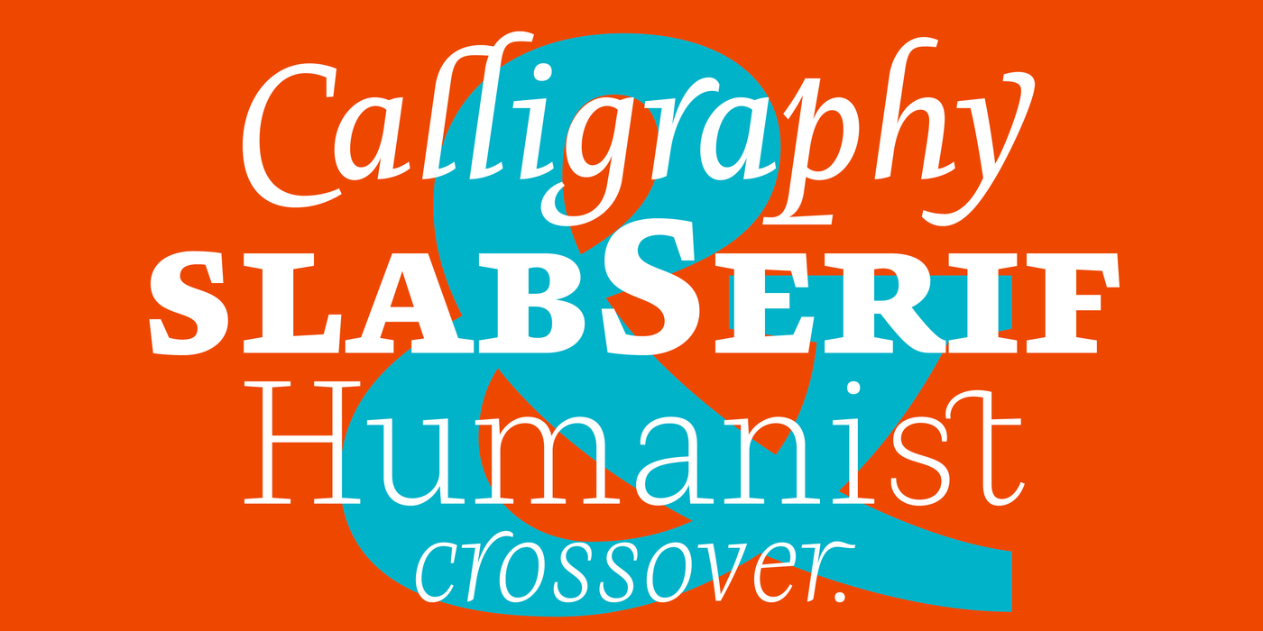
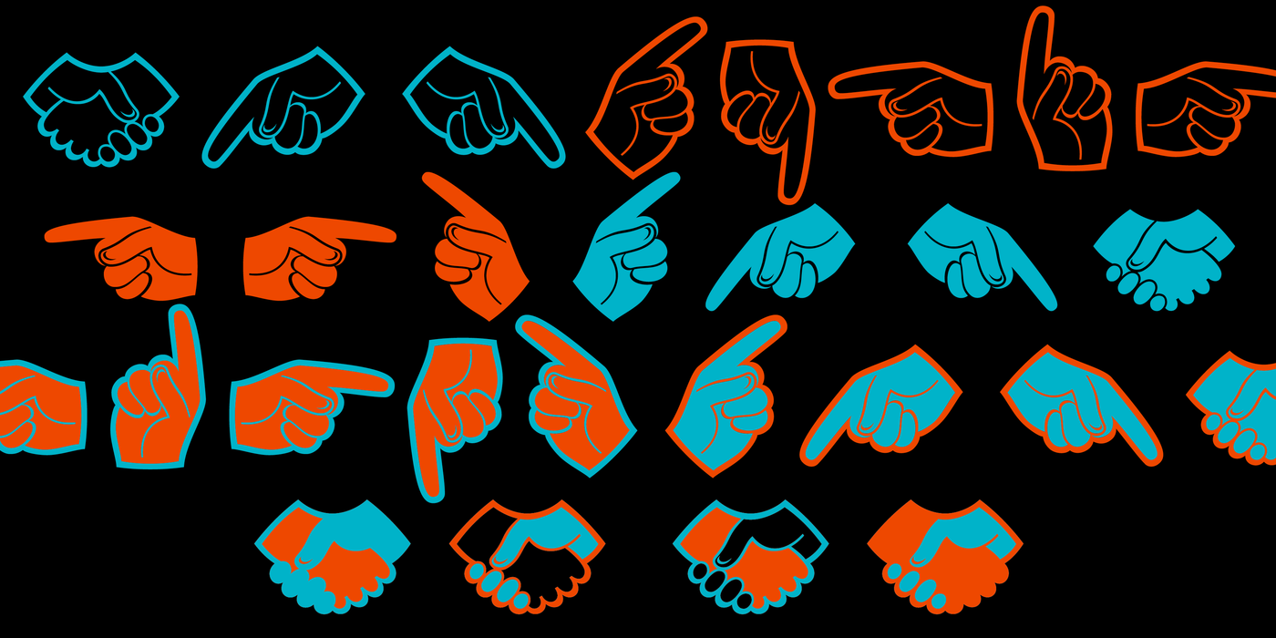
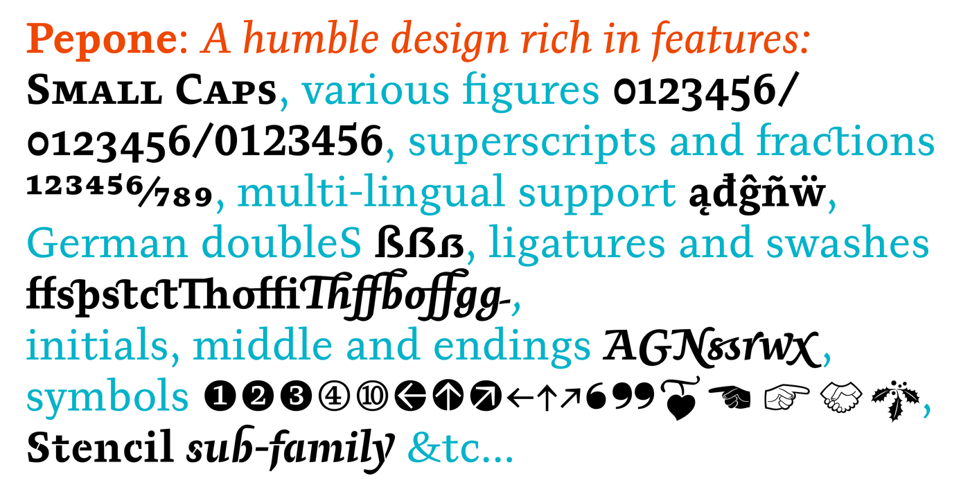
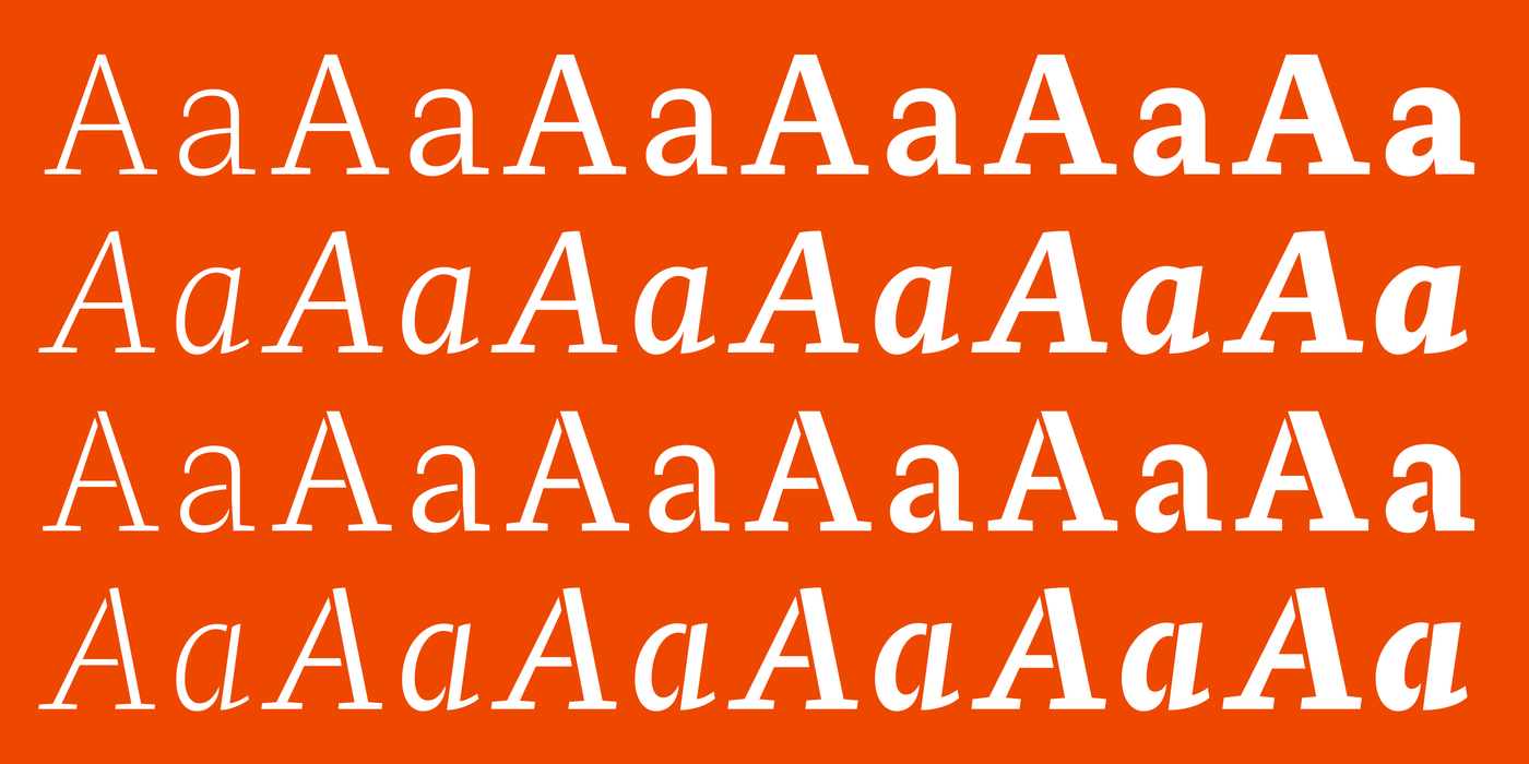
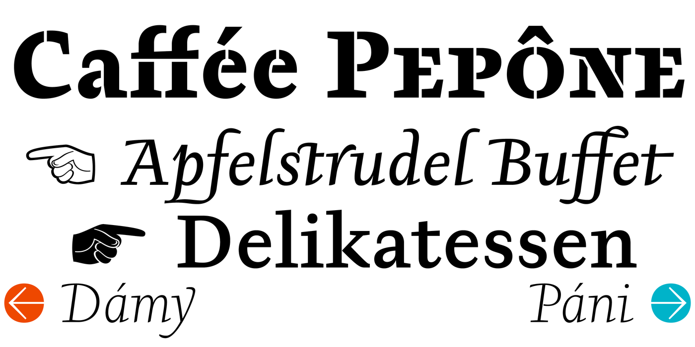
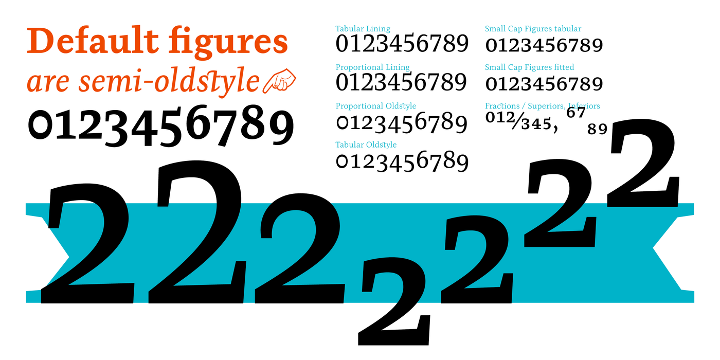
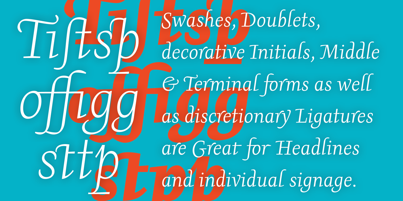
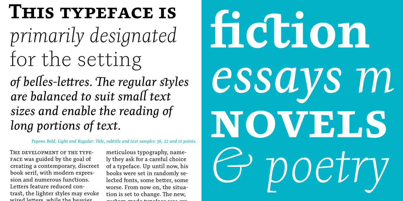
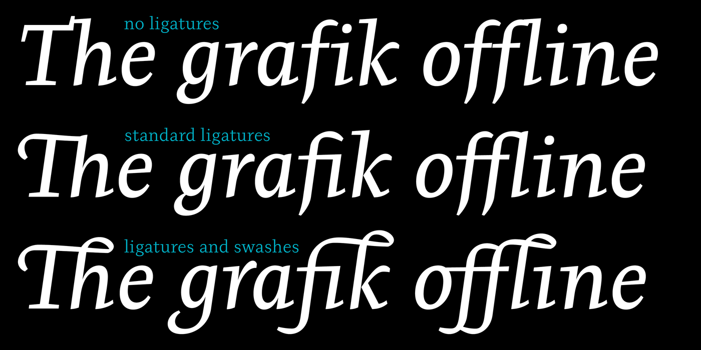
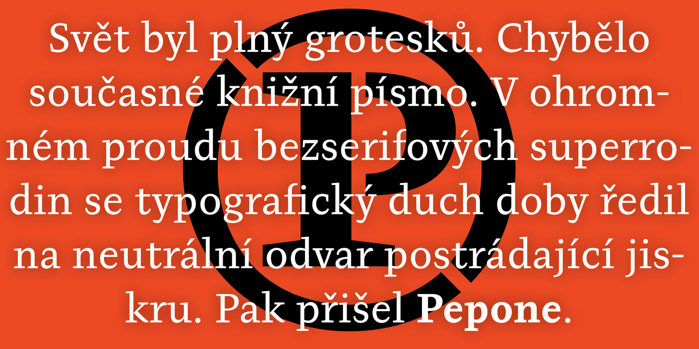
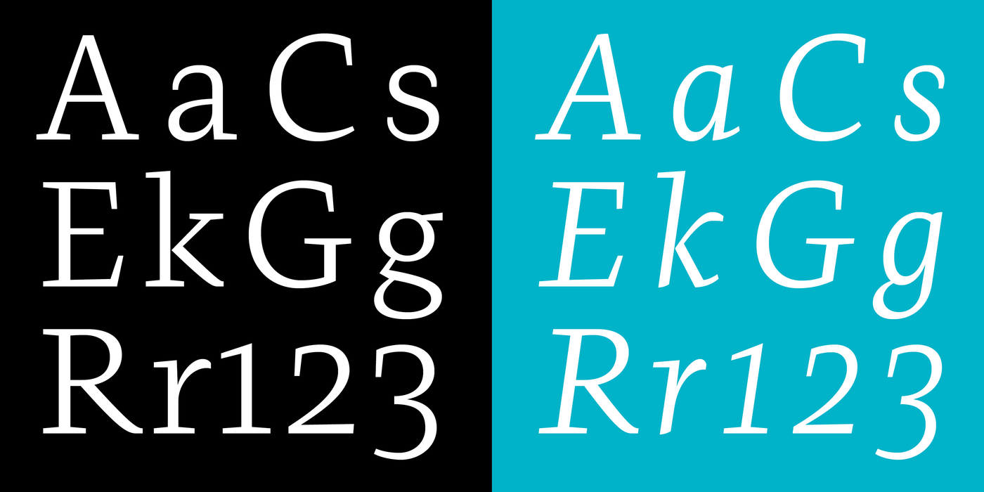
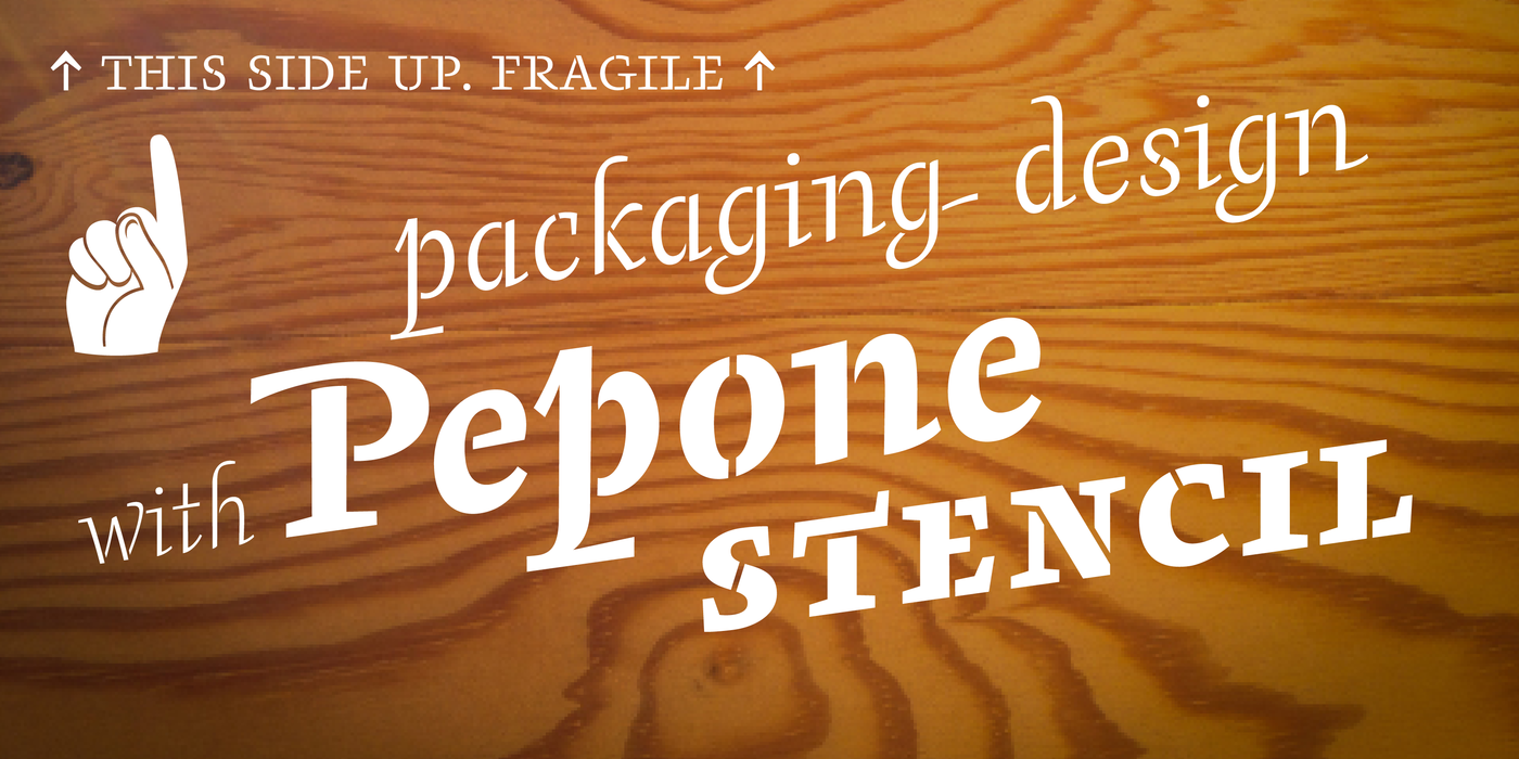
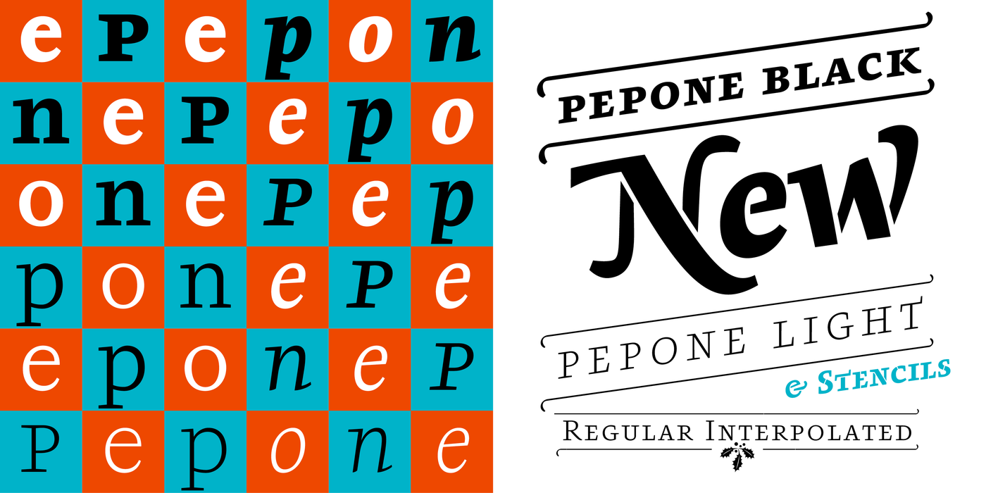
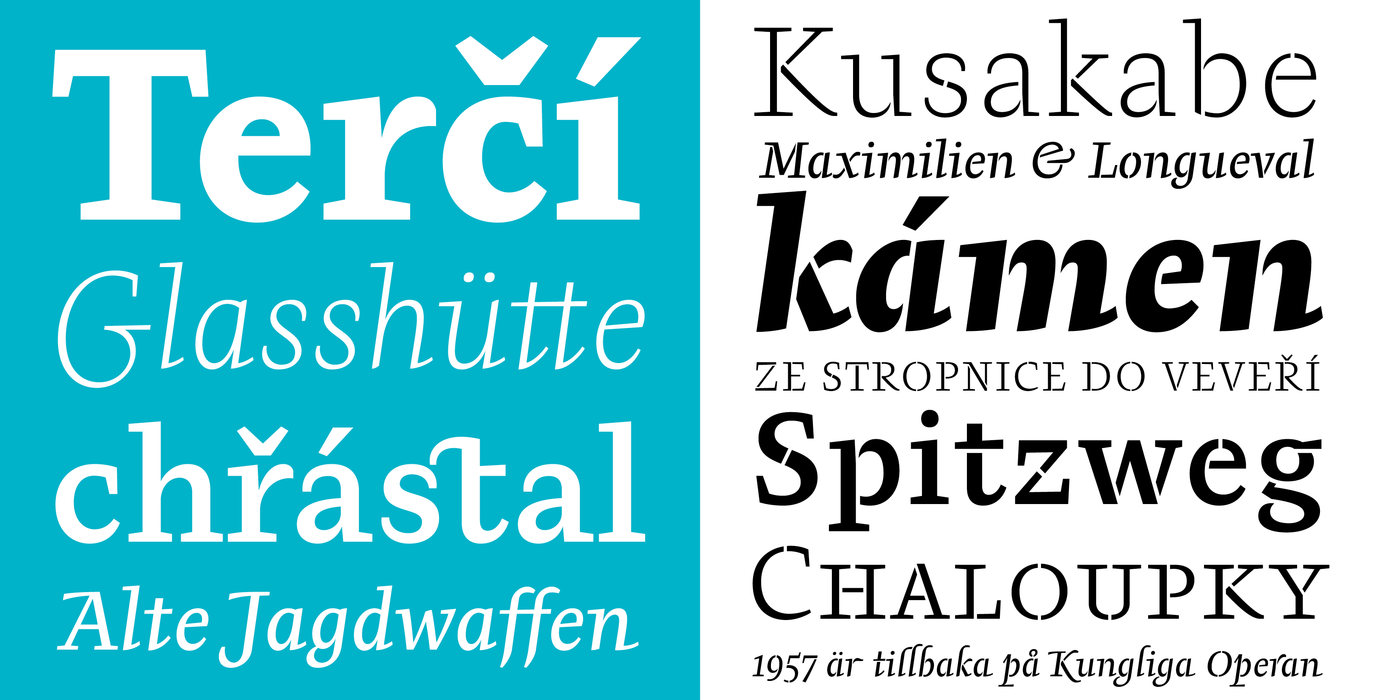
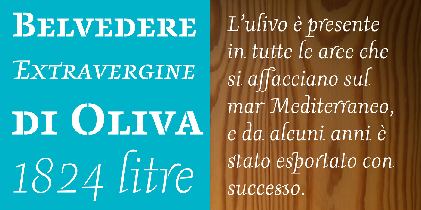
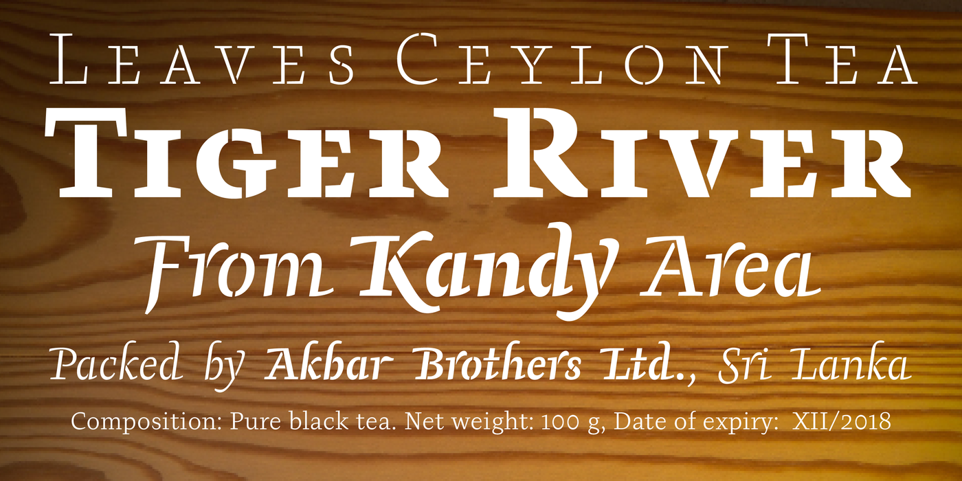
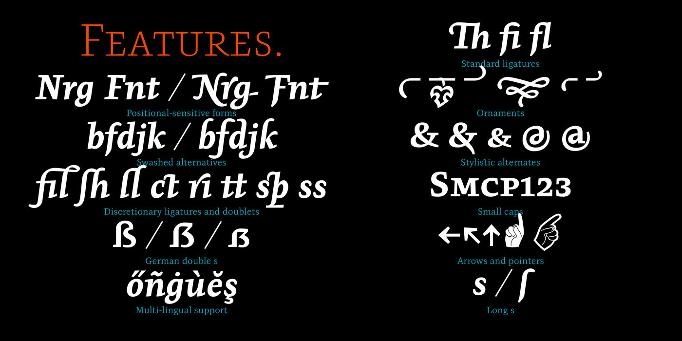
The world was full of dull grotesques. Contemporary book type was missing. In the immense flow of sans-serif superfamilies, the typographic spirit of the time was diluted to a neutral concoction lacking spark. Then came Pepone: a contemporary book font, with calm expression and numerous functions. Pepone is primarily designated for the setting of belles-lettres. The regular styles are balanced to suit small text sizes and enable the reading of long portions of text. Letters feature reduced contrast, the lighter styles may evoke wired letters, while the heavier ones bear distinct slab serif references. The extremes thus work in harmony and fulfill the demanding requirements of advertising and magazine layout. The typeface is suitable for bottle labels, invitations, exhibition catalogues and posters, for printed and online presentations alike. The name Pepone was chosen as an homage to Josef Kroutvor. His novels and poems need meticulous typography, namely they ask for a careful choice of a typeface. Up until now, his books were set in randomly selected fonts, some better, some worse. From now on, the situation is set to change. The new, custom-made typeface was created specifically for the purpose of setting his texts. Today, every other restaurant or steel factory boast their own typeface; why not every individual writer and author? Just as each of us has unique handwriting as well as individual written and spoken expression, each and every writer should have the privilege of having a unique image of a page in a book. The classic Old Style or transitional serif typefaces are too decorative and fragile to suit Josef’s texts, Didone modern typefaces are too strict and uptight, and the other modern serif typefaces lack expression and character. The solution cannot be found “in between”. On the contrary, we must try to express Josef’s literary world through type. The alphabet needs to deal with a number of influences, such as the landscape of Italy and South Bohemia, with European history, with current and long forgotten painters, poets, photographers, graphic artists, ceramicists, and plenty of other inspiration sources. The letters are constructed with typewriter letterforms in mind, which may remind of Josef K.’s beginnings in the samizdat era. The italics, on the other hand, vaguely remind of the scripts of the Italian Renaissance, narrowed to fulfill the need for economy (paper-saving in mind) in the offices of the day. The slight slanting of the Italics avoids extreme, fine contrast steers clear of graphic drama. Efficient, even minimalist construction is well suited for long texts where the reader needs to focus on content, not on the emotion of the text. Strong horizontal serifs anchor the line of text firmly on page, sharp details illustrate the refined style. The extremely heavy styles are to be used with careful consideration; their appearance, especially in the slanted forms, may evoke the 1960s and may prove more useful in signage. Similarly, the overly decorative details or frequent ligatures may disturb reading, so they may be turned off; it is up to the intelligent designer to use them sparingly and to their liking. Of course, the typeface isn’t solely reserved for the setting of the works of Josef K. On the contrary – we’d like to present a universal typeface suited for literature, catalogues and magazines. It wouldn’t be the first and the last example of a typeface created with a specific purpose in mind, which later became used universally.
Toto písmo je určeno především k sazbě krásné literatury. Základní řezy jsou opticky a proporčně vyváženy pro malé velikosti a dlouhé čtení. Jeho vývoj byl veden myšlenkou na současné a nenápadné knižní patkové písmo s aktuálním výrazem a mnoha funkcemi. Písmena mají jen mírný kontrast tahů, světlé řezy mohou působit jako drátěná kresba, zatímco v těch tmavších poznáváme typické rysy egyptienky. Vzájemně se vyvažující extrémy tak plní nároky na použití i v propagaci a časopisecké úpravě. Je použitelné pro označování lahví, k úpravě pozvánek, výstavních katalogů i plakátů, v tištěné i webové presentaci. Název „Pepone“ je poctou Josefu Kroutvorovi. Jeho prosaické i poetické texty vyžadují pečlivou typografii a zejména výběr vhodného písma. Dosud vycházely jeho knihy vytištěné různými, nahodile vybranými, dobrými či méně dobrými fonty. Od nynějška by se situace měla změnit. Bude možné používat k tomu účelu na míru vytvořené nové písmo. Když mohou mít dnes původní a výhradní písmo různé restaurace či železárny, proč by je nemohl mít každý unikátní spisovatel? Tak jako je jedinečný rukopis, řeč i sloh, tak jedinečný musí být i obraz stránky v knize. Renesanční či přechodové antikvy jsou pro Josefa příliš výtvarně zabarvené a subtilní, klasicistní antikva by byla příliš strohá a přísná, moderní antikvy zase zpravidla nemají vhodný výraz. Řešení neleží ani „někde mezi“ těmito polohami, ale v nalezení typografické ilustrace Josefova literárního světa. Taková abeceda se musí vypořádat s celou řadou témat jako jsou jihočeská a italská krajina, evropské dějiny, současní i dávní malíři, básníci, fotografové, grafici, keramici, a s množstvím dalších inspiračních zdrojů. Písmo má kostru strojopisných liter, což může evokovat počátky tvorby Josefa K v samizdatech, v kursivách pak vzdáleně připomíná italské renesanční skripty, jejichž typickým znakem byl zúžený obraz písmen kvůli úspoře papíru v tehdejších kancelářích. Mírný sklon italik je vzdálen každému extrému a jemné stínování nevytváří grafické napětí. Úsporný až minimalistický ráz kresby se dobře hodí na dlouhé texty, kde se osvědčuje emotivní nezabarvenost, jež napomáhá sledování obsahu. Výrazné vodorovné patky pevně ukotvují řádku v ploše papíru, ostře řezané detaily ilustrují vytříbenost slohu. Na úvahu se ponechává užití extrémně tučných řezů: jejich vzhled, zejména v italikách, může evokovat 60. léta a poslouží spíše v jednotlivých nápisech, stejně jako nadměrné zdobení či četnost ligatur, jež by neprospěly plynulosti četby; všechny tyto funkce jsou jednotlivě vypínatelné a ponechané na úvahu inteligentním grafikům. Použití pochopitelně není nikterak omezeno jen na dílo zmíněného autora, ba právě naopak – naší ambicí je všestranné řešení knižních edic, katalogů i časopisů. Ostatně nebyl by to první ani poslední případ, kdy se jednoúčelová abeceda stala universální.