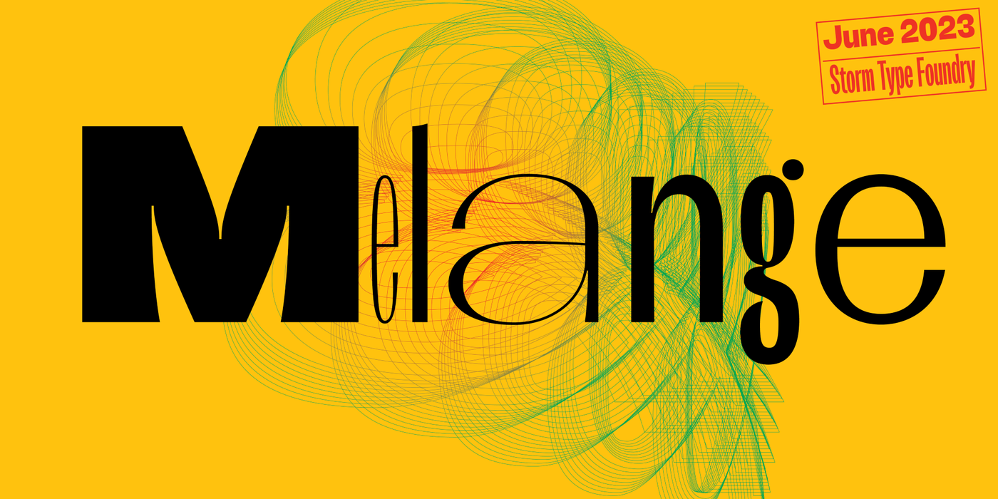
Cookies help us deliver our services. By using our services, you agree to our use of cookies.Got it
  • ☾☼
  • 🛒 (0) 0,00 EUR
  • Change currency
    • CZK
    • EUR
    • USD
  • Currency
    • CZK
    • EUR
    • USD
  • Login
  • Licensing
  • Font Packages
  • Custom Fonts
  • Printed Materials
  • Bestsellers
  • Cyrillic
  • Greek
  • Contact Us
  • Facebook
  • Instagram
  • About Us
  • People
  • Help
  • Rules and Conditions
  • Privacy Policy
  • GDPR
❓ Storm Type Foundry
  • Sans-serif 
    • Academica Sans
    • Amor Sans
    • Amphibia
    • Andulka Sans
    • Anselm Sans
    • Bahnhof
    • Beletrio
    • Carot Mono
    • Carot Sans
    • Clara Sans
    • DynaGrotesk
    • Etelka Pro
    • Header
    • Hercules Sans
    • Inicia
    • Jannon Sans
    • Jasan
    • John Sans
    • Josef Sans
    • Melange
    • Metron
    • Populus
    • Quercus C
    • Quercus Sans
    • Quercus Whiteline
    • Sebastian
    • Shompen
    • Solpera
    • Splendid Sans
    • St Croce Pro
    • Superscience
    • Teuton
    • Trivia Gothic
    • Trivia Grotesk
    • Trivia Sans
    • Vida
    • Walbaum Grotesk
    • Zeppelin Grotesk
  • Serif 
    • Academica
    • Alebrijes
    • Amor Serif
    • Andulka
    • Anselm Serif
    • Antique
    • Areplos
    • Baskerville Neo
    • Baskerville Original
    • Beletria
    • Biblon Pro
    • Carot Display
    • Carot Slab
    • Carot Text
    • Clara Serif
    • Comenia Serif Pro
    • Defender
    • Ermina
    • Etelka Slab
    • Farao
    • Genre
    • Hercules Neo
    • Jannon Antiqua
    • Jannon Neo
    • Juvenis
    • Kingdom
    • Lexon
    • Lido STF
    • Mediaeval
    • Mramor
    • Pentagraf
    • Pepone
    • Preissig Antikva
    • Preissig Poster
    • Quercus Serif
    • Quercus Ten
    • Regent
    • Regula
    • Serapion
    • Tenebra
    • Trivia Humanist
    • Trivia Serif
    • Trivia Serif 10
    • Trivia Slab
    • Tusar
    • Tyfa Antikva
    • Walbaum 2010 Pro
  • Blackletter 
    • Coroner
    • Dracula
    • Dream Within A Dream
    • Friedhof
    • Hexenrunen
    • Julinka
    • Monarchia
    • Moyenage
    • Moyenage Sans
    • Plagwitz
    • Spiritist
    • Wittingau
  • Decorative 
    • Abalda
    • Aichel
    • Alcoholica
    • Andaluz
    • Bhang
    • Brauer
    • Briefmarken
    • Clichee
    • Cobra
    • Compur
    • Enamelplate
    • Excelsor Script
    • Fenix
    • Gallus Konzept
    • Hammertone
    • Ideal Gothic
    • Libcziowes
    • Lokal Script
    • Modell
    • Mortal
    • Negro
    • Patzcuaro
    • Pivo
    • Politic
    • Rondka
    • Rooftiles
    • Splendid Quartett
    • Stencilul
    • Technomat
    • Traktoretka
  • Font Packages 
    • Baskerville Sans & Serif
    • Carot Complete
    • Hercules Sans & Serif
    • Jannon Sans & Serif
    • Storm Type Library 7
    • Trivia Complete
    • Walbaum Sans & Serif
    •  
    • Academica Value Pack
    • Andulka Value Pack
    • Anselm Value Pack
    • Baskerville Value Pack
    • Beletria Value Pack
    • Carot Value Pack
    • Clara Value Pack
    • Hercules Value Pack
    • Jannon Value Pack
    • JBW Value Pack
    • Quercus Value Pack
    • Trivia Grotesk Value Pack
    • Trivia Humanist Value Pack
    • Walbaum Value Pack
91 fonts :
232,26 EUR
(2,55 EUR per font)
🛒 add to cart

Melange
Buying options: Storm Type Library 7: 9497,50 EUR

  • Typefaces
  • Gallery


  • Full melange poster01
    Full melange poster 3
    Full melange poster 4
    Full melange poster 5
    Full melange poster 6
    Full melange poster 7
    Full melange poster 8
    Full melange poster 9
    Full melange poster 10
    Full melange poster 11
    Full melange poster 12
    Full melange poster 13
    Full melange poster 14
    Full melange poster 15
    PreviousNext

    Melange

    by František Štorm

    A sans-serif that is NOT neutral. Magazine design, block printing of posters, enterprise and packaging – that’s where the new Melange font is headed. Also, 
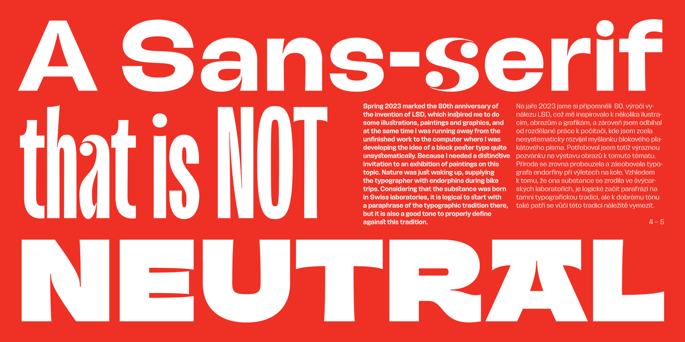
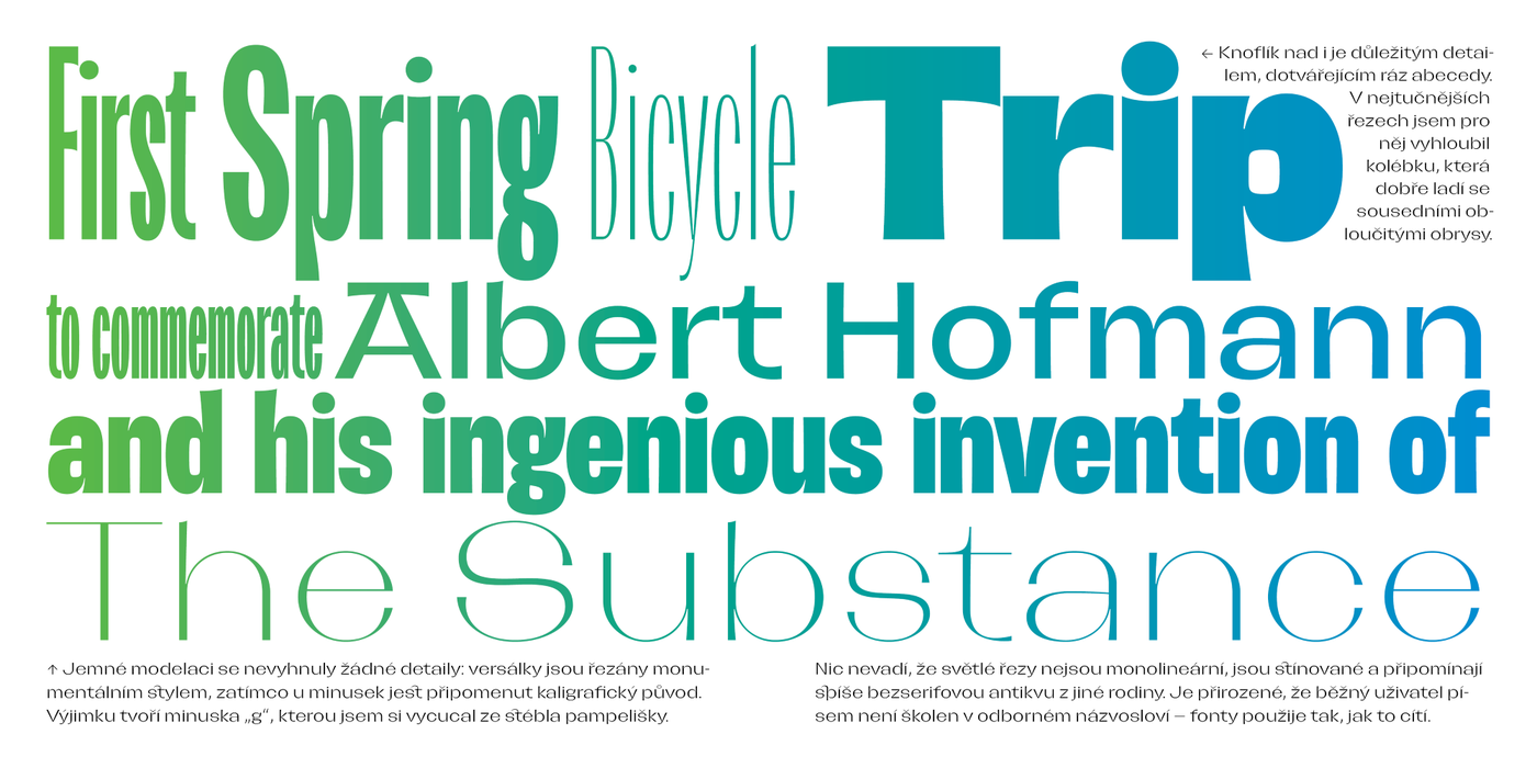
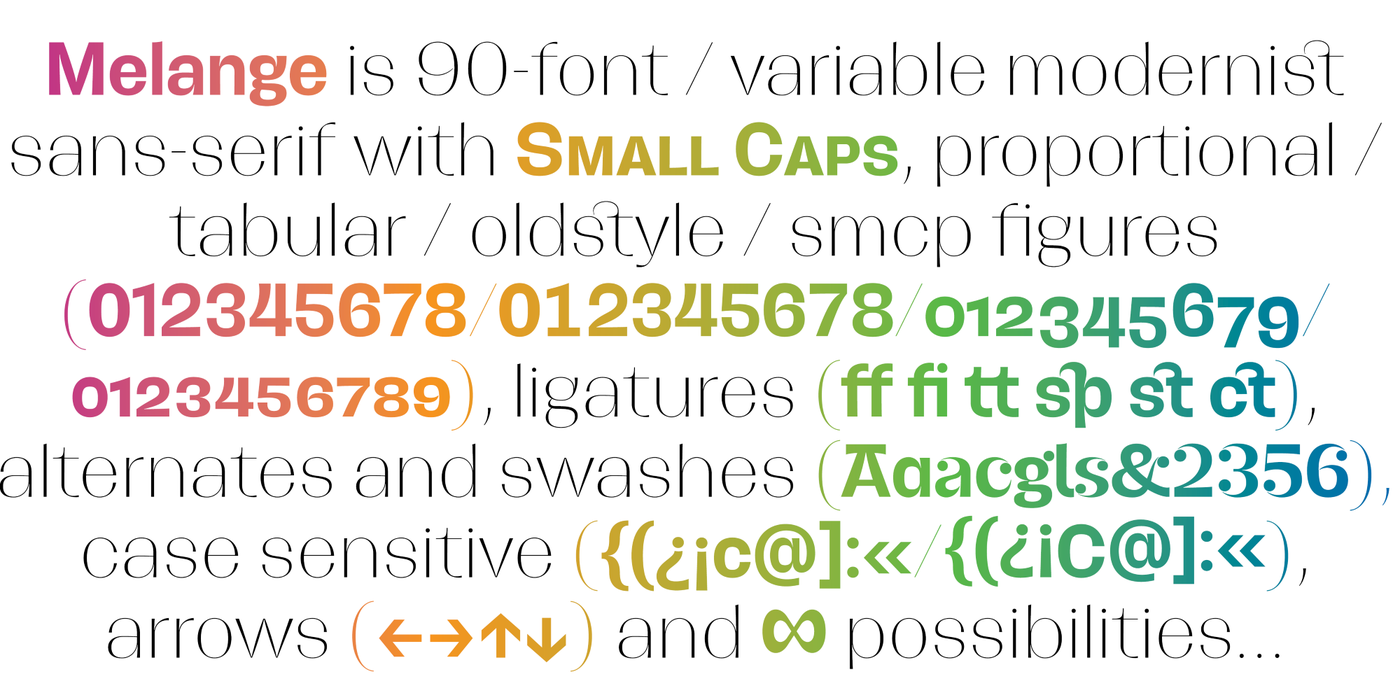
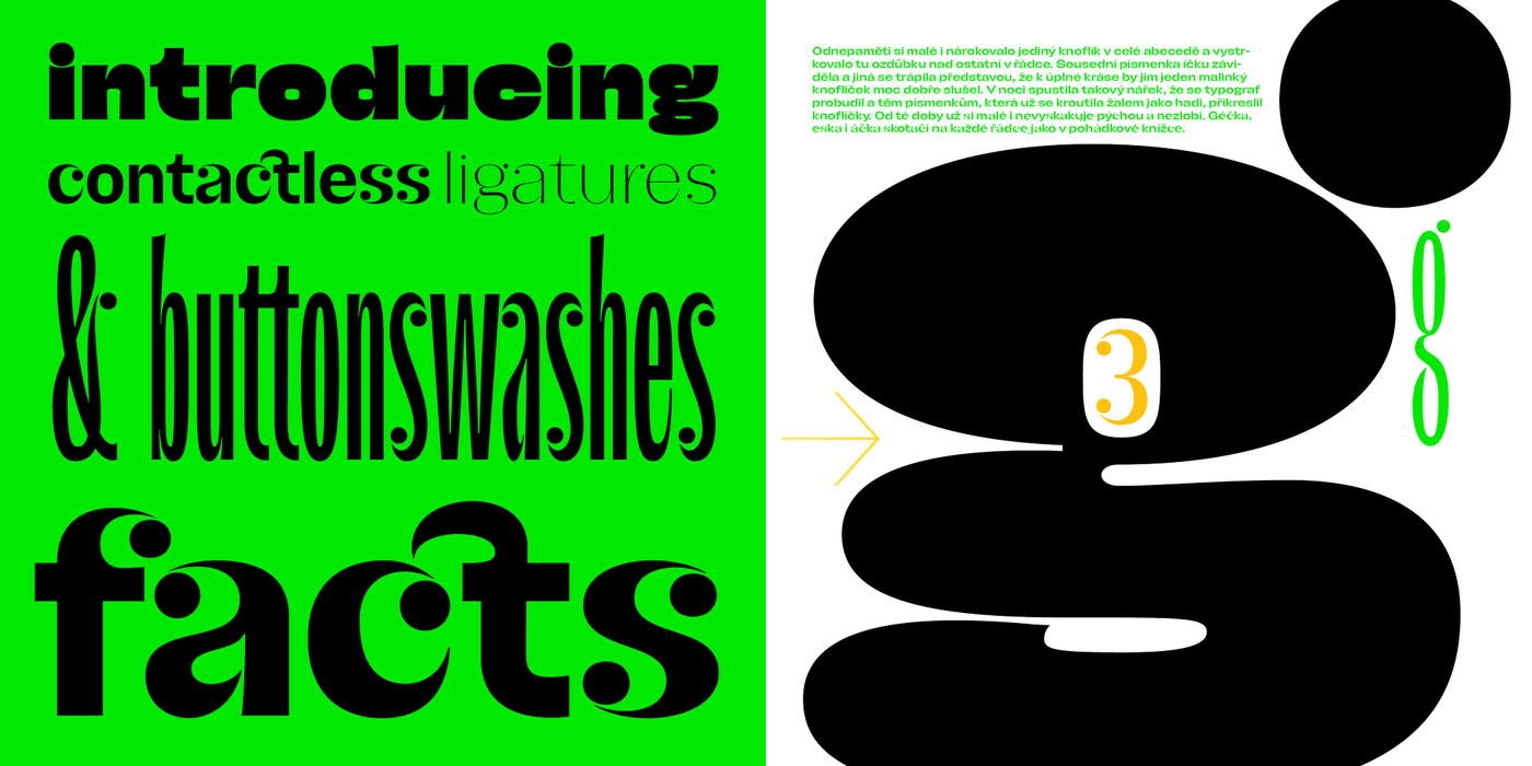
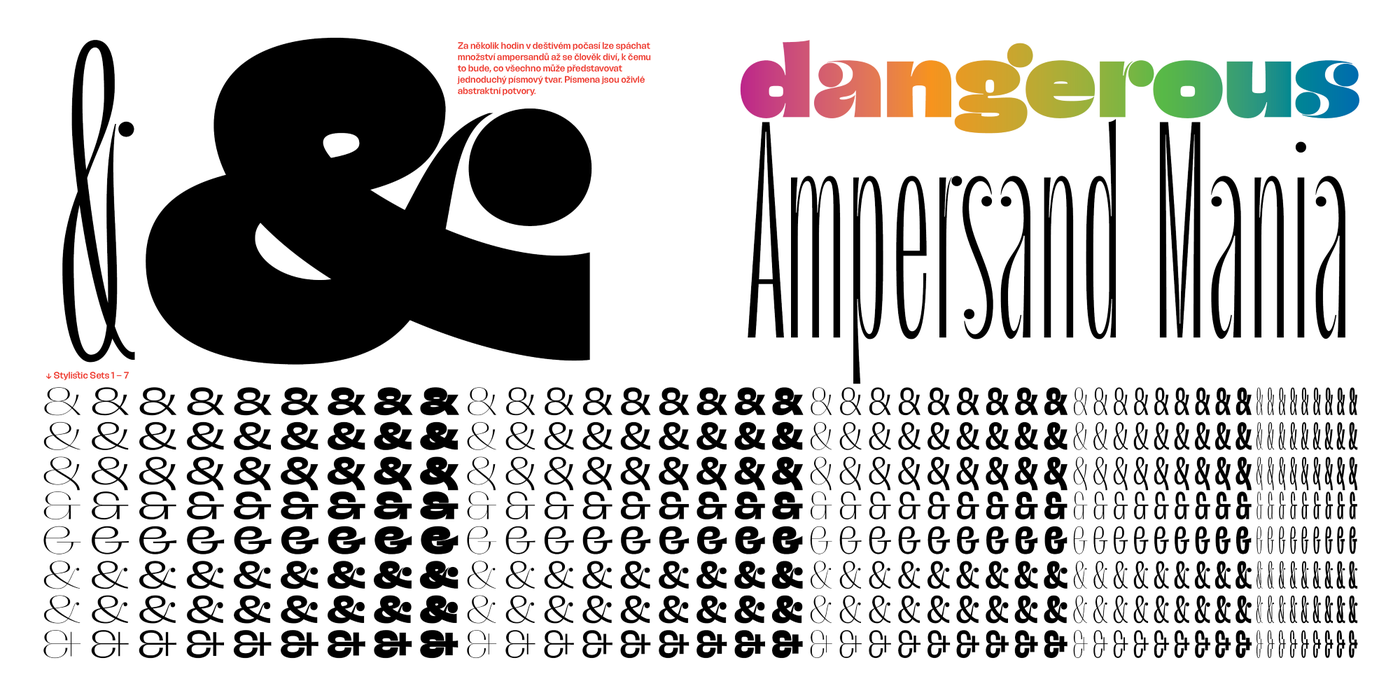
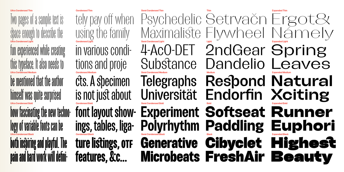
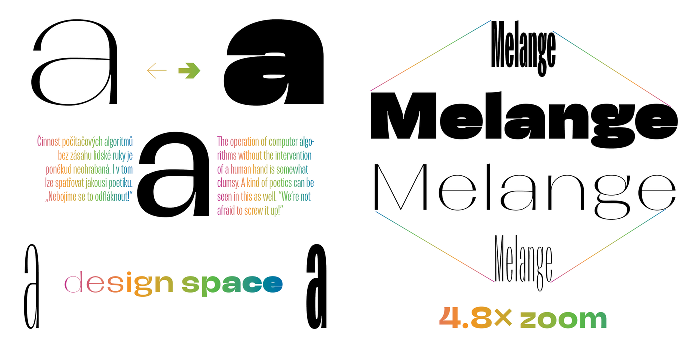
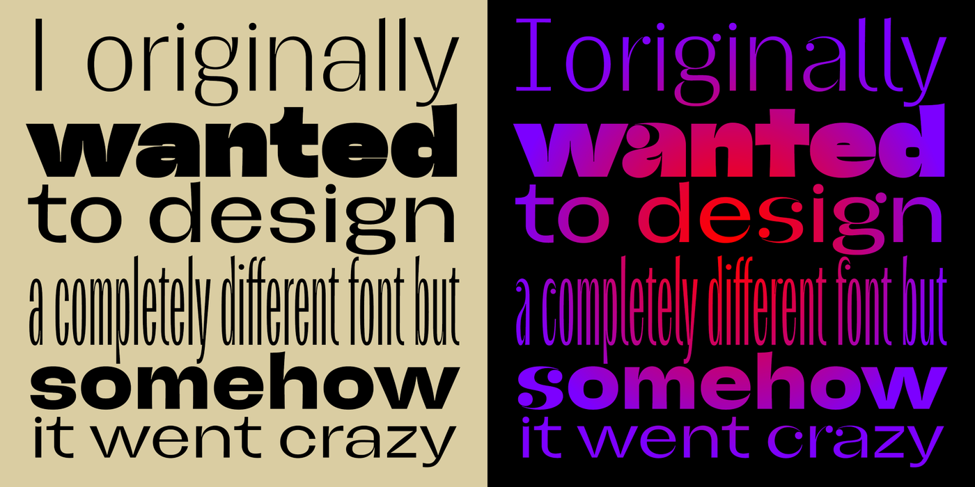
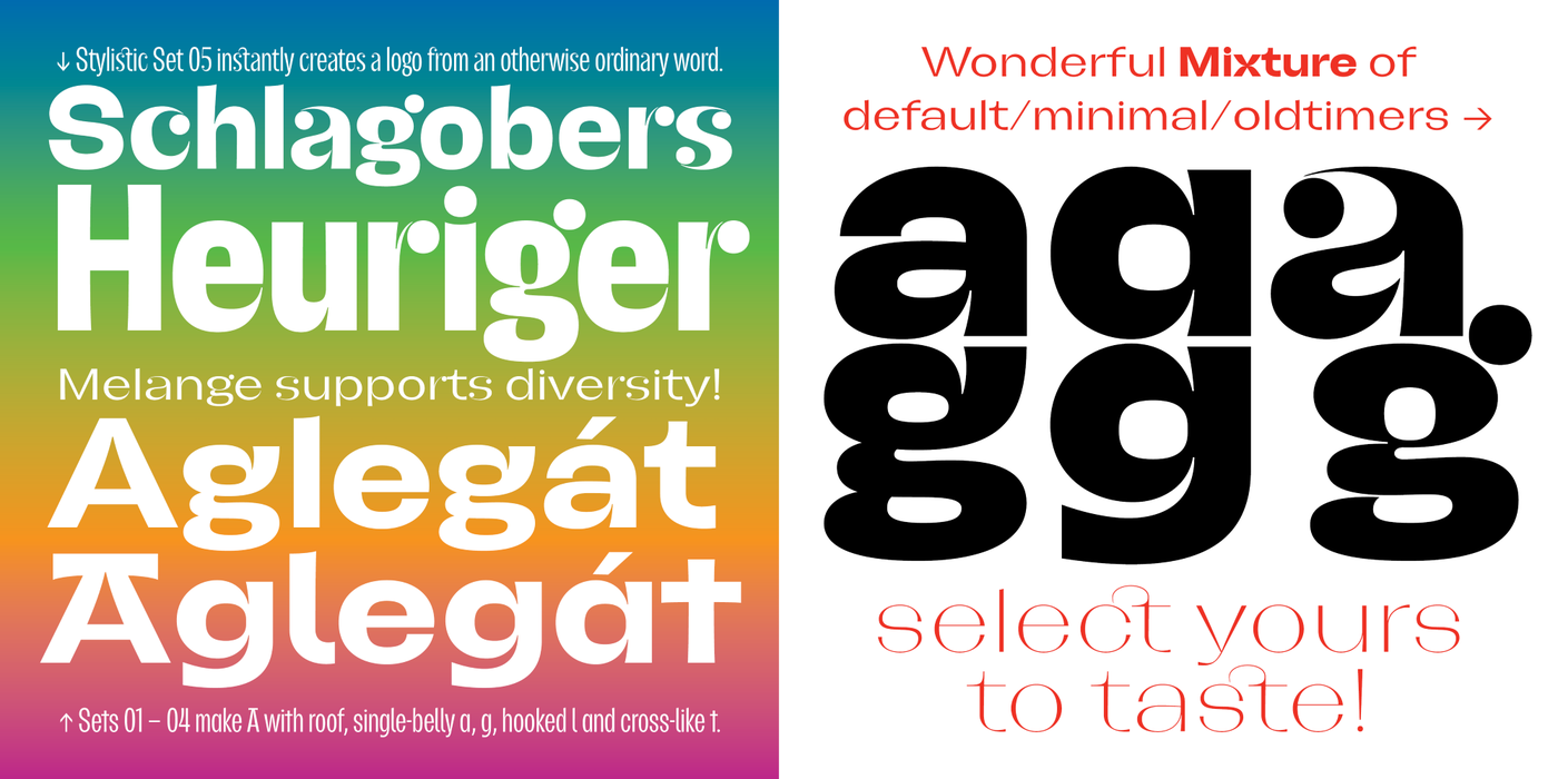
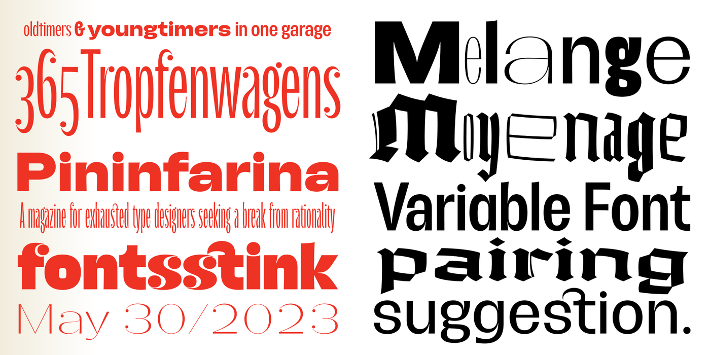
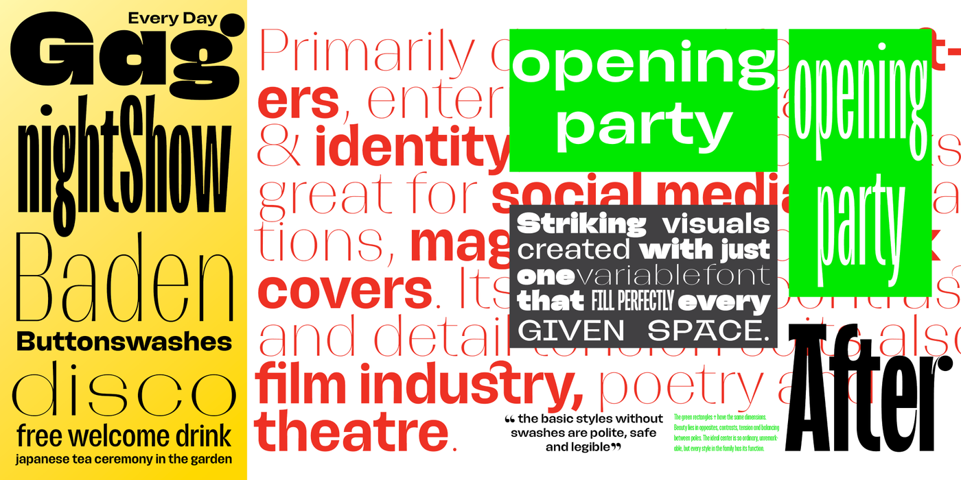
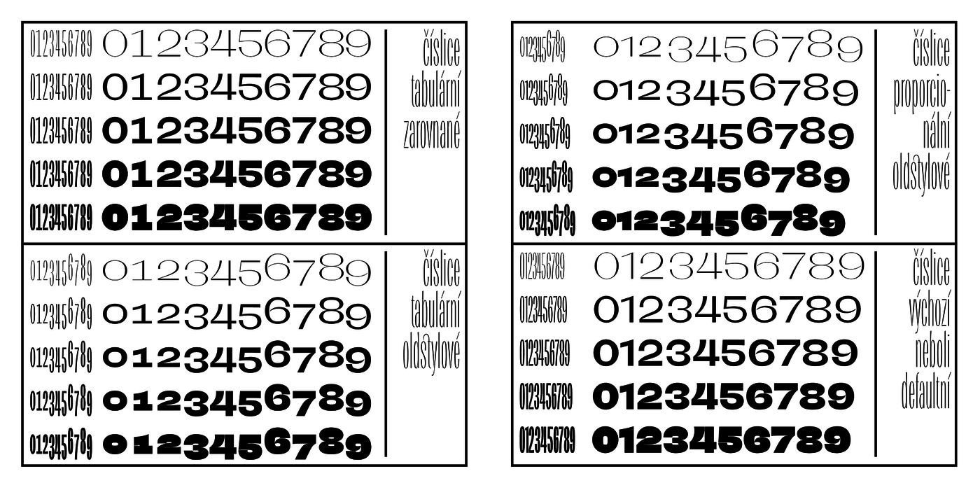
It can be assumed that when the designer is having fun, the viewer will also have fun. It also works great for social media invitations, magazines and book covers. Its extreme contrast and detail tension suits also film industry, poetry and theatre. Spring 2023 marked the 80th anniversary of the invention of LSD, which inspired me to do some illustrations, paintings and graphics, and at the same time I was running away from the unfinished work to the computer where I was developing the idea of a block poster type quite unsystematically. Because I needed a distinctive invitation to an exhibition of paintings on this topic. Nature was just waking up, supplying the typographer with endorphins during bike trips. Considering that the substance was born in Swiss laboratories, it is logical to start with a paraphrase of the typographic tradition there, but it is also a good tone to properly define against this tradition. Na jaře 2023 jsme si připomněli osmdesáté výročí vynálezu LSD, což mě inspirovalo k několika ilustracím, obrazům a grafikám, a zároveň jsem odbíhal od rozdělané práce k počítači, kde jsem zcela nesystematicky rozvíjel myšlenku blokového plakátového písma. Potřeboval jsem totiž výraznou pozvánku na výstavu obrazů k tomuto tématu. Příroda se zrovna probouzela a zásobovala typografa endorfiny při výletech na kole. Vzhledem k tomu, že ona substance se zrodila ve švýcarských laboratořích, je logické začít parafrází na tamní typografickou tradici, ale k dobrému tónu také patří se vůči této tradici náležitě vymezit. Odnepaměti si malé i nárokovalo jediný knoflík v celé abecedě a vystrkovalo tu ozdůbku nad ostatní v řádce. Sousední písmenka íčku záviděla a jiná se trápila představou, že k úplné kráse by jim jeden malinký knoflíček moc dobře slušel. V noci spustila takový nářek, že se typograf probudil a těm písmenkům, která už se kroutila žalem jako hadi, přikreslil knoflíčky. Od té doby už si malé i nevyskakuje pýchou a nezlobí. Géčka, eska i áčka skotačí na každé řádce jako v pohádkové knížce. knoflík nad i je důležitým detailem, dotvářejícím ráz abecedy. V nejtučnějších řezech jsem pro něj vyhloubil kolébku, která dobře ladí se sousedními obloučitými obrysy. Jemné modelaci se nevyhnuly žádné detaily: versálky jsou řezány monumentálním stylem, zatímco u minusek jest připomenut kaligrafický původ. Výjimku tvoří minuska „g“, kterou jsem si vycucal ze stébla pampelišky. Nic nevadí, že světlé řezy vůbec nejsou monolineární, jsou stínované a připomínají spíše bezserifovou antikvu z jiné rodiny. Je přirozené, že běžný uživatel písem není školen v odborném názvosloví – fonty použije tak, jak to cítí.

    〗 Download PDF
    Tags
    magazine  poster  headlines  music  musical  theater  social media  social 
    ©2025 Storm Type Foundry
  • made by Gravastar s.r.o.