Moyenage Sans
- Typefaces
- Gallery


Cучасна репліка блеклеттера, У той час як каліграфічне сімейство шрифтів можна використовувати в коротших текстах і плакатах, беззасічковий варіант — це радше експериментальний проєкт, який може знайти своє застосування в дизайні обкладинок музичних творів, випадкових написів і запрошень.
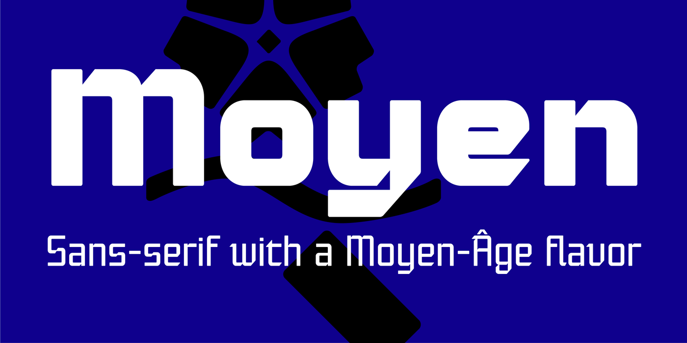
Moyenage is a modern replica of blackletter. Whereas the calligraphic typeface family can be used in shorter texts and posters, the sans-serif variation is rather experimental project which may find its use on music cover design, occasional lettering and invitations.
Moyenage je moderní replikou lomeného písma. Zatímco kaligrafická rodina může být použita na kratší texty a plakáty, její bezserifová varianta je spíše experimentálním projektem a najde své uplatnění na hudebních obalech, příležitostných nápisech a pozvánkách.
Blackletter typefaces follow certain fixed rules, both in respect to their forms and to the orthography. Possibly, they were a reaction to the half-developed Carolingian minuscule which was soon to end in the Latin script. Narrow, ordered script was to replace the round, hesitant and shattered shapes of letters in order to simplify writing, to unify the meaning of individual letters, and to save some parchment, too. Opposed to the practice common in monasterial scriptoriums where Uncial, Irish and Carolingian inspiration flew freely and as a result, the styles of writing differed in each monastery, the blackletter type was to define one, common standard. It was to express spiritual verticality, in perfect tune with the architecture of the Gothic era. Typography became an integral part of the overall style of the period. The pointed arch and the blackletter type were the vanguard of the spectacular transformation from the Middle Ages towards the modern era, they were a celebration of a time when works of art were not signed by their makers yet.
Some unfortunate souls keep linking blackletter solely with Germany and the Third Reich, while the truth is that its direct predecessor, the Gothic minuscule, evolved mostly in France.
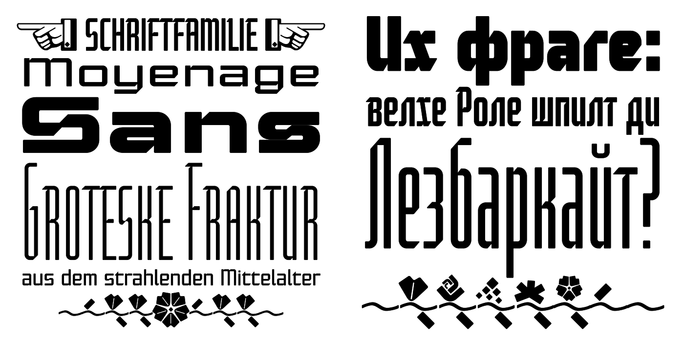
Once we leave our prejudice aside, we find that the shapes of blackletter type have exceptional potential, unheard of in sans-serif letterforms. The lower case letters fit into an imaginary rectangle which is easily extended both upwards and sideways. In its scope and in the name itself, the Moyenage type family project is to celebrate the diversity of the Middle Ages.
I begun realizing the urge to design my own blackletter when visiting the beer gardens of Munich and while walking through the villages of rural Austria. The letters from the notice boards of inns are scented with spring air, with the flowers of cudweed, with white sausage and weissbier. The crooked calligraphic hooks and beaks seem to imitate the hearty yodeling of local drinkers and the rustle of the giant skirts of girls who distribute the giant wreaths of beer jugs.
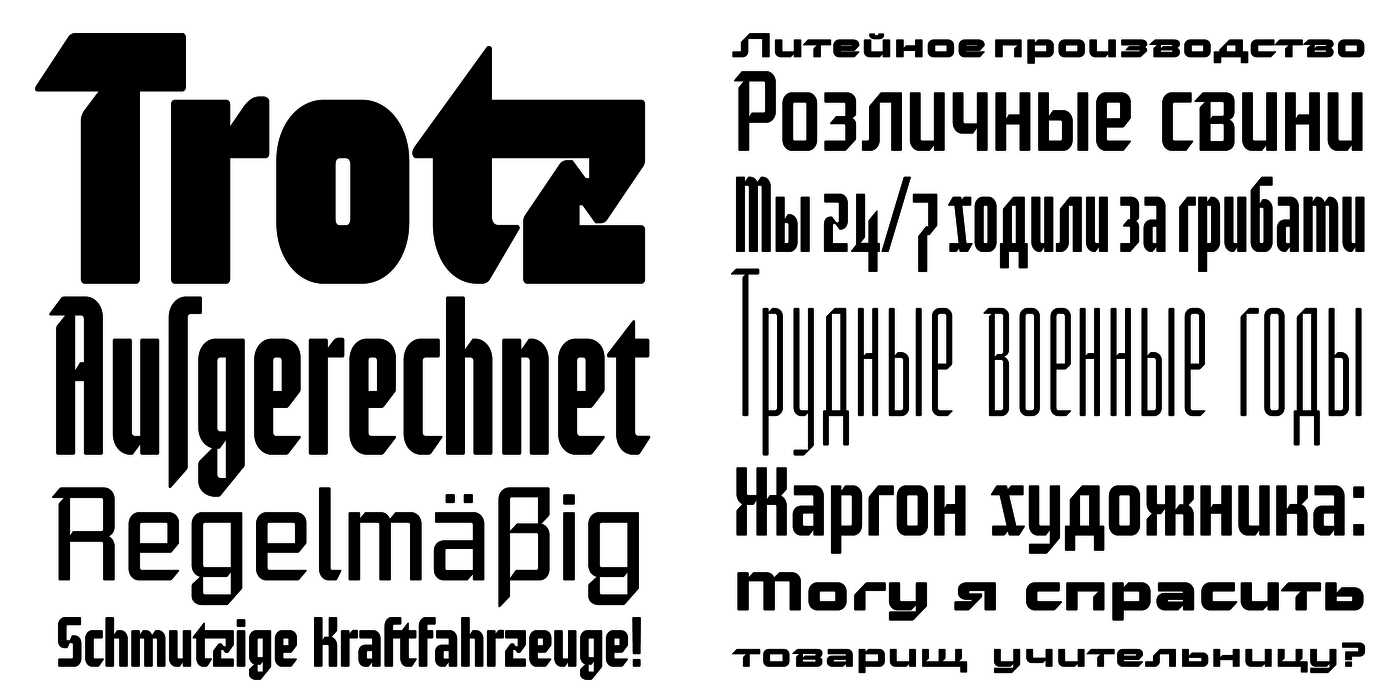
Moyenage is, however, a modern replica of blackletter, so it contains some otherwise unacceptable Latin script elements in upper case. I chose these keeping the modern reader in mind, striving for better legibility. The font is drawn as if written with a flat pen or brush, and with the ambition to, perhaps, serve as a calligraphic model. In medium width, the face is surprisingly well legible; it is perfect for menus as well as posters and CD covers for some of the heavier kinds of music. It has five types of numerals and also a set of Cyrillic script, symbolising the lovelorn union of Germans and Russians in the 20th century. Thus, it is well suited for the setting of bilingual texts of the German classic literature, which, according to the ancient rules, must not be set in Latin script.
Lomená písma mají pevná pravidla tvaroslovná i pravopisná. Formovala se možná v reakci na nedovyvinutou karolinskou minuskulu, která měla zanedlouho sublimovat v latince. Úzký písařský řád měl nahradit obloučité rozpaky nejednotných tvarů, usnadnit psaní, sjednotit význam znaků a ušetřit pergamen. Na rozdíl od volných pravidel klášterních skriptorií, zmítaných unciální, irskou a karolinskou inspirací, jejichž znaky se různily od kláštera ke klášteru, mělo lomené písmo nastolit všeobecný standard vyjadřující duchovní vertikalitu a dokonale ladit s gotickou architekturou. Typografie se stala přirozenou součástí slohu. Lomený oblouk i lomené písmo předznamenaly spektakulární zlom starověku a novověku, oslavovaly nezkažený věk, kdy se ještě umělecká díla nepodepisovala.
Někteří nešťastníci dodnes spojují frakturu hlavně s němectvím a Třetí říší, ale ve skutečnosti se její přímá předchůdkyně – gotická minuskula – vyvíjela převážně ve Francii.
Zbavíme-li se předsuků, zjistíme, že fraktura má výjimečný tvarový potenciál, o jakém se bezserifovým písmům ani nesnilo. Litery minusek jsou ohraničeny pomyslným obdélníkem, který lze snadno natahovat do výšky i do šířky. Projekt rodiny Moyenage má svým rozsahem i názvem vzdávat hold mnohobarevnosti středověku.
Potřebu vlastní fraktury jsem si začal uvědomovat už dávno při návštěvách mnichovských pivnic a při procházkách rakouským venkovem. Pohostinské nápisové písmo voní jarním vzduchem, květy protěží, bílou klobásou a kvasnicovým ležákem. Křivolaké kaligrafické zobáky jako by kopírovaly srdečné jódlování štamgastů promísené s šustotem obrovských sukní servírek roznášejících věnce tupláků.
Moyenage je ovšem novodobou replikou fraktury se slohově nepřípustnými latinkovými prvky ve versálkách, ty jsem zvolil z důvodu lepší čitelnosti pro dnešního čtenáře. Je nakresleno tak, jako by je někdo psal plochým perem či štětcem, s cílem případně posloužit i jako kaligrafický vzor. Písmo je ve středních šířkách překvapivě dobře čitelné a hodí se výborně na jídelní a nápojové lístky, stejně jako na plakáty a CD obaly nějaké ostřejší hudby. Má pět druhů číslic a azbuku, na důkaz lomeného přátelství Rusů a Němců ve dvacátém století, a je tedy vhodné i pro sazbu bilingválních děl z německé klasické literatury, pro kterou je latinka (dle starých pravidel) nepřípustná.