Inicia
- Typefaces
- Gallery

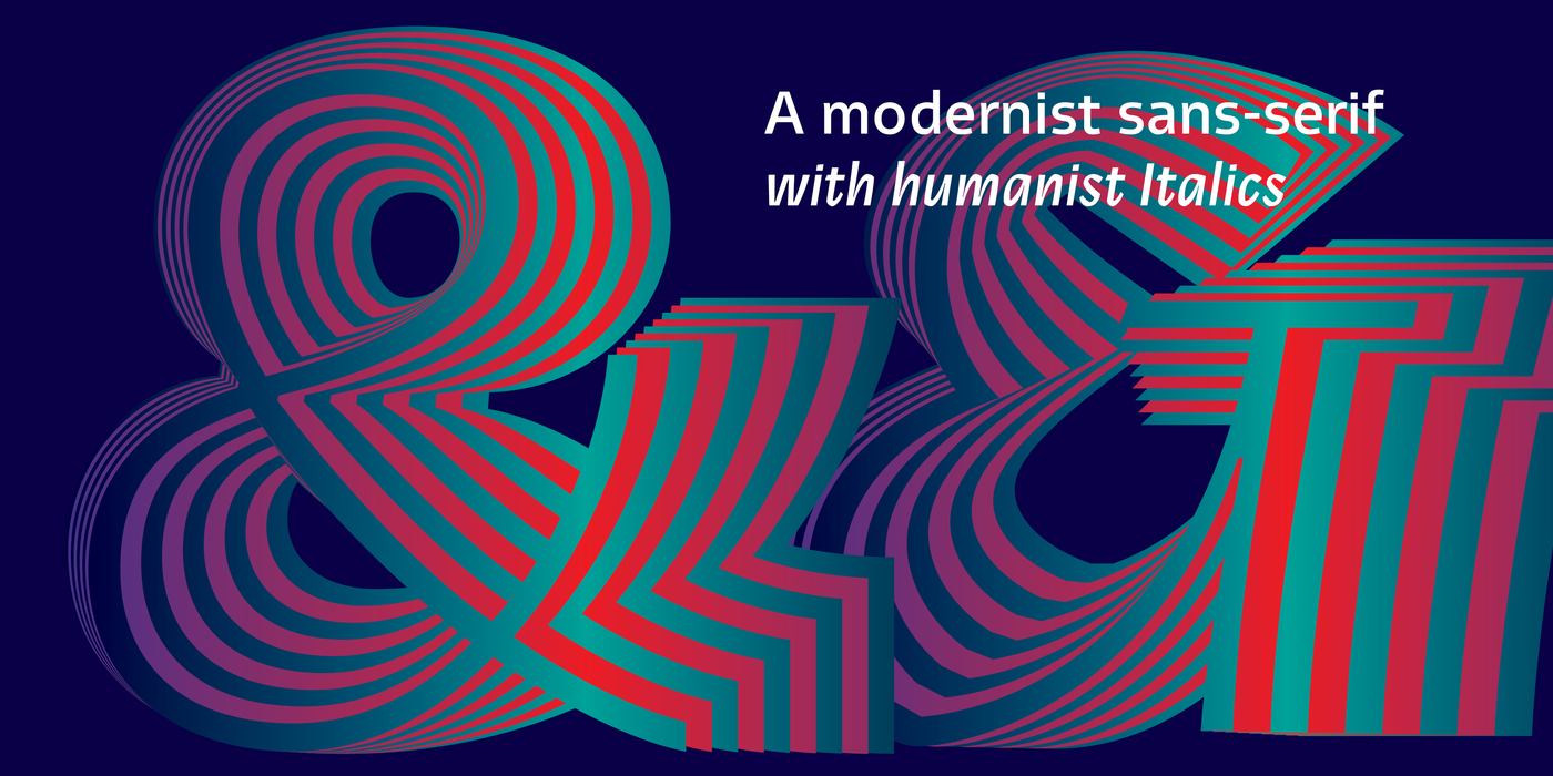
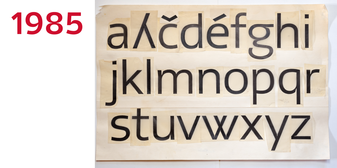
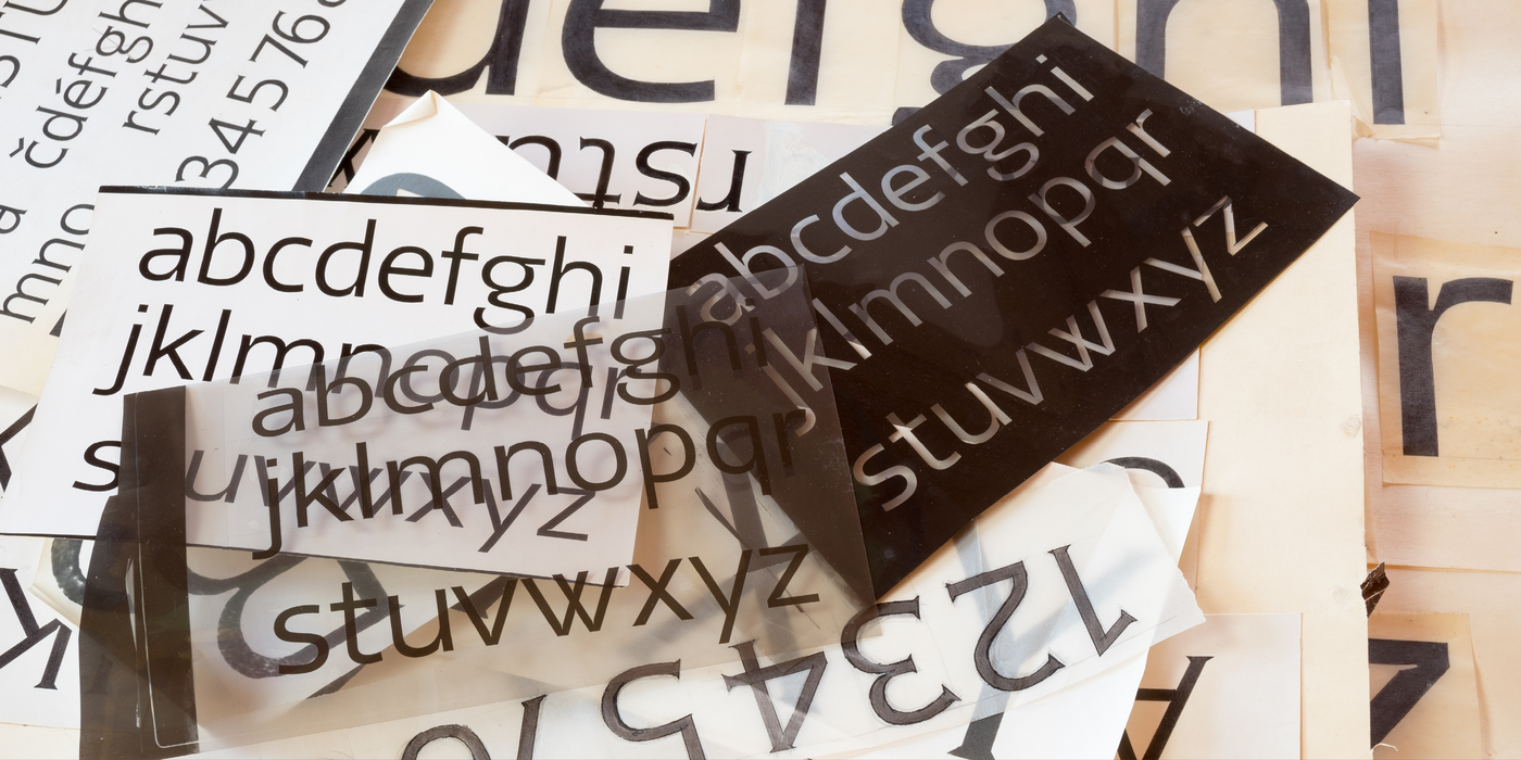
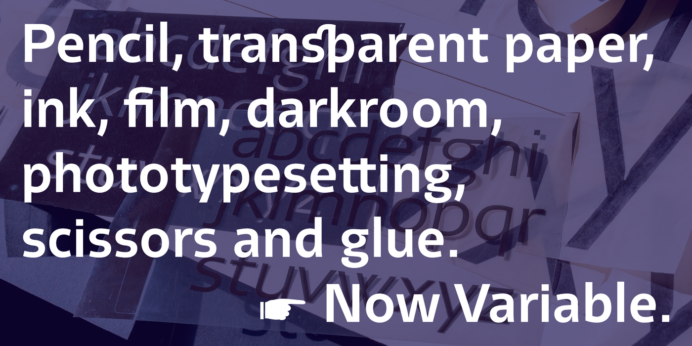
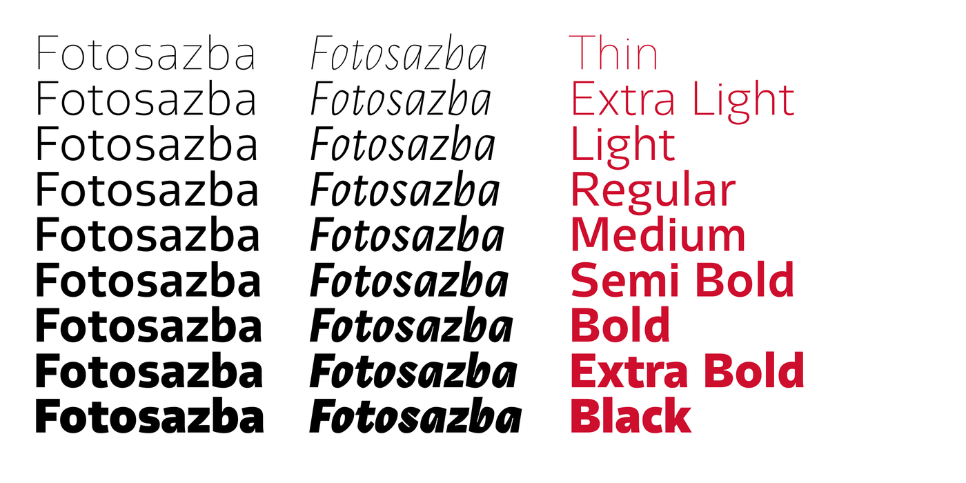
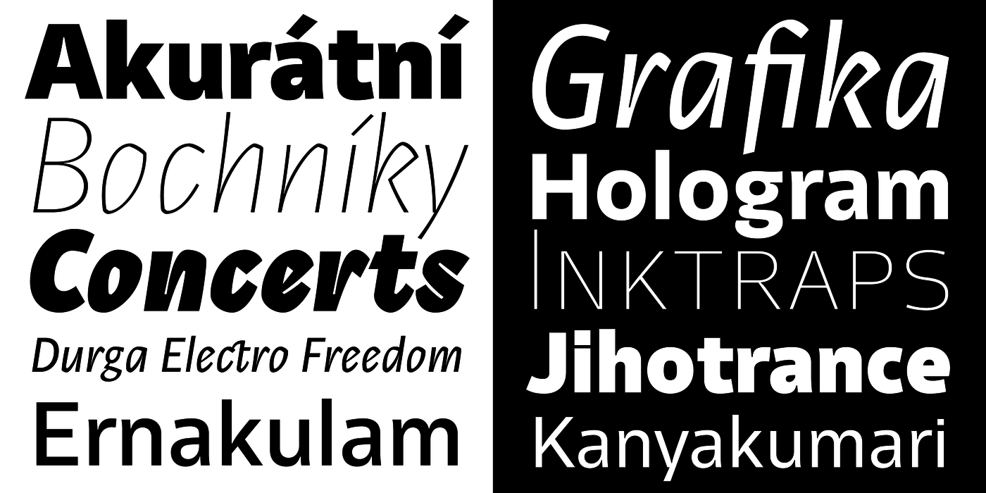
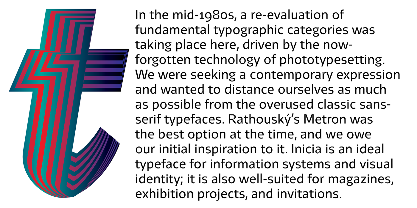
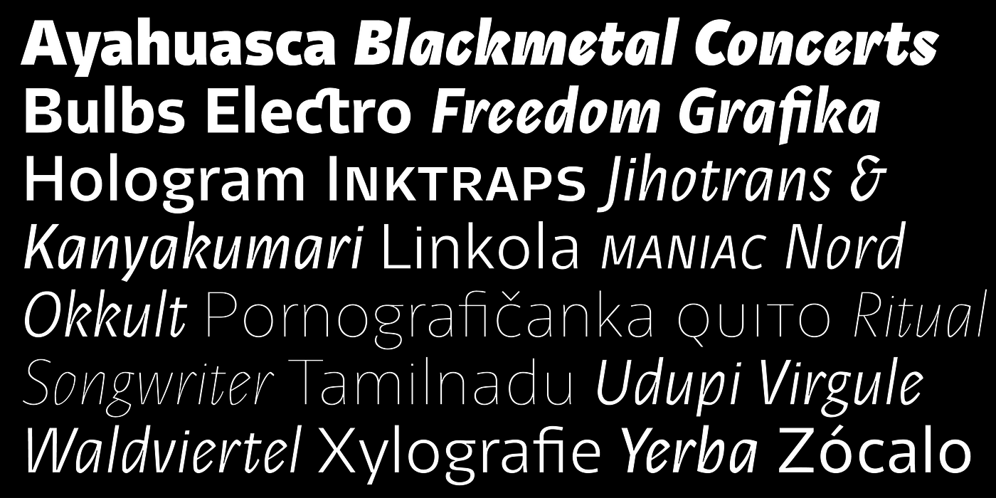
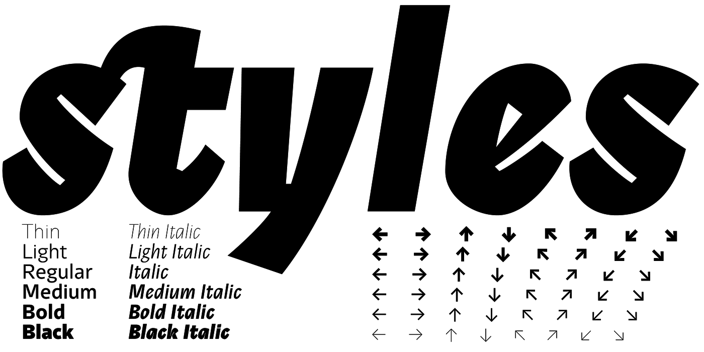
In the mid-1980s, a re-evaluation of fundamental typographic categories was taking place here, driven by the now-forgotten technology of phototypesetting. We were seeking a contemporary expression and wanted to distance ourselves as much as possible from the overused classic sans-serif typefaces. Rathouský’s Metron was the best option at the time, and we owe our initial inspiration to it. Inicia is an ideal typeface for information systems and visual identity; it is also well-suited for magazines, exhibition projects, and invitations.
V polovině osmdesátých let docházelo i u nás k revizi základních typografických kategorií v souvislosti s dnes již zapomenutou fotosazbou. Hledali jsme současný výraz a chtěli se co nejvíce vymezit vůči nadužívaným klasickým bezserifovým písmům. Nejlepší byl tehdy Rathouského Metron, jemu vděčíme za iniciační inspiraci. Inicia je ideálním písmem pro infosystémy a vizuální identitu. Hodí se dobře i na časopisy, výstavní projekty a pozvánky.
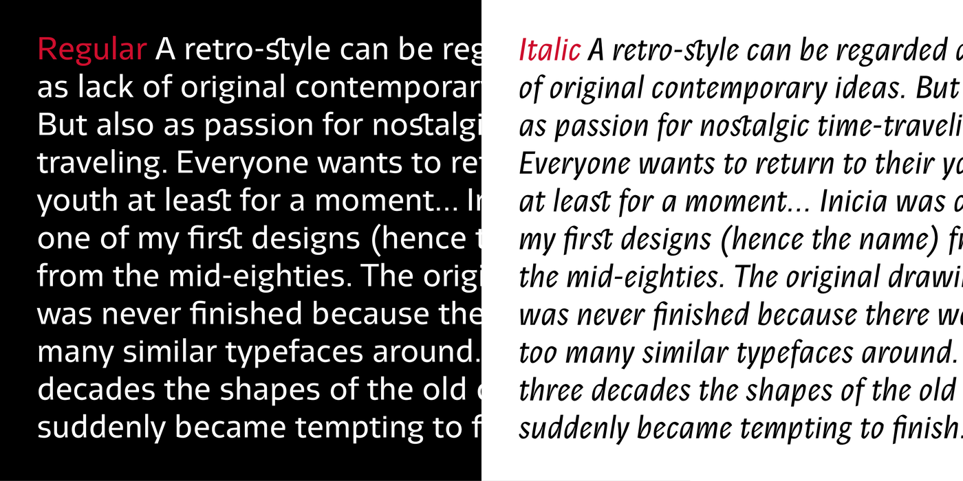
A retro-style can be regarded as lack of original contemporary ideas. But also as passion for nostalgic time-traveling. Everyone wants to return to their youth at least for a moment... Inicia was one of my first designs (hence the name) from the mid-eighties. The original drawing was never finished because there were too many similar typefaces around. After three decades the shapes of the old designs suddenly became tempting to finish.