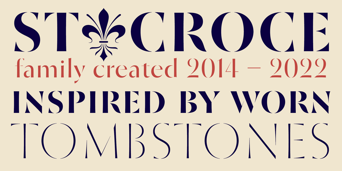
St Croce
- Typefaces
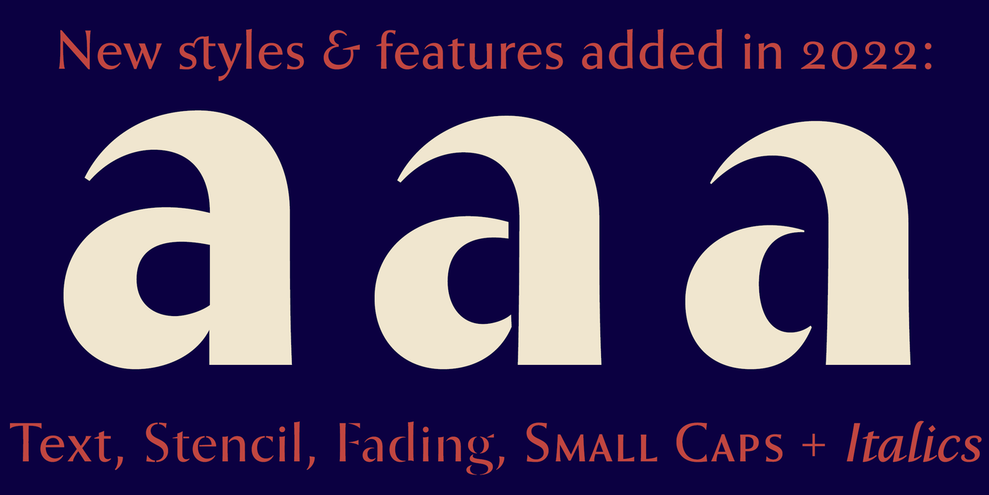
- Gallery

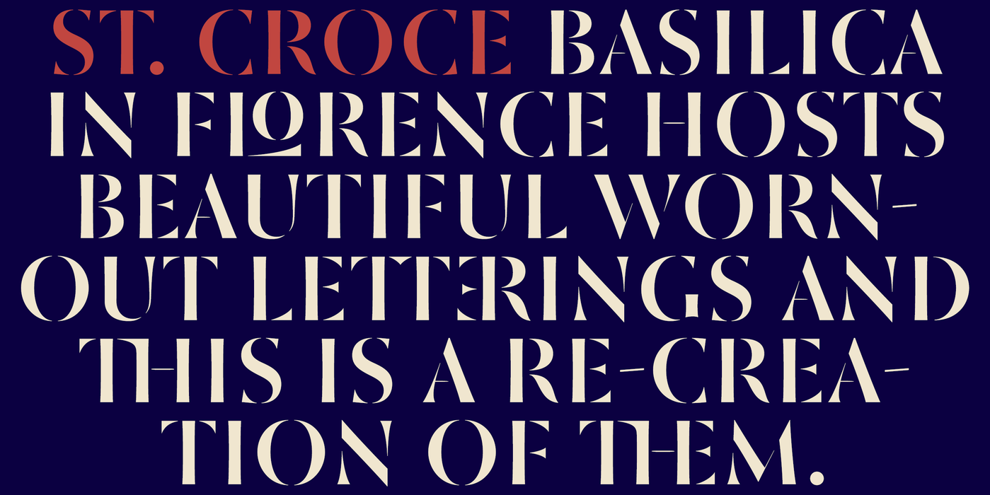
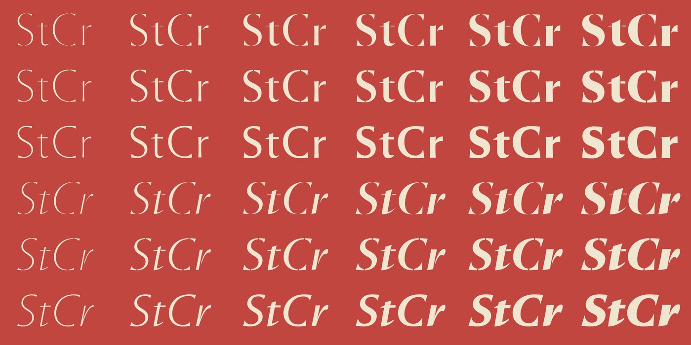
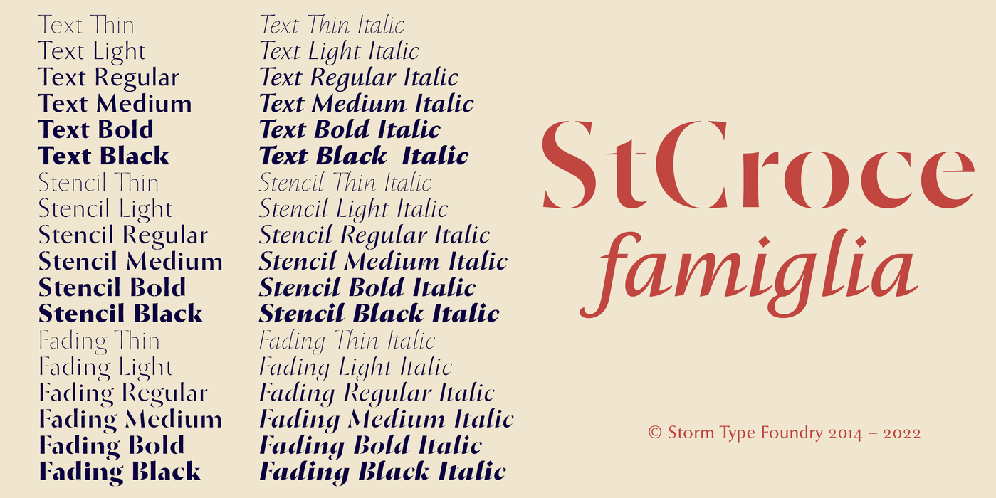
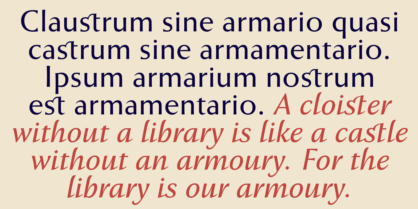
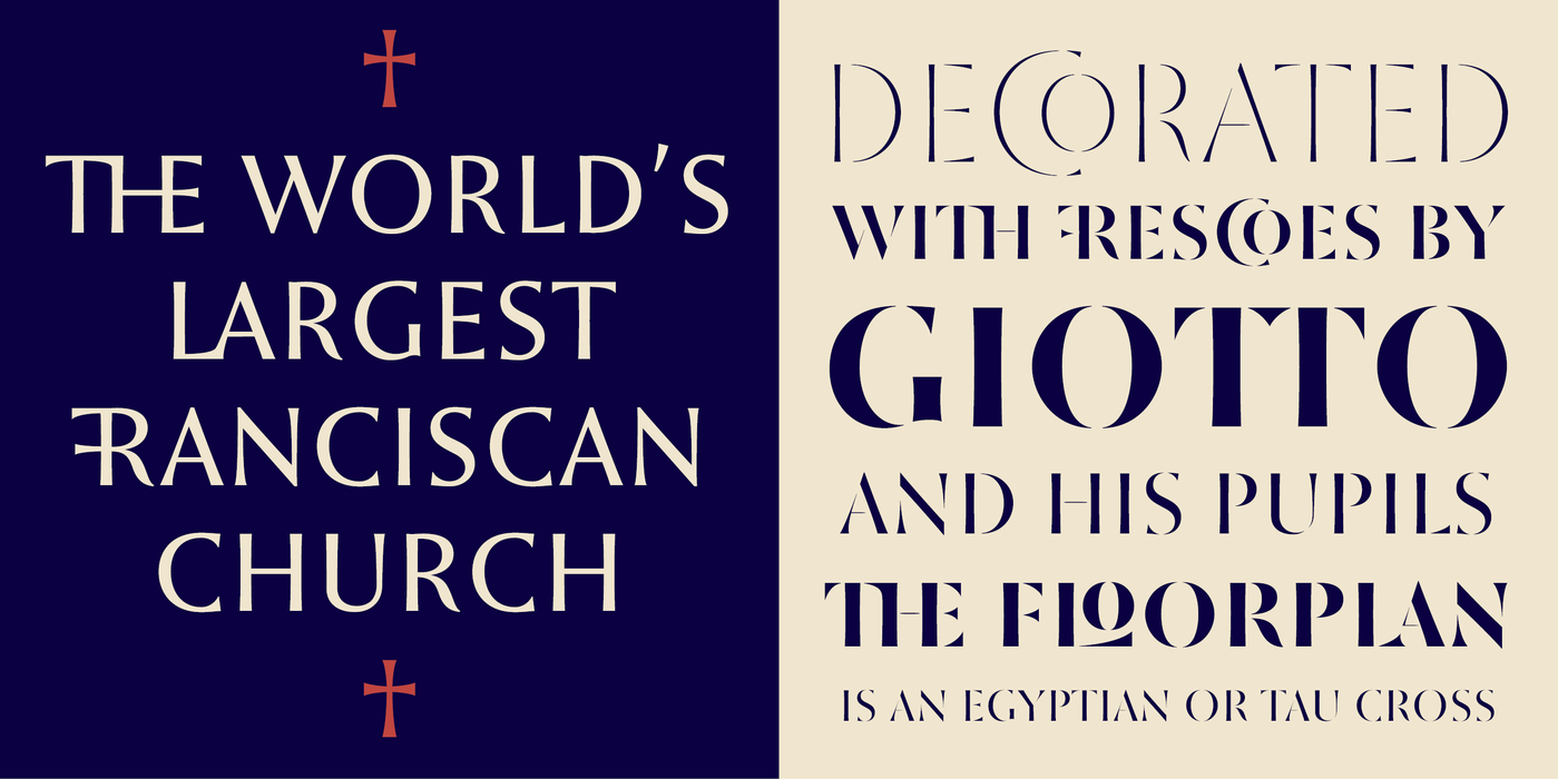
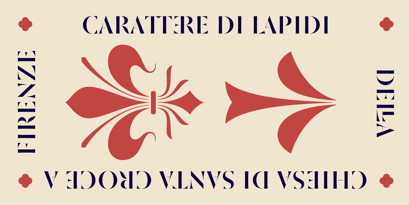
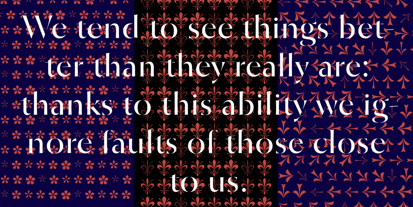
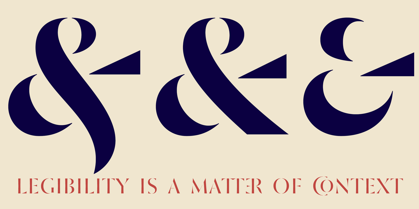
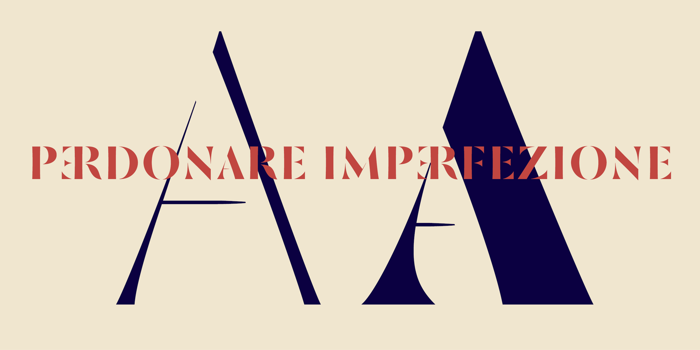
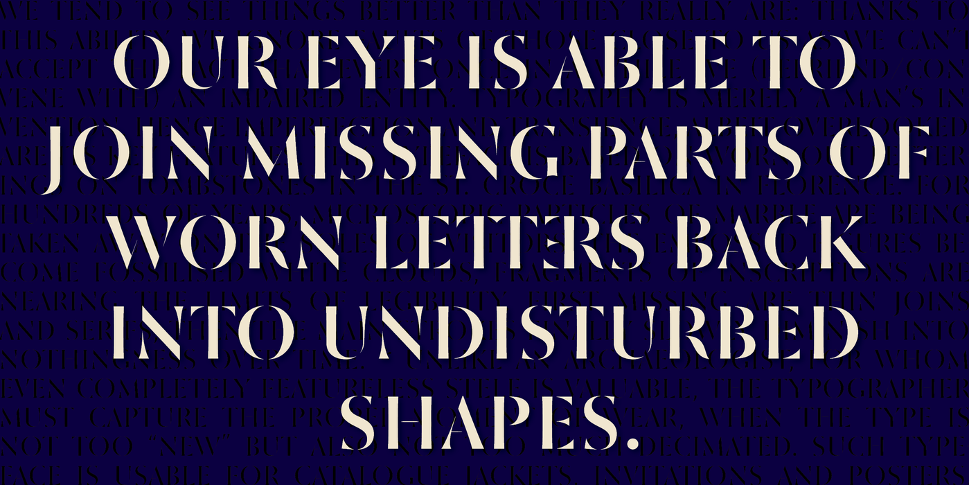
Our eye is able to join missing parts of worn letters back into undisturbed shapes. We tend to see things better than they really are. Thanks to this ability we ignore faults of those close to us as we can’t accept the fact that every once in a while we convene with an impaired entity. Typography is merely a man’s invention, hence imperfection and transience, albeit overlooked, are its key features. This typeface is based on worn-out letterings on tombstones in the St. Croce basilica in Florence. For hundreds of years, microscopic particles of marble are being taken away on the soles of visitors: the embossed figures become fossilised white clouds, fragments of inscriptions are nearing the limits of legibility. First missing are thin joins and serifs, then the main strokes finally slowly diminish into nothingness over time. Unlike an archaeologist, for whom even completely featureless stele is valuable, the typographer must capture the proper moment of wear, when the type is not too “new” but also not too much decimated. Such typeface is usable for catalogue jackets, invitations and posters.
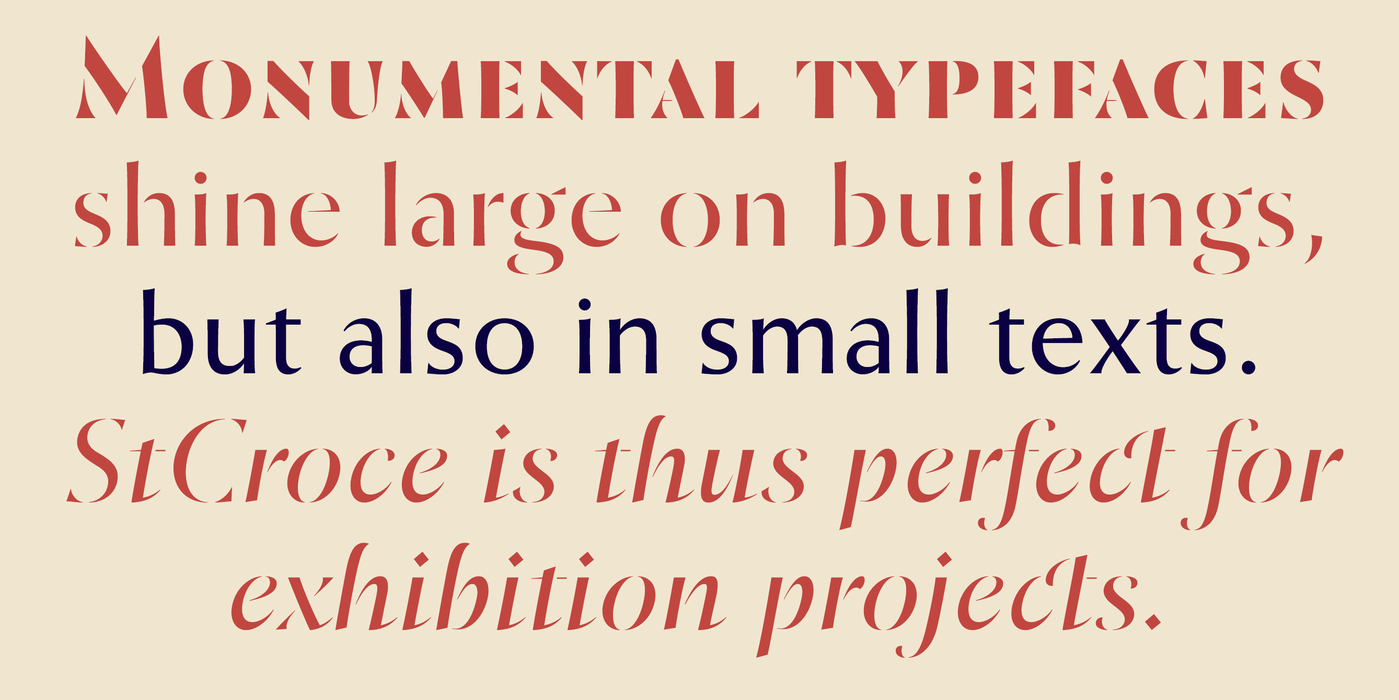
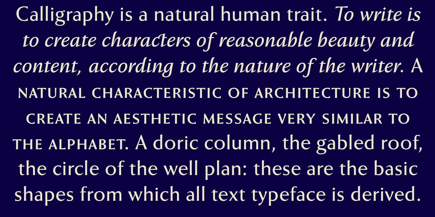
Calligraphy is a natural human trait. To write is to create characters of reasonable beauty and content, according to the nature of the writer. A natural characteristic of architecture is to create an aesthetic message very similar to the alphabet. A doric column, the gabled roof, the circle of the well plan: these are the basic shapes from which all text typeface is derived.
Naše oko si umí spojovat chybějící části opotřebovaných písmen zpátky do neporušených, čitelných tvarů. Chceme vidět věci lepší než ve skutečnosti jsou: díky této schopnosti umíme přehlížet chyby bližních, protože si nechceme připustit, že se občas stýkáme s narušenou bytostí. Typografie je jen lidským dílem a tudíž nedokonalost a pomíjivost jsou její hlavní, byť přehlížené složky. Na nedokonalostech vzniklých ošlapáváním písmen tesaných do bílého mramoru náhrobků v basilice St. Croce ve Florencii (1294) je založeno i toto písmo. Stovky let odnášejí podrážky návštěvníků mikroskopické částečky mramorů: z figur a reliéfů se stávají bílé zkamenělé obláčky, fragmenty nápisů se blíží hranici čitelnosti. Nejdřív mizí tenké spojnice a serify, poté se nějaký čas zeslabují i hlavní tahy, aby nakonec zmizely zcela v běhu času. Na rozdíl od archeologa, pro kterého je cenná i úplně ohlazená stéla, musí typograf vystihnout moment přiměřeného ošoupání, kdy písmo není ani moc „nové“ ale ani přespříliš zdecimované. Taková abeceda se pak hodí na obálky knih, katalogů, pozvánky a plakáty.
Kaligrafie jest přirozenou vlastností člověka. Psát znamená vytvářet znaky přiměřené krásy i obsahu, podle povahy pisatele. Přirozenou vlastností architektury je vytvářet estetické sdělení velmi podobné abecedě. Dórský sloup, sedlová střecha, kružnice půdorysu studny: toť základní tvary, ze kterých je odvozeno veškeré textové písmo.